Overlay
Let's talk

Hello!

When Designers and Developers Collaborate, Everyone Wins

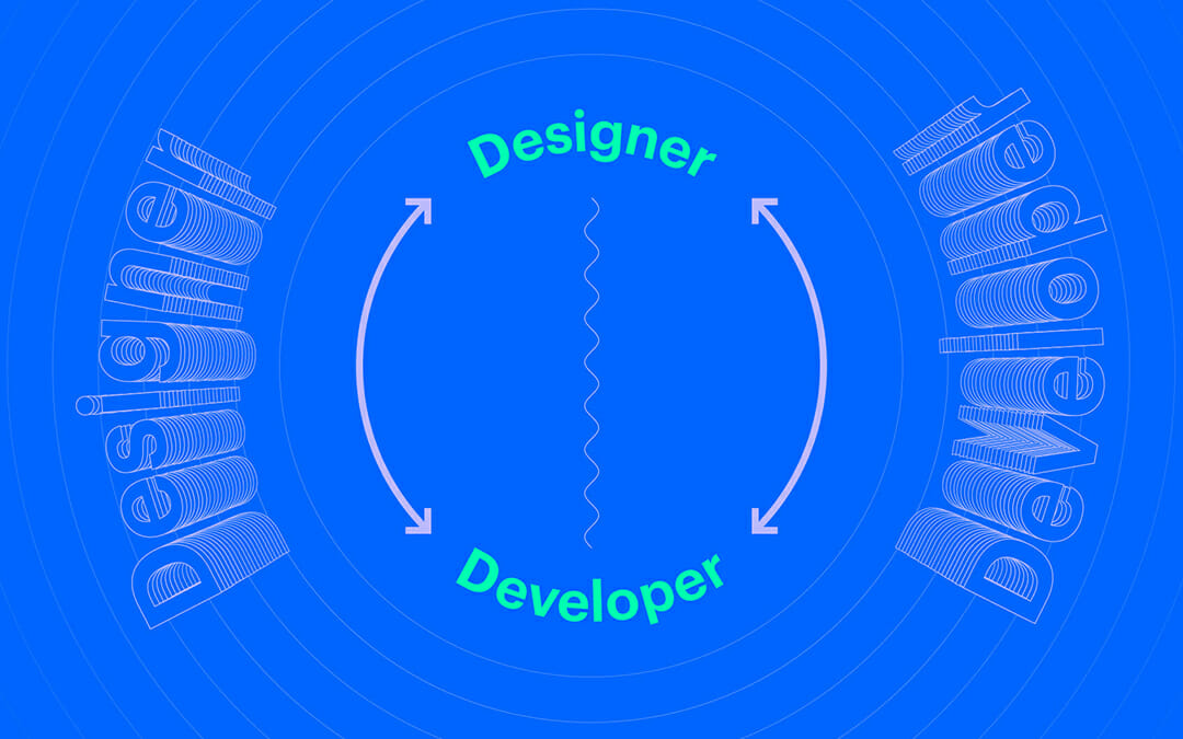
A great developer recognizes and enhances design decisions. A great designer understands the technology they are designing for. Both developers and designers need to have an intimate understanding of each other’s fields in order to produce better experiences for brands.

In order to deliver a bespoke experience for a brand, a collaborative environment needs to be fostered.

How to Actually Collaborate

A key element to facilitating design and developer collaboration is reshaping the reviewing process. The traditional way is to do a bunch of design work upfront, get client approval, polish the entire project, and hand it off to a developer completely “designed.” This often results in quite a few design decisions being compromised because of poor documentation, developer interpretation, or non-feasibility.

The new way of doing things is beyond agile—its actual collaboration.

Collaborate

Setting a frequent and casual cadence of check-ins between designer and developer not only speeds up each other’s workflows, but it also allows each party to influence each other’s practice. True collaboration is a developer showing a designer an interaction that is 50% of the way done, so that the designer can fiddle with the code in order to make it perfect. True collaboration is also a designer showing the developer what they are thinking for design early on, so that the developer can raise any flags or offer suggestions to improve the design.

Using contemporary tools is the best way to achieve this type of working relationship. Gone are the days of sharing Sketch files over email and setting calendar events where eight people on the agency side show up to have a formal conversation with a developer.

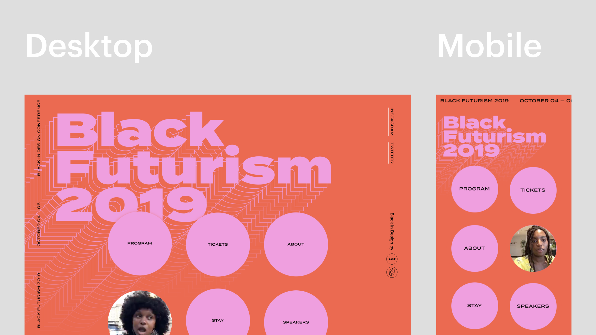
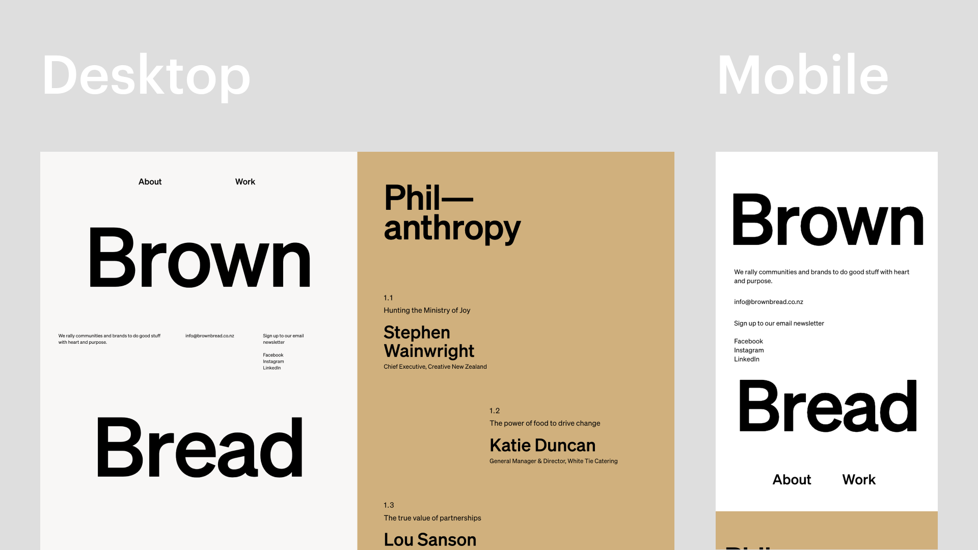
Today, we use Figma so that the developer can see and modify the designs as they are being worked on. We use Slack to keep in communication on a regular basis and have video/screen share calls when reviewing things that keep updates frequent and easy.

Building Collaboration via Overlapping Skill Sets

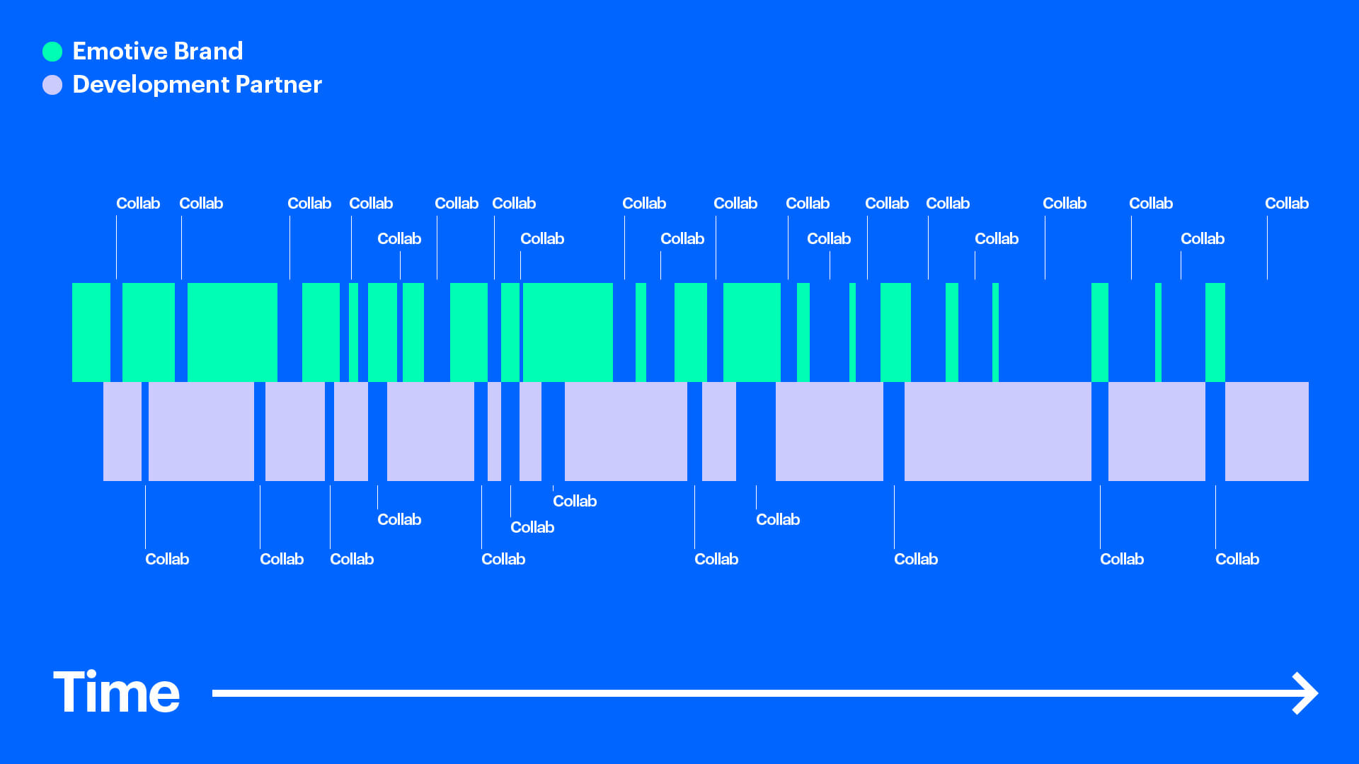
To actually collaborate with someone, having overlapping skill sets is key. If each party has an understanding of the other’s expertise, they can make decisions together confidently. This also establishes trust between one another. For example, if a certain interaction is going to be too time-consuming to develop, the developer can offer a suggestion that is rooted in the agency’s design expertise. This is great when needing to come to a consensus on changing a piece of the design to fit the timeline since we can trust that the developer’s suggestion is going to be feasible. It also gives designers a new model of interaction to design against, so we can refine the design accordingly.

Building Collaboration via Remixing

When you have two parties with overlapping skill sets, the other party will often take the idea you have designed and enhance it.

Internally, we used our knowledge of front-end development to deliver custom interactions to our developer Cory, and he would surprise us by making them even better in his implementation. This type of relationship is critical in creating a site that expresses the brand to its fullest potential.

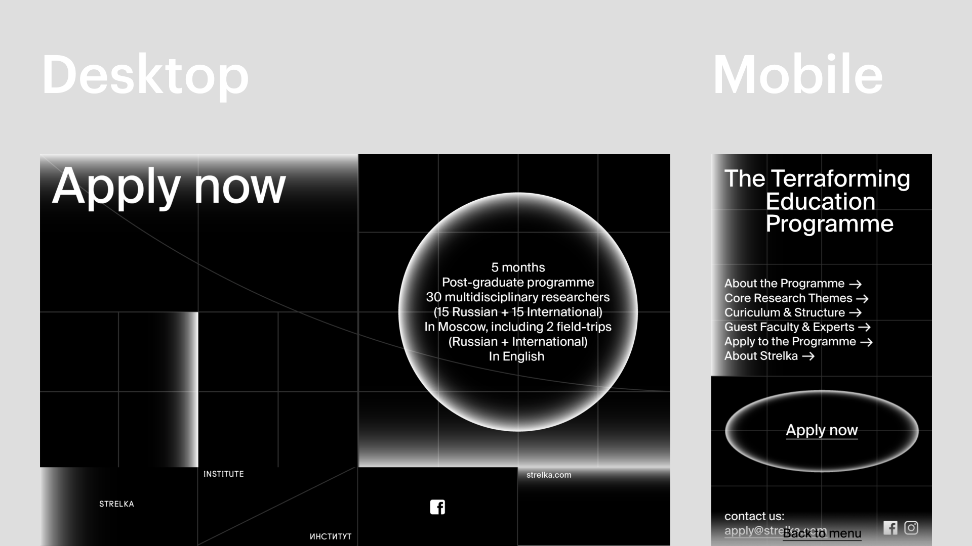
To be technical, our original design intended to use CSS to pin one part of the design while the rest scrolled. The developer went even further and added an overlap to the pinned area once a certain scroll threshold is reached.

This design was enhanced in implementation because the developer split up a Lottie animation and CSS animations that aligned perfectly with the timing. This needed to be implemented this way because the text needed to be editable in the CMS.

Start Today

The best way to build a culture of true collaboration is to start actually collaborating with people today.

Are you working on a document that you are trying to perfect before sending off? Get on a screen share and get input from a developer.

Do you work with a team that has a skill set you don’t have? Start learning their skills, gain empathy for what their jobs are, and bring them into the conversation. Show that you care about their craft and that you’re willing to learn outside of your role in order to make something better than you could have done alone.

Did someone send you a project to execute? Think creatively about it and enhance it beyond what they were expecting. Those little one to two-hour experiments add up over time and really improve the quality of what you’re working on.

Emotive Brand is a brand strategy and design agency in Oakland, California.

Feeling the Holiday Spirit: Introducing Emotive Feels

Emotion Is Everything

For brands to make an impact on the outside world, they must explore inner worlds. In our line of work, emotion is everything. The most successful brands are those that evoke feeling—that ignite new ways of thinking about the world and our unique place in it

At Emotive Brand, naturally, we’re obsessed with emotion. We believe every company can perform better if its brand connects with people on an emotional level. A brand that’s emotive triggers feelings, inspires action, earns loyalty, and lifts spirits. In the overcrowded business world, your brand must resonate rationally and emotionally. Never overlook the mind, but always aim for the heart.

Emotional Impact

As part of our methodology, we’ve identified 301 positive emotions that a brand could possibly elicit in their target audience. These range from expected—supported, enabled, secure—to unconventional—nostalgic, vibrant, zealous. We call this set of feelings an Emotional Impact, and it acts as a compass for guiding creative and strategic decisions.

Emotional Impact is a tool we use in workshops, it’s on our business cards, and all 301 emotions even hang as separate tiles on our office wall. This year for our holiday card, we were thinking of another, more expressive way to bring this methodology to life.

Introducing Emotive Feels

And so, we created Emotive Feels—an interactive dictionary all about emotion. For each entry, we paired graphic design and animation with quotes from our team and influential thinkers. More than just defining the feeling, we’re seeking to enact it through motion and emotion.

“Visualizing the set of 301 positive emotions has always been very important to us,” said Creative Director Thomas Hutchings. “We are always looking for new ways to do this and find new ways for people to engage with this emotion-first philosophy. This site adds to this quest. It’s fun, engaging, and meaningful. It’s always been important to us to make sure this comes through. A methodology should never be laborious and self-serving.”

To be a truly emotive brand requires more than creating one-off emotional ads. It’s about forging valuable emotional connections at every touchpoint: your logo, your website, even the tone of voice your employees use on customer calls. When brands behave this way, they connect more meaningfully with their audiences. This means people are more likely to remain loyal and engaged, and ultimately feel bonded to the promise of the brand in the long term.

“The Emotive Feels site is such a great opportunity for our studio to showcase a unique aspect that separates us from other agencies,” says Designer Keyoni Scott. “The creation of the site makes our methodology tangible so it can always live on the web and be a tool to help anyone learn about the ways we help brands thrive. We’re always striving to evoke feeling through design.”

“The big buzzword in design is ‘empathy,’” says Senior Designer Jonathan Haggard. Everyone wants to design with empathy for their end-user in mind, which is great, but the conversation usually stops there. In order to effectively design for your customers, it’s best to understand them on a visceral and emotional level. At this level, you are able to affect their perceptions using the principles of design to build a brand or product that amplifies certain emotional responses.”

On Emotive Feels, you’ll find inspirational words from poets, designers, editors, strategists, musicians, artists, and historians. You’ll see shapes shift, bend, twist, morph, spin, snake, and dance. And when you’re done, we hope you leave feeling differently than when you arrived.

“Emotional Impact has always been embedded in our design process, so this project was a fun opportunity to create something visually engaging around our methodology and have it live beyond our office walls,” said Design Director Robert Saywitz. “I think it’s also vital to constantly exercise that creative muscle by carving out the time to create internal projects such as these, where imagination really leads the charge and allows everyone to be involved for a true team effort.”

From our hearts to yours, we hope the holidays are merry and bright.

The blog will return after the holiday break in January 2020.

Emotive Brand is a brand strategy and design agency in Oakland, California.

The New Web: How Development Tools and Collaboration Enable New Design

From 2007 until very recently, the web was infiltrated by the same design patterns. Everyone is familiar with this: a generic headline with a call to action, three icons below describing features, and a few full-width, black-tinted images with text on top.

When Sketch burst onto the scene in 2010, the web design discipline sped up, but the developer hand-off process was still tedious. Dimensions were specified using redlines, and the web was built with block and inline elements. Flash was dying, and there were no tools for designers to easily bring their more expressive designs to life. Mobile browsers were, for the first time, making a huge dent in the web’s traffic and the current desktop designs were failing.

Between 2007 and 2010, dominant patterns emerged and were swiftly distributed across the web, otherwise known as Web 2.0. Sites were designed as “mobile-first,” and the same design needed to grow to desktop. The result? A simplification of UI, a flattening of design expression, and designs that were nearly indistinguishable from each other.

Web Two Dot Oh No

In the same way that designers weren’t yet educated in development practices, developers were often blind to design decisions. Due to the time spent learning Web 2.0 development practices, developers would take redlines and build them to spec with little improvement on the design. In the early 2010s when web design patterns were so new, designers weren’t comfortable pushing the boundaries. It was impossible to find rules to break while still creating a successful design on multiple platforms.

Developers started building tools to educate designers on how they could use their new playground. Prototyping and animation toolsets started appearing, like Principle, Framer, and Invision, which gave designers tools to bring their work to life through animation and interaction. On the dev side, new technologies like flexbox, CSS transitions, Lottie, and most recently canvas libraries like three.js and p5.js gave developers tools to seamlessly bring those animated designs to fruition—instead of hacking designs together with jQuery. Additionally, tools like Zeplin sped up the transition between design and development, allowing both departments more time for creative expression.

As the crossover between design and development increased, the line between the two disciplines blurred and a design resurgence occurred. A new generation of designers emerged that were comfortable designing for the web with these new tools from day one. Graphic design became a key component to what was previously specified as interaction design, as designers could be more experimental with elements like layout, typography, and color. Web tutorials and resources like codepen.io, CSS-tricks, and DevTips let designers in on the new tech that was being developed for the web and how they could employ it in their designs.

Welcome to the New Web

This merging of graphic design, interaction design, and new development practices has created a New Web. This New Web is rooted in the principles of design and comes to life through the collaboration of contemporary development practices. In fact, a savvy designer can create a New Website using a tool like Webflow which incorporates design and development into one seamless tool.

The key to creating a New Website is to get developers in on the conversation as early as possible. Showing them the thinking behind a design, and being open to modifying as needed can be the difference between a static site or a great brand expression. The more frequent these conversations happen, the more opportunities there are for collaboration. On the other side of the coin, developers who are open to non-traditional designs and to learning new technologies can be the turning point in making a great site.

New Web can be as avante-garde as you can imagine. No forms are off-limits, as long as you spend the time designing a mobile experience that achieves the same goal as your desktop design. This allows for more specific and greater brand expression. A New Website creates a custom experience for a brand that stands out from the pack as memorable and clever. This also allows for cohesion between web, print, event, and motion in a brand system.


There is no excuse for an average-looking site today. For many companies, your website is your lifeblood. It’s the first point of contact, a funnel for sales, a magnet for attracting top talent, and a vehicle for radical creative expression. There have never been better resources for building than right now—and that’s because the people who spend their days making websites are the ones actually making the tools. Both designers and developers must continue pushing the boundaries to take the New Web into uncharted territories.

Emotive Brand is a brand strategy and design agency in Oakland, California.

Accessible Design Must Be the Rule, Not the Exception

In the nascent days of computing, the highly sought after feature we now call “dark mode” was the standard. Cathode ray tube (CRT) monitors got their green-on-black look from the phosphor inside of the screens. While this technology was long-ago abandoned, dark themes have re-entered the zeitgeist as the latest “new innovation.”

“It’s thoughtfully designed to make every element on the screen easier on your eyes,” Apple claimed in its announcement of the feature for iOS 13. But here’s the thing: there’s no real evidence that’s true. For people with astigmatisms (approximately 50% of the population), dark mode is worse on the eyes.

As Gizmodo reported in 2014, citing research by the Sensory Perception and Interaction Research Group, at University of British Columbia, white backgrounds act as a “crutch” for astigmatic eyes:

People with astigmatism find it harder to read white text on black than black text on white. Part of this has to do with light levels: with a bright display (white background) the iris closes a bit more, decreasing the effect of the “deformed” lens; with a dark display (black background) the iris opens to receive more light and the deformation of the lens creates a much fuzzier focus at the eye.

Follow the Leader Is a Losing Game

While there isn’t concrete evidence of the benefits of dark mode, at the end of the day, Apple is a tastemaker and hundreds of companies will now see this as a design imperative. The question then becomes: instead of playing follow the leader, how can brands leverage design to make themselves accessible to the most people possible?

“When we think about accessibility design, dark mode is a recent example of behavior change only coming as a result of following others, as opposed to being the one to take those risks,” says Senior Designer Jonathan Haggard. “Software and accessibility can influence brand in a great way, instead of being an afterthought.”

It starts with an acknowledgment that if you want to create something truly groundbreaking, there is no such thing as “a given.” It requires pausing to question those knee-jerk decisions you make without really thinking, like, “Oh, I’m building a website. First step: white page.” After all, when Tesla designed their car, they didn’t start with a gas engine.

It Ain’t Easy Being Pink

Take the Financial Times, for example. Instead of volleying back and forth between white or black modes as others have done for the last 35 years, they are unabashedly pink. As a design choice, it’s a risk. But it’s one that immediately differentiates them, increases the contrast, and may provide better readability over longer sessions, especially at night. They could have just stuck with white like everyone else, or followed-suit with Apple, but they have stuck to their guns.

Walk the Walk with Your Design

For another take on accessibility, consider Low-tech Magazine, a solar-powered, self-hosted website that has been designed to radically reduce the energy use associated with accessing content online.


They opted for a back-to-basics web design, using a static site instead of a database-driven content management system. They apply default typefaces, dithered images, off-line reading options, and other tricks to lower energy use far below that of the average website. Because it uses so little energy, this website can be run on a mini-computer with the processing power of a mobile phone. In addition, the low resource requirements and open design help to keep the blog accessible for visitors with older computers and/or less reliable internet connections.

Countless brands tout the importance of accessibility and sustainability, but how many are actually walking the walk with their design choices?

Accesible Design Has Unexpected Positive Upsides

As we learned in our work with Alluma, a tech nonprofit whose solutions help people enroll in public benefits programs, designing for accessibility lends itself to unique executions. People tend to think about the word “disability” as a separate, static category, but it’s much more fluid than that. In taking the steps to make your website accessible, you will be helping everyone on the spectrum—from those with slight preferences to those with severe barriers.

“When you design for the ‘worst-case scenario,’ oftentimes people who are suffering in similar but less intense ways can benefit, too,” says Jonathan Haggard.

Accessible design will always save you time in the long run. It’s worth remembering that you and your customers are not fixed in space. Their preferences, abilities, and circumstances will change over time. Why not plan for those contingencies now?

Emotive Brand is a brand strategy and design agency in Oakland, California.

Don’t Let Your Product Ruin Your Brand

It’s a tale as old as time. You can’t sell product without a brand; you can’t sell brand without a product. Product designers and brand designers are sometimes viewed as adversarial disciplines, but in truth, both sides are working toward the same goal with different tools. But what’s the right balance? And how can you get the best of both worlds? To begin, a bit of level-setting.

Product Designers

Product design is commonly defined as the approach to building a new product from start to finish. This encompasses market research, identifying problems, product development, designing informed solutions—and everything in between. It is a practice that values analytics, speed, efficiency, and multiple iterations, so it should come as no surprise that the role of product designers has exploded in the age of startups. Most of the time, product designers are working with an established toolkit and experimenting with how best to implement it.

Consider this clip from The Founder wherein they mockup a version of a McDonald’s kitchen on a tennis court. The way they are thinking about design is decidedly not about how it will make customers or employees feel when entering the restaurant, it is about what levers can be tweaked to create a burger in thirty seconds.

“While every project is different, there is a paint-by-numbers approach to the visuals that can happen in product design,” says Senior Designer Jonathan Haggard. “It tends to be very mathematical and results-driven to get to the design. Deciding a color works because it signifies a specific goal which can be tested. Technically, you can be a fantastic product designer and still have an unappealing aesthetic.”

As outlined by the UX Collective, the main tasks of a product designer are to:

– Define different scenarios and build interaction patterns
– Use tools that help them study user behavior (UX)
– Create interface prototypes (UI) and create the logic of the product with wireframes
– Pose and analyze different tests (A/B) to verify that this is the best product that can be offered
– Transfer the status and needs of the product to the Product Manager

Brand Designers

Creating a brand, on the other hand, is a completely different story. In the words of Seth Godin, a brand is “the set of expectations, memories, stories, and relationships that, taken together, account for a consumer’s decision to choose one product or service over another.” Whereas brand may once have been confined to a logo, it now extends on-and-offline to encompass visual identity, photography, video, copywriting, events, experiences, and behaviors. The tall order of brand designing is constituting a system that can hold all of these different elements and form an identity that not only feels right for today, but is flexible enough to grow for tomorrow. By definition, brand designers will not have analytics for every decision and there is an element of risk in decision making.

Action vs. Reaction

To be clear, companies need stellar product and brand design. But in the age of analytics and big data, when it has never been easier to make every single decision a numbers game, we argue that companies have over-indexed on product design thinking. If you’re always reacting to analytics, it’s incredibly difficult to surprise, provoke, or differentiate yourself because you’re letting what’s there dictate what could be.

There is a video from 2006 that still gets passed around between designers. It asks the simple question: What if Microsoft designed the iPod?

“The fact is that great design is a mix of art and science, and in a world run by product, where is the art?” asks Creative Director Thomas Hutchings. “Results and testing are incredibly important, but they will lead you to familiarity. If you want to pave the way for new thinking, you need an element of risk—you have to resist the urge to test everything and be comfortable with the fact that ground-breaking stuff may be poorly received at first.”

“The tricky thing about product design is that it is all about patterns, without necessarily an investigation of whether those patterns are good or bad,” continues Jonathan Haggard. “If you make a change to the pattern, some product designers will ask, ‘Does Google or Apple do that?’ It’s a fair question, but that’s not how you break the mold. That is the mold.”

Stay Weird

In a perfect world, you adopt best practices without losing your appetite for risk. Because while business is, of course, a business, there will always be an unquantifiable element of art, of storytelling, of magic that brings it all together and elevates your rational strategies to a higher emotional plane. You can’t get there by brain alone. You need heart.

In his great article, “When Product Design and Brand Join Forces,” Rob Goldin says, “Often as product designers, we develop such a deep empathy for customer needs, fears, and desires, that it can become a natural extension of our thinking from product requirements to emotional brand attributes.”

And that’s the ticket right there. A willingness to blend the rational and the emotional, the analytical and the unknown to create something larger than the sum of its parts.

Emotive Brand is a brand strategy and design agency in Oakland, California.

A Designer’s Guide to a Successful First Presentation

Presentation Is Everything

The Emotive Brand design team had the pleasure of attending First Round San Francisco, a one-day showcase of original client presentations showing initial design explorations for logo, identity, and branding projects. Twelve different design studios presented on a variety of client projects – everything from a global healthcare non-profit to a menstrual cup company. The crowd was filled with eager designers – some from design studios, others from tech companies, and some freelancers.

We’ve gathered a few key takeaways – a checklist of sorts – to make sure all the first-design-preso bases are covered. Some may sound like common sense, but you’d be surprised at just how uncommon they are.

1. It all starts with strategy.

Research, research, research. The first step to a successful project is to do your homework. Immerse yourself in the client’s arena and competitive landscape. Set up a strategic framework that can be used as a jumping-off point for design. The stronger the strategy, the more criteria you have to evaluate and back-up creative. We lead with strategy, as we believe it provides the true foundation for smart creative work. We encourage our designers and strategists to work together closely, so designers can either take part in creating strategy or give feedback in real-time.

2. Establish expectations. Educate the client. Get on the same page.

Aligning with the client and being transparent from the beginning will start things off on the right foot, and make for a (hopefully) smoother process down the road. It’s helpful to show where you are in the process, be clear about what the client will and will not see in the presentation, explain relevant design objectives, and set up evaluation criteria. Sometimes clients need a bit of education on what the tangible design goals are, and guidance on how to evaluate them. For a second presentation, it always helps to reiterate what you heard so the client knows you’re listening. We are always looking for constant alignment with our clients. This allows us to be an extension of their team and them an extension of ours.

3. Frame the story.

One of the many hats we wear as designers is that of The Storyteller. The power of persuasion in the way a story is told is real, and a great idea has no value unless it’s communicated well. Some things to consider are pacing, naming directions, and implementing metaphors. Using real-life mockups that are relevant to the client’s business also helps to frame the context. We love taking the client on a journey through storytelling, and are always looking to perfect this skill. It’s an essential component of good branding, and enhances the client experience.

4. Show the process.

It’s always helpful for the client to see the process you took to get to an idea. Document all of the messy sketches, scribbles, and iterations, and present them in a beautifully composed snapshot. Don’t be afraid to show inspiration, or what sparked an idea. Help the client feel like they are along for the ride.

5. Environment is important.

Environment is important, and so is making the client feel comfortable. Design is a service after all, and the environment sets the tone for the rest of the process. General rules of thumb – always meet face-to-face if possible, and provide snacks and coffee! We like to create a refreshing experience for the client by immersing them in their world and ours. We look to create a warm, relaxing but very energetic environment.

6. Motion is table stakes.

Brands move, there’s no question about it. The days of static brands are over, and today’s brands are living and breathing. Motion isn’t about demanding attention or standing out from the crowd anymore, but instead about communicating a complete idea and triggering emotion in the viewer. Motion can help clients visualize what their brand will actually look and feel like. An effective motion piece helps to put the pieces together so the client can see the full picture. We look to train in motion tools and principles so that all designers can think in a 3-D space. We aim to create motion principles for the brand as early as possible that can relate back to and enhance the strategy.

7. Anticipate the Frankenstein.

When presenting more than one design direction, the design Frankenstein is a very possible likelihood. For those that aren’t familiar, this is when the client wants to take one piece from Direction A and another piece from Direction B, and combine them into One Big Super Direction. Sometimes there’s no getting around this, but it’s important to be strategic in the number of directions you show and think about how they relate to each other. Acknowledge the similarities between directions and lean into the differences. A popular choice for the number of directions seems to be three – one to like, one to love, and one to hate. We always look to make sure Frankensteins are either difficult and the client understands why, or that they can work seamlessly when implemented. We are happy with either.

8. Always have a summary slide (or multiple).

It’s important for clients to see both how their brand sits in the competitive landscape, and an overview of all the directions in one place. Summary slides are a great way to do this, as they are great resting points for the client to digest what they’ve just been taken through.

9. Facilitate an interactive conversation.

It can be helpful to take the conversation away from the screen, and open the floor for a back-and-forth between the design team and the client. Physical print-outs of the work can help encourage this dialogue. Allow the client to raise any questions or concerns, and listen to feedback carefully. Even if it doesn’t seem relevant at the time, certain comments at this stage can be vital for the next round. We lead our clients upstairs, where work is pinned up across extra-large cork boards. This provides a nice change of pace, invites conversation and a new flow of energy.

10. Collaborators are key.

As much as we like to think as designers we are Jacks of all trades, one of the most important skills is to know when to seek outside help. We love our friends and the creative community around us. We are super inspired by others and love to get people involved wherever we can. Work only gets stronger when we collaborate with creative experts like web developers, type foundries, filmmakers, illustrators, animators, etc. Design is no easy task, and it takes a village.

So, what’s the big takeaway? Success is not about re-inventing the wheel, but about consistently hitting all of these basics. Of course, the work has to be stellar, but the method and framework are just as vital.

Emotive Brand is a brand strategy and design agency in Oakland, California.

Image and GIF credit

The Super Tough Brands of Fragile Masculinity

Last week, the world was given two small wonders: War Paint, a hyper-aggressive makeup brand exclusively for men, and Liquid Death, canned water designed to look like beer. Two “wellness” brands aimed at men, cloaked in the visual language of skulls, tattoos, and violence.

What can these two bizarre companies teach us about the role of gender in branding? And is breaking down male stigma in the wellness space simply a design problem?

Branding … For Him!

Let’s start with War Paint. Their 13-second ad features a heavily tattooed man using various products, flexing his pecs, and adorning himself with a skull ring. Notably missing from this peacocking is how the actual makeup looks on the guy’s face. But that’s not the point of this ad. The point is to disrupt your expectations of makeup and remind you, to a cartoonish degree, that this is for herculean men.

Everything about this brand – the militaristic association of its name, the tattoo parlor visual language, the chant of its tagline “makeup for men, designed by men, for men” – is attempting to shift perception. And in theory, that’s a good thing. For decades, many men have felt uncomfortable with the fact that they have human bodies that require basic care, like moisturizer or water. If War Paint is working toward a future in which men can boldly engage in self-care, that’s progress, right?

Unfortunately, everything about their execution is decidedly backward. Online, many people were off-put by their singular expression of what it means to be a man, and we’re hoping to see a larger spectrum of masculinity represented.

In a tweet attempting to clarify its positioning, War Paint wrote: “If females can have products just for women, why can’t men? Our aim is to allow makeup to be gender neutral and to do that we must have male-specific brands also.”

As Vox writer Cheryl Wischover responded in her piece, “Achieving the goal of increased gender neutrality by making stuff for the underserved ‘males’ demographic struck many as counterintuitive or even nonsensical. The truth is that it probably is still hard for some men to walk into a Sephora and buy makeup. But selling makeup with muscles and war is not going to take away that stigma any time soon.”

The Shape of Water

Let’s shift to Liquid Death, the punk rock canned water aiming to “murder your thirst.” In a way, this feels like a thought exercise for aspiring salespeople. Take the most basic thing possible – water – and make it irresistible. Former Netflix Creative Director Mike Cessario has done just that, raising a new seed round of $1.6 million for his new company. In total, he’s raised $2.25 million for, and I can’t stress this enough, water in a tallboy can. Backers include Biz Stone of Twitter and founders of Dollar Shave Club and Away.

According to Cessario, he’s not solely marketing to the heavily male punk and death metal crowd indicated by the skull logo; he’s targeting the “straight-edgers”– those who eschew drugs and alcohol in a scene often known for both – and doing so under the guise of eco-friendliness because a single, shiny nickel from every $1.83, 16.9oz. can sold will support cleaning up plastics from the ocean.

It would be a shame to deny Liquid Death’s sense of humor. They produced a truly bonkers video called, “Hey Kids, Murder Your Thirst,” which wouldn’t look out of place on Adult Swim. Similar to War Paint, they are aggressively (and joyfully) disrupting the status quo of their category. But here’s the thing: this whole brand narrative is still supported by outdated modes of masculinity. Healthy habits – drinking water, taking care of yourself – shouldn’t need to be draped in distortion and blood to appeal to men.

Why Is Self-Care Gendered?

Ideally, self-care has no gender. Over-indexing on masculinity to make something appeal to men doesn’t encourage actual perception shifts. Quite the opposite, it teaches men to only respond to the violent, the blunt, the obtuse.

As Erika Nicole Kendall noted in her essay, “Marketing has the ability to convey powerful messaging, drive consumer behavior, and legitimize messages we frequently see and hear about ourselves. It simultaneously guides our aspirations and affirms how we see ourselves. When the marketing used to sell wellness brands to the public validates questionable ideas about gender – and, for that matter, race – we should collectively cringe.”

War Paint and Liquid Death are hardly the first, and they won’t be the last. There’s Dude Wipes, which are baby wipes, but for dudes. There’s Man Salt Muscle Soak, which are bath salts, but for men. You’ll never guess who the target audience for the candle company Man Cans is. (Hint: it’s men.)

Perception Shifts

Those who work in branding have a real opportunity to shift perception – if they approach this challenge from a place of curiosity and empathy. What does it mean to be a man in 2019? Whatever we want it to mean. It can be intersectional, non-binary, and yes, masculine, if the aperture of that masculinity is open enough to allow for other identities to exist. Wearing makeup, drinking water, lighting a candle, or taking a bath shouldn’t rattle your identity. If it does, you’ve got bigger problems than branding.

Hair loss company Keeps and wellness brand ForHims are steps in the right direction. Through diverse photography and minimalist design, they are expanding masculinity by focusing on what it means to be human, not just male. There’s still an edginess and personality to their copy, but it refrains from veering into the overtly macho.

“We hope to enable a conversation that’s currently closeted,” goes the ForHims’ about page. “Men aren’t supposed to care for themselves. We call bullshit. The people who depend on you and care about you want you to. To do the most good, you must be well.”

In the productivity-economy, caring about yourself can feel radical. The role of good branding makes those magic moments as accessible, inclusive, and frequent as possible.

Emotive Brand is a brand strategy and design agency in Oakland, California.

Image credit

2019 Marketing Budget Planning: Questions to Help You Get Started

It’s That Time: 2019 Marketing Budget Planning

Developing your 2019 marketing budget is nobody’s favorite time of year. But it’s inevitable. Like clockwork each year, it’s here. As an agency immersed in helping businesses deliver the results they need to thrive, we understand first-hand that marketing budget planning can be overwhelming and taxing. Knowing what to include to deliver the results needed seems nearly impossible for many VPs of Marketing looking to drive growth, build brand, drive lead gen, and fuel revenue.

We know CFOs can be tough audiences. In fact, many VPs of Marketing that we know or work with express trepidation about the need to clearly articulate and validate a budget for the next year. It’s a daunting challenge. And even those who have significant growth and ROI to show from this year’s marketing spend still dread it.

As you develop your 2019 marketing budget, we’ve outlined a few questions to consider.

Positioning and Messaging

Confident that your positioning and messaging is tight, but still unable to deliver the growth you’re on the hook for? Have you considered building a brand campaign to drive awareness, spark engagement, and ultimately, foster loyalty? A brand campaign can grow your brand and business in meaningful and impactful ways by bringing your positioning and messaging to life. Learn more about why and how.

Differentiated Messaging

Struggling to articulate differentiated messaging that can support a complex technology that is difficult to understand? Disruptive technologies require a different approach to messaging and positioning. And in order to be truly disruptive, you need to change the perception of what is possible. Consider how you might approach messaging differently.

Aligning Leadership Team

Having trouble moving forward on any decision because your Leadership Team is misaligned and you can’t get everyone to agree on the right strategy? Sometimes, it takes a deep dive and full immersion into your most pressing business and brand challenges to get everyone focused on the right priorities. Learn more about our Fast Forward workshop.

Positioning and Category Creation

Feel the need to reposition? Or, are you considering a new category to help you stand out and enable a stronger valuable to raise your next round? We believe a strong positioning strategy can help your business thrive, your brand become more meaningful, your team hire and retain top talent, and your business realize their full purpose and vision. Here’s why to consider adding a Positioning Strategy to next year’s marketing budget.

Customer Journey Mapping

Having trouble delivering on the experience you promise your customers? Think your company could benefit from research-based customer journey mapping to better understand the people who matter to your business? Customer journey mapping is proven to help businesses market better, sell easier, build better products, and deliver a better brand experience. Here’s how to do it right.

Strategic Marketing Budget

At the end of the day, every business has unique challenges and struggles. That’s why our approach is always tailored to our clients. Discussing specific challenges with someone outside the walls of your business can help ignite new thinking around how to address projects and problems you want to tackle next year.

If you would like to understand how we can augment your internal team or discuss specific projects you have coming up in 2018 so you can get a better idea of our approach, timing, and fees, please give us a call.  Now is the right time for you to evaluate the options and costs associated with working with an agency so you have what you need to develop your marketing budget for 2018.

Emotive Brand is a B2B San Francisco brand strategy and design agency.

Design Trends for 2019

Friction Builds Character

Friction is one of those words you see in Silicon Valley all the time. Specifically, in technology’s promise to remove it. A frictionless experience is instantly digestible, seamless, clean. The only problem is that in desperately trying to remove the friction from every experience, you can remove the experience altogether. A little friction, intrigue, or mystery is not always a bad thing – especially when it comes to design. As we look forward to 2019, we have talked about trends for employer branding and overcoming strategic challenges. Today, we turn our sights to the world of design. Combining the best elements from nostalgia and futurism, the design trends of 2019 are reinventing the aesthetic movements of the past to create a bold and fired-up vision for the digital future.

Just My Type

They say never use Futura. Well, apparently, everyone listened. This year, all the big brands decided to invest in creating their own typefaces. Airbnb, Netflix, Uber, and Squarespace each took the plunge. And while designing your own typeface can have a huge upfront cost, it will actually save them millions every year on font licensing. Plus, type is an essential building block for creating meaningful connections for your brand. You get what you pay for.

Design Trends for 2019

Think Way Outside the Box

After years of being forced to encase every element in a strict order of circle avatars and content boxes, designers are finally being given the freedom to experiment with open compositions. Akin to the iceberg method of writing, these are designs where you are only given a slice of the picture and are enticed to explore an entire world off-page. As Meg Reid of 99designs says, “Often open-styled, seemingly chaotic, broken, and cut-up, these compositions take a very strong design hand since the placement of each element is anything but random.” Check out the beautiful motion of VIITA Smartwatch, or the typographic playground of Lionel Durimel.

design trends for 2019

Worlds of Opportunity

As technology advances, it seems like we’re wielding entire universes in the palm of our hands. Perhaps it’s only natural that design has followed suit, exploring the use of isometric illustration. In short, it’s about creating visual storytelling through elaborate miniature landscapes or scenarios. The style is especially adept at explaining services that have many parts or stages, which is probably why technology companies like Cryptogoal and Docker have embraced the trend.

design trends for 2019

Brutalize the Web

Though it was written in 2016, Xtian Miller’s essay  “How To Brutalize The Web” continues to be way ahead of its time. In architecture, Brutalism was a movement that exhibited a lack of concern to look comfortable or easy. Web Brutalism continues this trend, exhibiting an intentional effort to be whatever a consumer website isn’t. As Miller says, “A unique journey and experience for the user is more memorable and engaging than the one they’ve seen countless times before. A Brutalist approach can provide the opportunity to create something that is unexpected – even chaotic.” Sites like Bloomberg Businessweek and Drudge Report were early adopters to this movement, which has only led to more experimental and artistic sites like Yale University of Art, The Outline, Indiecon, and Props Paper Magazine.

design trends for 2019

You Too Could Have a Body Like Mine

In HR, we talk a lot about the importance of representation, perspective, and making sure everybody has a seat at the table. Maybe that’s the force behind the recent explosion of retro human illustration among software companies. In all skin tones, proportions, and sizes, brands are becoming body positive for every kind of body. Zendesk, Slack, Headspace, and Airbnb all took part in the mid-century aesthetic of bodies that can move, work, and thrive with jazz-like agility.

design trends for 2019

Bold Colors, Bolder Gradients

Vivid color combinations have been on trend for a while now – but expect these transitions to only get dreamy, bolder, and more futuristic. Ever since Dropbox blew the lid off its blue and white identity, it seems tech companies are getting more and more comfortable with embracing something vibrant.

design trends for 2019

Limitless Opportunities

It would be impossible to list all the ways that designers will push the envelope in 2019, but if there’s one key lesson here, it’s this. Don’t be afraid to visually disrupt your audience. Your technology may be frictionless, but that doesn’t mean your design has to be. As Charles Thaxton says, “If the internet is trending toward commercial consolidation and monopoly, it shouldn’t really surprise us that this would also mean a monopolization of its effect, its look and feel, too.” Don’t feed into the design monopoly. Nothing is harder to grab than your customer’s attention. Design is your first line of defense in disrupting the expected and instilling a sense of true delight.

To discover how your brand can disrupt and differentiate itself through design, contact Founding Partner Tracy Lloyd at [email protected]. Emotive Brand is a brand strategy and design firm in San Francisco.

Great Design Shifts Perception

One of my favorite quotes about identity comes from American architect, author, and designer, Buckminster Fuller. “Ninety-nine percent of you who are,” he says, “is invisible and untouchable.” No matter how much we think we understand, there is always something unseen and overlooked humming beneath the surface.

Great design can function in a similar way. A logo or a car engine each has a tip-of-the-iceberg function that appears obvious. But behind every glyph and gear, there is an invisible force that has the power to fundamentally shift how we think about and move through the world. Great design can empower, provoke, and transform public perception – even if we don’t realize it’s happening.

Today, we’re speaking with Emotive Brand’s Creative Director Thomas Hutchings. With over 15 years of experience in the industry, Thomas has made his career challenging preconceived notions of design by crafting original and innovative ideas. He is the Founder of Studio January, which focuses on creating experimental graphic art pieces, as well as the former Creative Director over at Landor.

The basic definition of perception is “the way in which something is regarded, understood, or interpreted.” How do you view the relationship between design and perception?

Perception is all about understanding. One challenge is that 90% of people don’t really understand what design is. The other challenge is that the world is saturated with bad design. For many people, public or modern art is their first introduction to design. They’ll see a stool in the middle of an art gallery and think, “I don’t get it” or “I could do that.” What art and design share is that both are attempting to make people think deeper. Design is a key tool for making someone stop, think, and challenge their own preconceived notions of what something is or how it should work.

When you think about just how just many brands we interact with each day, there is so much noise. We filter out way more than we take in. As a result, some people think the only way to stand out is by shouting louder than the rest – but that just creates more noise. It’s much more about disruption. Designers need to work harder than ever to make their ideas and applications stand out by disrupting our expectations.

Regardless of what the creative brief says, shifting perception is the number one goal of design. I always tell my clients, “Don’t underestimate the power of intrigue.” Design activates intrigue. It’s the thing that keeps our heart beating and our brains ticking. It can’t be something that merely washes over us.

What examples have you seen of design transforming public opinion?

In my own work, I think about the brand Accenture. We helped transform them from a legacy B2B brand to an innovation brand. Before, they weren’t in the conversation with Apple and Google, and now they are. We really wanted to challenge the B2B space and blow the whole thing up as if they were a consumer brand with a load of color and expression. Within their brand, they had the greater-than sign tucked away in a small corner. We isolated that sign and said, “That’s your call to action.” By bringing it front and center, it instilled that boldness of being greater-than and turned their platform into a call to action for anything.

Out in the world, I think about what Tesla has done for the perception of electronic vehicles. Before them, EVs were thought to be slow or uncool when compared to gas. In addition to the obvious technological advances, their design completely shifted this perception. It’s everything from the sleekness of their design to their naming model. I mean, they have something called “Ludicrous Mode,” which could only have come from the mind of Elon Musk.

Dyson challenged everything in vacuum design and even how they talk about it. They baffle people with science to stand out and gain the head-nodding credibility. Their work completely challenged the idea of a basic commodity from the ground up.

Patagonia, as well. They implemented radical transparency and a no bullshit, honest approach and look to make people think harder about their choices in life. They also use digital designed experiences in an amazing way to take people on compelling journeys. They have some of the best digital experiences I have ever seen, and it’s proof that you don’t just have to be brash in design to stand out and shift. You can be intelligent, witty, or just down to earth courteous.

In our work with brands, we deal with startups that are often trying to get people to trust in a process that is new or potentially uncomfortable. Whether it’s cryptocurrency, data privacy, or tackling mental health in the workplace, how can design help bridge the gap?

For me, that comes down to tonality. Startups have a way of grabbing the headlines, but people want to know, “Is this legitimate? Is this going to disappear next week?” For the last five years, almost every client tells me, “We need to appear credible and trustworthy.” It’s table stakes.

The interesting thing for me is in how you establish that credibility. What’s the tone? Who are you? Are you childish, colorful, ridiculous? Are you serious, professional, safe? The tone doesn’t always correlate in the way you’d think, and a perfect example is the difference between Lyft and Uber. Lyft has this fun and community-driven aspect to its design, whereas Uber went more clinical. Yet at the end of the day, Uber is the one suffering a greater brand discrepancy. There’s a balance you need to strike. You don’t need to be boring to gain credibility. And really, it comes down to how much you invest in the raw talent of your design team. Design is so closely tied to your brand’s reputation. There’s no room for error.

What category or vertical do you think could benefit most from a design-led perception shift?

Marijuana is a very confused space at the moment. Perhaps because of how contentious it is, all of these different brands have no idea who they are. Some look like real chemical companies. Others, upscale apothecaries. There’s no defined role in that space and no one is leading the charge. When you think about the automotive space, you have an understanding of the design parameters. People know you need an emblem on the front and the name on the back. Marijuana has no common understanding of the space. You go from 70s-style psychedelics to something that looks like a tech startup. It’s lacking a point of view, and that’s where design can come in. It can offer that pathway or bridge for understanding something’s place in the world.

To discover how great design can shift perception for your brand, contact Founding Partner Tracy Lloyd at [email protected].

Emotive Brand is a brand strategy and design firm in San Francisco.