Overlay
Let's talk

Hello!

Infusing a Brand with Big Heart Begins with Big Thinking: How Small Design Cues Can Generate Great Big Feels

“We need to make our brand feel human. It needs to reflect our people and our customers. We need to tell a human, emotive story.”


This is how a lot of our conversations about brand design begin. If we were designing for packaged goods that sit on a shelf and give people a tangible representation of your brand, we’d have a well defined experience to address. But most of our work takes place behind the scenes in the B2B and tech space. There are no shelves or stores mediating the process, no physical objects or packaging. There’s sparse or no direct interaction with the end-user. And the technology itself is invisible which increases the challenge of crafting a bespoke visual identity that evokes emotion.

Curating a distinct visual style is table stakes when developing design systems. But we’ve seen that in B2B branding, sometimes the smaller, more nuanced design moves can transform a smart visual identity design into a deeply evocative brand that evokes just the right feelings. Because these design moves don’t hit people over the head, they may not fully register at first glance, but over time, they shape the response people have to a brand.

A sense of (e)motion

Motion elevates the game. While static logos aren’t going away, just about every brand needs to move in some way, shape or form—whether it’s a dynamic logo or a kinetic design system that pushes the limits. And it’s often the little moments that spark delight—the sudden blink of a circle, the anthropomorphic smile in a lowercase ‘e’, or a subtle twinkle of light to punctuate a moment in the story. It’s these moments that draw people deeper into the brand story in the same way that physical packaging might speak directly to a consumer with an elegant serif font or bespoke illustration.

Our recent work to rebrand Katapult—an AI platform behind the e-commerce scenes that gives customers a fair way to pay for their purchases online—was an opportunity for our team to bring all the heart, feeling and optimism of the customer to the forefront of the brand. Sure, the photography needed to capture the heart and goodness underlying the brand, but we had to go deeper. So we used their name as our launching-off point, or catapult, if you will. Rather than trying to force all of our storytelling into a logo symbol, we crafted a wordmark that evokes the feeling of the human hand signing for a bill of goods. That calligraphic sense of motion led our team to develop something more emotive than just a symbol—a brand feeling of being uplifted and elevated. This feeling—which came to be known as “The Bounce”—comes through at every turn, from the upward curve that literally bounces off screen, guides storytelling in infographics, or connects images, words and ideas together. Ultimately, “The Bounce” became more than a visual component—it became a deeply felt personality trait of the brand—and something the client could really get behind as an emotive representative of the brand, something much greater than a traditional logo symbol.

Sonic branding

Just like the barrage of visuals that we experience every day, our world is filled with sounds (a lot of it noise). In addition to motion, sound has a similar capacity to evoke feelings and brings another dimension to what a brand—and more specifically, a logo—can do. Sonic branding adds a richness to the brand experience, often creating a more bespoke and lasting imprint on how you experience (and recall) a brand. The Disney+ logo that introduces their content is a good example of a small moment that adds a big feel to how you interact with their identity. Now, it may be that I’ve seen/heard their identity more times than I care to count while watching with my 7-year old, but there’s no denying how seeing AND hearing that magical beam of light swoop over the wordmark makes a deeper impression. It puts viewers into a state of curiosity and preparation for what’s about to come on screen. The ability to generate that lean-in feeling is a mark of a truly successful logo experience.

Our recent rebrand project for Pindrop included a sonic dimension to the brand. Because Pindrop is a pioneer in the voice technology space, creating a sonic brand was a strategic imperative. It was exciting to work with our partners at MusicVergnuegen to craft an audio component that brought Pindrop’s invisible, future-forward technology to life with a sound of a safe unlocking. Similar to Disney+, it’s hard not to smile when their logo symbol transforms and resolves on an audio crescendo. It’s the little things that often make the most impact.

Design needs to solve problems and deliver on the goals of the client but also has the great potential to unlock new ways of seeing, hearing and experiencing a brand. See (and hear) more of our work here and let us know if we can partner together to help solve your branding challenges.

Designing and Maintaining an Emergent Brand

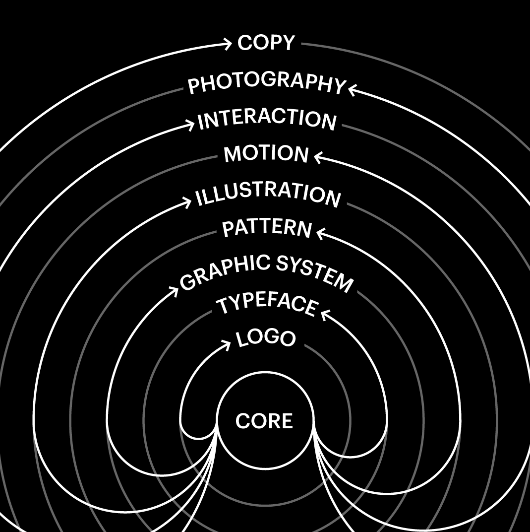
When the Emotive Brand design team creates a brand system, we design it to last for many years. In order for a brand system to last that long, it needs to be consistent with a specific core idea, yet flexible enough to grow over time in order to accommodate changes in the landscape, growth into new sectors, building out sub-brands, etc. Let’s explore two different methodologies in conducting brand design and the end result of each: modernist design and emergent design.

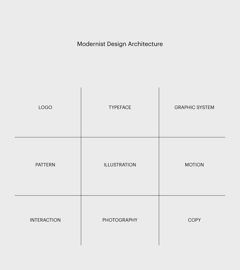
Modernist Design: One Solution

Modernist design methodology is built on the practice of digging to find the golden nugget of a single solution, then testing and polishing that nugget into something that is refined and workable for the specific problem at hand. The rules for the solution are codified and set in stone. The specific problem is continually solved using the same set of rules. However, this often leads to the same solution being applied to multiple different problems as a way of short cutting the design process. Why wouldn’t businesses be trying to use the same solution? It’s what they have in their toolkit – but they aren’t aware that this method is ill-fated from the start. It’s the classic “when all you have is a hammer, everything looks like a nail.” 

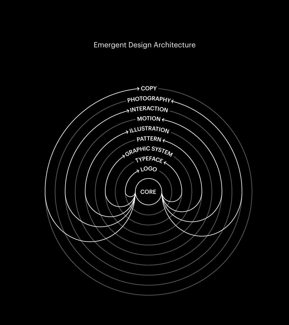
In contrast, emergent design strives to give you the raw steel to work with, so you can create hammers, pliers, screwdrivers, drills, any tool that will naturally solve the problem at hand yet still remain true to its core composition.


Emergent Design: A Step Further

Similar to modernist design, emergent design also strives to find that nugget, but goes a step deeper and inspects the atomic composition of the nugget, and uses that underlying structure to let the rest of the design system emerge naturally from its basis. 

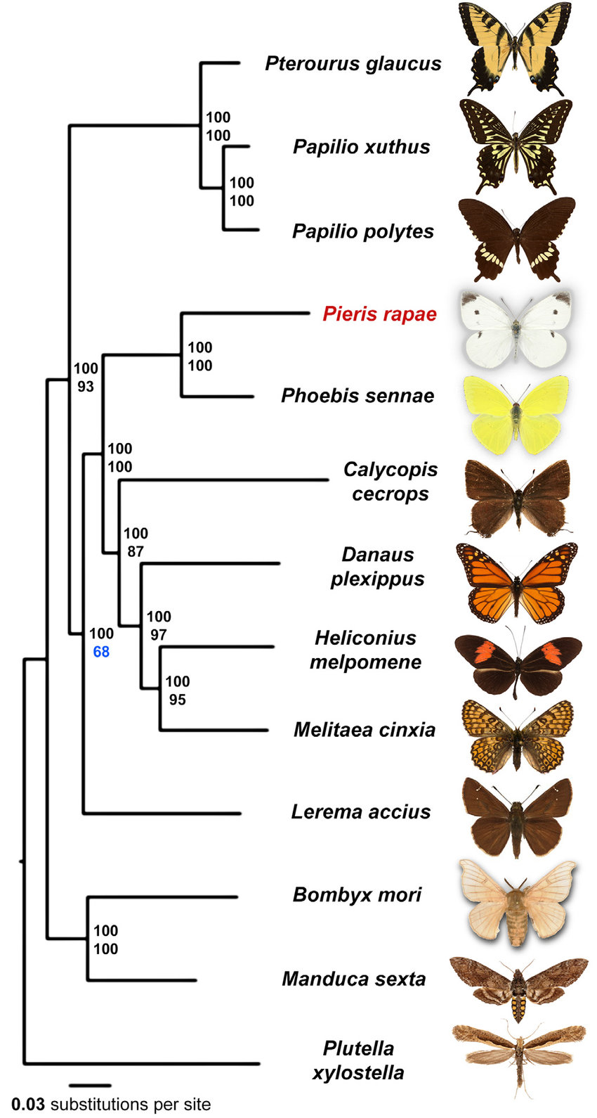
Just as nature is able to adapt to its environment, emergent design adapts to an ever-changing business environment. Take the butterfly. Within the core of a butterfly is a systemic solution to a specific set of problems, but those problems can vary across the entire planet, yet the core of the butterfly is able to adapt. Circumstances were created to benefit an insect that drinks nectar and transfers pollen across plants. This in turn became beneficial to the larger ecosystem. The butterfly never receives education or is told specifically what to do in its role, but the structure of the creature itself lets its behavior emerge naturally. 


Designing To Let Your Brand Learn on Its Own

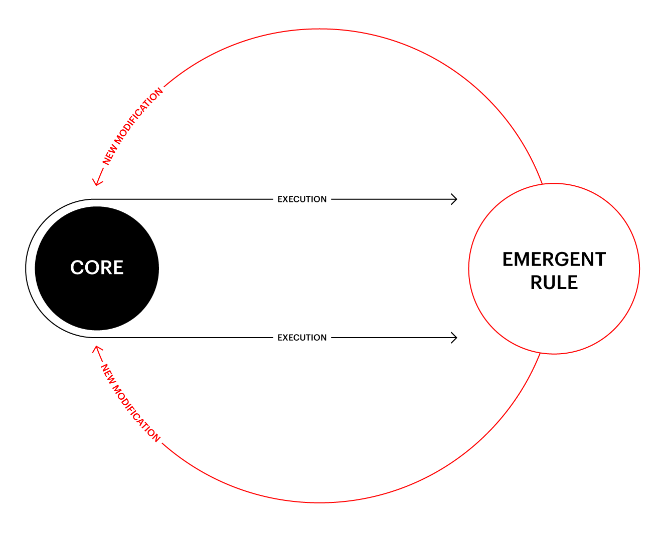
Emergent rulesets are cultivated naturally from the core of a brand in response to execution. We learn in the same way. Our core has a few properties that are true no matter what, then we are let loose to execute that core within the world. The results that we receive from our behaviors directly modify our core and lead us to change our next execution. A new rule has emerged.

Let’s say that you’re a naturally curious teenager. Your curiosity is your core and it naturally leads you to learn new things. So you pick up guitar and learn a few songs to show your friends. You get a positive reaction and a big rush of dopamine. A new ruleset has emerged. Learning new things at a deeper level facilitates your core curiosity in a beneficial way and so that emergent ruleset of deeper learning becomes interwoven with your core. This modification to the core will change your behavior to not only be curious about things, but to learn them on a deeper level in the future.
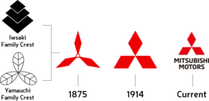
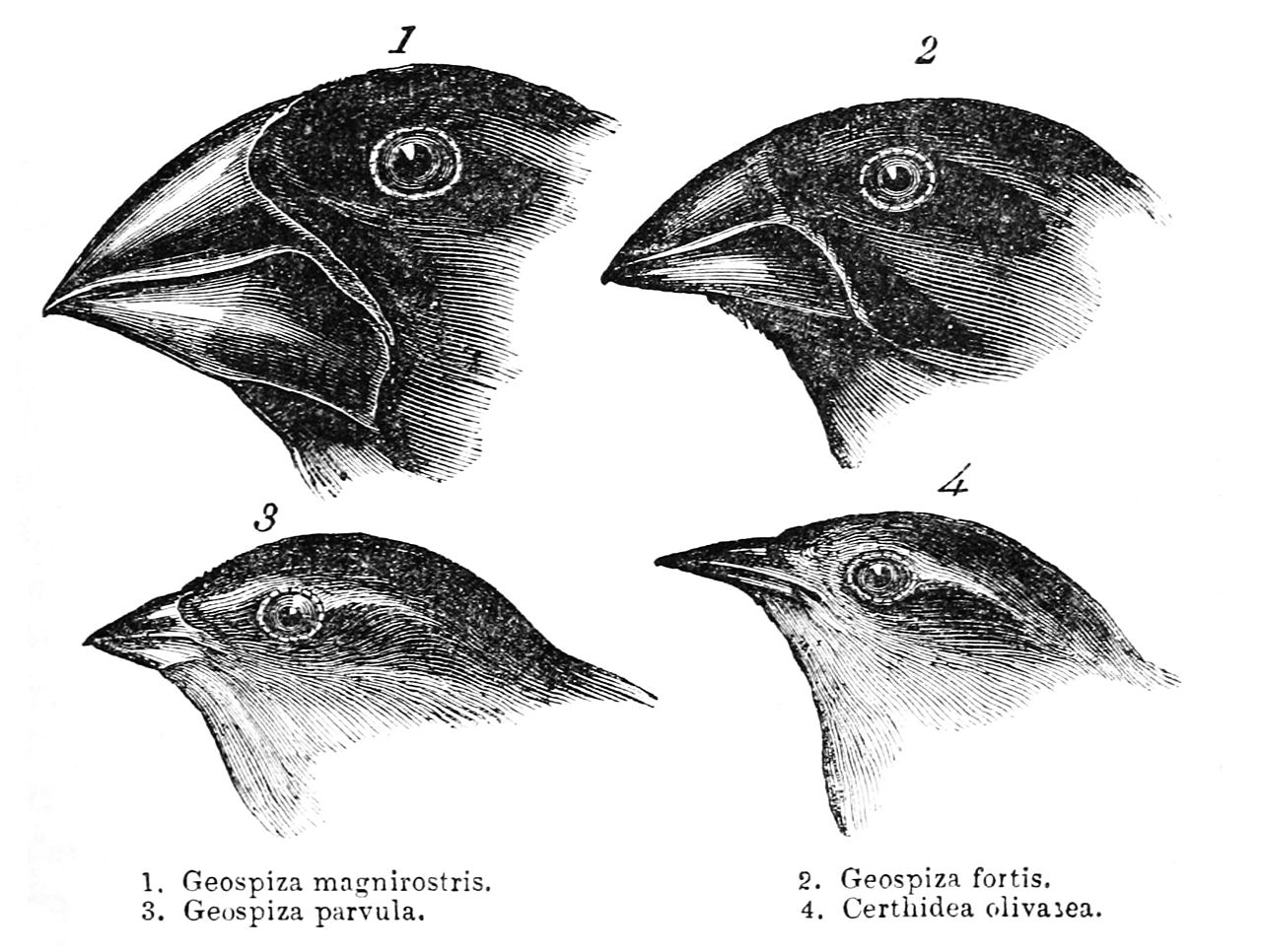
Adaptation and learning are innate characteristics to emergent design. Take Darwin’s finches below. They are of the same family (share the same core), but have adapted to their environments over time. Emergent brands do the same thing. The core is not prescriptive, but emergent. The core family of these birds did not restrict their adaptations, because if it did they wouldn’t be able to propagate as much as they have. Because the core was able to be modified from external factors, the core let an adaptation emerge in order to take advantage of a new food source. In business, this means your brand can flourish entering a new market and still represent the core of your company. 
An Emergent Brand Is Self-Maintaining

Emergent design leads to the opposite of a traditional brand guidelines document. Instead of specifying very specific instances where the system was designed to work, we instead specify the core concept and underlying structure of the brand and let the rules dictate themselves. An emergent system grows over time, it adapts to its environment, and as a result the rulesets change and grow over time as well. This eschews the typical PDF or printed guidelines document where everything is set in stone and ushers in a new era of digital-only guideline systems that are accessible and editable by your design team.

When a designer looks at an emergent brand, they should be able to take in the system from seeing just a few examples and be able to execute the system without drudging through 5 pages of what NOT to do with your logo. The componentry at work isn’t the thing that needs to be systematized. The most critical thing that a designer needs to understand about an emergent brand is what defines the core and what properties are being used to express the core.

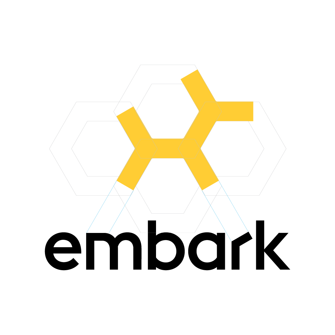
When we consider the Embark example above, this is what the core of a brand looks like. Embedded into the geometry of the mark is a series of hexagons. This is all you need to design the rest of the Embark system.

But Emergent Design Depends on the Designer

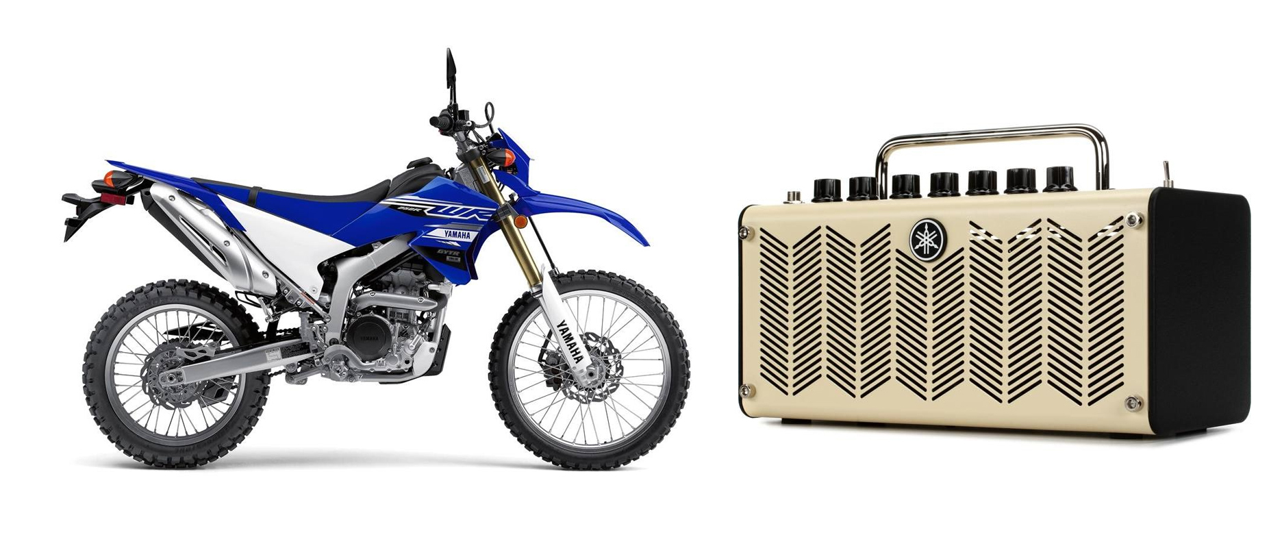
The thing about emergent design systems is that you need really good designers to see them through thoughtfully. You can’t just plug any person into your design role and expect them to be able to execute on an emergent brand. They need to be able to see the underlying structure of your system and know where to push it to adapt to your business’s needs. Take Yamaha for example. Their core is “Sharing Passion & Performance.” They make products that range from dirt bikes to professional audio equipment. If they had a strict modernist brand, both of the products below would share the exact same design characteristics. However, they don’t. The dirt bike is light, stripped-down, colorful, and aggressive. To the right, the guitar amplifier is a solid and reliable heirloom that is beautiful enough to be passed down to your grandchildren. They still stuck to their core of “Sharing Passion & Performance,” but they adjusted the aesthetic values of the execution based on the emergent nature of the forms of the products themselves and the demographics of the people who would buy them.

How To Interview Designers for Your Emergent Brand

Here are some questions to gauge fluency in emergent design and the underlying intention behind design candidates.

What is your philosophy of design?

  • See if they have a specific idea of what they are trying to accomplish in their practice. If they are early on in their career, it might be fuzzier. Avoid people who just want to make “cool shit” without any conceptual thinking backing it up.

Where do you start in your design process?

  • Look for whether or not concepting is at the start of their process, or if it’s there at all. Concept underlies all emergent design.

Can you show us an example of something where you had to research a really complex topic in order to come to your design solution?

  • It’s critical for designers to have a cogent understanding of the topic they are designing for. They are making decisions that are directly impacting the communication of the business and they need to understand it thoroughly.

What is the underlying idea in a specific project and how was that idea brought to life in componentry?

  • See if the idea extends into typeface selection, color choice, graphic system. There should be an underlying idea that has informed the whole system and that idea should be woven throughout everything.

You wouldn’t use only a hammer to build a house. There’s a myriad of problems that you run into that require special tools suited to each individual job. Emergent design allows for multiple tools and solutions to naturally occur that all remain true to your original core element. It’s a flexible methodology for chaotic times and a philosophy proven by nature for 3.5 billion years.

Emotive Brand is a San Francisco-based brand strategy and design studio.

The Key Difference Between Graphic Design and Branding


Graphic Design vs. Branding

Brand is a dirty word. It’s misunderstood and misused by people in and out of the industry. Some people think it means a new logo. Others, an advertisement. And as a company that has “Brand” in its very name, we spend a fair amount of time educating exactly what this word means.

Today, we dive into a key distinction: the difference between graphic design and branding. That may seem basic, but you’d be surprised by how many projects are stymied by this lack of clarification. Understanding this distinction is a crucial first step in creating a visual identity that is both gorgeous and strategically informed.

Graphic Design Is the Skeleton

When thinking about what makes a brand, it’s natural to start with the visual cues: logos, headers, business cards, websites. In truth, these elements are only a very basic skeleton of what makes a strong brand.

Great designers are the guardians of your visual identity, taking great care to make sure that each element – colors, shapes, typography, and yes, the logo – is compelling and consistent across all environments. When done right, graphic design ensures that everything is cohesive and in its right place, like a proper working skeleton.

Branding Is the Body and Soul

But of course, a business can’t run on bones alone. To keep the metaphor going, branding is the entire fleshed out body. Not only one’s muscles and clothes, but one’s beliefs, behaviors, and personality. It’s everything from how your customer support answers the phone to the stock photography in your sales deck. Branding is any action a corporate body makes, and the art of branding is making that movement as deliberate and harmonious as possible.

Graphic design and branding are inextricably linked. Aesthetics mean nothing without a solid strategy, and a solid strategy means nothing if it can’t be expressed. As an agency, we constantly have to balance these two forces. Sometimes, that means choosing between something beautiful and something purposeful. In a perfect world, you’re able to get the best of both worlds, but at the end of the day, every decision must be made in service of adding depth to the brand.

Aesthetic vs. Function

So, how do you navigate those difficult conversations? It can be tough, especially when as many as 80% of entrepreneurs believe that graphic design and branding are the same things. While creative decisions will always feel subjective, it’s important to remember that branding goes far beyond the visual. It handles the entire customer experience on all levels, senses, and dimensions. No matter how technical or granular, no element is ever “just a mark” or “just a logo.” It’s a nuanced, interconnected system that is involved in an active conversation with your audience.

Simply put, graphic design feeds your brand, your brand feeds your business. If your visual elements are competing with one another, you’ll never win the competition for your customer’s attention.

Emotive Brand is a brand strategy and design firm in San Francisco.

Brand Guidelines: An Interview with Emotive Brand Senior Designer

The Importance of Brand Guidelines

Emotive Brand hinges itself on the ability to transform businesses through brand strategy and strategically informed design. Miguel, a senior designer in the studio, works to bring brands to life by creating clear, inspired, and emotive brand identities. In this interview, Miguel discusses a process of branding that is often overlooked: building brand guidelines. Read to learn more about the importance of having a roadmap for your brand and how it should be used to create maximum impact.

Why might businesses overlook the importance of brand guidelines?

They aren’t easy. No one wants to read a manual. And it can be overwhelming, both to digest and to create. Building a clear guide takes focus, a high attention to detail, and a deep understanding of the brand itself. I think part of the reason why people disregard the importance of guidelines is that they don’t fully grasp all the places their brand touches. It isn’t just a logo. It’s composed of a variety of elements that when used correctly together make your brand recognizable and meaningful to people. You need a roadmap to keep the brand consistent. Brand guidelines are essential to every brand no matter how big or small, local or global, new or old.

How do guidelines help bring a brand to life?

The goal of brand guidelines is to help your people – designers, writers, strategists, new employees, veterans, freelancers, hired agencies, etc. – bring your brand to life. Brand guidelines help those people build a cohesive, clear, and recognizable brand and they are the people enabled to propel your business. Without guidelines, the brand assets have no value – the guidelines bring them to life. They provide a clear and simple toolbox that includes a set of standards for using brand names, logos, typefaces, and other design elements in ads, brochures, newsletters, packaging, digital communications, and any other ways the brand might communicate.

What happens when a brand doesn’t have clear guidelines?

The brand will inevitably become inconsistent. It will be diluted. This means that brand recognition goes down and customers and employees become confused about your brand. With all the pieces and no instructions on how to use them, the brand assets become valueless. Without a roadmap, your brand seems unsure of where it is and where it’s going. Especially during times of growth, those new to your brand need to have a clear understanding of how they can help your brand live. So you need a strong, consistent, and solid brand to stand out. Without a guide, that just isn’t possible.

How do the guidelines help employees?

In the end, having a clear guide helps the whole team become aligned. It doesn’t matter if you’re a strategist or a designer, everyone has the tools to build the brand in the most meaningful way. Everyone has a map and this map makes people feel empowered and able to do their job. Less time is wasted. Less people are frustrated and lost. Even when a business is onboarding someone new, the guidelines get them quickly on board with how the brand lives. And when you’re brand is truly living and all the parts are working altogether, that’s your emotional impact. That’s your brand doing its job.

What are some of the challenges of creating brand guidelines?

For me, as a designer, writing is not my strong suit. But I’ve learned to make sure whatever I’m writing for the guide is detailed, yet still clear and simple, much like a manual. It really has to take people through the process, step by step. It can’t be complicated because at the end of the day, complication will dilute essential brand information. I’ve learned that the simpler the visuals are, the fewer steps you need to communicate. It’s about achieving the right balance between visual and verbal instructions so the guide is the clearest it can be for everyone who might use it.

Another challenge is finding balance between laying out rules and structure, while also allowing for brand flexibility. When I’m working, I’m also thinking, “What’s the next thing for the brand?”. You have to try and imagine possibilities for the future so that the brand can grow. One thing that helps is showing examples of how the brand lives in real life situations. At Emotive Brand, we always outline parameters for print, digital, and environmental signage. These situations might not exist for the brand yet, but we are trying to help build a brand that thinks ahead and work within those parameters while still moving forward.

Do you think brand guidelines can help businesses grow?

At the end of the day, guidelines are what make a brand recognizable. The consistency a guide creates is key to people’s ability to recognize your brand. When people recognize your brand, your brand is able to grow. Strong brand guidelines help steer your business towards growth. Guidelines, in the end, are all about creating maximum impact for your brand.

Read Miguel’s post on Brand Identity: What’s Your Type?

Emotive Brand is a San Francisco brand strategy firm.

Launching a Global Re-Brand: Interview with Brand Strategy Firm, Emotive Brand

As an Account Strategist at Emotive Brand, Sarah plays a pivotal role in helping us transform global brands in to more empathetic, purpose-led, and meaningful companies. Her ability to connect the worlds of writing, research, strategy, and design make her the perfect point person for tackling the nuances and challenges of bringing a new brand strategy to life.

In this post, Sarah shares her thoughts on why a global brand rollout can be tricky, gives guidelines on how to tackle obstacles that might arise, and execute a successful maximum-impact launch.

A global re-brand is a large undertaking. Where do you begin?

The real challenge for any global brand rollout is the challenge of execution. The bigger the brand, the more links in the chain. So when we embark on any global project we engage people across the organization and talk about implementation first. We make sure to get a clear understanding of all their brand channels, both internal and external. Understanding the complexities of a brand’s communication system allows us to come up with the strategic and tactical solutions that will make our work together smarter and easier to execute.

Who needs to be involved in a global re-brand? And how do you engage the right people at the right place and time?

It’s critical to involve a variety of stakeholders from the beginning of any global assignment. We strive to interview as many global players as we can to get a broad understanding of the unique challenges and opportunities that vary from region to region and to elicit the common themes that unite the brand. When developing the brand strategy for a global organization, key components like the brand’s Promise, Emotional Impact, and Positioning Statement should be crafted with company leaders because they are the drivers of the overarching business strategy. Once these strategic pillars have been established, we begin to include regional managers to gain their perspective on how to best adapt messaging and/or a campaign to their markets and audiences.

How is the creative process different for a global re-brand?

No matter how big or small the organization, a brand’s emotional impact is the driving force in the creative phase. The feelings a brand evokes should feel the same no matter what region or location. When developing a creative concept that has global reach, we have to be mindful that certain photography or language can be interpreted in different ways from culture to culture. What makes someone feel confident in the US might not make someone feel confident in Asia. Adapting an idea to suit different cultures and outlooks — while remaining true to the brand strategy— is a must for global brands. Making sure the creative and emotional elements tick all the boxes across an organization can be tricky, but if done smartly, it can prevent a creative concept from falling flat.

How do you maximize the impact of a global re-brand launch?

Today, we have technology to help us improve coordination and communication for launching a new brand, but there is also a higher expectation for relevant, localized execution. Cross-organization collaboration and a Go-To-Market strategy help put the right plan in place – telling the right stories, in the right channels, at the right time. To increase the impact of a global brand launch, part of the strategic plan should be laying some groundwork to prepare internal and external audiences for what’s to come. While a big flashy reveal can be fun and intriguing, it’s important to pace out your brand rollout over time – people are more likely to pay attention and stay excited if you engage them in digestible and personally meaningful ways.

Emotive Brand is a San Francisco branding agency.

Uber Rational: A New Brand

Yesterday, Uber launched a new brand identity, and it has sparked a lot of media attention. It’s amazing that an app icon update and a new website can create so much buzz, attention, and debate, but it got us thinking: What’s the real impact of changing an already established brand identity?

We believe brands need to consider both rational and emotional needs when embarking on telling their story. Uber’s new identity focuses on telling a rational story about what they do. But it lacks the emotional impact of why they do it and why consumers flock to it. ‘Why’ is critical because it imbues a brand with meaning, drives consumer decision-making, and fosters loyalty.

And the brand identity is particularly important to a company like Uber, where every journey begins with the app. Uber’s new “Bit Atom” concept feels austere, so much so that we wonder if Uber considered what feelings they were looking to evoke when users tap the icon on their screen. We envision Uber would want to evoke feelings like freedom, movement, ease, safety, and liberation – none of which are particularly rational or austere.

At Emotive Brand, we believe that brands should evoke human emotions at every touchpoint. Evolving your visual identity is something that needs to be considered thoughtfully. To do it right, you need to lead with a clearly articulated purpose and an understanding of your brand’s desired emotional impact. Emotional impact drives the expression of how your brand looks and feels to consumers.

Communicate the change and bring people along your journey.

Modifying, evolving, or introducing a whole new visual cue isn’t the same or as simple as introducing a series of new product features or software updates. If brands are about emotion (and they are), then changing a brand’s identity is going to have an effect on how people feel about you.

So when you change your brand’s identity, it’s important to manage how people experience the story of change. Communicate the change, internally and externally, in a way that takes people along for the “ride.” Don’t foist the change on people. Make the people who matter to your brand part of the story.

Make sure the story starts with why, not with what.

When creating a visual identity, it’s important not to get bogged down in the what. Lead with why, and let your symbol mark this journey.

For Uber, the app icon should set the emotional tone of the  experience from the first tap. What feelings does Uber evoke? Why does the brand matter? These are the questions we would ask when embarking upon a brand transformation.

Don’t misunderstand: We are confident that Uber didn’t undertake this change lightly. But change is hard, particularly when it comes to big brands with lots of social currency like Uber, and the stakes are very high.

We would have gone with something more evocative of feelings, emotion, and sense of purpose. But then, it’s not for nothing that our name is “Emotive Brand.”

Emotive Brand is a brand strategy and design consultancy.