Presentation Is Everything
The Emotive Brand design team had the pleasure of attending First Round San Francisco, a one-day showcase of original client presentations showing initial design explorations for logo, identity, and branding projects. Twelve different design studios presented on a variety of client projects – everything from a global healthcare non-profit to a menstrual cup company. The crowd was filled with eager designers – some from design studios, others from tech companies, and some freelancers.
We’ve gathered a few key takeaways – a checklist of sorts – to make sure all the first-design-preso bases are covered. Some may sound like common sense, but you’d be surprised at just how uncommon they are.
1. It all starts with strategy.
Research, research, research. The first step to a successful project is to do your homework. Immerse yourself in the client’s arena and competitive landscape. Set up a strategic framework that can be used as a jumping-off point for design. The stronger the strategy, the more criteria you have to evaluate and back-up creative. We lead with strategy, as we believe it provides the true foundation for smart creative work. We encourage our designers and strategists to work together closely, so designers can either take part in creating strategy or give feedback in real-time.
2. Establish expectations. Educate the client. Get on the same page.
Aligning with the client and being transparent from the beginning will start things off on the right foot, and make for a (hopefully) smoother process down the road. It’s helpful to show where you are in the process, be clear about what the client will and will not see in the presentation, explain relevant design objectives, and set up evaluation criteria. Sometimes clients need a bit of education on what the tangible design goals are, and guidance on how to evaluate them. For a second presentation, it always helps to reiterate what you heard so the client knows you’re listening. We are always looking for constant alignment with our clients. This allows us to be an extension of their team and them an extension of ours.
3. Frame the story.
One of the many hats we wear as designers is that of The Storyteller. The power of persuasion in the way a story is told is real, and a great idea has no value unless it’s communicated well. Some things to consider are pacing, naming directions, and implementing metaphors. Using real-life mockups that are relevant to the client’s business also helps to frame the context. We love taking the client on a journey through storytelling, and are always looking to perfect this skill. It’s an essential component of good branding, and enhances the client experience.
4. Show the process.
It’s always helpful for the client to see the process you took to get to an idea. Document all of the messy sketches, scribbles, and iterations, and present them in a beautifully composed snapshot. Don’t be afraid to show inspiration, or what sparked an idea. Help the client feel like they are along for the ride.
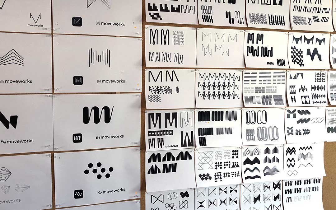
5. Environment is important.
Environment is important, and so is making the client feel comfortable. Design is a service after all, and the environment sets the tone for the rest of the process. General rules of thumb – always meet face-to-face if possible, and provide snacks and coffee! We like to create a refreshing experience for the client by immersing them in their world and ours. We look to create a warm, relaxing but very energetic environment.

6. Motion is table stakes.
Brands move, there’s no question about it. The days of static brands are over, and today’s brands are living and breathing. Motion isn’t about demanding attention or standing out from the crowd anymore, but instead about communicating a complete idea and triggering emotion in the viewer. Motion can help clients visualize what their brand will actually look and feel like. An effective motion piece helps to put the pieces together so the client can see the full picture. We look to train in motion tools and principles so that all designers can think in a 3-D space. We aim to create motion principles for the brand as early as possible that can relate back to and enhance the strategy.
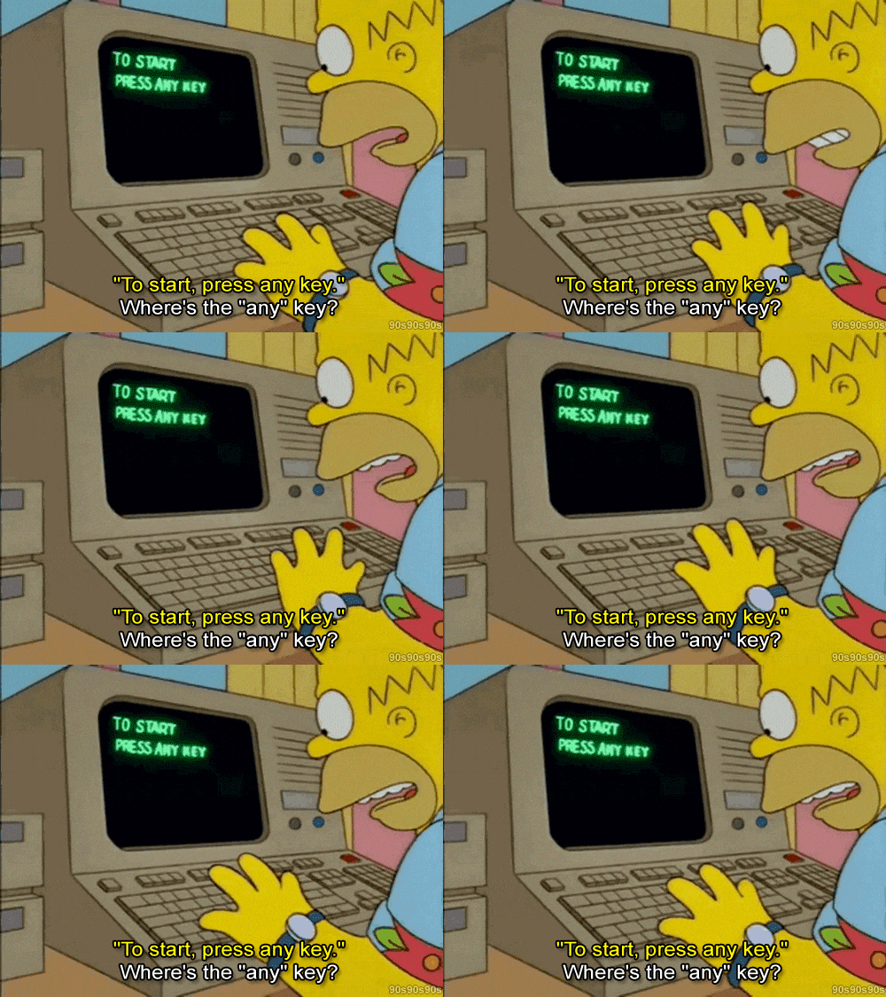
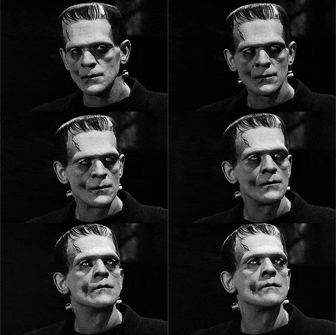
7. Anticipate the Frankenstein.
When presenting more than one design direction, the design Frankenstein is a very possible likelihood. For those that aren’t familiar, this is when the client wants to take one piece from Direction A and another piece from Direction B, and combine them into One Big Super Direction. Sometimes there’s no getting around this, but it’s important to be strategic in the number of directions you show and think about how they relate to each other. Acknowledge the similarities between directions and lean into the differences. A popular choice for the number of directions seems to be three – one to like, one to love, and one to hate. We always look to make sure Frankensteins are either difficult and the client understands why, or that they can work seamlessly when implemented. We are happy with either.
8. Always have a summary slide (or multiple).
It’s important for clients to see both how their brand sits in the competitive landscape, and an overview of all the directions in one place. Summary slides are a great way to do this, as they are great resting points for the client to digest what they’ve just been taken through.
9. Facilitate an interactive conversation.
It can be helpful to take the conversation away from the screen, and open the floor for a back-and-forth between the design team and the client. Physical print-outs of the work can help encourage this dialogue. Allow the client to raise any questions or concerns, and listen to feedback carefully. Even if it doesn’t seem relevant at the time, certain comments at this stage can be vital for the next round. We lead our clients upstairs, where work is pinned up across extra-large cork boards. This provides a nice change of pace, invites conversation and a new flow of energy.
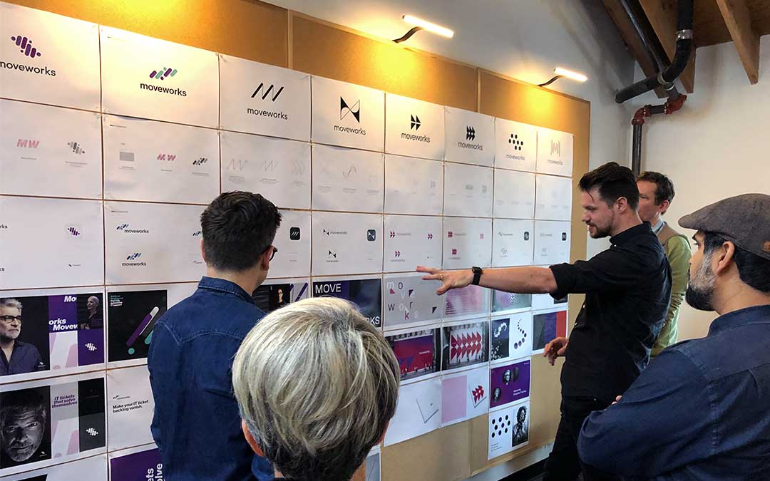
10. Collaborators are key.
As much as we like to think as designers we are Jacks of all trades, one of the most important skills is to know when to seek outside help. We love our friends and the creative community around us. We are super inspired by others and love to get people involved wherever we can. Work only gets stronger when we collaborate with creative experts like web developers, type foundries, filmmakers, illustrators, animators, etc. Design is no easy task, and it takes a village.
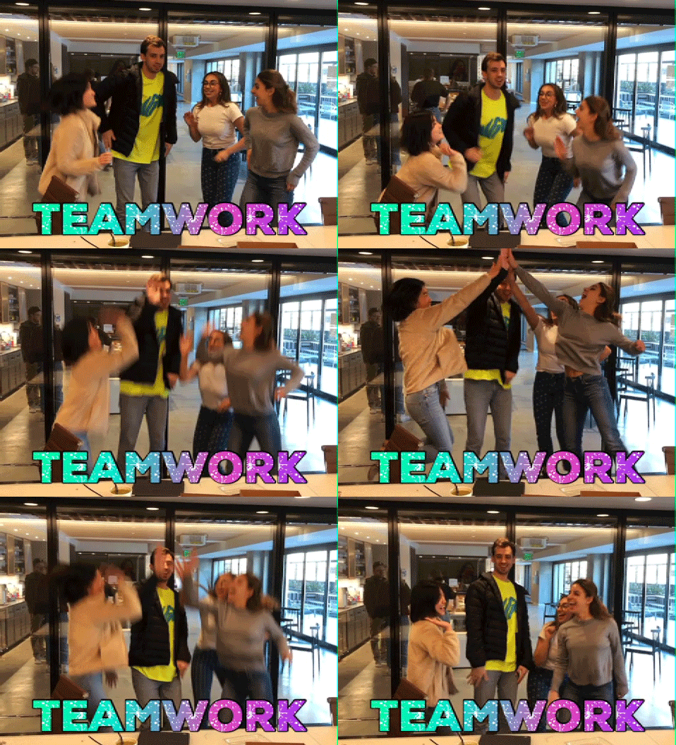
So, what’s the big takeaway? Success is not about re-inventing the wheel, but about consistently hitting all of these basics. Of course, the work has to be stellar, but the method and framework are just as vital.
Emotive Brand is a brand strategy and design agency in Oakland, California.


