


Finally, freedom from the growing threat of cyber attacks.
Illuminating secure futures by giving identity security teams the technology they deserve.
Services
- Brand Strategy
- Brand Voice
- Corporate Narrative
- Visual Identity
- Positioning
- Copywriting
- Website Design
- Brand Guidelines
Some innovations create ripples. Some transform the landscape forever. Silverfort found a way to disrupt the very nature of identity security, the bedrock of cyber security, by eliminating blind spots and gaps that let attackers breach enterprise systems.
But with new funding as fuel, and a new identity security paradigm becoming reality, Silverfort’s existing brand did not capture their revolutionary role.
Part of our challenge was confronting a decades-old status quo that saw identity security as a feature, not the foundation, of cyber security. Our job was not only to elevate the emotional impact of Silverfort’s brand and the power of their innovation, but change how enterprises think about identity security.
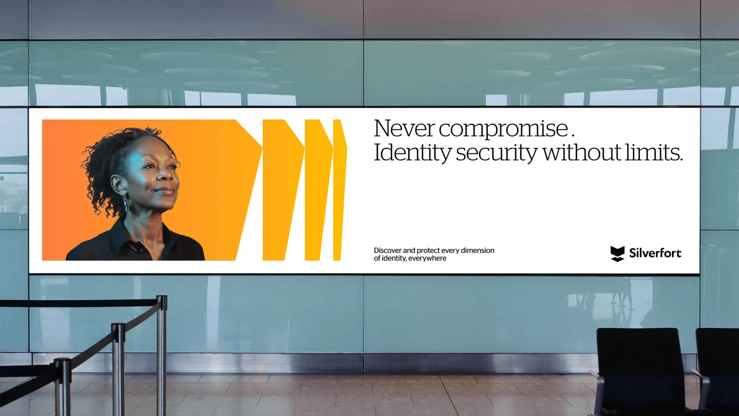
In the brand platform, and resulting identity and website, we broke away from category tropes about dark, lurking threats. Instead, Silverfort pivoted toward the light to illuminate secure futures—free from identity-based attacks—for the companies that anchor economies and livelihoods.
What We Learned
Find a way.
We first had to understand the magnitude of Silverfort’s innovation, and the mindset that powered it. They not only recognized identity as a blind spot left unprotected from attackers. They totally reimagined identity security, finding a way to secure all users across all environments. This intrepid spirit of discovery inspired the brand’s emotional impact.
Out from the shadows.
Before Silverfort, identity was seen as a feature of cyber security, not the foundation. That left identity professionals sidelined, patchworking subpar IAM and security solutions. We knew the brand had to validate and uplift these essential teams. Rejecting trite themes of dark threats, Silverfort leads identity security into the spotlight with optimism and pioneering expertise.
Break free.
Silverfort’s legacy brand, and shield-meets-fortress logo, traded on traditional notions of security—yet their platform rendered those notions obsolete. The technology shifts seamlessly, transcends silos, and adapts to protect an enterprise’s entire identity infrastructure. The new brand reflects its dynamic, boundless nature. Silverfort can boldly move forward, helping enterprises break free from the specter of breaches.
Tarah Cammett, Silverfort, CMOOur new brand signals Silverfort’s next chapter of innovation and growth in identity security. We have been living and breathing this for over a year now and I could not be more elated to introduce it to the world. I am beaming with pride.”

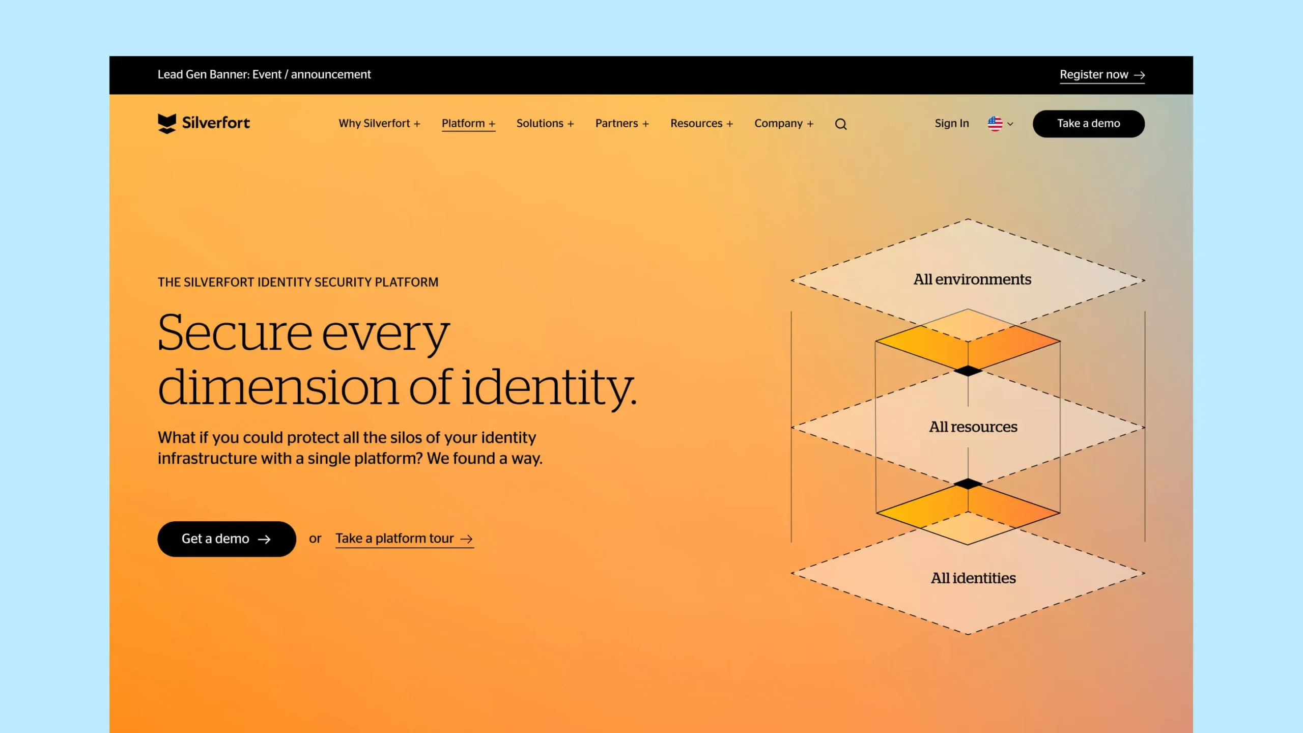
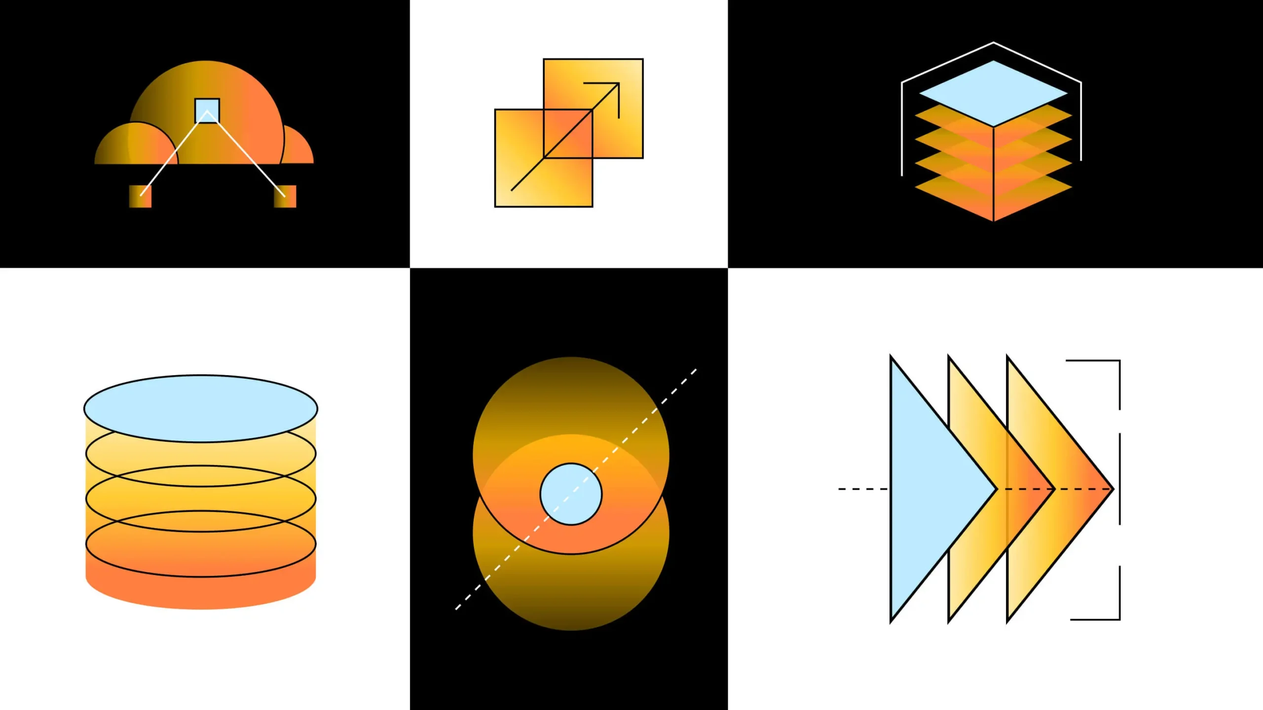
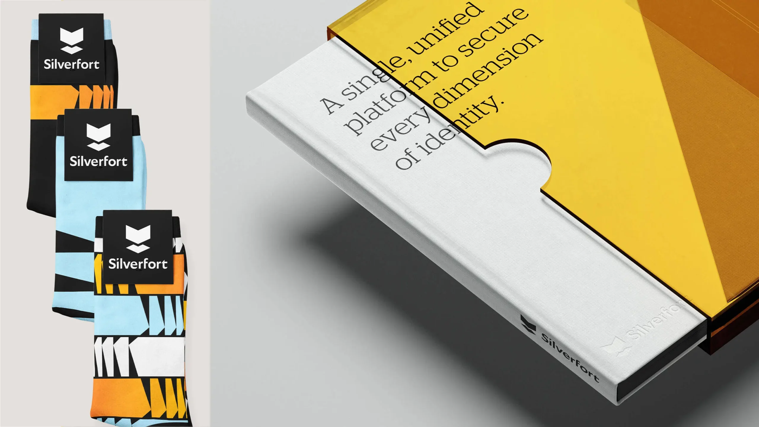
Boundless & Illuminated
A dynamic, shape-based system adapts to fit any layout or context—a powerful metaphor for Silverfort’s ability to protect every dimension of identity security. It’s paired with a color approach that evokes illumination of a new day, signaling the arrival of a new era for the brand.


Shaping Transformation
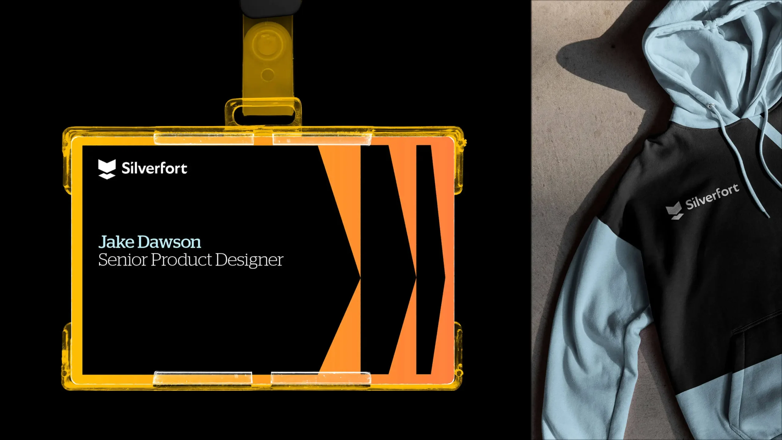
Shapes reconfigure, multiply, and adapt across layouts—conveying a sense of momentum and creating flexible windows for messaging. An ambient gradient permeates the brand language—amplifying backgrounds, technical illustrations, photo treatments and data visualization. It’s a seamless thread that brings the Silverfort brand—and identity security—into the light.
Experience That Works

Rolling with constant change.
Category reinventors don’t wait for opportunity–they create it. Silverfort was growing and evolving fast, so open communication with decision-makers was vital. Our strategic foundation aligned so deeply with their purpose that any new developments found their place in the framework.

Wrapping a problem in optimism.
Silverfort solved a scary problem–breaches siphoning billions from enterprises annually. Yet most executives were unaware of the issue’s true scale and source. By thoughtfully defining the brand’s emotional impact, we illuminate dangers without fear mongering—and instead point to brighter horizons.

Branding for boundlessness.
Brands are everything, everywhere, all at once—the totality of perceptions. But in practice, identity is contained in sites, decks, and ads. How to represent limitless drive and boundless technology? Motion, dimensional shapes and color, and intrepid language deliver across contexts.

Open to what’s next.
Innovators always have the next big thing in their sights. Silverfort’s brand needed to maintain integrity over time and flex to hold future breakthroughs. The brand platform organizes how a growing number of solutions fit together and move enterprises forward.
Recent Work


Bringing a people-centered brand into a digital-first, product-led future.
View case study