



Neato. Building the future of digital commerce.
Giving a clever, creative, digital brand builder the tools to share its unique perspective.
Services
- Brand Strategy
- Visual Identity
- Brand Voice
- Collateral Design
- Brand Narrative
- Brand Guidelines
- Copy Playbook

Neato was an expressive force in a subdued category: “e-commerce accelerators.” Their unique business model entailed partnering with companies to both sell those companies’ products online and manage their digital brands, and Neato was struggling to succinctly express its own value and distinguish itself from the competition. They approached us knowing they needed a brand that showed them for who they really were: bold, brash, and brilliant. We were happy to oblige.
We realized early in the project that part of the challenge—and the fun—was that we were building a brand for a company that itself builds powerful brand expressions. This meant Neato needed to give prospective customers confidence in their ability to build remarkable, resonant experiences, starting with Neato’s own brand. Fortunately, we found in Neato a willing collaborator, so together we were truly able to turn up the volume.
What We Learned Along the Way
Authenticity is the best differentiator.
Neato came to us looking to roll up its sleeves…and show its tattoos. We found that its competitor brands were nearly all variations on a theme—a theme defined by the largest player in the space. We saw this as an opportunity to build a brand that was not only true to Neato’s values, but also showed them for the daring original they are.
Commerce is Commerce.
As we immersed ourselves in Neato’s business, it became apparent that online marketplaces were increasingly influential in consumers’ perception of brands, on- and offline. The silos which previously separated digital and traditional commerce were falling, and Neato was at the forefront of their unification.
Category is not destiny.
Neato was founded as an “e-commerce accelerator,” an outdated title coined by its biggest competitor. As we dug into the business Neato had become and their unique take on commerce and brand expression, we realized they required a more accurate—and distinctive—descriptor: “brand amplifier.”
The Neato’s-Eye View
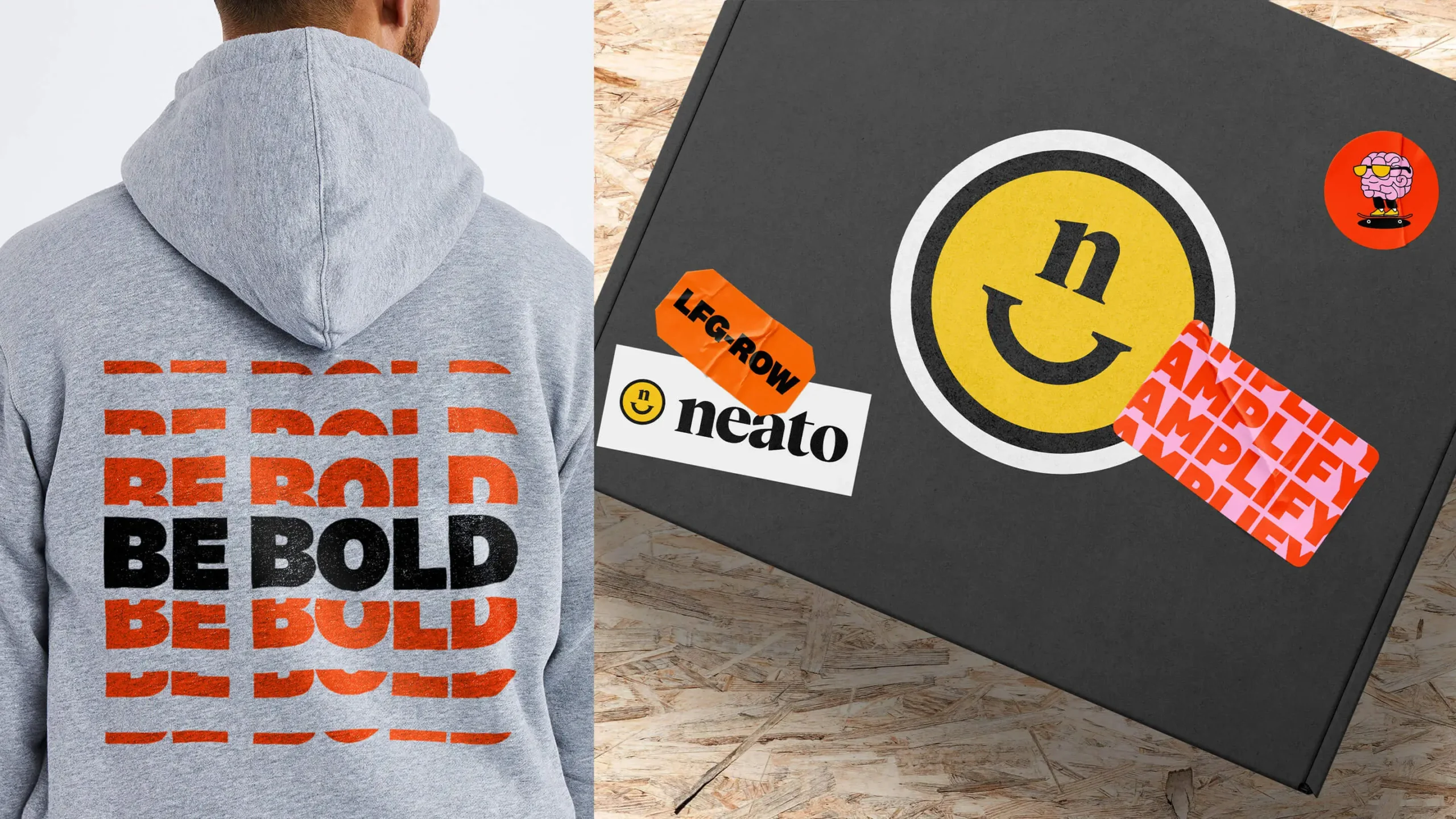
Everything Neato touches is marked by its unique perspective and iconoclastic attitude, and we wanted a symbol that reflected this. So, we crafted a signature mark, one that puts Neato’s imprimatur on an icon, showcases their well-earned confidence, and stands out from the competition just as much as Neato itself.


Brands with Resounding Impact
With Neato, we had a unique opportunity to build a brand for a fellow brand builder. During our immersion phase, we heard loud and clear that Neato’s customers valued its omni-channel perspective: Neato built brand expressions that reverberated across channels and advanced overall brand strategies. We based our own brand strategy for Neato on this talent for amplifying brands until they became unignorable.


Ruffle Some Feathers
Working with a client with its own creative studio has its own advantages. We knew we needed a visual identity that would inspire Neato’s own creativity, so we crafted a bespoke illustration style that gave Neato’s team limitless ability to express their wildest ideas and boldest takes.

Big Ideas for Bold Brands
Neato’s passionate voice deserved an intrepid type treatment. We used typography in the Neato system in a variety of ways, from type as texture to hero typographic moments. In messaging, the juxtaposition of a bold sans headline with a professional serif subhead allowed Neato to express themselves as both experts and visionaries.


Made You Look
Neato’s visual system is like an outre outfit at a stuffy party: you can’t take your eyes off it. From colors to logo to typography, every element is intended to stand out from the competition while still conveying Neato’s expertise, talent, and professionalism.


Follow the insights.
During our competitor audit, we identified clear white space on the warmer end of the color spectrum, but Neato was very skeptical about how that palette might execute. We proceeded to develop a warm option and the client chose that direction, realizing how distinctive and powerful it would be.

Not everyone needs a safety net.
The Neato team was entirely aligned in their desire to push the limits with their new brand. Instead of developing “safe” and “daring” options, at each stage of the project we blew past “safe” and explored different ways to go big and bold.

Don’t be afraid to play.
Early in the development of our brand strategy, we played around with a fun, internal manifesto inspired by our first client interviews. The manifesto ended up unlocking the verbal identity that would become the cornerstone of our brand platform.

Honesty is advocacy.
During customer interviews, we spoke to one company that had declined to partner with Neato, and had a frank conversation with them about what appealed and what didn't. They were so impressed with Neato’s efforts to evolve that they reached out to Neato to reconsider the partnership.