




Making privacy infrastructure impossible to overlook.
We helped turn a radically simple idea—privacy as an API—into a distinctive brand built to earn trust with developers, security teams, and enterprise buyers.
Services
- Brand Strategy
- Content Strategy
- Visual Identity
- Website Design
- Motion Language
- Brand Guidelines

All of us as consumers trust our data with companies to buy medicine, fly on airplanes, pay our salaries, and much more. So, who’s going to build the platform to ensure that all this data is secure and used and promised?
Enter Skyflow. Fresh off raising $17.5 million in funding, their mission was to tackle a radically simple question: what if privacy had an API? They came to us in stealth looking to build equity in a new category — the data privacy vault. Through a tight brand strategy and an optimistic yet technically-robust visual identity system, we ensured they would emerge as the flag bearers of this new industry. Loved by developers, trusted by security teams, and soon to be adopted by all, Skyflow is poised to lead the future of data privacy.
What We Learned Along the Way
No more either/or.
This project was about solving a fundamental problem in a very simple way. Normally, that’s not possible. But the DNA of this assignment was about rejecting false dichotomies: technical and human, private and personalized.
Simple can be radical.
Simplicity isn’t boring — it’s the highest form of sophistication. It can be provocative, confident, and blistering in its clarity. No complexity for complexity’s sake.
Make devs feel at home.
We know developers are like craftspeople. We know CTOs feel like Sisyphus, endlessly throwing money at point solutions. This was about imbuing empathy and expertise for solving this pain in a straightforward way.
Paul Kopacki, CMO at SkyflowA great brand is a critical foundation stone for a startup, so we looked at proposals from half a dozen highly recommended brand agencies before choosing Emotive. And we are happy we did. They have a highly collaborative process and a talented team that took the time to really understand Skyflow, our core ideas, and our audience — and then built us a brand that we love.”
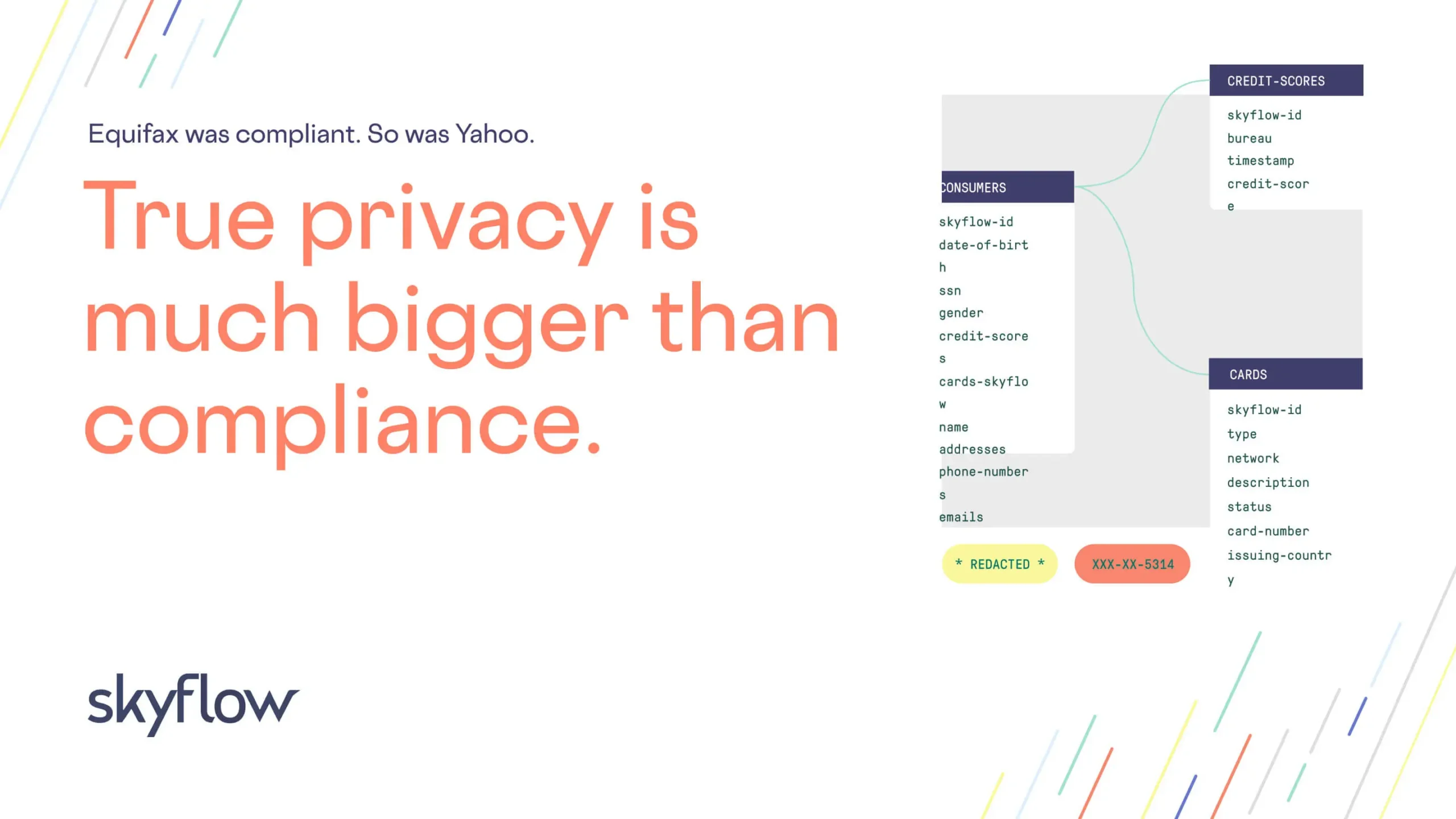

Low-Fi Brilliance
Our goal with the design system was to capture the spirit of the developer community. That is, the kind of unadorned brilliance and easy collaboration you’d see on a whiteboard brainstorm: simple diagrams, clean icons, everything serving a functional purpose.
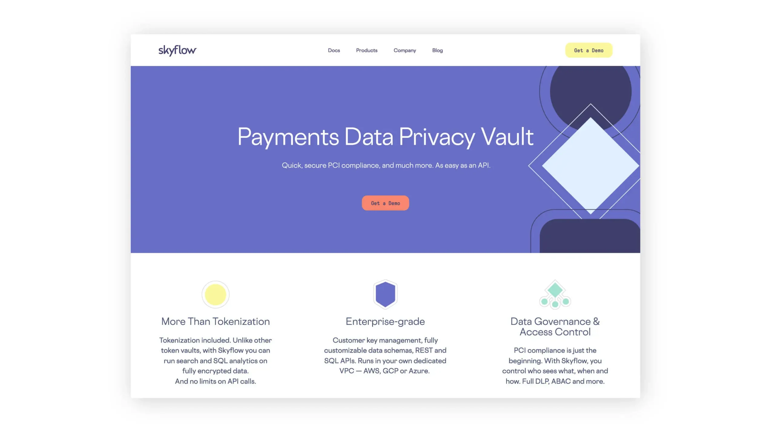
Up, Up, and Away
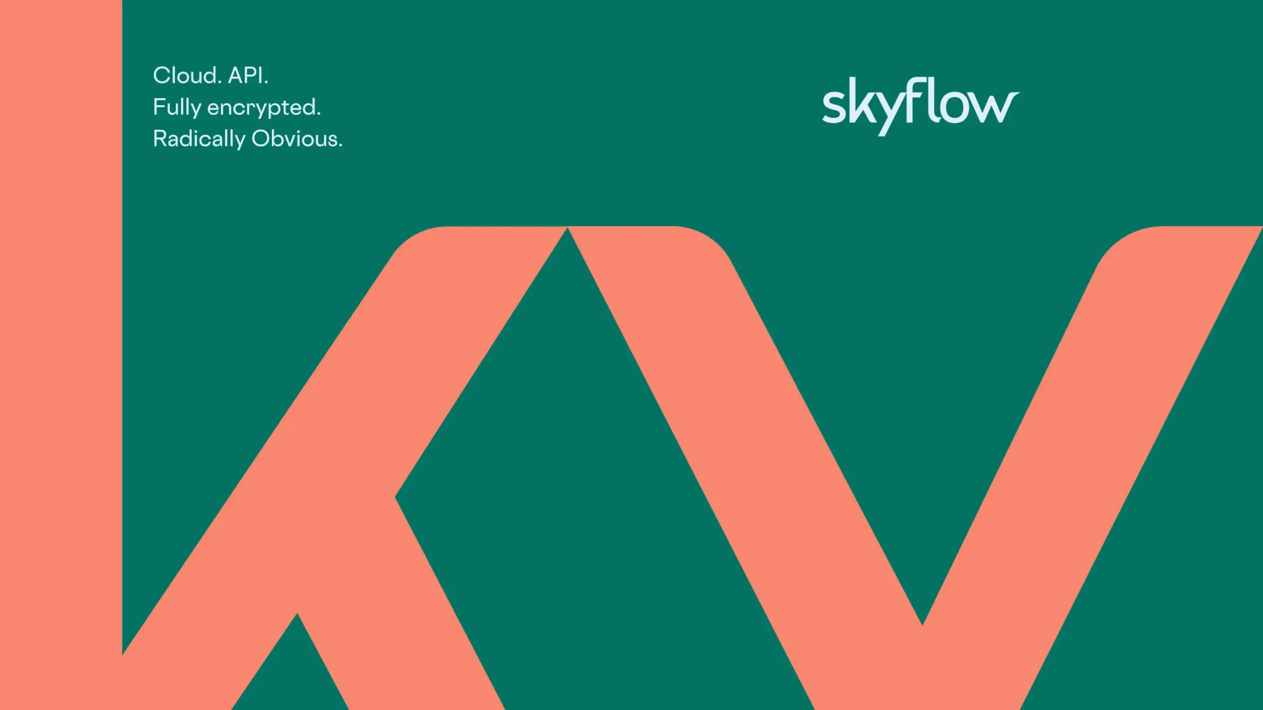
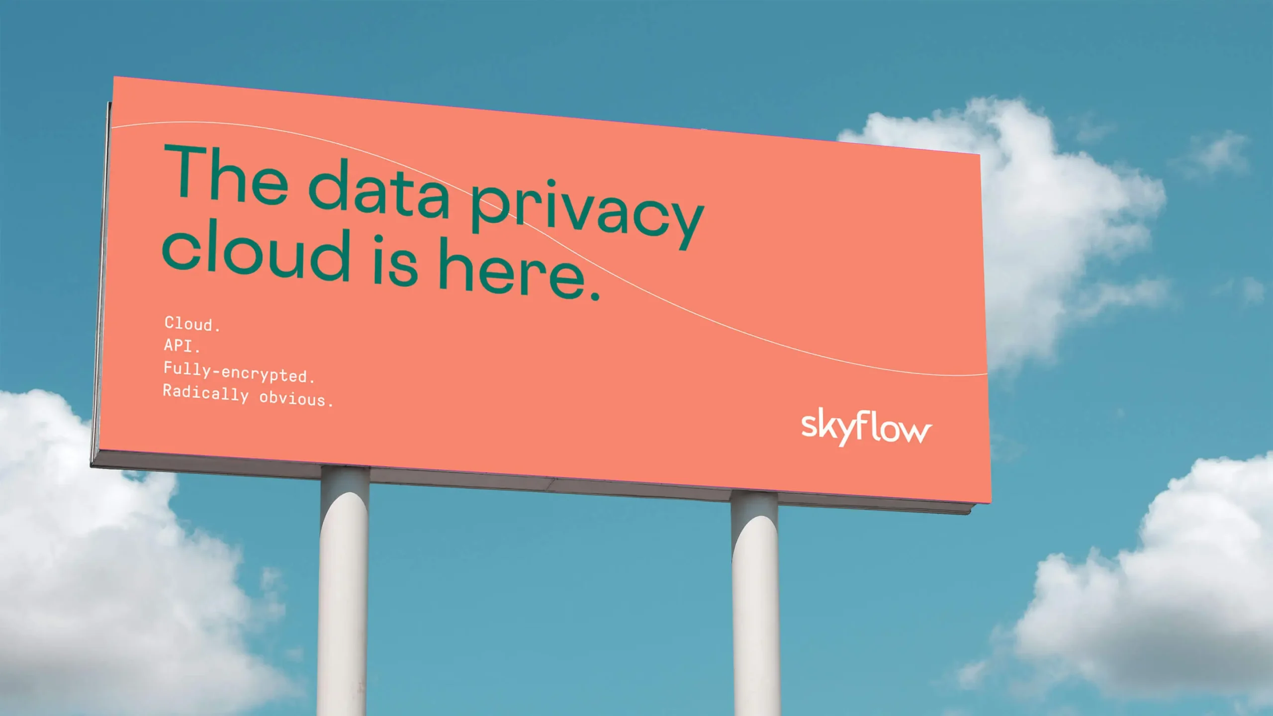
Through the use of diagonal lines — taken from the angles of the wordmark itself — we created a system that radiates movement, momentum, and optimism. This breath of fresh air was paired with bold, cheeky copy to add even more energy and verve.
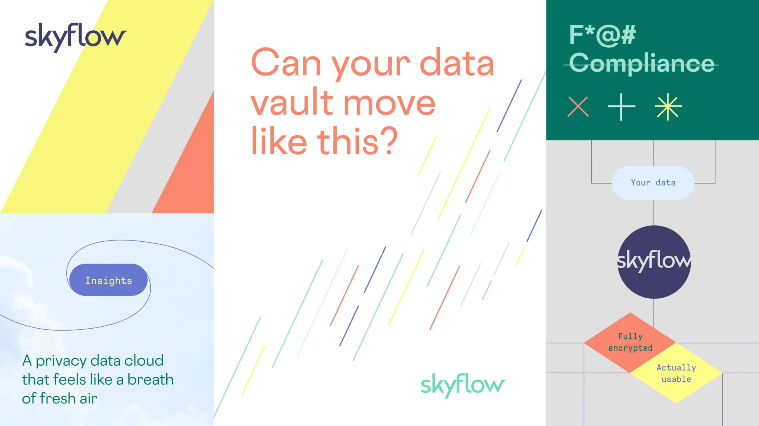
Locked-Down Type, Inviting Palettes
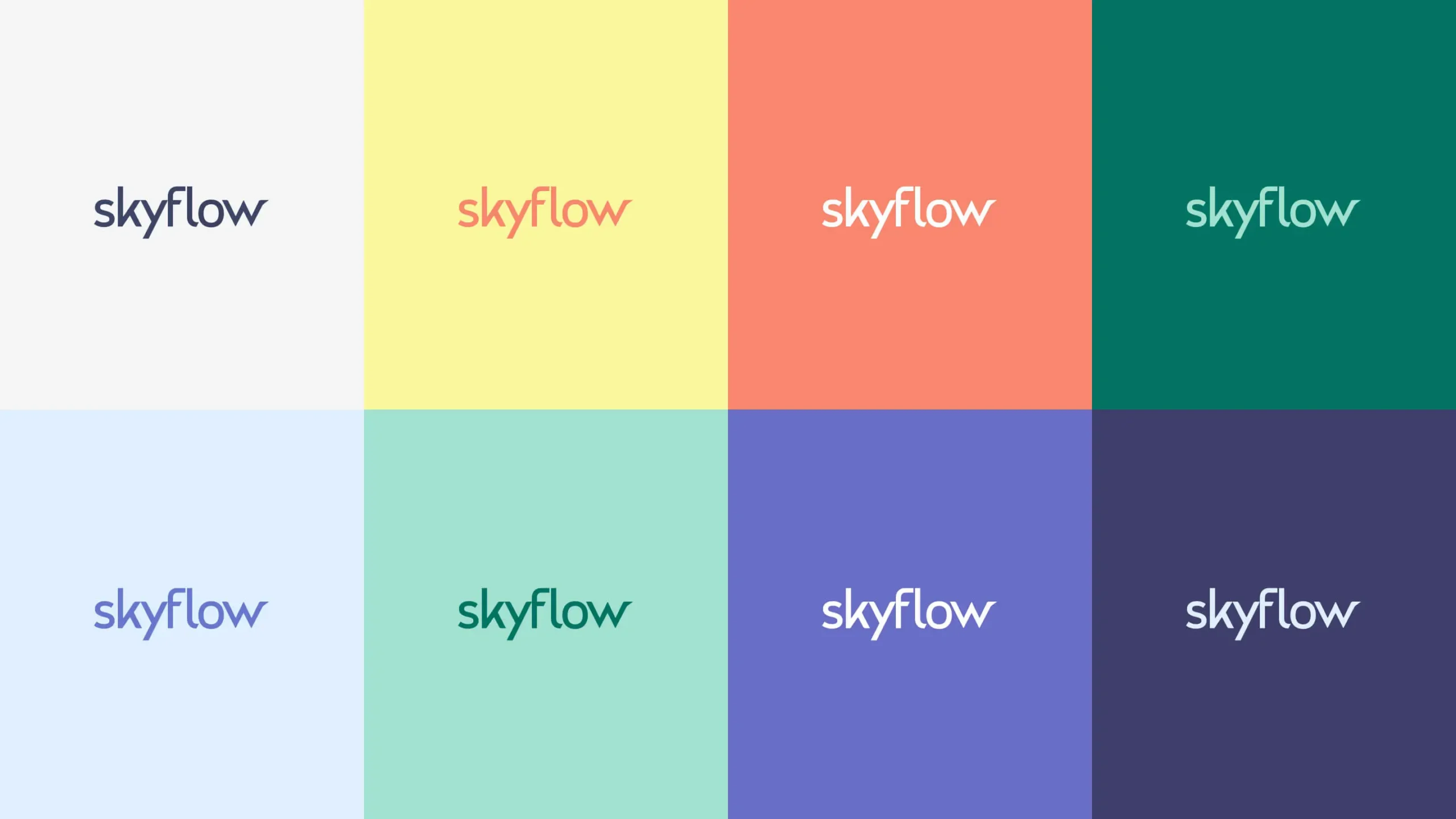
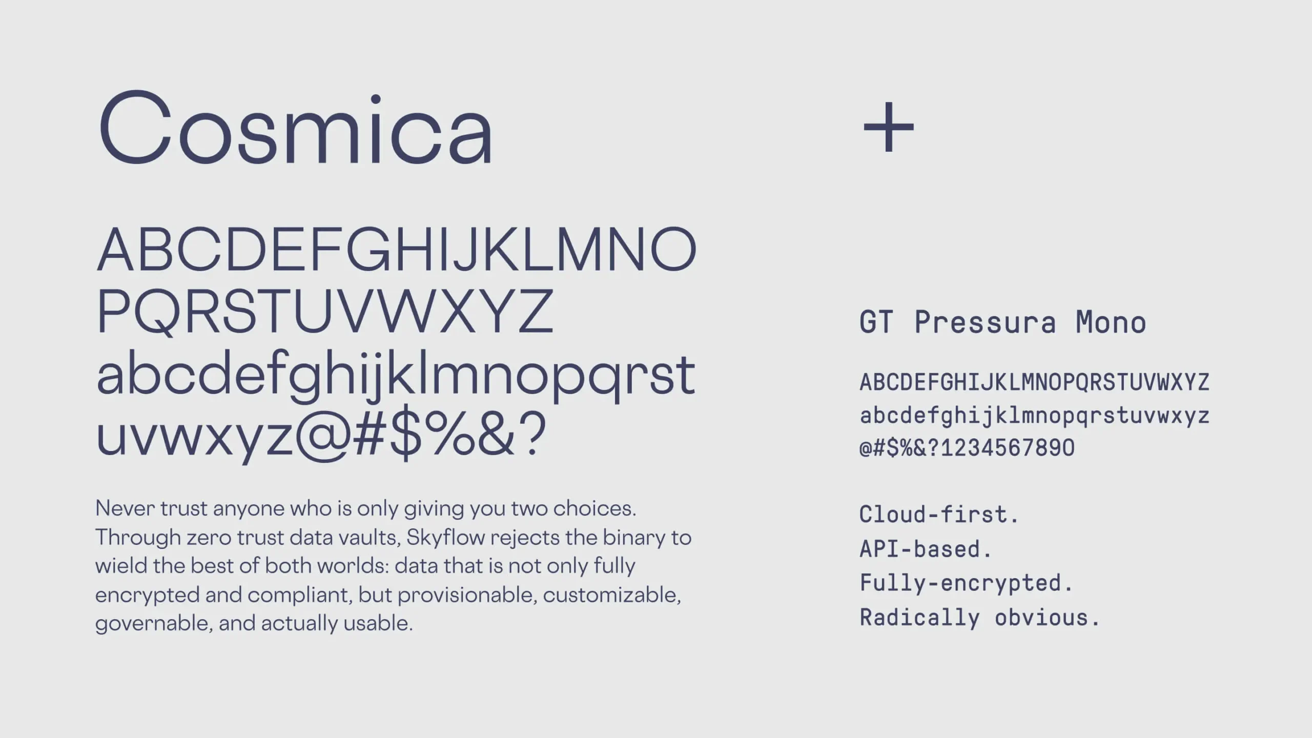
As a whole, the system balances traditional code-like type, which implies a sense of security and privacy, with a vibrant color palette you might find in a summer sky. This balance of opposites reinforces our brand idea of “No More Either/Or.” Why can’t the privacy space be both secure and shimmering?
Experience that Works

A new connotation.
The only thing more powerful than invention is reinvention. Our design system set out to reposition data vaults (normally portrayed as static) into something dynamic, full of movement, and optimistic.
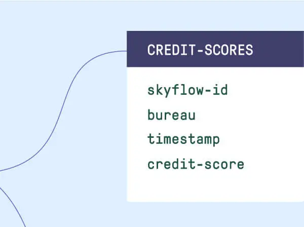
Resilience is the best offense.
When it comes to brand perception, especially around sensitive topics like privacy, there’s only so much you can control. You must build a brand that is consistent and resilient enough to endure the tide of any potential misconceptions.
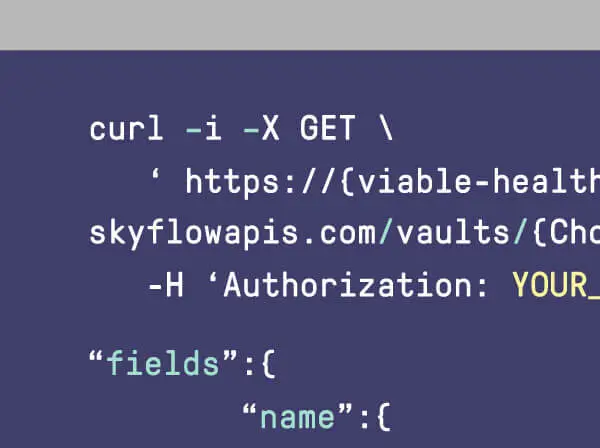
Marrying product and design.
If the product is flexible, the design should be as well. From incorporating light and dark modes to creating modular content structures, everything about this project was built to mirror and bolster the product experience.

Solve it once and for all.
Good brands solve problems. Great brands change the system. To match their ambition, this project required a new kind of visual system with enough boldness, energy, and hope to confidently emerge from stealth.
Recent Work

Launching an open-source project to design the future of DevOps.
View case study