


On a mission to maximize the value of every byte of data on the planet.
Building a new-to-the-world brand for today, with a big vision for the future.
Services
- Brand Strategy
- Visual Identity
- Positioning
- Corporate Narrative
- Brand Guidelines
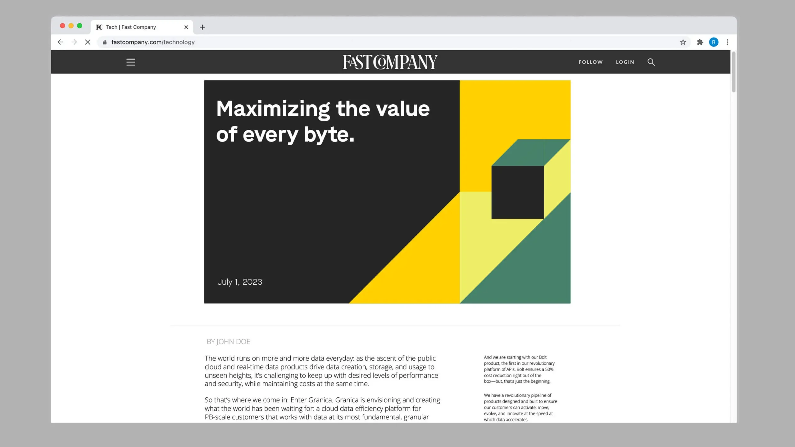
Granica is the first of its kind. Sitting as a layer above where object data is stored in the cloud, it makes data faster, cheaper, more secure, and better performing—enabling enterprises to shift their focus from figuring out how to store the proliferation of real-time data to reaching maximum efficiency, readiness, performance, and value.
One of the biggest brand opportunities we brought to life for Granica was helping them emerge from stealth with the clarity that they are not just another storage provider: they are a cloud data optimization layer, a middleware of sorts. They wanted to make this explicitly apparent, while also relying on some of the familiarities of the storage category. Additionally, Granica needed a strong brand to show that even though they are a new company, they’ve been deeply entrenched in the space for decades with the mathematical expertise, technical prowess, and measurable results to prove it.
What We Learned Along the Way
Balance familiarity with awe.
As a new brand in the nascent category of cloud data optimization, we needed Granica to stand out as something fresh and unexpected. However, we also found it important to lean on relatable and traditional cues from the cloud storage category for a frame of reference and to build confidence in an unfamiliar space.
Build for a visionary future.
Granica’s vision is big and takes them far beyond their product offerings at launch. Therefore, we built a positioning and identity that gives the brand something to grow into for the long-term, while letting messaging and marketing efforts take the lead in speaking to the direct product benefits available today.
Overcoming skepticism can be exciting.
Cost savings is an alluring value proposition, but often comes with the perception that when costs are lower, performance suffers—seeming too good to be true. We knew we needed to lean into strong proof points right out of the gate and build emotional connection in a typically product-led category in order to earn trust.
Rahul Ponnala, CEO, GranicaLaunching the new brand is a small milestone in building an iconic company in the world!”
Power of The Byte
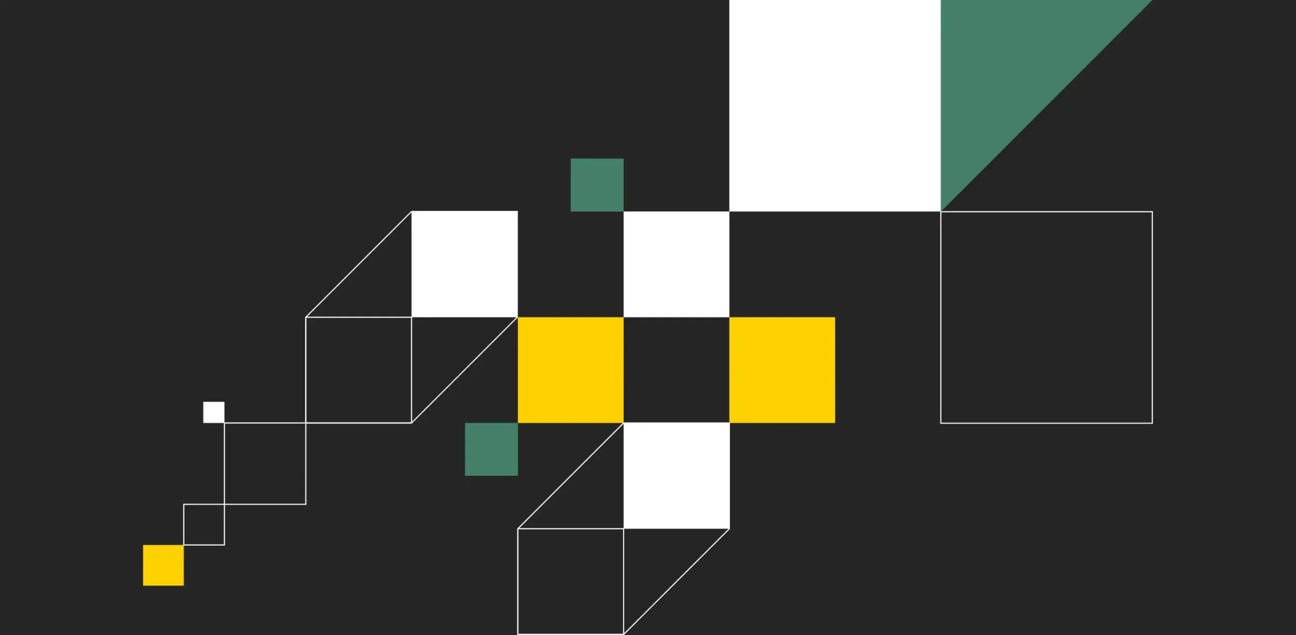
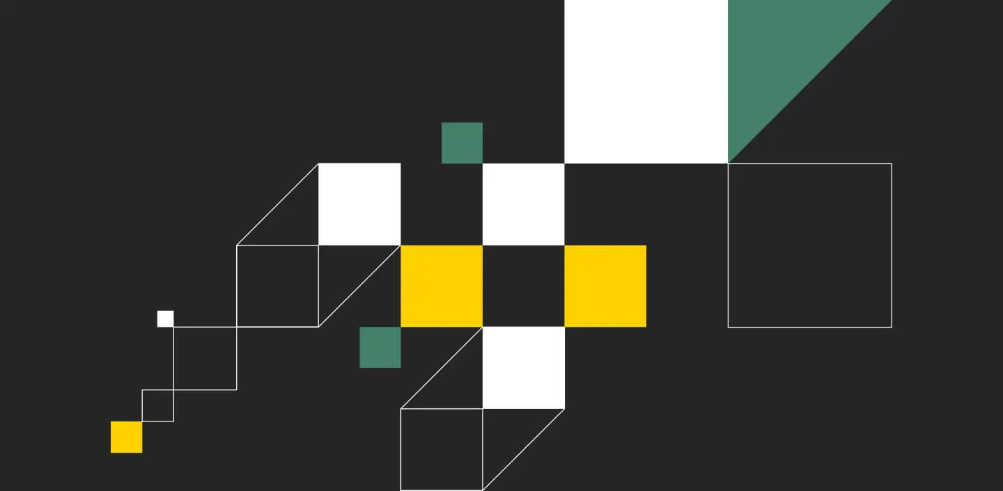
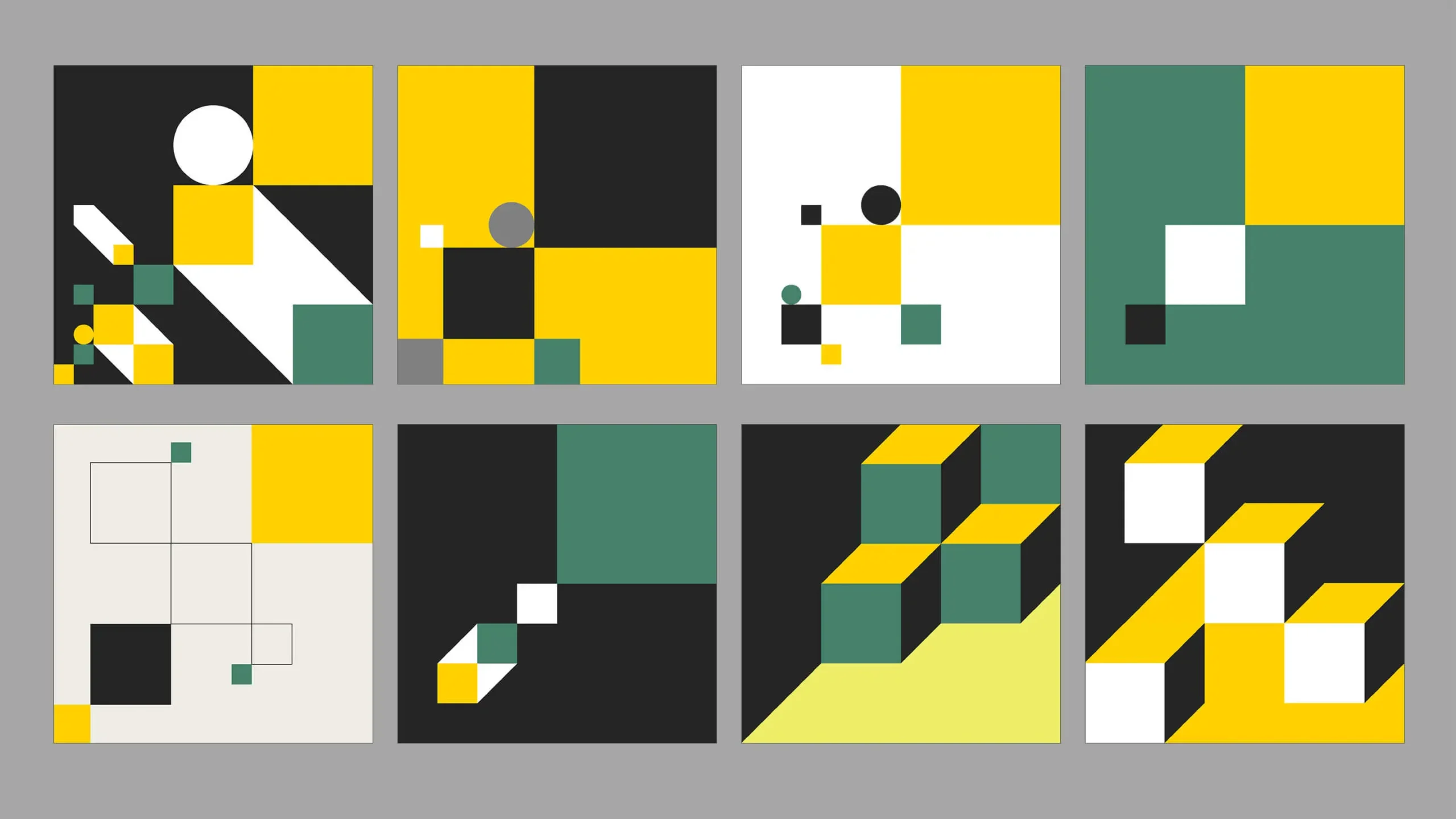
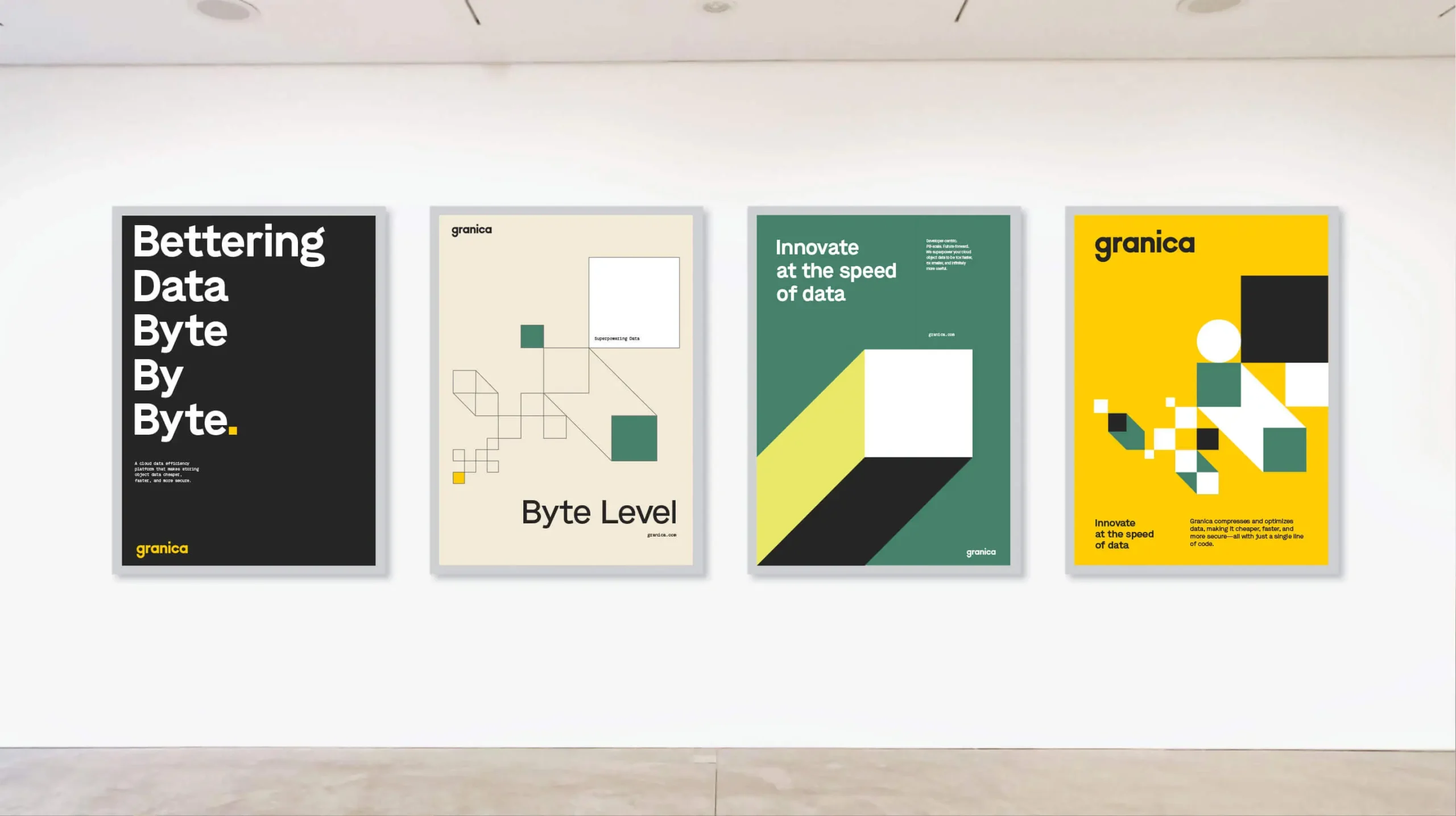
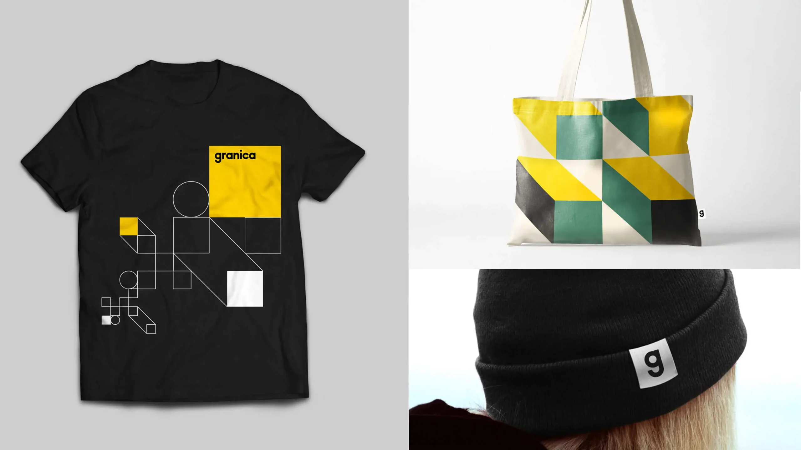
Inspired by the ones and zeroes of digital code, the Granica Wordmark was carefully crafted from the pure geometric forms of rectangles and circles—the square dot over the ‘i’ references the power of the data byte. This inspiration led to a lush graphic system which utilizes a pixel perfect grid to create a broad range of compositions using squares and circles.
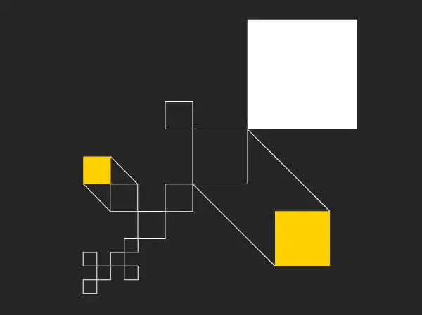
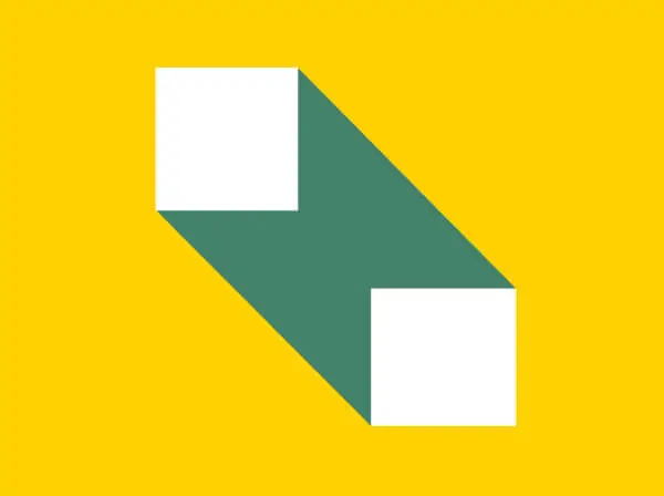
Complex Beauty
The Granica Graphic Language is a geometric, shape-based system that visualizes the complexities of Granica’s capabilities and creates a bespoke means of brand storytelling that does not rely on photography. Variations with solid, linear and dimensional forms only add to the flexibility of the system.

The Shape of Data
Our bespoke graphic language allows for dynamic states—solid color shapes optically extrude to create dimension and visually support brand storytelling. Kinetic compositions help convey ideas of elasticity, agility, systems, and real-time data.
Byte by Byte
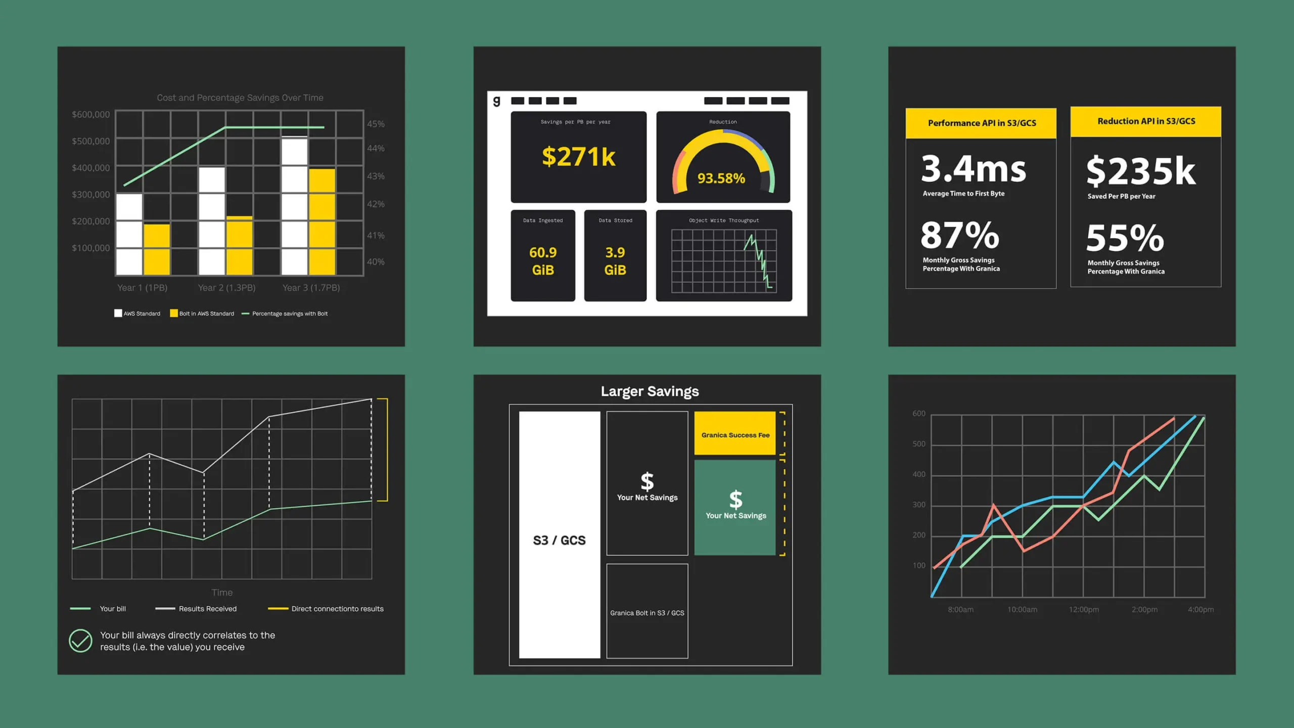
Our pixel grid enabled a paired down style of iconography which purposefully highlights the most fundamental element in the brand story: the byte. Employing that same grid structure, a distinct and highly legible suite of infographics was developed for brand communications.
Experience that Works
It was emotional (in a good way).
It was really heartwarming to hear founder Rahul Ponnala’s journey to launching Granica. We might have even got a little teary-eyed listening to his experience and his inspiring story.
We all got granular.
As brand experts, data compression isn’t something we talk about every day. But we really enjoyed digging into the science of understanding how Granica works, and needless to say, we learned so much and loved getting into the technical details.
Emotive + Granica as one team.
As a stealth project, we kept the teams small. This intimate structure helped us feel like we were one team with Granica, creating a very collaborative and integrated working experience.

The Goldilocks zone.
Crafting an effective brand positioning that aptly reflects your brand’s current state, while also allowing room for growth and a forward-looking approach, is crucial. Granica’s positioning did just this—allowing them to capitalize on the explosion of AI in recent months.
Recent Work


Bringing a people-centered brand into a digital-first, product-led future.
Read more