



Building Radical Resilience.
We translated a radically different approach to email security into a brand built to launch from stealth and stand out in cybersecurity.
Services
- Brand Strategy
- Positioning
- Visual Identity
- Naming
- Copywriting
- Collateral Design
- Brand Guidelines
- UX/UI Design
- Content Strategy

The presidential election of 2016 pointed out the flaws in one of our most ubiquitous technologies—email. Our mailboxes are filled to the brim with personal and business information, links to other accounts, and are open to various different forms of attacks. The founding team at Material Security saw this as an opportunity to take a radically new approach to solving these problems.
In a truly collaborative approach, Emotive Brand worked with the Material team to bring their brand to life. We partnered to define the brand strategy, name, visual identity, and their new website.
Backed by iconic investors and venture capital groups, Material launched out of stealth with an impressive list of customers. Their products and brand are setting a new standard for how security companies break into the market.
What We Learned Along the Way
Building Radical Resilience.
The core idea of Material is about taking a radical approach to building resilience against email breaches and attacks. We found opportunities to highlight how they take ubiquitous tools and use them in unexpected ways to accomplish this goal.
Fostering a new understanding of email security.
People think they understand email, but they often overlook its importance in our digital lives. We created a visual system that uses diagrams to explain commonly misunderstood concepts and makes Material’s unique approach to security easy to grasp.
Don’t say you’re different. Show it.
The security industry is filled with brands that rely on black and white photos, illustrations of masks and shields, and messaging filled with fear tactics to make emotional connections with its audiences. Material took a hopeful and helpful approach to their brand in a way that lets the product be the hero.
Alex Pozin, Head of Marketing, Material SecurityI challenged Emotive to translate the powerful experience of learning a new perspective directly from our founders into a brand and visual identity that will stand out in the security industry. Emotive exceeded our expectations in what they delivered and in how they worked with us as essential members of our team.”
An Inside-Out Approach to the Logo
Working from the idea of ‘Radical Resilience’, we wanted to make sure the Material logo showed how they approach email security from the inside-out and scale across organizations. In order to reference their use of ubiquitous tools in unexpected ways, we worked from simple geometry to make an iconic and simple logo.
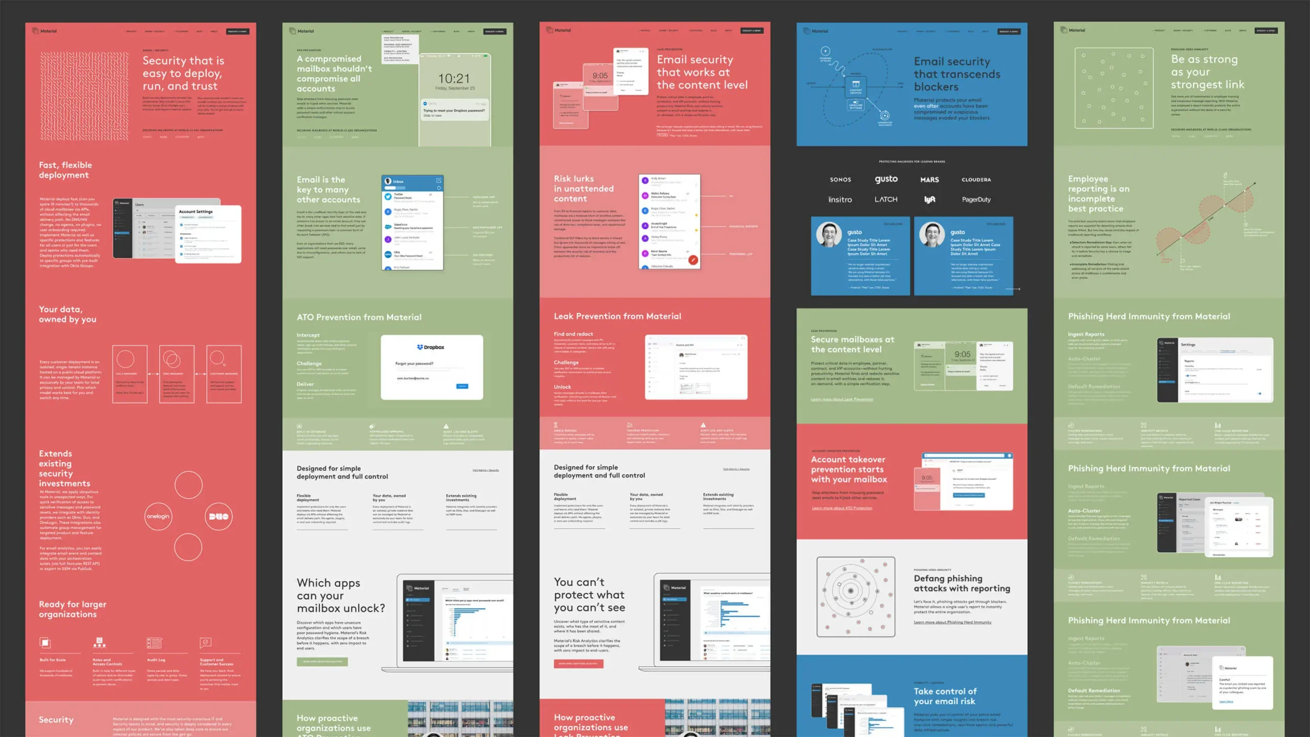
Balancing Brand and Product
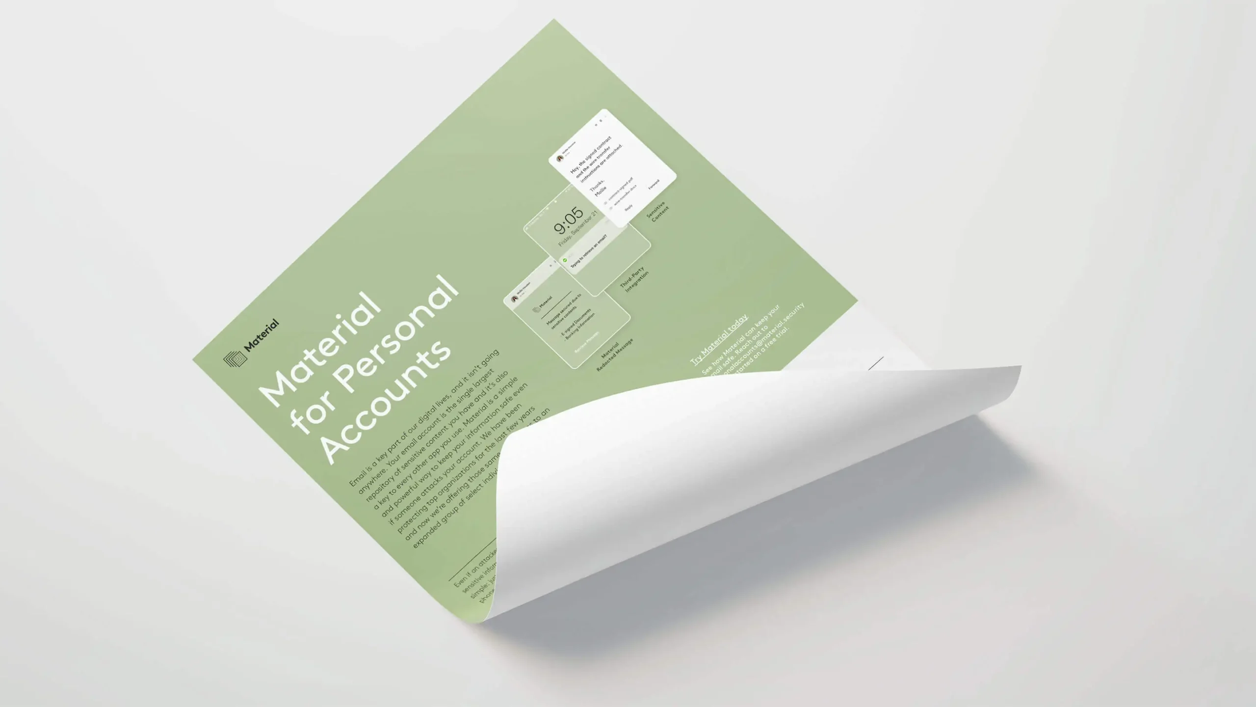
Material provides their customers unprecedented visibility and control over their email systems. Showcasing the product and the problem it solves were a key focus. We used simplified UI and abstract visuals rooted in scientific schematics to break complex problems down to their core components and reconstruct the narrative together for the viewer.
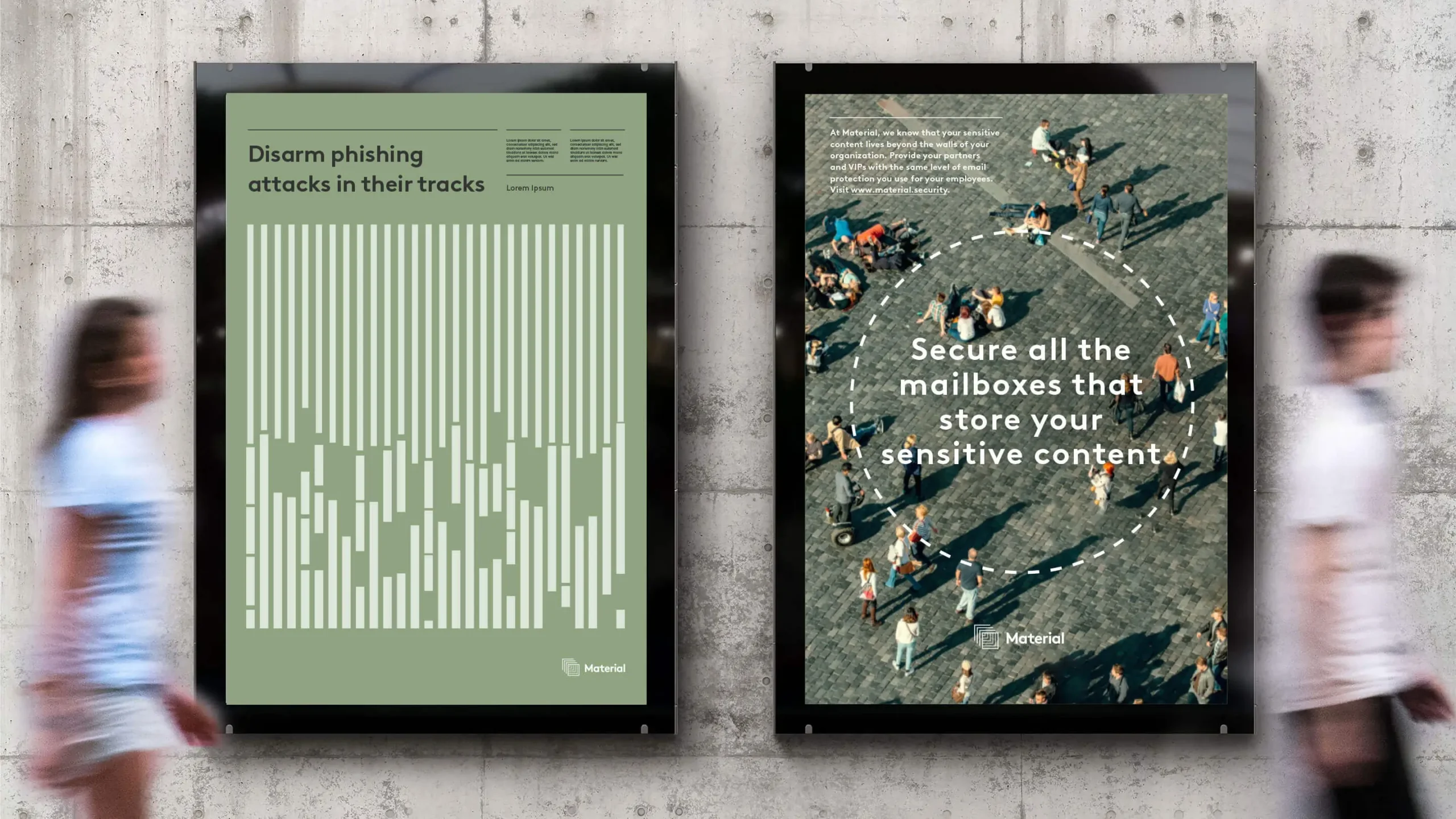
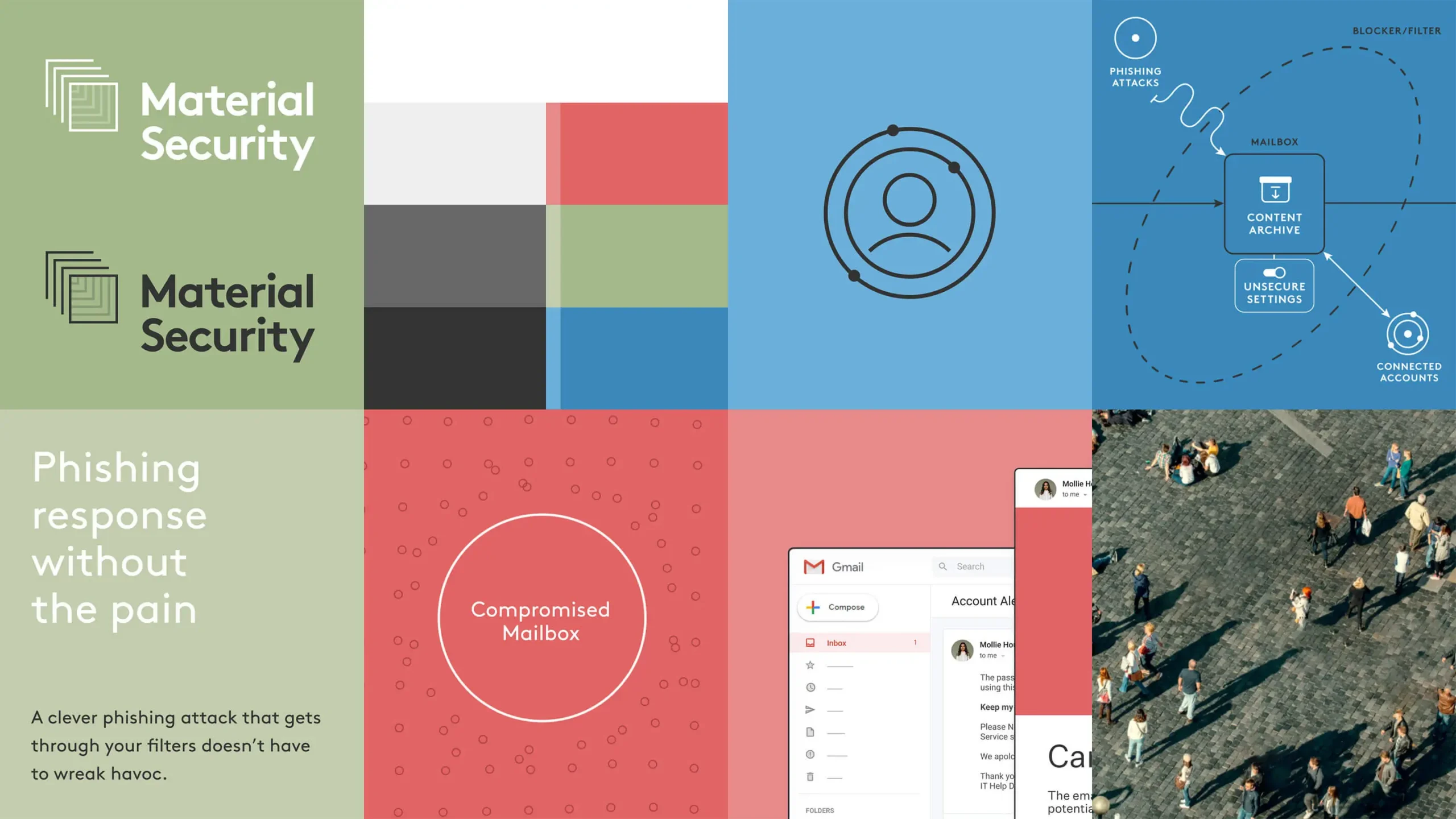
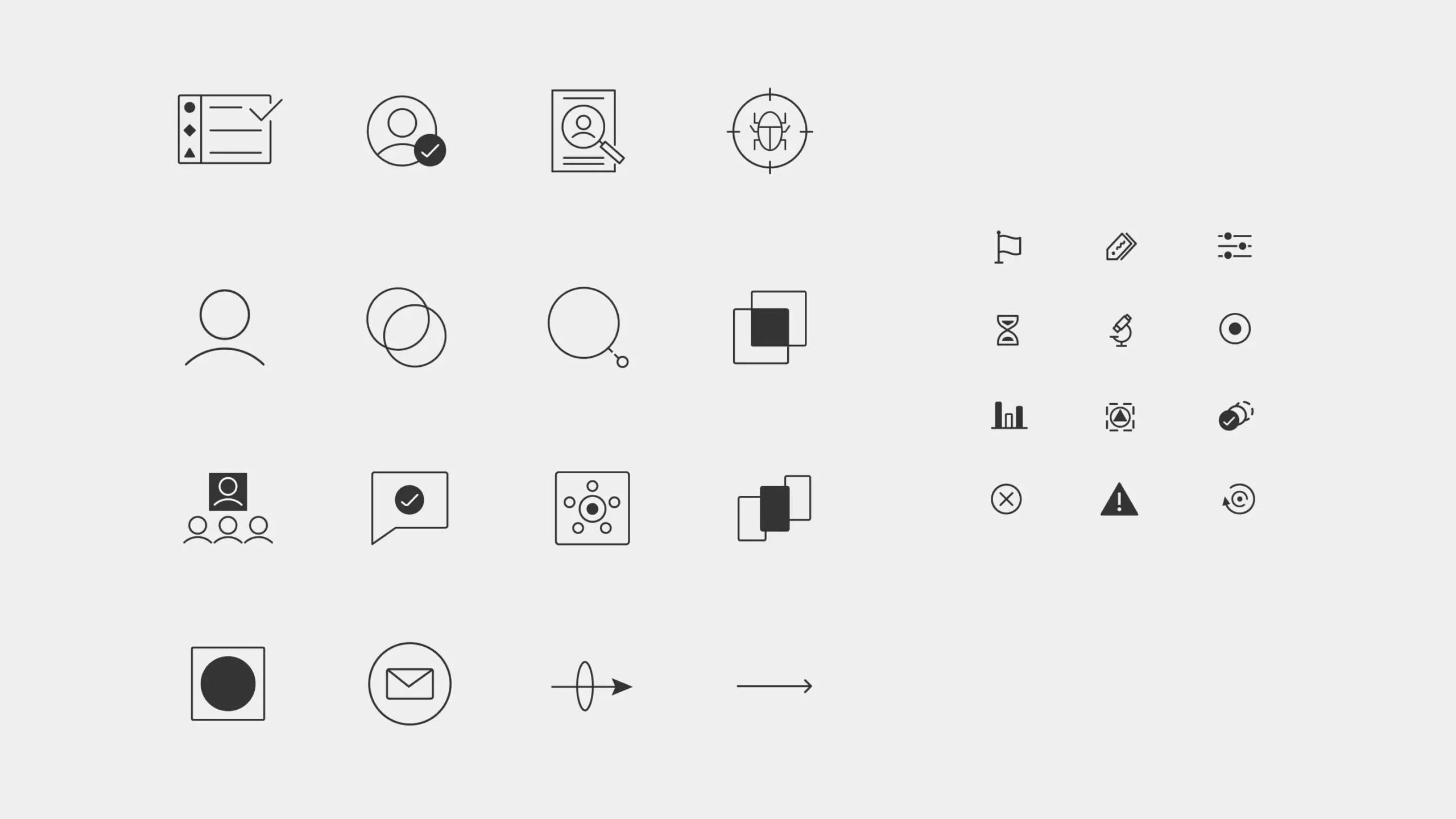

A Powerfully Simple Brand System
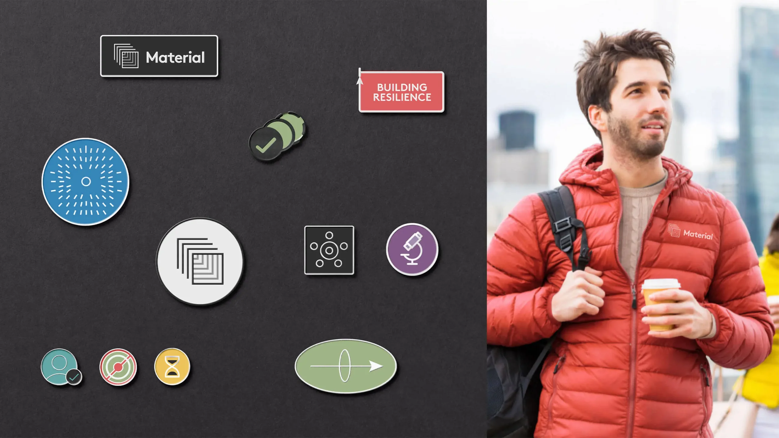
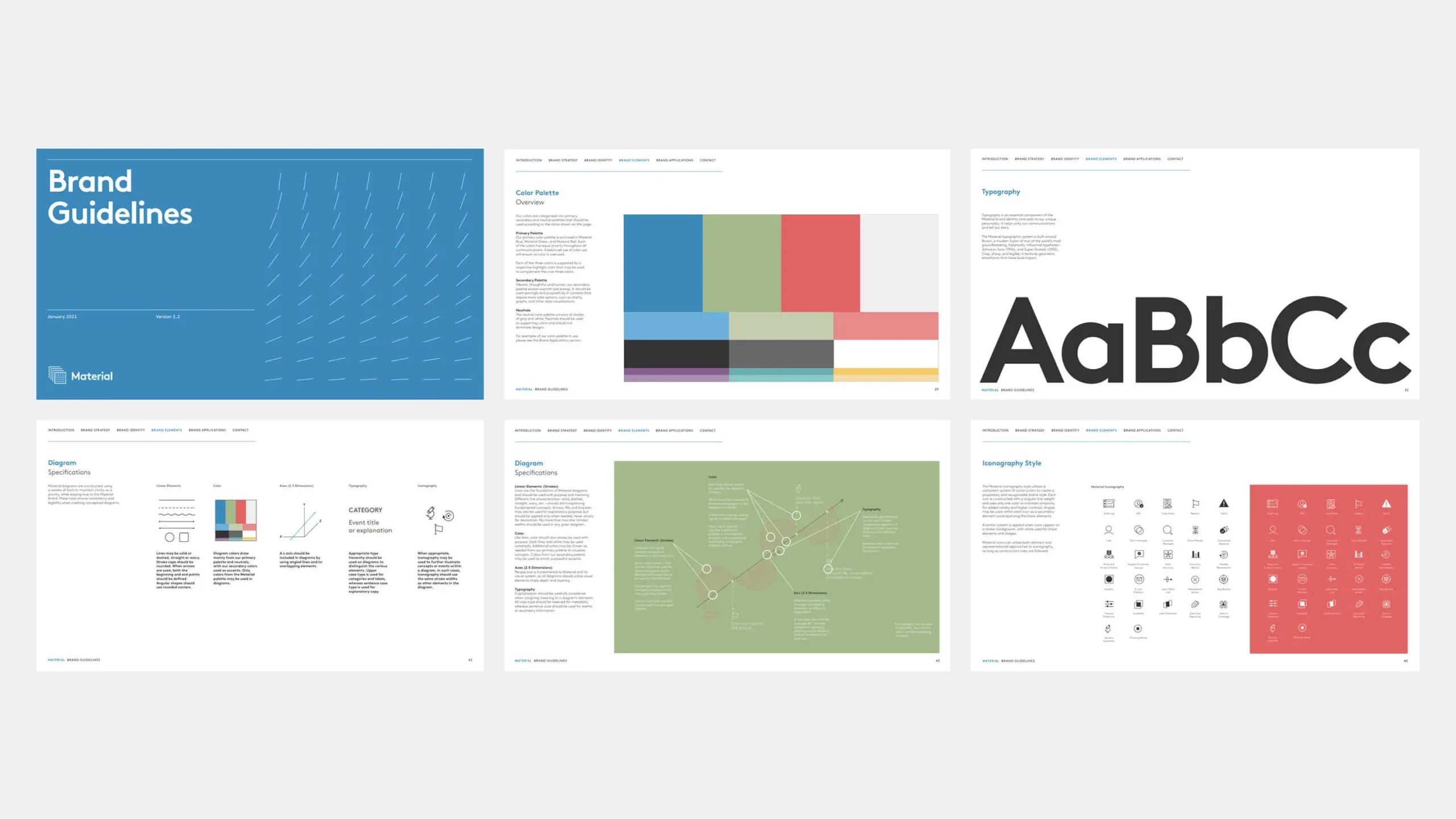
Everything in the system is rooted in fundamentals. This guided all of our choices from diagram construction, typeface selection, iconography, and color system. Simple geometry found in the logo, typeface, and illustrations, paired with a restrained color system based on RGB are the foundational elements of the Material visual system.
Experience that Works
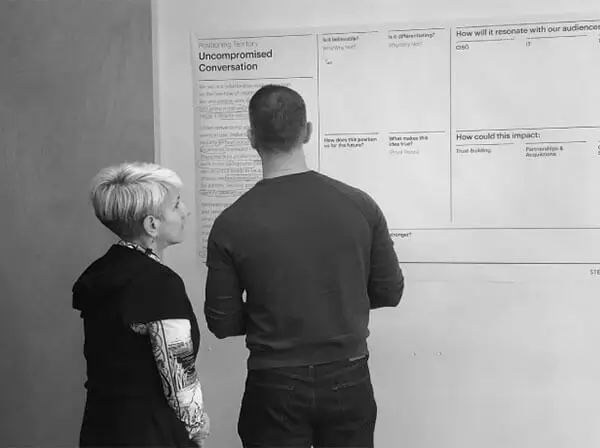
All access pass.
From the outset, the Material team wanted to be involved in every aspect of the process. We opened up our files and invited them in to work alongside us. Were we an extension of their team, or the other way round?
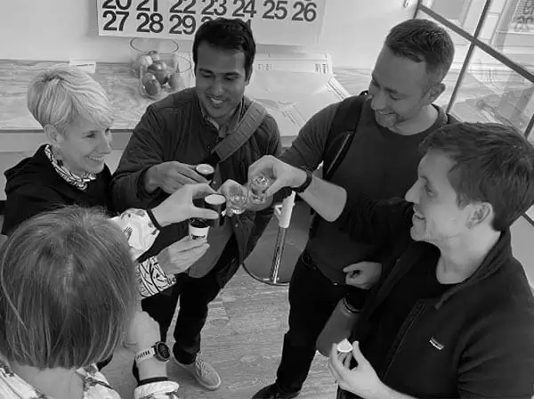
No stone unturned.
Choices, choices, choices. When it came to making big decisions about the brand, from the name to the strategic idea to the look & feel, the Material team wanted to see every possible option before they could settle on a path forward. Late-night brainstorms with tequila and beer helped.
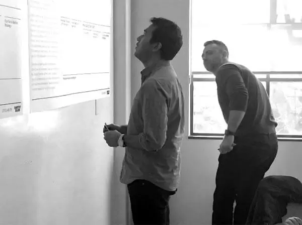
Buckle up.
Sometimes all you need is a good metaphor to get you over the hump of understanding what the technology actually does. When Abhishek the CTO said “It’s like putting on a seatbelt. When you crash it sure hurts less with the belt on.” Instant aha!
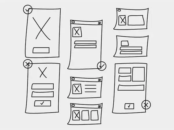
COVID collaborators.
Our team did not have one in-person meeting throughout the entire creative process— internally or externally. We adopted new methodologies and tools to collaborate seamlessly from concept through launch. Cameos by cats, dogs, and kids…essential.