


The right kind of different.
An unconventional approach to mortgage banking for a brand that’s designed to be different.
Services
- Positioning
- Naming
- Visual Identity
- Employee Engagement
- Corporate Narrative
- Go-To-Market Strategy
- Launch Planning
- Launch Activation
- Website Design
- Collateral Design
- Brand Guidelines

Newmark Realty Capital becomes Gantry and a new chapter begins. The firm’s leadership felt the Newmark brand was not working hard enough to support the goals of the business. And yet, there was something unique about the firm that made a compelling proposition for both clients and talent, if the firm could just get its story out there. We uncovered a thoughtfully unconventional approach to the way they were conducting their business: consultative, not transactional; teams working together, not in competition; and leveraging independent, data-led thinking over standard practices.
We wanted a name that would be memorable and different—something that felt confident, optimistic, and conveyed a sensibility of structure and support. Gantry.
Once we landed a name, our design team went into high-gear to create a new visual identity and design system that would roll out across all touchpoints company-wide, from a website, to signage, to sales materials, and swag. Working in tandem, the strategy team worked hand in hand with Gantry to develop a launch plan to engage employees internally and excite the market externally.
What We Learned Along the Way
Love at first sight.
The naming process is a complicated journey. Set expectations that the name you fall in love with early on in the process may not make it through legal checks unscathed. Keep an open mind to all names until the deal is really done.
What, no marketing team?
Overseeing a large rebrand project is not for the faint of heart. Factor in a complete lack of marketing team and the challenge just got even harder—but it’s not impossible. Set up a core project team with complete authority to make decisions and develop a rigorous schedule for all to live by and it gets done.
Sharing is not always caring.
As tempting as it is to show off new work that you are excited about—a positioning statement, a new name, a new logo, hot swag ideas—it is almost always better to hold back and make sure things get introduced with the right kind of framework so that nobody is blindsided and your project doesn’t get derailed.
Adapt & Support
When it comes to Gantry, there’s expected and unexpected support. You expect great buildings to be structurally sound and reinforced at every touchpoint. What you might not expect is that Gantry treats its personal relationships with the same level of strength and fortitude. The emotional foundation of mortgage banking should be just as sound as the physical one. This philosophy drove all creative.


Reimagining Experience
We built a fully responsive web experience “from the ground up.” We led with relationships and storytelling over numbers and images of cold glass buildings. We helped develop the whole brand extension down to launch swag, onboarding materials, sales templates, stationery systems, holiday cards, and more.


A Multi-Perspective Story
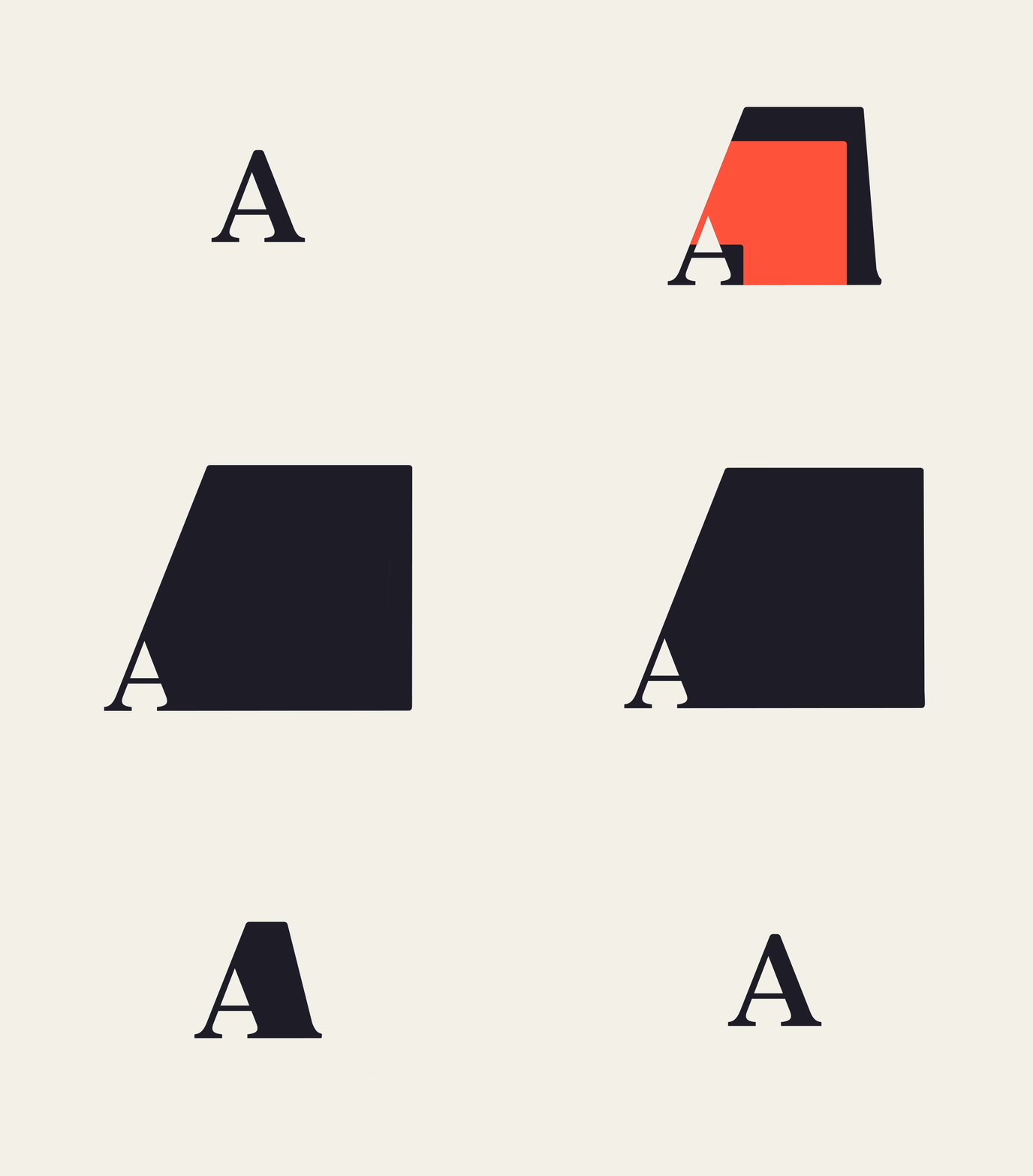
45° angles and triangles represent the strength and support of Gantry. The two overlapping shapes show a physical extrusion of a building—as well as a representation of the relationships Gantry builds. The resulting mark allows you to draw from many possible stories, creating engagement for the right kind of different.


Warmth and Humanity
Moving away from the conventions of colder, safer blues in the business world, the new brand brings warmth and a fresh palette. It doesn’t distance Gantry too far outside the category, but rather signifies a more approachable, human-centered company.


Experience that Works

Have serious fun.
We include this “rule” as part of every workshop set-up and we really mean it. This work is not easy, it often requires soul searching, but it should be fun, too. The Gantry team knows how to follow rules.

Make things simple.
Without a marketing team to manage the ongoing implementation of the brand, it was more important than ever to keep things simple and usable for all. From messaging to design, the Gantry brand is “user first.”

Go against the grain.
Gantry takes pride in doing things differently and leveraging their independence to provide a better service to clients. Our role was to build a strategy that was equally bold and differentiated to help give the team the courage to stand out.

Different grows on you.
By nature, we are drawn to things that we have seen or heard before. We encouraged the Gantry team to look at each name presented, imagine the story behind it, and ask which name is most interesting—not necessarily which one feels familiar.
Recent Work

Bringing a people-centered brand into a digital-first, product-led future.
View case study