Overlay
Let's talk

Hello!

Emotive provided the right level of listening, offering up a unique point of view, and collaborating to refine our brand positioning. It was an amazing partnership to accelerate us from a start-up to a growth-stage company much faster.”

Eric Futoran, CEO, Embrace

Seeing the Future of Mobile

The new Embrace logo embodies simplicity with brackets and dots that make a nod to code and establishes a brand authentic to developers. The logo reflects the e’s that begin and end the Embrace name. The composition asserts the symbol as a character that can come to life dynamically.
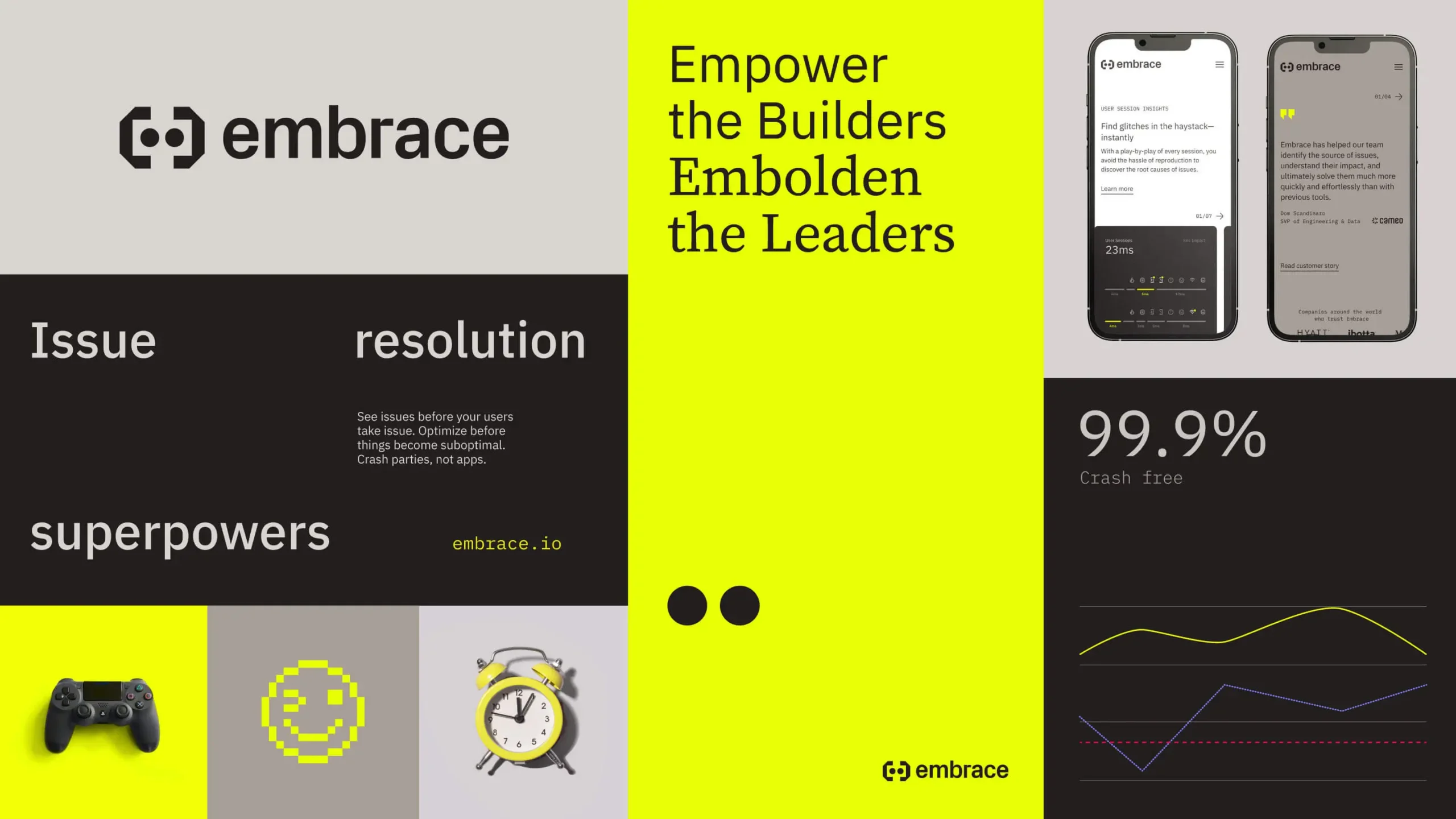
Embrace information page comprised of three columns. Column one is light gray on top with black text of the embrace logo, there is a middle rectangle shape below this with white text that reads " Issue resolution superpowers" and below that small photograph of a black game controller on a bright yellow square, a small darker gray square with a bright yellow pixelated icon of a winking smiley face, and to the right of that a light grey square with a photograph of a bright yellow vintage alarm clock in it. The middle column is bright yellow and reads in black text "Empower the Builders Embolden the Leaders." A small black embrace logo and text is on the bottom right corner. The column all the way to the right has a top light grey square with the photograph of two smart phones in it. The left smart phone has a white embrace webpage loaded and the right phone has a dark grey embrace webpage loaded on it. The bottom portion of the column is black with white text that reads "99% Crash free" and the graphic image of a line graph on it.

Creating a Conversation

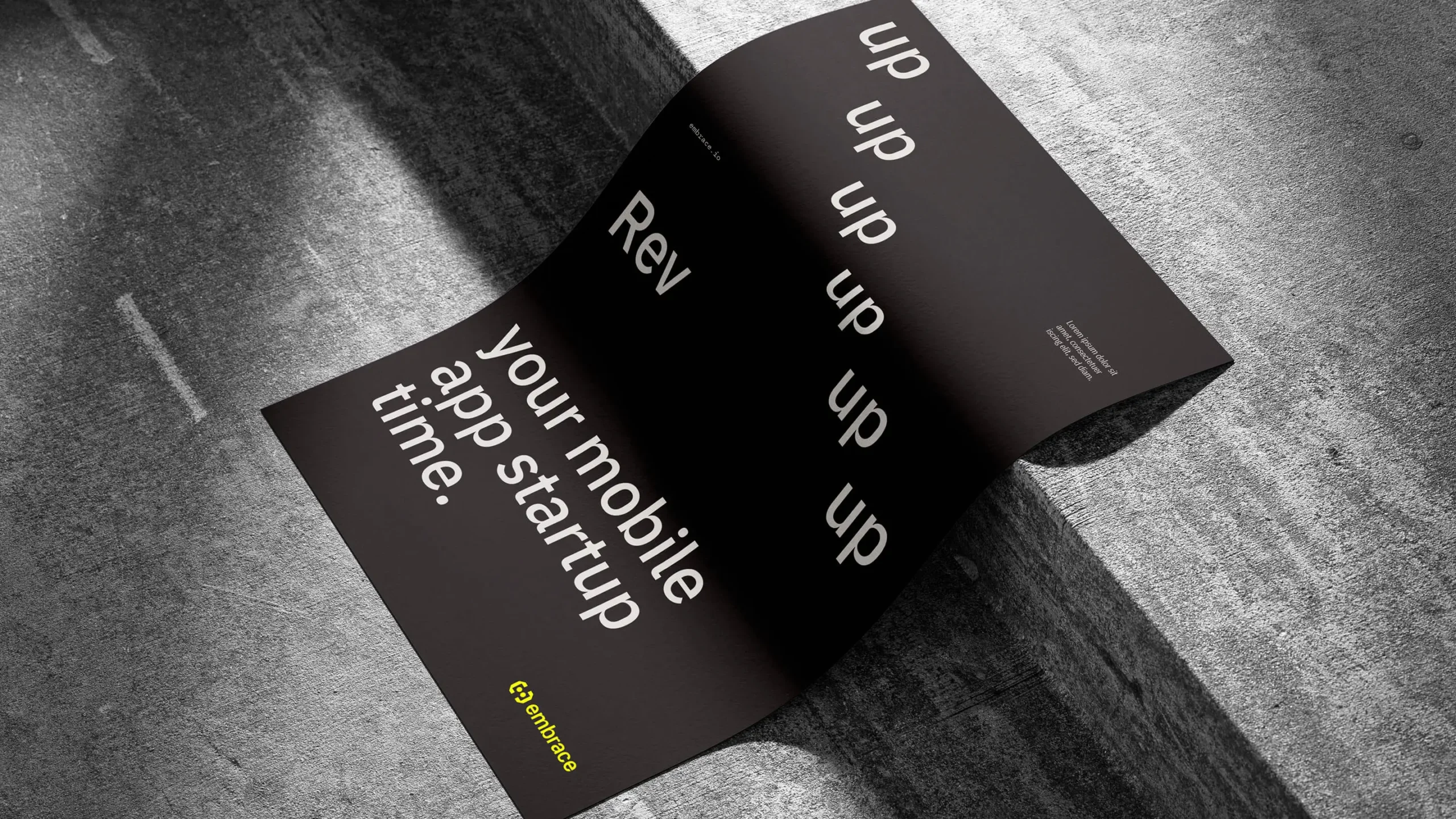
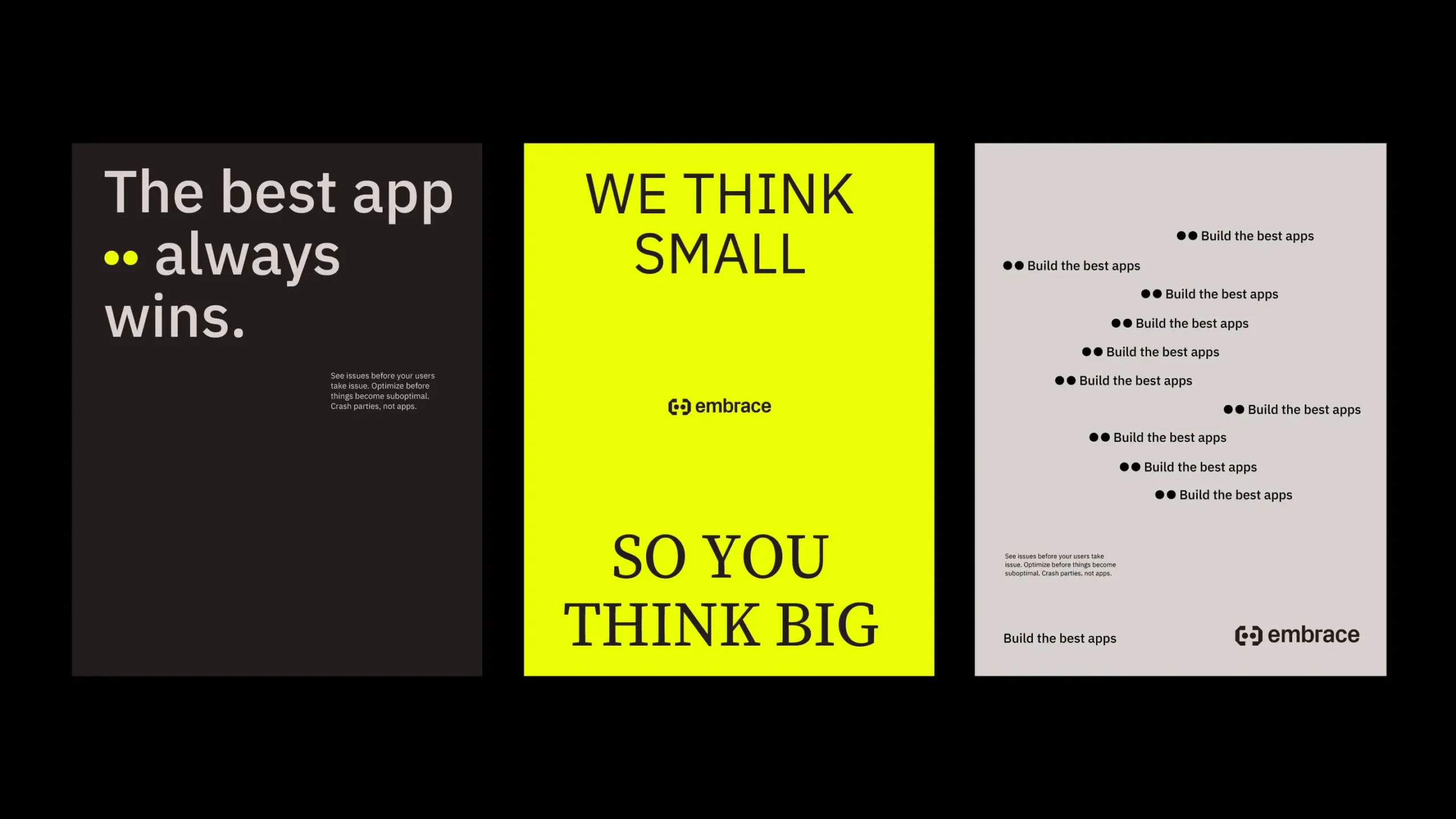
Key to the Embrace design system is a typographic approach where different typefaces represent different points of view. This allows the Embrace brand to engage different audiences in a dialogue and deliver messages that fly at different elevations and embody different tones.

Photograph of a billboard in an enclosed tunnel like space. There a view of the top of an escalator in the middle and foreground of the image. The billboard has white text that reads "Make your mobil apps scream." and below that in bright yellow text "Build the future of mobile." There is a smaller embrace logo to the left middle of the billboard.
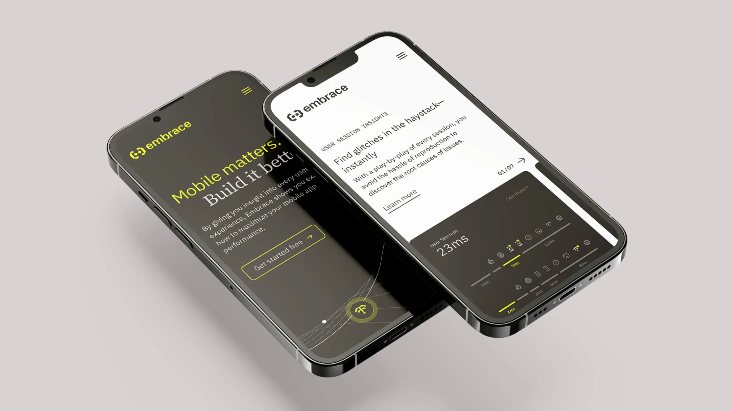
Photograph of two smart phones one resting on the other floating in a light gray space. The each have embrace webpages loaded on their screens. One screen is black with white and bright yellow text the other is white with black text.
Photograph of three framed wheat paste posters in a city on the side of a building with a sidewalk in front of it. The left posted is dark grey why white text that reads "Empower your developers." on top, a small embrace logo in the middle and in bright yellow text on the bottom that reads "Make the C-suite giddy." the middle poster is bright yellow and has a large Embrace logo in black in the middle. The right poster is light grey and has black text on the top of it that reads "Build the Future of Mobile." a small black embrace logo in the middle and two lighter grey sold circles on the bottom of the poster.

8-Bit Amazing

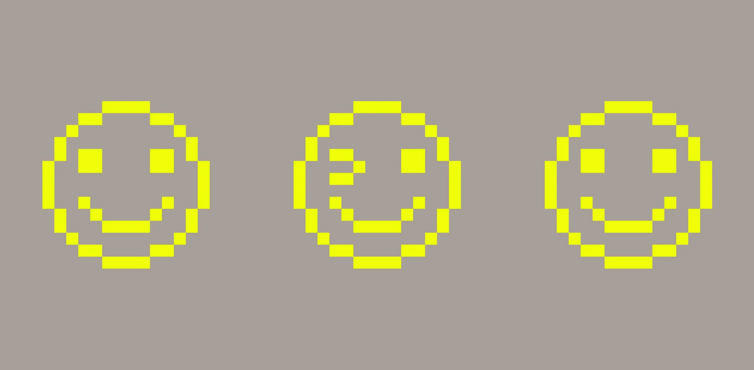
A photography style that relies on simple objects combined with 8-bit icons creates a unique graphic language that gives the Embrace brand an iconic approach to expressing itself. The visual language feels authentic to developers, and brings fun, honesty, and approachability into how the brand shows up.
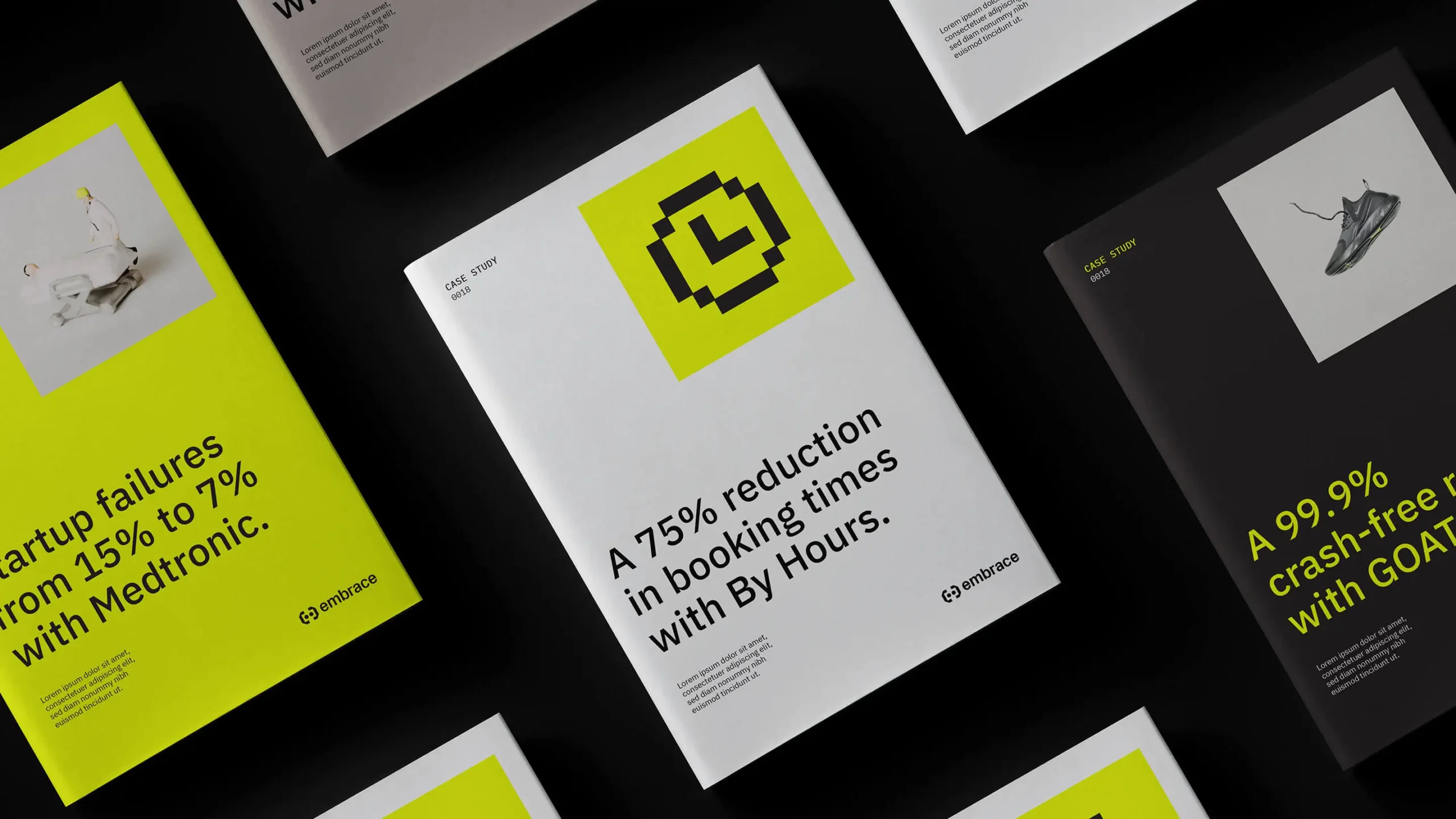
Three Embrace booklets on a black background laying flat next to each other n a row. The first booklet is bright yellow with black text and a square photograph of a figurine of a person in a hospital bed and a doctor figurine standing over the bed, the middle booklet is white with black text and the graphic of a black clock icon on a bright yellow square background on the upper right corner and the right side booklet is black with bright yellow text and the photograph of a black athletic shoe on a white square background in its upper right corner.
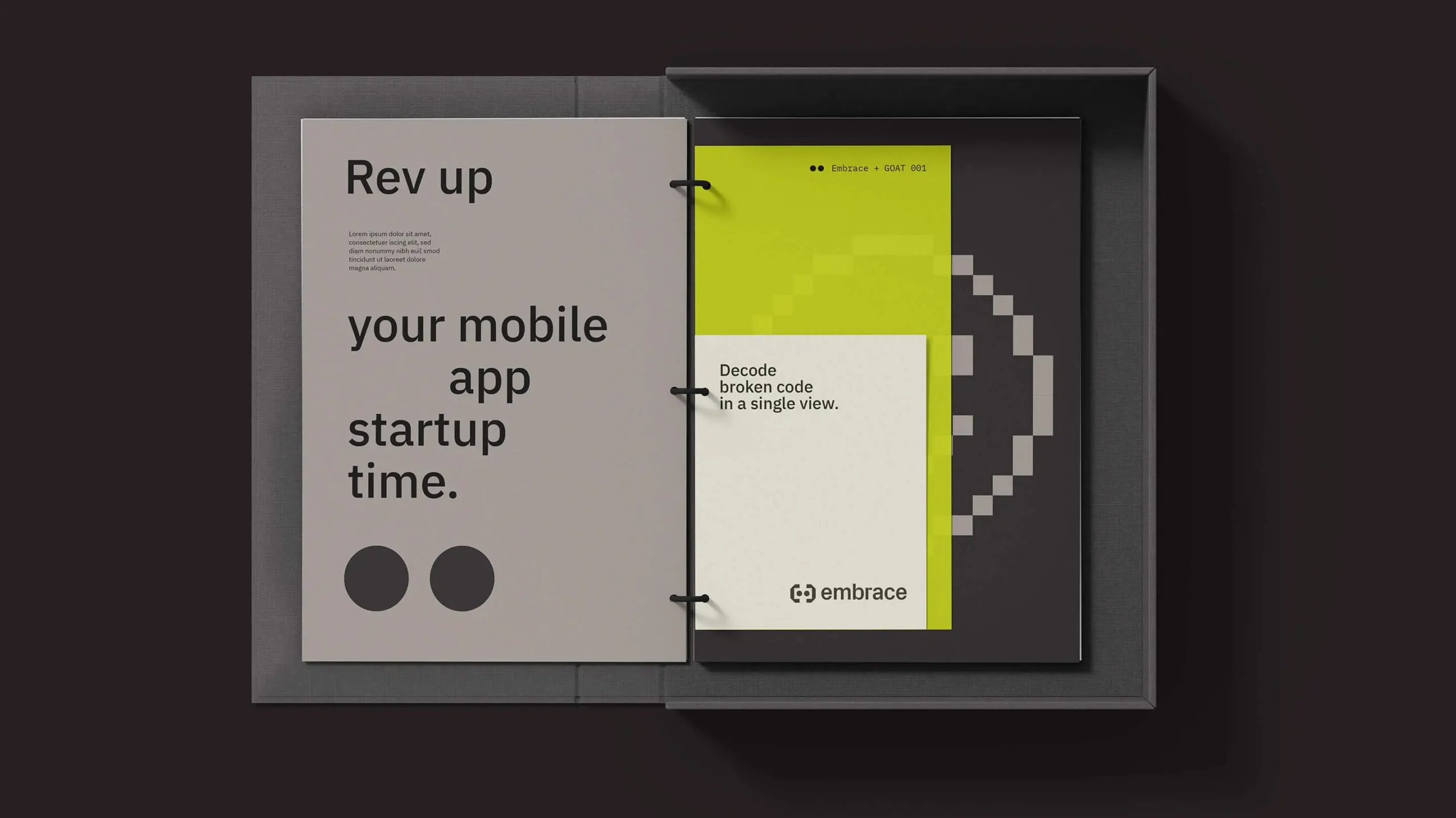
Photograph of an Embrace information booklet in binder form. The binder is in a great box type container and is open with information of the left and right pages. The binder is on a black background

Standing Out with Simplicity

A clean logo. A reductive, differentiated color palette. Imagery and iconography that speaks to developers. An illustration style that accelerates your ability to identify what matters. The Embrace design system sets Embrace apart in a crowded field with a bold, direct identity that communicates confidence.
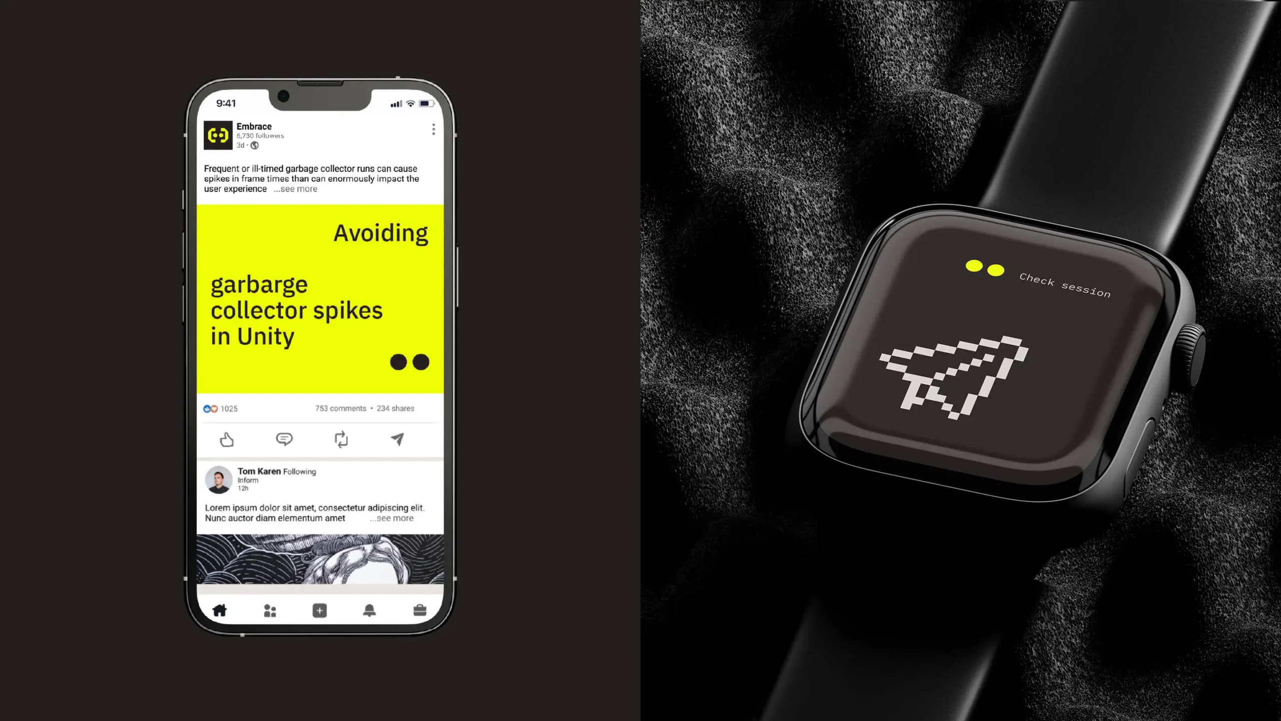
Photograph split into two sides. The left side is a photograph of a smart phone on a black background. The screen of the smart phone have a post fro Embrace on a social media type platform similar to Instagram. The right side of the image is a closeup photograph of a smart watch with the graphic icon of a paper plane on it. The watch is resting on back packing sound insulation foam.
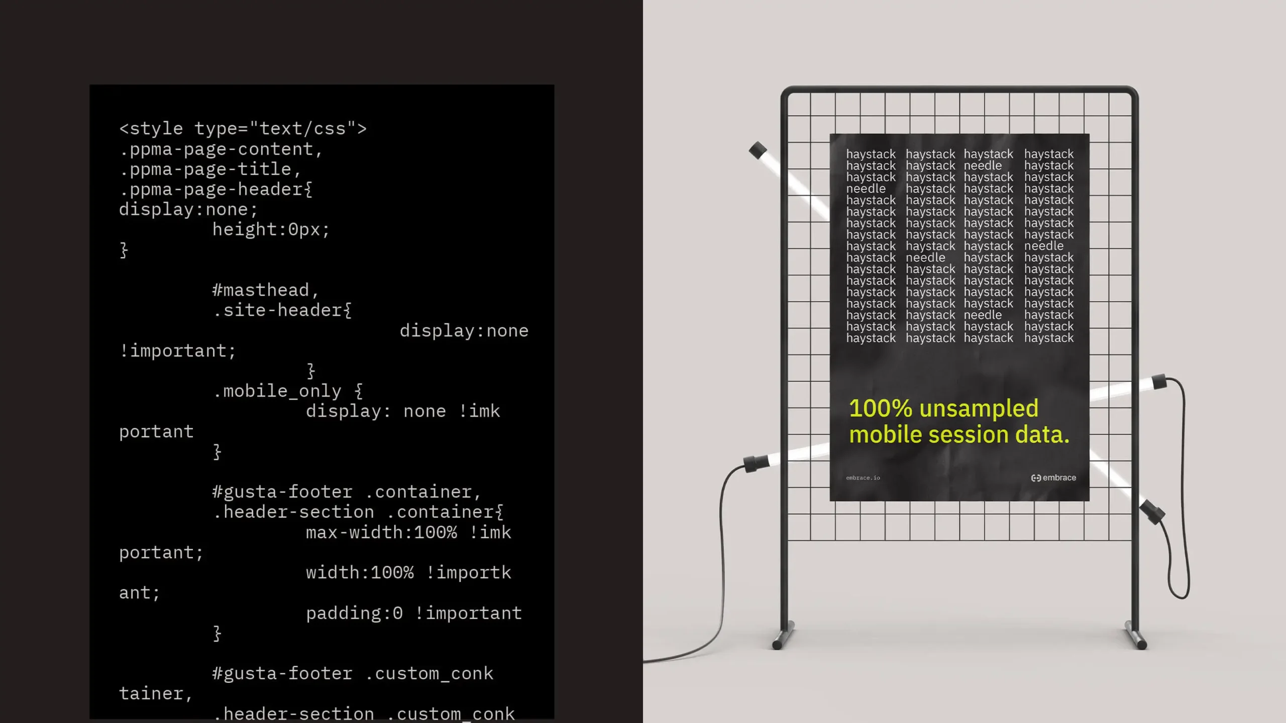
A rectangle that is split into two sides. The left side is a light black background with a smaller black rectangle within it that has white computer coding text with code type data. the right side of the image is a black rack with two fluorescent light tubes on it standing upright in a grey space. The rack also has a black poster with white text that reads "haystack" in four columns and 17 rows. In each column in various places one of the texts says "needle" instead of haystack. Below this white text is larger, bright yellow text that reads in all lowercase letters "100% unsampled mobile session data."
Black background with three columns and two rows of information. The top row has a bright yellow rectangle with data written in black text next to a black rectangle with white text that reads "Empowering Transformation" and the Embrace logo in bright yellow in its bottom right corner. The last rectangle in the row is white with the black and white aerial photograph of a typewriter. The bottom row has a white rectangle with a black and white photograph of a Lego storm trooper figurine standing in a white space. Next this is a a black and white rectangle split in half the black half is first and contains a grey graphic icon of a suitcase with bright yellow text underneath it that reads "How their mobile team used Embrace to spot a $1.8M issue" the white side of the rectangle has black text with data in it. The final rectangle in this row is a grey and contains a photograph of a black vintage telephone receiver with a cord coming from its end and black text that reads "Quality of Service"
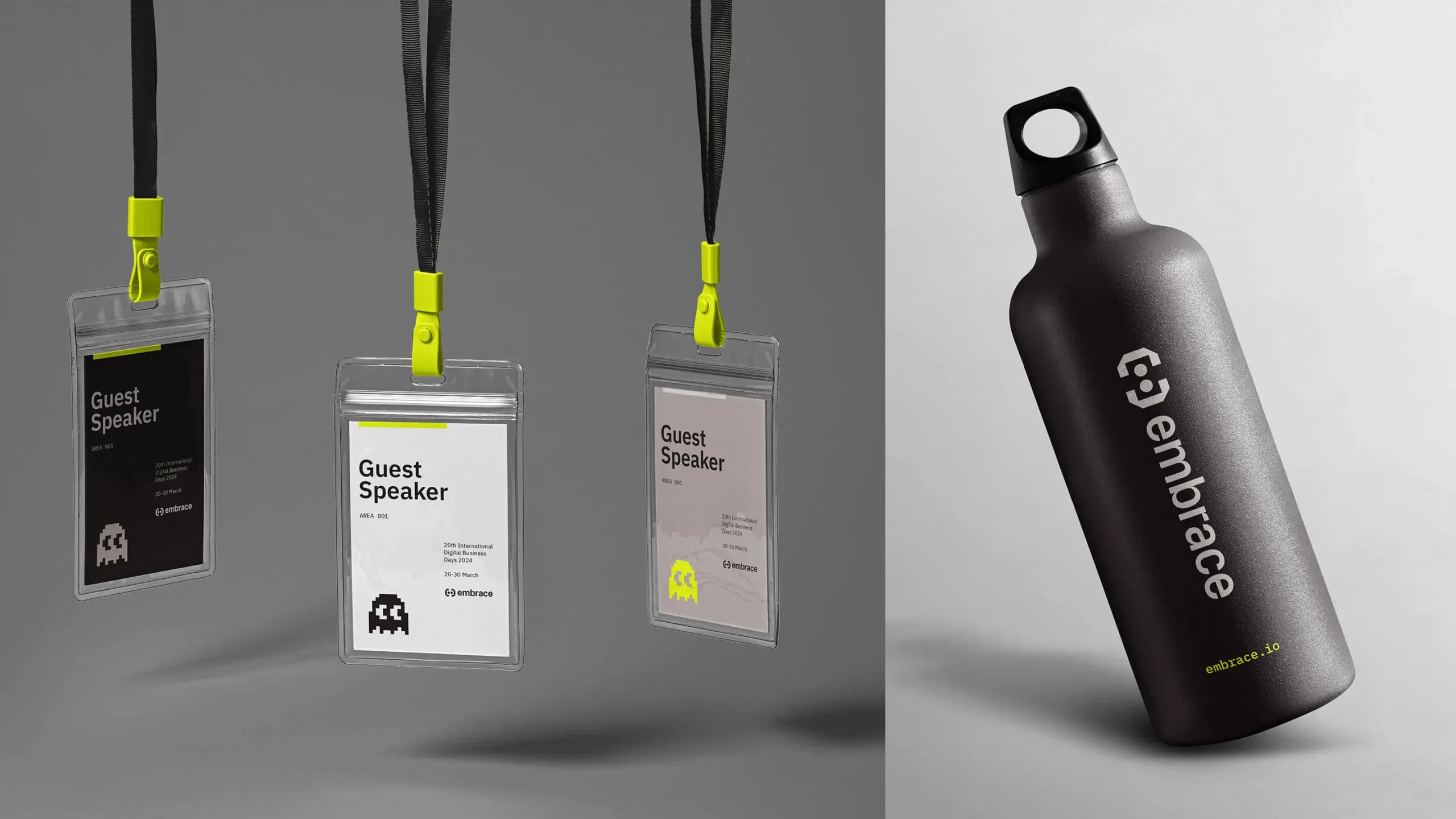
Photograph of with three Embrace guest speaker lanyards dangling from the top of a grey space of the left side of the image. They have bright yellow clasps where the lanyard meets the hanging loop. On the right is a photograph of a black water bottle in a white space that has the Embrace logo running horizontally on the the bottle. The water bottle is standing upright but tilted to the left.

Experience that Works

Black background with white text in all lowercase letters that reads "[extend parameter]" in the middle

Push the boundaries.

To go from start-up to positioning for growth, don’t be afraid to push the boundaries of where a brand can go. The combination of authenticity and boldness helps everyone see bigger possibilities for the brand.

Photograph of a Rubics Cube in a white space. We see three sides of the cube which appears to be solved as all colors on each side match and are aligned. The top of the cube is Orange, the left side is white and the right side is blue.

Be ready for change.

A brand positioning process can take months to complete. Expect that there will be strategic shifts in the business while the process is underway. Be ready to pivot to meet the changing needs while staying true to the brand.

Black background with all lower case text that reads "jump" with "on board" below and to its slight right.

Drive employees with the “why”.

The story of how a company plans to grow creates an opportunity to engage employees on a deeper level by connecting them to a bigger “why.” When people see the individual, organizational, and world-level benefits of growth, inspiration surrounds them.
Photograph of a yellow vintage alarm bell clock in a great background.

Know your timeframe.

Being clear about how long you need the brand to live. Establishing constraints allows you to push on the creative to ensure your brand is working as strategically as it can within a timeframe (and possibly beyond).

Recent Work
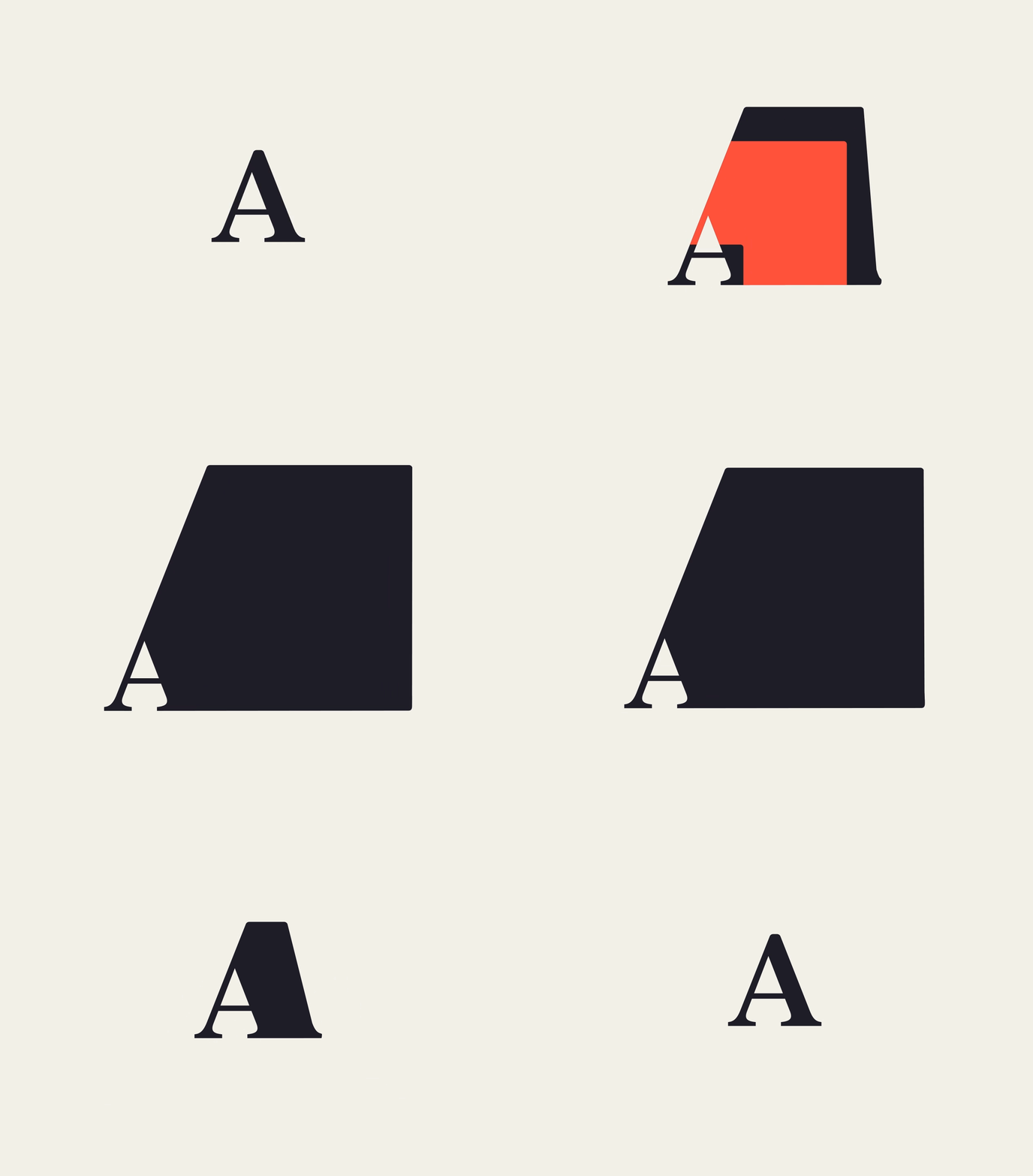
Animation of the Aperian logo in black text moving from a simple "A" that then expands into a thicker more square like graphic on a cream color background
Read More
Aperian

Bringing a people-led company into a product-led future.

Skyflow text in white on a purple background with diagonal lines of various colors (yellow, green, red, and bright purple) and lengths surrounding it.
Read More
Skyflow

The new standard for data privacy.

Let’s start something big.

Let’s start something big.

Let’s start something big.

Let’s start something big.

Let’s start something big.

Let’s start something big.

Let’s start something big.

Let’s start something big.

Let’s start something big.

Let’s start something big.

Let’s start something big.

Let’s start something big.

Let’s start something big.

Let’s start something big.

Let’s start something big.

Let’s start something big.

Get in touch.

Get in touch.

Get in touch.

Get in touch.

Get in touch.

Get in touch.

Get in touch.

Get in touch.

Get in touch.

Get in touch.

Get in touch.

Get in touch.

Get in touch.

Get in touch.

Get in touch.

Get in touch.

Get in touch.

Get in touch.

Get in touch.

Get in touch.

Get in touch.

Get in touch.

Get in touch.

Get in touch.

Get in touch.

Get in touch.

Get in touch.

Get in touch.

Get in touch.

Get in touch.

Get in touch.

Get in touch.

Get in touch.

Get in touch.

Get in touch.

Get in touch.

Get in touch.

Get in touch.

Get in touch.

Get in touch.