Overlay
Let's talk

Hello!

Designing and Maintaining an Emergent Brand

When the Emotive Brand design team creates a brand system, we design it to last for many years. In order for a brand system to last that long, it needs to be consistent with a specific core idea, yet flexible enough to grow over time in order to accommodate changes in the landscape, growth into new sectors, building out sub-brands, etc. Let’s explore two different methodologies in conducting brand design and the end result of each: modernist design and emergent design.

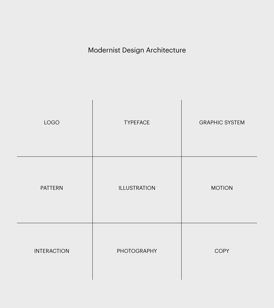
Modernist Design: One Solution

Modernist design methodology is built on the practice of digging to find the golden nugget of a single solution, then testing and polishing that nugget into something that is refined and workable for the specific problem at hand. The rules for the solution are codified and set in stone. The specific problem is continually solved using the same set of rules. However, this often leads to the same solution being applied to multiple different problems as a way of short cutting the design process. Why wouldn’t businesses be trying to use the same solution? It’s what they have in their toolkit – but they aren’t aware that this method is ill-fated from the start. It’s the classic “when all you have is a hammer, everything looks like a nail.” 

In contrast, emergent design strives to give you the raw steel to work with, so you can create hammers, pliers, screwdrivers, drills, any tool that will naturally solve the problem at hand yet still remain true to its core composition.


Emergent Design: A Step Further

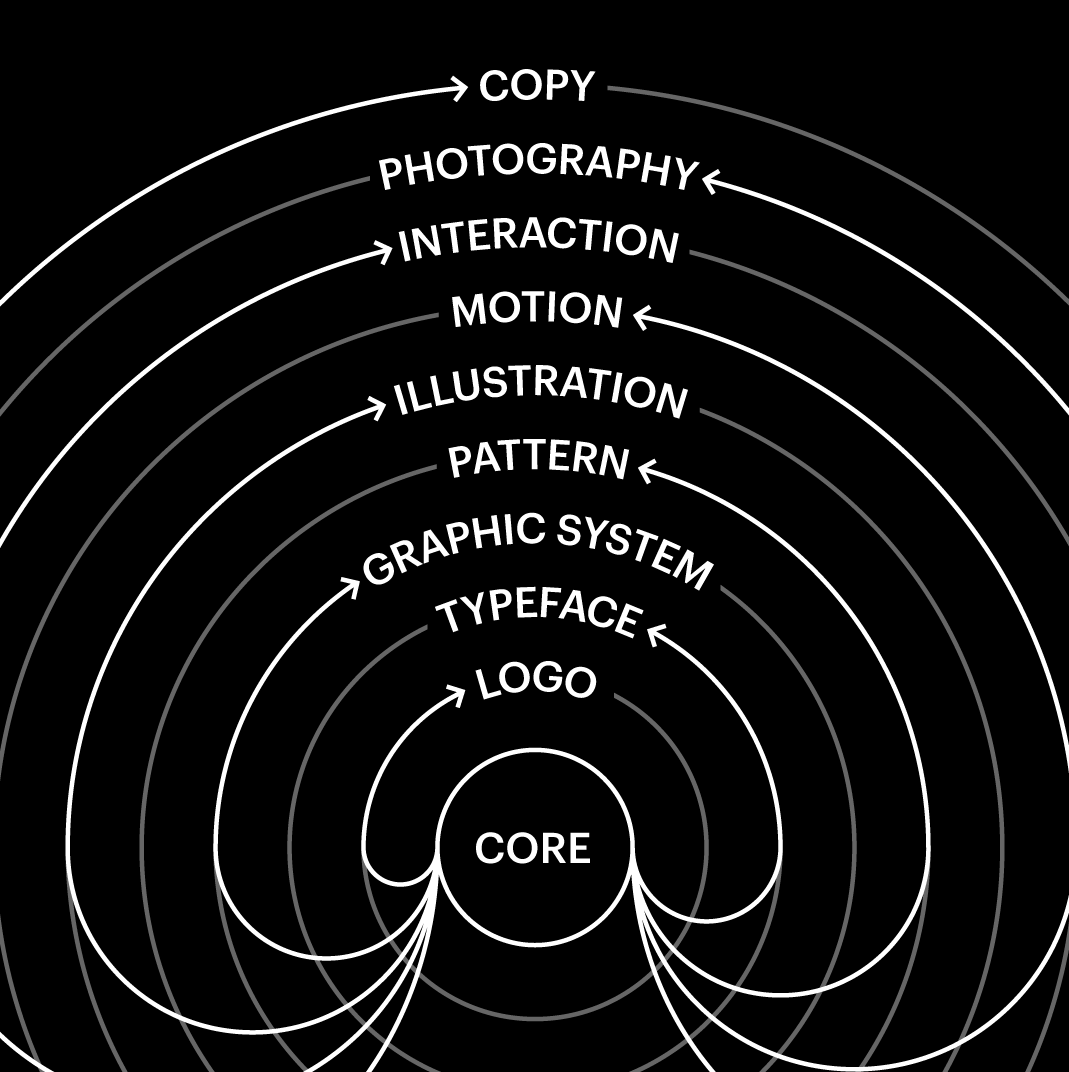
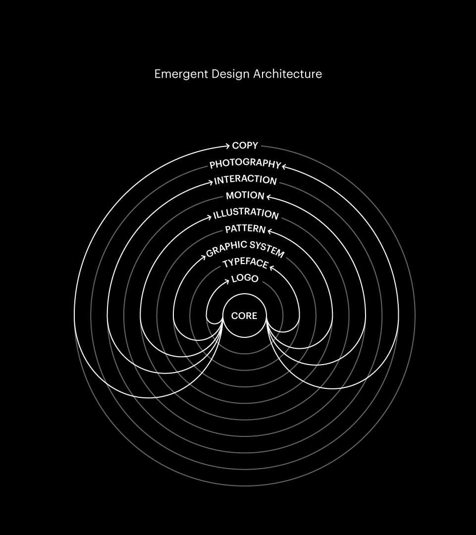
Similar to modernist design, emergent design also strives to find that nugget, but goes a step deeper and inspects the atomic composition of the nugget, and uses that underlying structure to let the rest of the design system emerge naturally from its basis. 

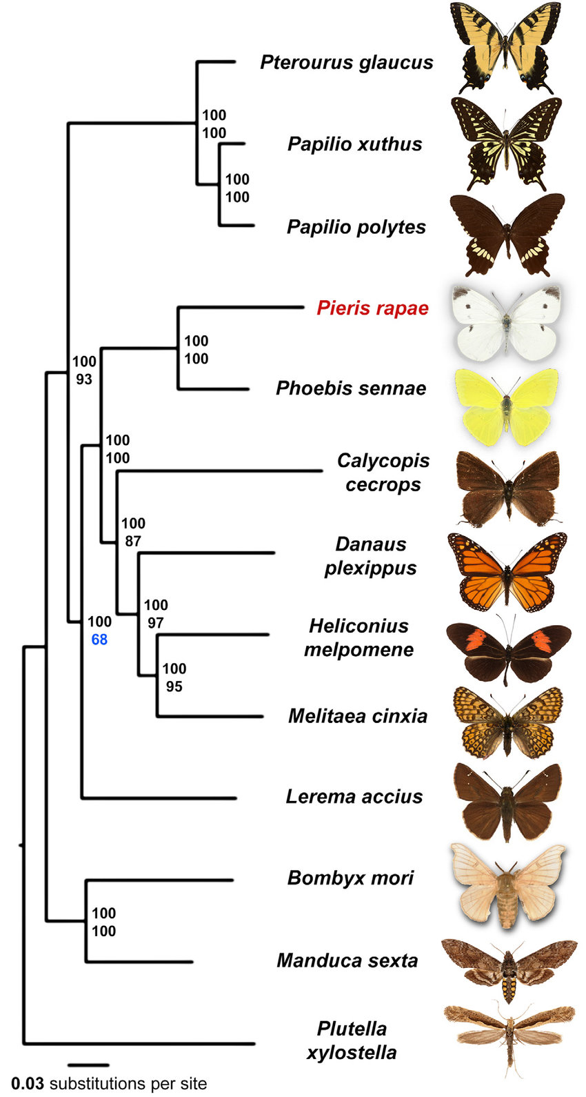
Just as nature is able to adapt to its environment, emergent design adapts to an ever-changing business environment. Take the butterfly. Within the core of a butterfly is a systemic solution to a specific set of problems, but those problems can vary across the entire planet, yet the core of the butterfly is able to adapt. Circumstances were created to benefit an insect that drinks nectar and transfers pollen across plants. This in turn became beneficial to the larger ecosystem. The butterfly never receives education or is told specifically what to do in its role, but the structure of the creature itself lets its behavior emerge naturally. 


Designing To Let Your Brand Learn on Its Own

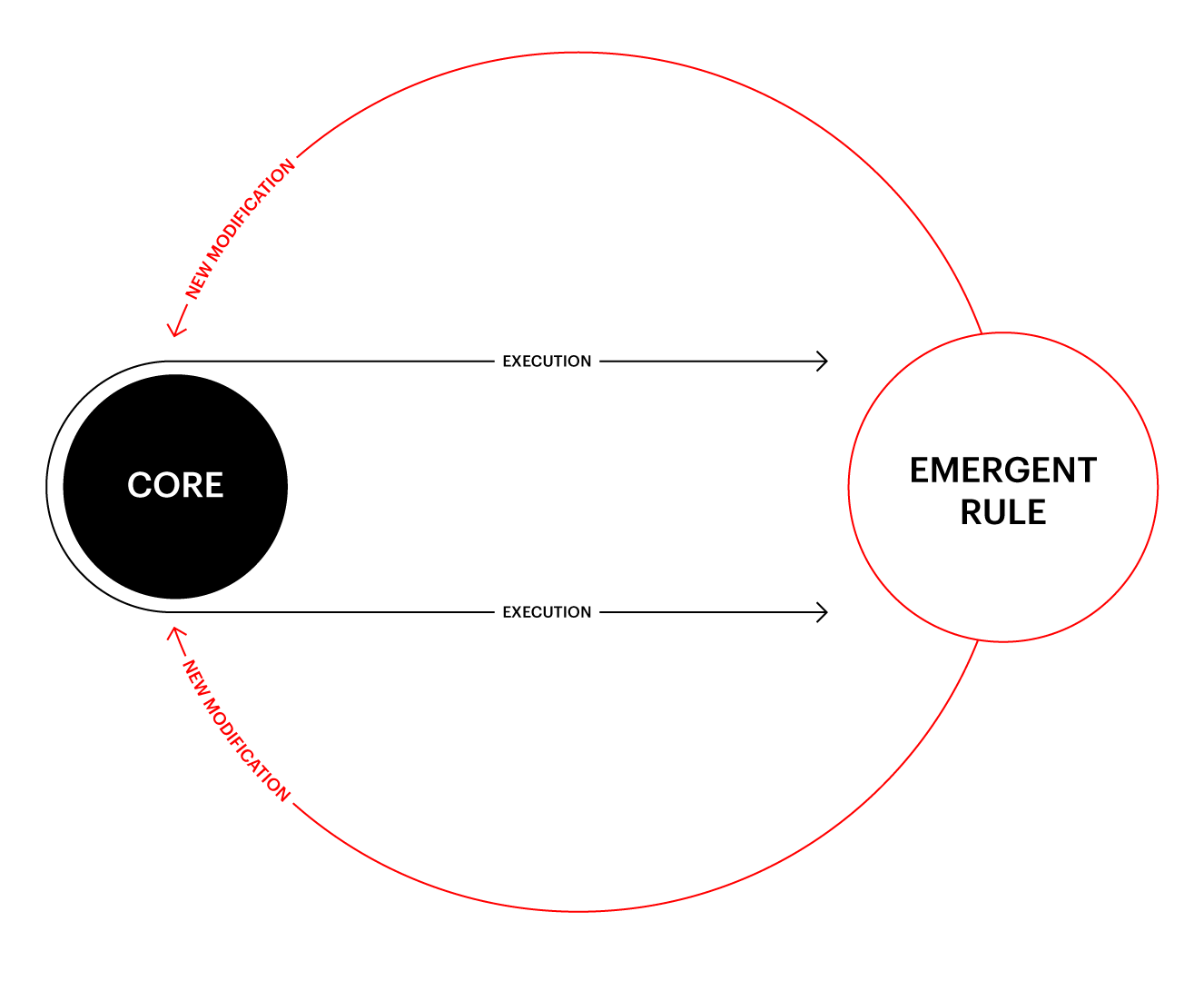
Emergent rulesets are cultivated naturally from the core of a brand in response to execution. We learn in the same way. Our core has a few properties that are true no matter what, then we are let loose to execute that core within the world. The results that we receive from our behaviors directly modify our core and lead us to change our next execution. A new rule has emerged.

Let’s say that you’re a naturally curious teenager. Your curiosity is your core and it naturally leads you to learn new things. So you pick up guitar and learn a few songs to show your friends. You get a positive reaction and a big rush of dopamine. A new ruleset has emerged. Learning new things at a deeper level facilitates your core curiosity in a beneficial way and so that emergent ruleset of deeper learning becomes interwoven with your core. This modification to the core will change your behavior to not only be curious about things, but to learn them on a deeper level in the future.

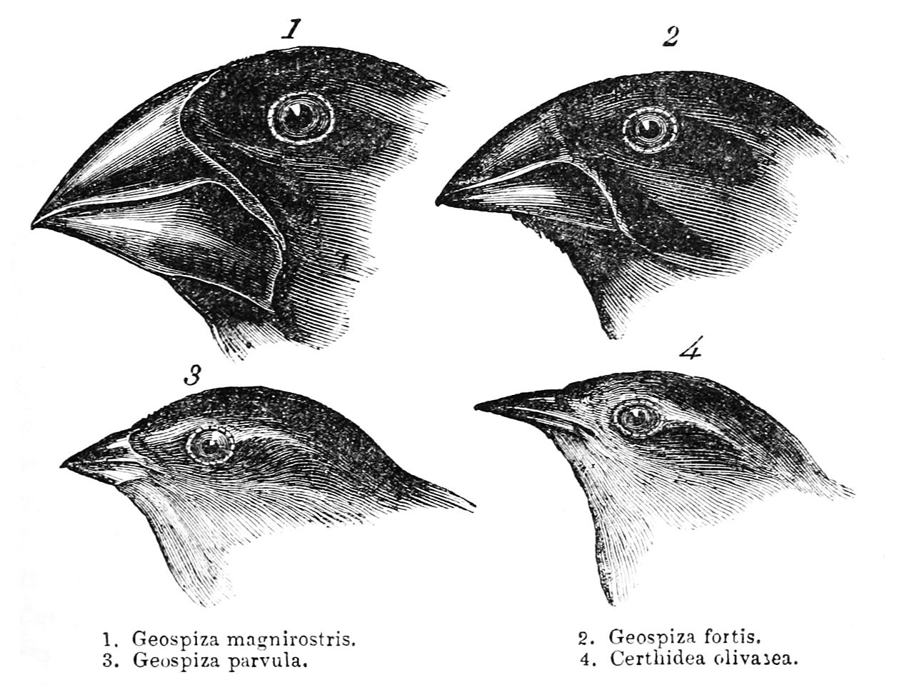
Adaptation and learning are innate characteristics to emergent design. Take Darwin’s finches below. They are of the same family (share the same core), but have adapted to their environments over time. Emergent brands do the same thing. The core is not prescriptive, but emergent. The core family of these birds did not restrict their adaptations, because if it did they wouldn’t be able to propagate as much as they have. Because the core was able to be modified from external factors, the core let an adaptation emerge in order to take advantage of a new food source. In business, this means your brand can flourish entering a new market and still represent the core of your company. 

An Emergent Brand Is Self-Maintaining

Emergent design leads to the opposite of a traditional brand guidelines document. Instead of specifying very specific instances where the system was designed to work, we instead specify the core concept and underlying structure of the brand and let the rules dictate themselves. An emergent system grows over time, it adapts to its environment, and as a result the rulesets change and grow over time as well. This eschews the typical PDF or printed guidelines document where everything is set in stone and ushers in a new era of digital-only guideline systems that are accessible and editable by your design team.

When a designer looks at an emergent brand, they should be able to take in the system from seeing just a few examples and be able to execute the system without drudging through 5 pages of what NOT to do with your logo. The componentry at work isn’t the thing that needs to be systematized. The most critical thing that a designer needs to understand about an emergent brand is what defines the core and what properties are being used to express the core.

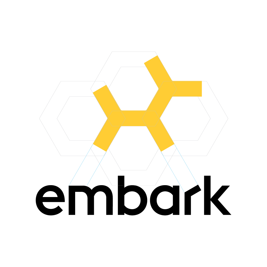
When we consider the Embark example above, this is what the core of a brand looks like. Embedded into the geometry of the mark is a series of hexagons. This is all you need to design the rest of the Embark system.

But Emergent Design Depends on the Designer

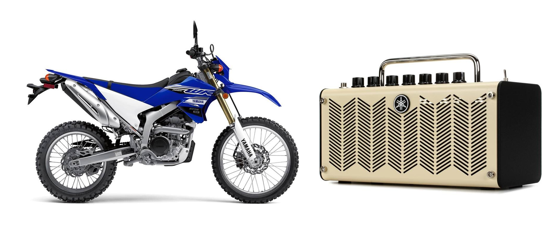
The thing about emergent design systems is that you need really good designers to see them through thoughtfully. You can’t just plug any person into your design role and expect them to be able to execute on an emergent brand. They need to be able to see the underlying structure of your system and know where to push it to adapt to your business’s needs. Take Yamaha for example. Their core is “Sharing Passion & Performance.” They make products that range from dirt bikes to professional audio equipment. If they had a strict modernist brand, both of the products below would share the exact same design characteristics. However, they don’t. The dirt bike is light, stripped-down, colorful, and aggressive. To the right, the guitar amplifier is a solid and reliable heirloom that is beautiful enough to be passed down to your grandchildren. They still stuck to their core of “Sharing Passion & Performance,” but they adjusted the aesthetic values of the execution based on the emergent nature of the forms of the products themselves and the demographics of the people who would buy them.

How To Interview Designers for Your Emergent Brand

Here are some questions to gauge fluency in emergent design and the underlying intention behind design candidates.

What is your philosophy of design?

  • See if they have a specific idea of what they are trying to accomplish in their practice. If they are early on in their career, it might be fuzzier. Avoid people who just want to make “cool shit” without any conceptual thinking backing it up.

Where do you start in your design process?

  • Look for whether or not concepting is at the start of their process, or if it’s there at all. Concept underlies all emergent design.

Can you show us an example of something where you had to research a really complex topic in order to come to your design solution?

  • It’s critical for designers to have a cogent understanding of the topic they are designing for. They are making decisions that are directly impacting the communication of the business and they need to understand it thoroughly.

What is the underlying idea in a specific project and how was that idea brought to life in componentry?

  • See if the idea extends into typeface selection, color choice, graphic system. There should be an underlying idea that has informed the whole system and that idea should be woven throughout everything.

You wouldn’t use only a hammer to build a house. There’s a myriad of problems that you run into that require special tools suited to each individual job. Emergent design allows for multiple tools and solutions to naturally occur that all remain true to your original core element. It’s a flexible methodology for chaotic times and a philosophy proven by nature for 3.5 billion years.

Emotive Brand is a San Francisco-based brand strategy and design studio.

Shedding Ego in The Branding Process

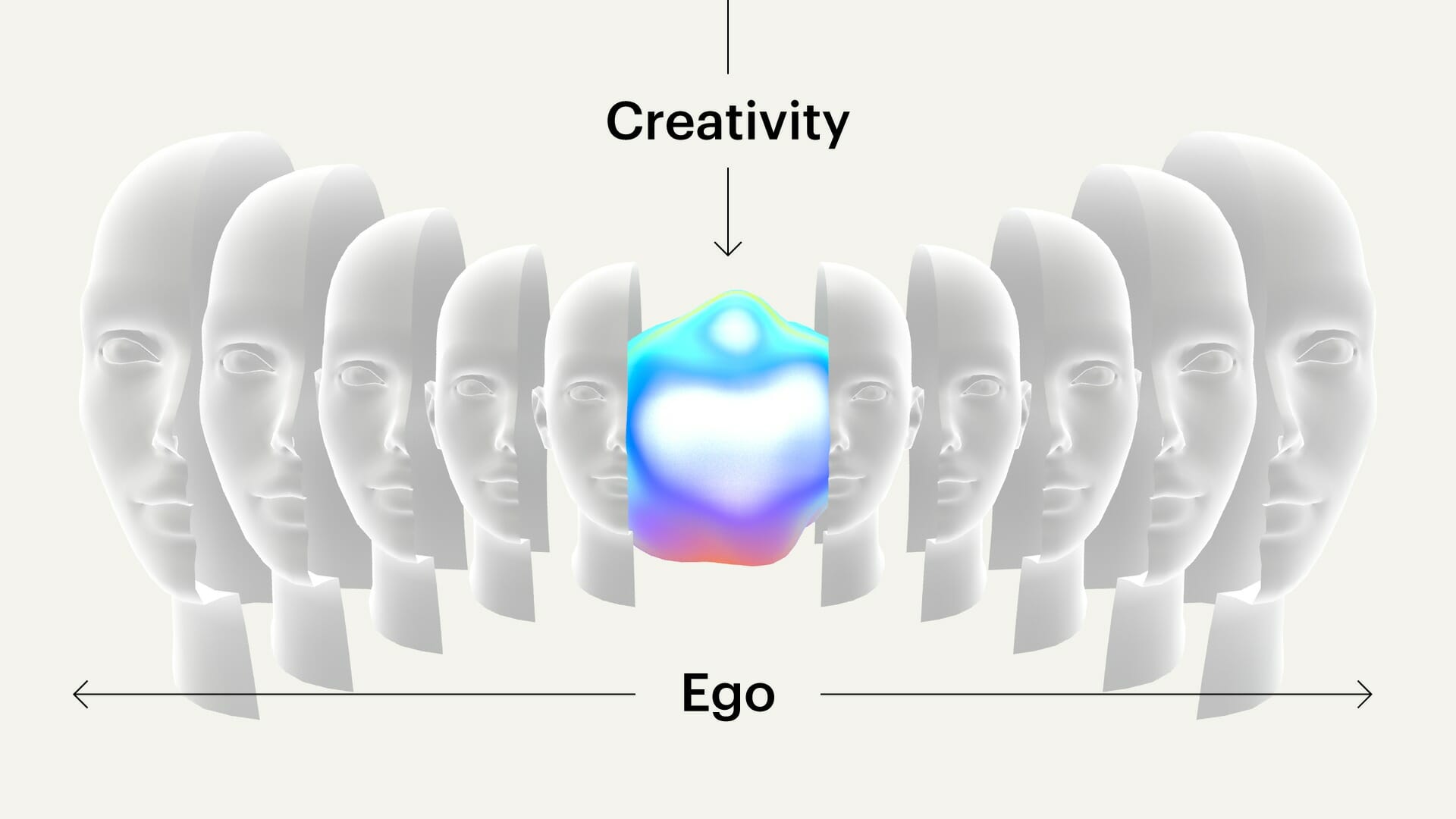
As creatives, we believe deeply in our craft and put ourselves fully into what we make. Our humor, our creativity, our problem-solving gets baked into the product. So, when work is rejected, it can feel like you’re being rejected. Add tight deadlines and multiple projects to the mix, and emotions are even higher. The key to keeping a level head is all about leaving your ego at the door and keeping a healthy authorial distance between maker and product. This is a guide for designers of all skill levels, clients, strategists—anyone taking part in the design process.

Creativity

Assume Good

If someone suggests changing the design, assume that they are coming from a good place. They want to improve the work and giving them the benefit of the doubt will not only start the collaboration off on the right foot, but it’ll also build trust over time.

Creativity

Try it on for Size

If you disagree with a piece of feedback, implement it anyway and see if it works. Your initial assumptions could either be totally wrong, or it could spur some additional inspiration that you wouldn’t have come to otherwise. The important part of this is to actually try and be an advocate for the thing that you may have initially disagreed with. If you can design from their viewpoint, you might uncover the root cause of the piece of feedback and be able to address it better.

Creativity

Yes and…

If you’re collaborating with someone and they mention an idea, try to build on their idea even just a little bit. They have given you a nugget and you can help them shine it into something amazing. It takes a lot of courage to share ideas. If you have made a safe environment to share thoughts, you’ll uncover gems that otherwise would be kept secret.

Creativity

It’s Not YOUR Design, It’s THE Design

Remember that no matter what, everyone’s job is to work together on the design. It is not your solo creation to be hung in a museum long after you’re dead. It’s a communal work that is being refined by multiple people. This helps distance yourself from any feedback that might sting. Oftentimes, when people are criticizing a piece of work, they are trying to improve the work—not make you look bad.

Creativity

Liven Up the Mood

Even if you feel very attached to a design you’ve been working on and someone points out a flaw, use that as an opportunity for humor. Oftentimes, if you can shift your perspective to the person who criticized the design, you can find a joke to make about it. Humor doesn’t just lighten the mood and facilitate good collaboration, humor has a sneaky way of lowering our own defenses and opening our minds to new ideas. Many brilliant ideas start out as “joke ideas,” something we throw out impulsively, wildly, provocatively. People don’t judge them with the same mind frame because “it’s just a joke.” And this type of playful ideation makes “joke ideas” become real ideas, with real impact.

How it Happens in Practice

Imagine you have an internal design review in 2 days—this time around everyone is expecting the work to be fully designed. Strategy will be there, client services, project management, and the managing director might stroll by. But your designs are stuck, you can’t seem to push through. Instead of trying to break through that wall on your own, take initiative and reach out to someone. Ask them how they’d make it cooler (instead of asking for their feedback). This starts the conversation off as immediately collaborative and frames it so that what they suggest is already going to be an improvement. When they think of something, get stoked about it. Really, let yourself feel that emotion. Then execute their suggestion. It may feel like you’re going down the wrong path, but it’s an open door that will let you get through that wall that was blocking you before.

5 Quick Tips:

  1. Get fast. If it only takes you 20 minutes to make changes, it won’t be that big of a deal. But if it takes 2 hours, then feedback hurts because you know you’re staying late.
  2. Meditate. 10 minutes a day, focus on your breath. This trains the brain to stay calm in situations that are overwhelming.
  3. Write it down. If you don’t, you’ll forget it and you won’t do it.
  4. Be proactive. Ask for feedback. You’ll become accustomed to receiving it gracefully.
  5. Practice. The goal here isn’t to be perfect. In fact, it’s the opposite. Shedding your ego is an ongoing practice that takes regular maintenance. Shedding your ego doesn’t need to be an earth-shattering event. It can be a series of small moments that are strung together.

Emotive Brand is a brand strategy and design agency in Oakland, California.

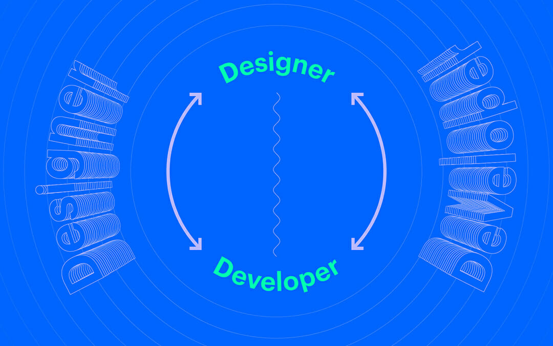
When Designers and Developers Collaborate, Everyone Wins

A great developer recognizes and enhances design decisions. A great designer understands the technology they are designing for. Both developers and designers need to have an intimate understanding of each other’s fields in order to produce better experiences for brands.

In order to deliver a bespoke experience for a brand, a collaborative environment needs to be fostered.

How to Actually Collaborate

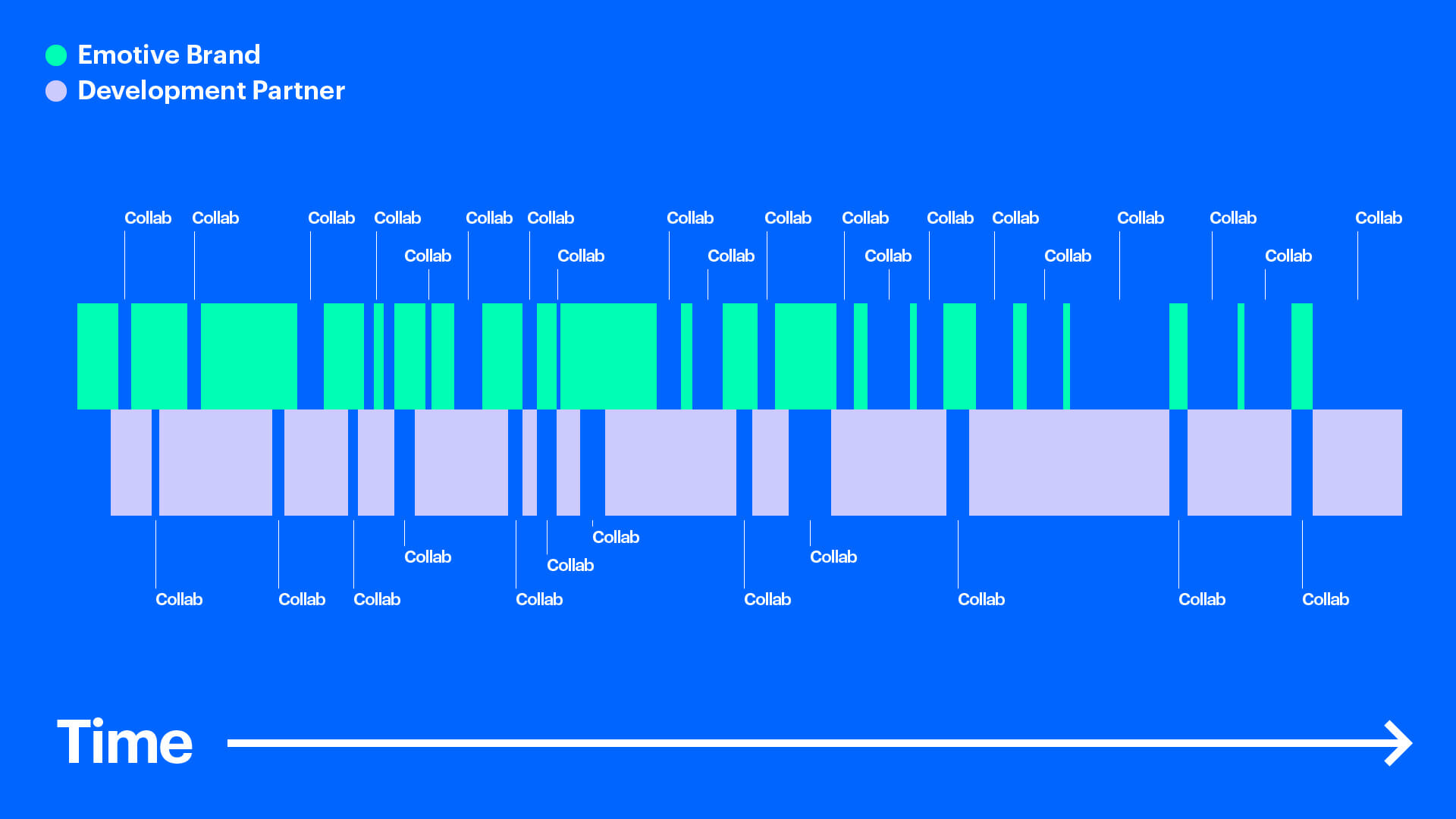
A key element to facilitating design and developer collaboration is reshaping the reviewing process. The traditional way is to do a bunch of design work upfront, get client approval, polish the entire project, and hand it off to a developer completely “designed.” This often results in quite a few design decisions being compromised because of poor documentation, developer interpretation, or non-feasibility.

The new way of doing things is beyond agile—it’s actual collaboration.

Collaborate

Setting a frequent and casual cadence of check-ins between designer and developer not only speeds up each other’s workflows, but it also allows each party to influence each other’s practice. True collaboration is a developer showing a designer an interaction that is 50% of the way done, so that the designer can fiddle with the code in order to make it perfect. True collaboration is also a designer showing the developer what they are thinking for design early on, so that the developer can raise any flags or offer suggestions to improve the design.

Using contemporary tools is the best way to achieve this type of working relationship. Gone are the days of sharing Sketch files over email and setting calendar events where eight people on the agency side show up to have a formal conversation with a developer.

Today, we use Figma so that the developer can see and modify the designs as they are being worked on. We use Slack to keep in communication on a regular basis and have video/screen share calls when reviewing things that keep updates frequent and easy.

Building Collaboration via Overlapping Skill Sets
To actually collaborate with someone, having overlapping skill sets is key. If each party has an understanding of the other’s expertise, they can make decisions together confidently. This also establishes trust between one another. For example, if a certain interaction is going to be too time-consuming to develop, the developer can offer a suggestion that is rooted in the agency’s design expertise. This is great when needing to come to a consensus on changing a piece of the design to fit the timeline since we can trust that the developer’s suggestion is going to be feasible. It also gives designers a new model of interaction to design against, so we can refine the design accordingly.
Building Collaboration via Remixing

When you have two parties with overlapping skill sets, the other party will often take the idea you have designed and enhance it.

Internally, we used our knowledge of front-end development to deliver custom interactions to our developer Cory, and he would surprise us by making them even better in his implementation. This type of relationship is critical in creating a site that expresses the brand to its fullest potential.

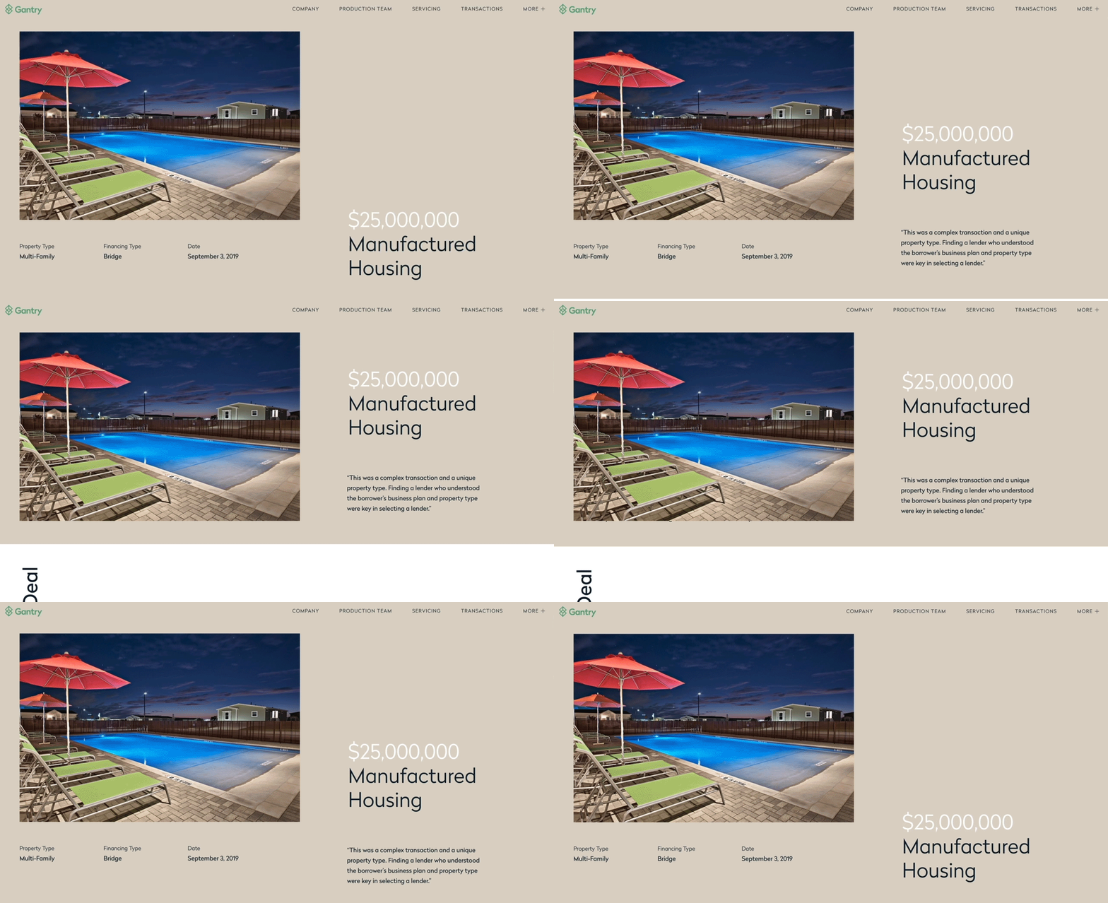
To be technical, our original design intended to use CSS to pin one part of the design while the rest scrolled. The developer went even further and added an overlap to the pinned area once a certain scroll threshold is reached.

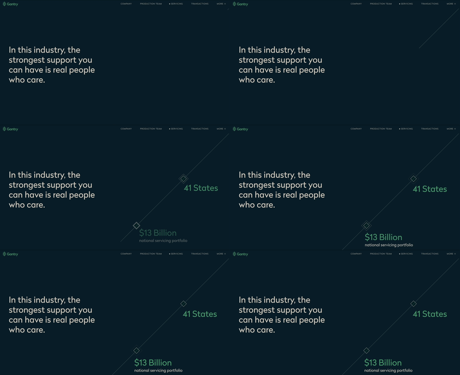
This design was enhanced in implementation because the developer split up a Lottie animation and CSS animations that aligned perfectly with the timing. This needed to be implemented this way because the text needed to be editable in the CMS.

Start Today

The best way to build a culture of true collaboration is to start actually collaborating with people today.

Are you working on a document that you are trying to perfect before sending off? Get on a screen share and get input from a developer.

Do you work with a team that has a skill set you don’t have? Start learning their skills, gain empathy for what their jobs are, and bring them into the conversation. Show that you care about their craft and that you’re willing to learn outside of your role in order to make something better than you could have done alone.

Did someone send you a project to execute? Think creatively about it and enhance it beyond what they were expecting. Those little one to two-hour experiments add up over time and really improve the quality of what you’re working on.

Emotive Brand is a brand strategy and design agency in Oakland, California.

The New Web: How Development Tools and Collaboration Enable New Design

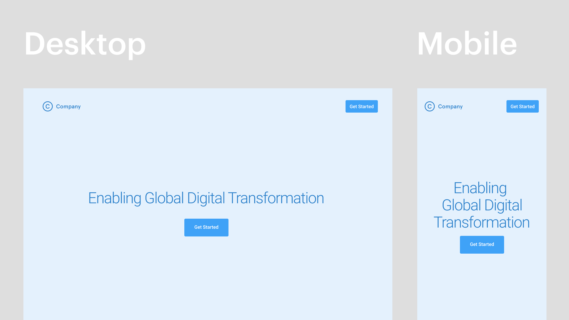
From 2007 until very recently, the web was infiltrated by the same design patterns. Everyone is familiar with this: a generic headline with a call to action, three icons below describing features, and a few full-width, black-tinted images with text on top.

When Sketch burst onto the scene in 2010, the web design discipline sped up, but the developer hand-off process was still tedious. Dimensions were specified using redlines, and the web was built with block and inline elements. Flash was dying, and there were no tools for designers to easily bring their more expressive designs to life. Mobile browsers were, for the first time, making a huge dent in the web’s traffic and the current desktop designs were failing.

Between 2007 and 2010, dominant patterns emerged and were swiftly distributed across the web, otherwise known as Web 2.0. Sites were designed as “mobile-first,” and the same design needed to grow to desktop. The result? A simplification of UI, a flattening of design expression, and designs that were nearly indistinguishable from each other.

Web Two Dot Oh No

In the same way that designers weren’t yet educated in development practices, developers were often blind to design decisions. Due to the time spent learning Web 2.0 development practices, developers would take redlines and build them to spec with little improvement on the design. In the early 2010s when web design patterns were so new, designers weren’t comfortable pushing the boundaries. It was impossible to find rules to break while still creating a successful design on multiple platforms.

Developers started building tools to educate designers on how they could use their new playground. Prototyping and animation toolsets started appearing, like Principle, Framer, and Invision, which gave designers tools to bring their work to life through animation and interaction. On the dev side, new technologies like flexbox, CSS transitions, Lottie, and most recently canvas libraries like three.js and p5.js gave developers tools to seamlessly bring those animated designs to fruition—instead of hacking designs together with jQuery. Additionally, tools like Zeplin sped up the transition between design and development, allowing both departments more time for creative expression.

As the crossover between design and development increased, the line between the two disciplines blurred and a design resurgence occurred. A new generation of designers emerged that were comfortable designing for the web with these new tools from day one. Graphic design became a key component to what was previously specified as interaction design, as designers could be more experimental with elements like layout, typography, and color. Web tutorials and resources like codepen.io, CSS-tricks, and DevTips let designers in on the new tech that was being developed for the web and how they could employ it in their designs.

Welcome to the New Web

This merging of graphic design, interaction design, and new development practices has created a New Web. This New Web is rooted in the principles of design and comes to life through the collaboration of contemporary development practices. In fact, a savvy designer can create a New Website using a tool like Webflow which incorporates design and development into one seamless tool.

The key to creating a New Website is to get developers in on the conversation as early as possible. Showing them the thinking behind a design, and being open to modifying as needed can be the difference between a static site or a great brand expression. The more frequent these conversations happen, the more opportunities there are for collaboration. On the other side of the coin, developers who are open to non-traditional designs and to learning new technologies can be the turning point in making a great site.

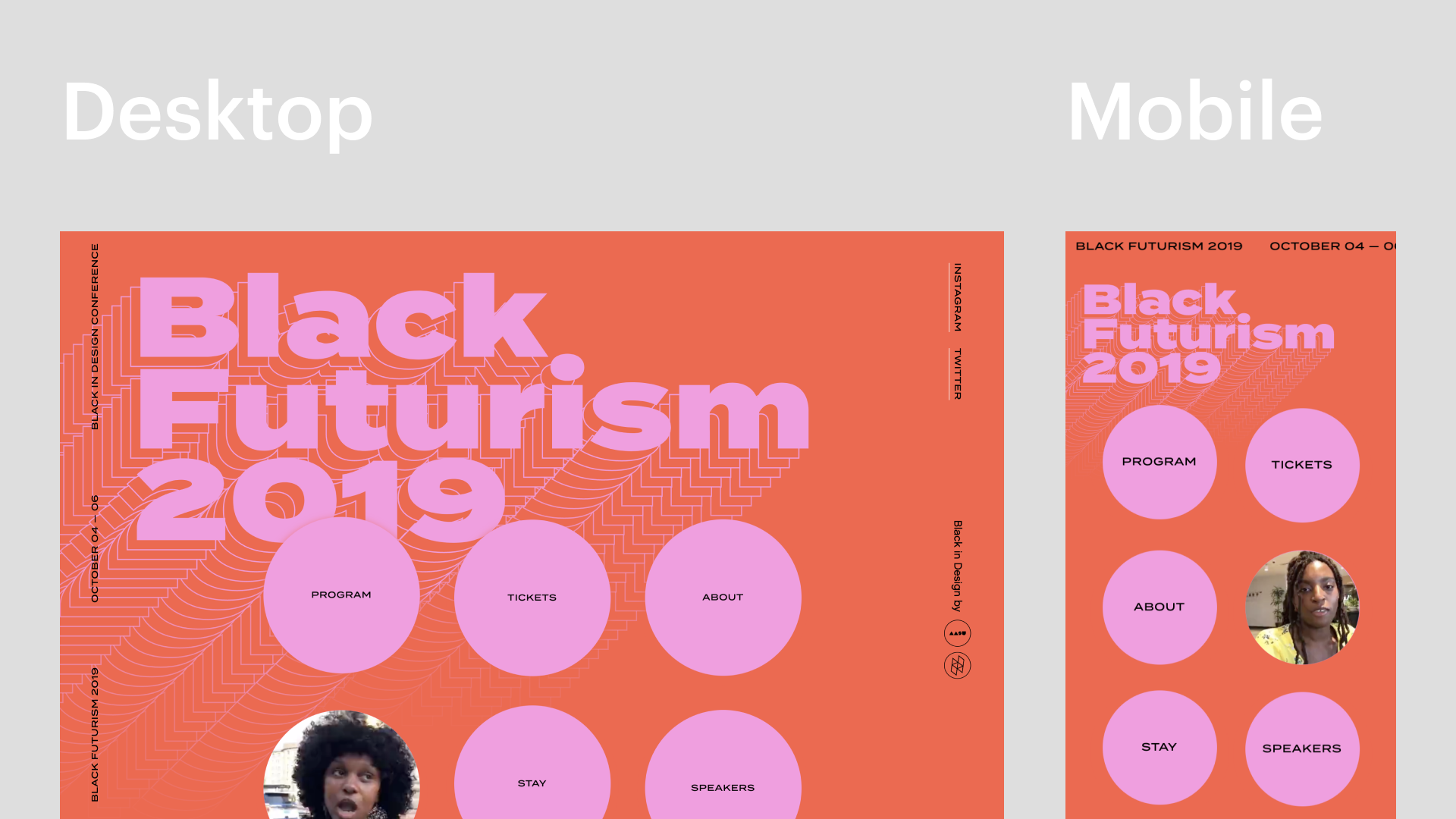
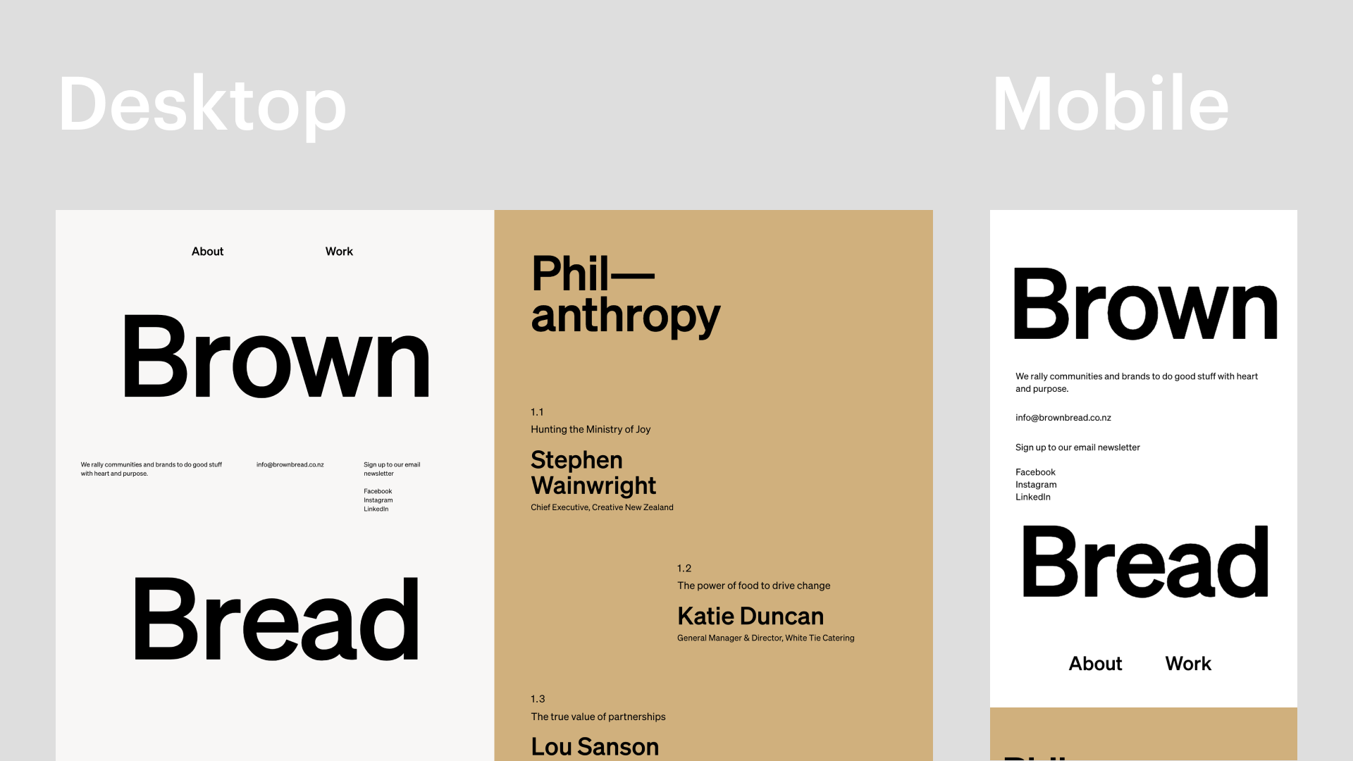
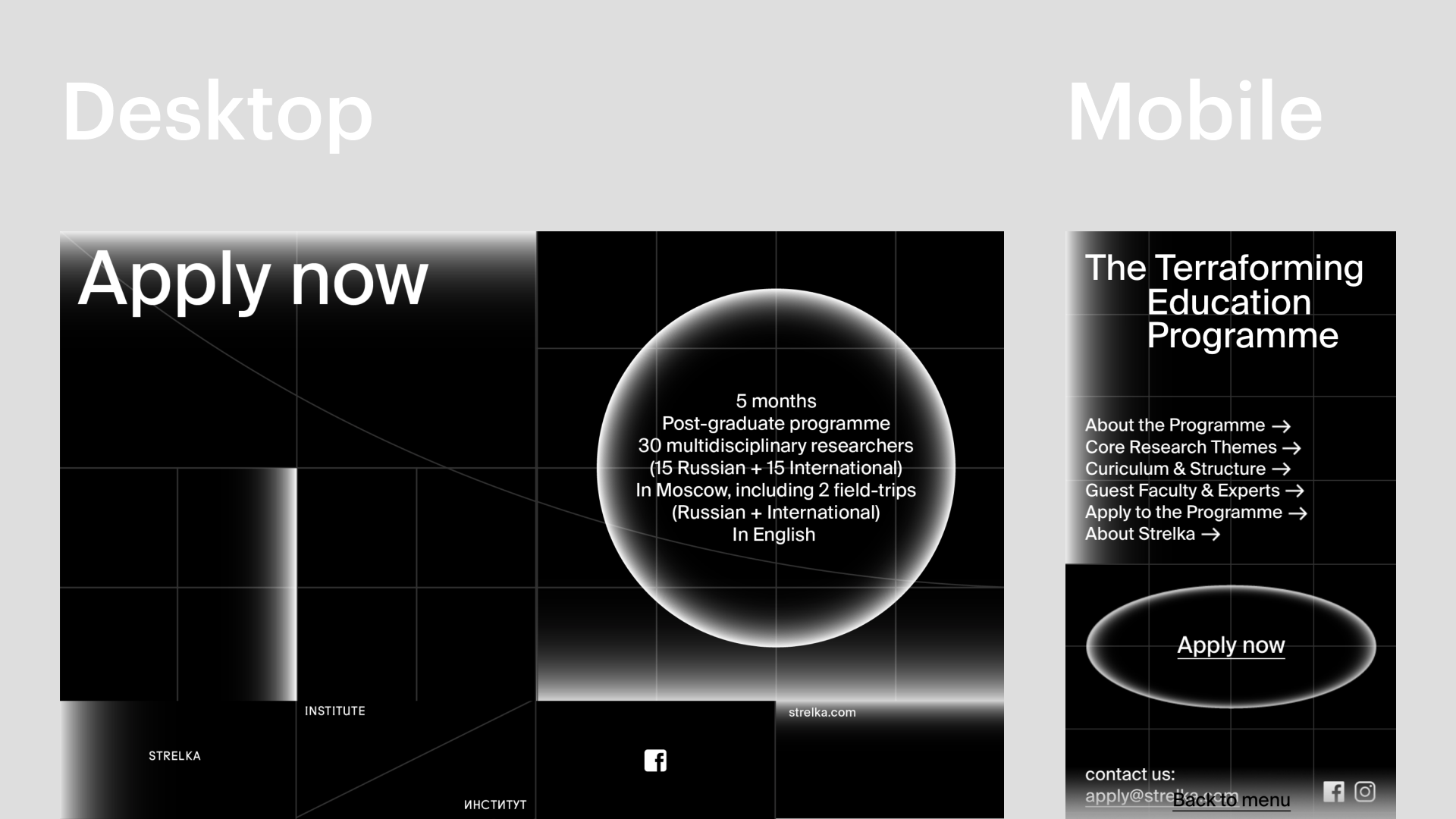
New Web can be as avante-garde as you can imagine. No forms are off-limits, as long as you spend the time designing a mobile experience that achieves the same goal as your desktop design. This allows for more specific and greater brand expression. A New Website creates a custom experience for a brand that stands out from the pack as memorable and clever. This also allows for cohesion between web, print, event, and motion in a brand system.


There is no excuse for an average-looking site today. For many companies, your website is your lifeblood. It’s the first point of contact, a funnel for sales, a magnet for attracting top talent, and a vehicle for radical creative expression. There have never been better resources for building than right now—and that’s because the people who spend their days making websites are the ones actually making the tools. Both designers and developers must continue pushing the boundaries to take the New Web into uncharted territories.

Emotive Brand is a brand strategy and design agency in Oakland, California.