Overlay
Let's talk

Hello!

Don’t Let Your Product Ruin Your Brand

It’s a tale as old as time. You can’t sell product without a brand; you can’t sell brand without a product. Product designers and brand designers are sometimes viewed as adversarial disciplines, but in truth, both sides are working toward the same goal with different tools. But what’s the right balance? And how can you get the best of both worlds? To begin, a bit of level-setting.

Product Designers

Product design is commonly defined as the approach to building a new product from start to finish. This encompasses market research, identifying problems, product development, designing informed solutions—and everything in between. It is a practice that values analytics, speed, efficiency, and multiple iterations, so it should come as no surprise that the role of product designers has exploded in the age of startups. Most of the time, product designers are working with an established toolkit and experimenting with how best to implement it.

Consider this clip from The Founder wherein they mockup a version of a McDonald’s kitchen on a tennis court. The way they are thinking about design is decidedly not about how it will make customers or employees feel when entering the restaurant, it is about what levers can be tweaked to create a burger in thirty seconds.

“While every project is different, there is a paint-by-numbers approach to the visuals that can happen in product design,” says Senior Designer Jonathan Haggard. “It tends to be very mathematical and results-driven to get to the design. Deciding a color works because it signifies a specific goal which can be tested. Technically, you can be a fantastic product designer and still have an unappealing aesthetic.”

As outlined by the UX Collective, the main tasks of a product designer are to:

– Define different scenarios and build interaction patterns
– Use tools that help them study user behavior (UX)
– Create interface prototypes (UI) and create the logic of the product with wireframes
– Pose and analyze different tests (A/B) to verify that this is the best product that can be offered
– Transfer the status and needs of the product to the Product Manager

Brand Designers

Creating a brand, on the other hand, is a completely different story. In the words of Seth Godin, a brand is “the set of expectations, memories, stories, and relationships that, taken together, account for a consumer’s decision to choose one product or service over another.” Whereas brand may once have been confined to a logo, it now extends on-and-offline to encompass visual identity, photography, video, copywriting, events, experiences, and behaviors. The tall order of brand designing is constituting a system that can hold all of these different elements and form an identity that not only feels right for today, but is flexible enough to grow for tomorrow. By definition, brand designers will not have analytics for every decision and there is an element of risk in decision making.

Action vs. Reaction

To be clear, companies need stellar product and brand design. But in the age of analytics and big data, when it has never been easier to make every single decision a numbers game, we argue that companies have over-indexed on product design thinking. If you’re always reacting to analytics, it’s incredibly difficult to surprise, provoke, or differentiate yourself because you’re letting what’s there dictate what could be.

There is a video from 2006 that still gets passed around between designers. It asks the simple question: What if Microsoft designed the iPod?

“The fact is that great design is a mix of art and science, and in a world run by product, where is the art?” asks Creative Director Thomas Hutchings. “Results and testing are incredibly important, but they will lead you to familiarity. If you want to pave the way for new thinking, you need an element of risk—you have to resist the urge to test everything and be comfortable with the fact that ground-breaking stuff may be poorly received at first.”

“The tricky thing about product design is that it is all about patterns, without necessarily an investigation of whether those patterns are good or bad,” continues Jonathan Haggard. “If you make a change to the pattern, some product designers will ask, ‘Does Google or Apple do that?’ It’s a fair question, but that’s not how you break the mold. That is the mold.”

Stay Weird

In a perfect world, you adopt best practices without losing your appetite for risk. Because while business is, of course, a business, there will always be an unquantifiable element of art, of storytelling, of magic that brings it all together and elevates your rational strategies to a higher emotional plane. You can’t get there by brain alone. You need heart.

In his great article, “When Product Design and Brand Join Forces,” Rob Goldin says, “Often as product designers, we develop such a deep empathy for customer needs, fears, and desires, that it can become a natural extension of our thinking from product requirements to emotional brand attributes.”

And that’s the ticket right there. A willingness to blend the rational and the emotional, the analytical and the unknown to create something larger than the sum of its parts.

Emotive Brand is a brand strategy and design agency in Oakland, California.

What Makes a Perfect Concept Statement?

Over the course of a branding project, there are thousands of micro-decisions to make along the way. As much as possible, agencies try to establish a common way of seeing and evaluating work to minimize decision fatigue. In our case, we create an Emotional Impact and a Brand Idea. We start by identifying four emotions we want to evoke in our target audiences, and then craft a big idea that brings these emotions to life across business, brand, and culture.

The thing is, as much as you try to establish frameworks and lenses and litmus tests, you can only ask a client to hold so much in their head at any given time. No matter how much groundwork you lay or how many recap emails you send, when you pitch a creative concept you are always essentially starting from scratch. You are always contending with someone’s aesthetic knee-jerk reaction. A gut feeling will always supersede a creative brief.

This is where the power of a perfectly crafted concept statement really shines. When deployed well, a concept statement is a distillation of strategy, a mini-narrative, and a sneak peek of an imagined future, all at the same time.

What Is a Concept Statement?

To put it simply, a concept statement is a small look at a big plan. They are short descriptions of products, services, or designs that help people visualize a particular vision of the future. In general, a basic concept statement provides a description of the business, defines the problem, identifies the target market, implies how the product or service will address this problem, and outlines the goals and objectives.

Above all else, a concept statement is a persuasive tool in decision making. If everything preceding this meeting has been stage-building, this is the last monologue before the audience reviews the play.

Brevity & the Iceberg Theory

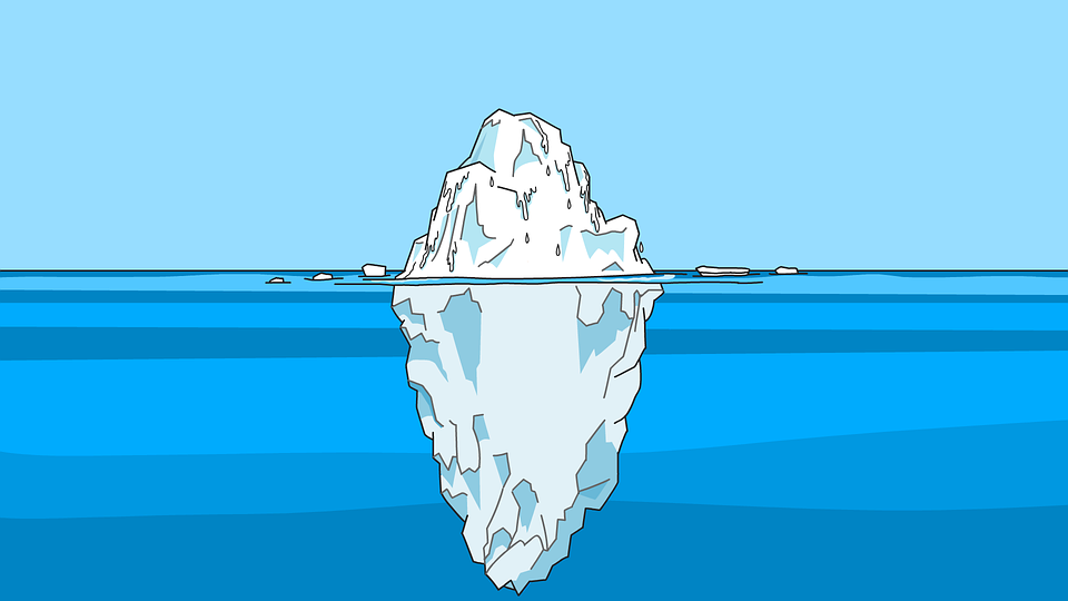
Before he was a novelist, Hemingway worked as a reporter for The Kansas City Star, where he quickly learned that truth often lurks below the surface of a story. This insight would lead to his trademark minimalistic style, which academics have coined as Iceberg Theory or the Theory of Omission. “I always try to write on the principle of the iceberg,” writes Hemingway. “There is seven-eighths of it underwater for every part that shows.”

When writing a concept statement, there is an urge to be as descriptive as possible, explaining every detail and nuance of the design to the client. This is a mistake for two reasons. One, you simply don’t have enough room, as a concept statement should only be one paragraph. And two, there is no mystery, no intrigue, and no magic in an exhaustive explanation. Part of our job, as an agency, is to help our client imagine. Imagine how their brand can grow, evolve, move into new territories, disrupt old spaces, speak, build, and behave in unexpected ways. That means leaving enough room for them to fill in the blank. That means speaking to the potential of what the design could be, as opposed to what is directly on the page.

Show, Don’t Tell

The implied risk, of course, is that you leave something important out. For one thing, you have to trust your reader. They are always smarter and willing to take bigger risks than you think. And two, that’s where design can help. Through the use of motion, storyboards, and applications, design can help you “show, not tell.” When a pithy concept statement is paired with powerful design, you have everything you need to make the cognitive jump into the future.

Hemingway’s biographer Carlos Baker said that Hemingway learned how to “get the most from the least, how to prune language and avoid waste in motion, how to multiply intensities, and how to tell nothing but the truth in a way that allowed for telling more than the truth.” Essentially, that’s exactly what a concept statement strives to do:

– Tell the most compelling story in the fewest number of words
– Crystalize strategy down to its purest components
– Amplify emotion
– Address the big picture, stay out of the weeds
– Project an unexpected but implementable end-state
– Merchandize every concept statement with a name and a hook
– Create a whole that’s larger than the sum of its parts

There are a million ways to “sell an idea,” but the best concept statements shouldn’t feel like flowery salesmen trickery. They should feel like a natural distillation of a larger story you and the client are writing together.

Emotive Brand is a brand strategy and design agency in Oakland, California.

Introducing the Art of Symbols: How Ancient Symbols Inform Brand Design

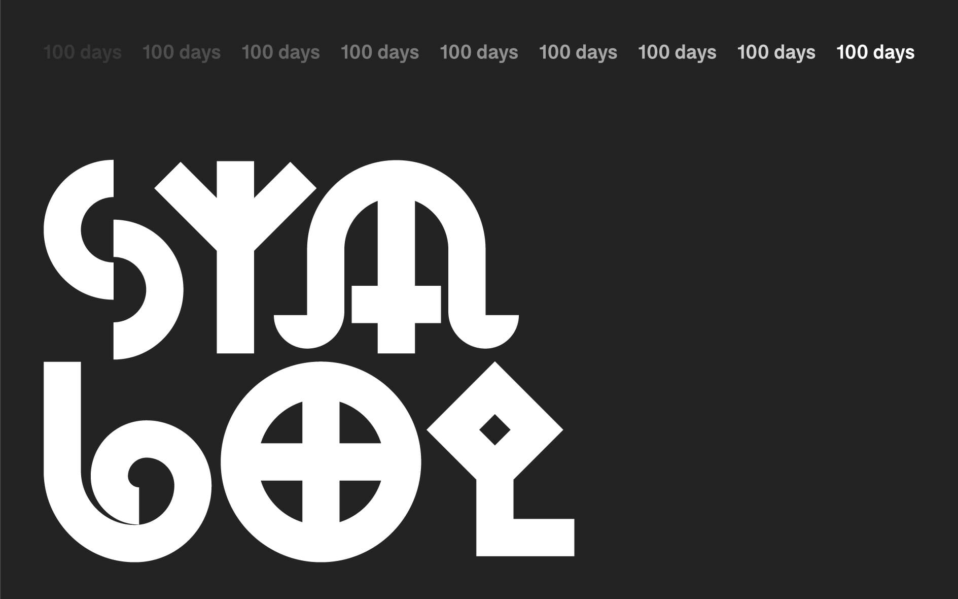
After successfully completing the #100DayProject, Emotive Brand is thrilled to launch the Art of Symbols, a website exploring how ancient symbols inform contemporary brand design. Check it out!

The Art of Symbols

As previously discussed, the 100DayProject is a free art project started by Lindsay Thomson that takes place online. Every spring, thousands of people all around the world commit to 100 days of exploring their creativity.

“It’s a lot to commit to, 100 variations on a theme,” said Jonathan Haggard, Senior Designer. “Just like creating anything, the first 90 are the expected and routine, and it’s not until you feel like you’ve scraped the bottom of the barrel that the truly creative stuff comes out.”

The Power of Side Projects

At Emotive Brand, we’ve long believed that side-projects are not only important to keep us inspired and flex new creative muscles, but that it makes our client work much stronger.

“Side projects are critical for me,” continued Jonathan. “I like to keep my momentum going, so when I have a few hours in between client work, I can fill that with some creative exercise. This also pushes me outside of my comfort zone and allows me to learn about subject matter that I may be curious about, but haven’t had a reason to pursue.”

In terms of our next project, we will be exploring Emotive Branding—our methodology of digging deep into a brand’s products and services and finding emotional connections to the needs, beliefs, interests, and aspirations of its target audiences. It’s about aiming for a meaningful outcome from your commercial endeavors, and recognizing that when you touch people in meaningful ways, they pay you back.

Emotive Branding

When it comes to brand strategy, you may not always have all the answers—but chances are, you know exactly how you want your brand to make people feel. If you can hone in on that emotional impact: your employees work with greater purpose and get more satisfaction from their work, your customers become more loyal, and your supply and distribution chains become more responsive to your needs.

This isn’t about creating “emotional” advertising that gets people all misty-eyed about your widgets. Rather, it is about conveying meaning and evoking emotions that draw people closer to you—and sets you apart from your competition. When brands deliver in these ways, it is one of the most powerful ways to differentiate, grow revenue, hire top talent, and more easily deliver customer success stories.

“We are in the process of bringing new life to the 300+ emotions we use with all of our clients,” said Beth Abrahamson, Senior Designer. “Emotions are super intangible and super personal—one feeling can mean twenty different things to twenty different people. We hope that by honing in our interpretation of them, we can provide clients with an Emotive Branding language that is relatable, impactful, and artful.”

Whether you’re an artist, an agency, or just an avid fan of symbols and their histories, we hope you enjoy exploring the Art of Symbols. And as always, keep an eye on our Instagram to stay up to date with our creative projects.

Emotive Brand is a brand strategy and design agency in Oakland, California.

Turn Your Instagram Into a Playground for Experimentation

Instagram is incredible. All in one app, you can feel jealous of other people’s lives, hungry for other people’s food, and intimidated by other people’s makeup routines. When it comes to brand strategy agencies and design studios, Instagram tends to be used for either sharing polished client work or photos of employee’s dogs (equally important).

But more and more, we’re seeing studios break out from the norm and utilize the platform as a playground for design experimentation. Turning the web into their own personal focus group, agencies are sharing weird sketches, creative side projects, and honing new skills.

The Art of Symbols

Recently, we completed the #100DayProject on our Instagram – an experiment in reimagining 100 symbols through illustration and motion design. Part creative marathon, part research assignment, it was a fantastic way to test-drive some new ideas. Outside the typical constraints of a client project, we could ideate and follow our curiosity wherever it led us.

https://www.instagram.com/p/Byq0UOFh8k7/

As Senior Designer Jonathan Haggard says, “I think there’s something about quick validation via Instagram. I’ll throw ideas up on Instagram that I’m not sure if I should keep pushing. If it gets a positive response, I’ll keep going. And if it doesn’t, I know that it might not be worth pursuing. I don’t have to work at something for months to finally unveil it in some grand gesture.”

Testing, Testing

DIA studio specializes in kinetic typography, and they utilize their Instagram as a veritable gymnasium for moving type. Alongside client work, they showcase tests, attempts, and chaotic exercises. Maybe there’s an assumption one should only post perfect works from your portfolio to appear “professional,” but bringing the client in on your thinking shows your brilliance in another way. From a strategic and artistic point of view, people love gaining insight into the process.

https://www.instagram.com/p/BhuwyAcFpbQ/

As Design Director Robert Saywitz says, “Social media has completely changed how we think about design. Instagram is a positive tool for design firms to share their own work – and work that inspires them – with the world. The impact of that instant access, compared to say, ten or twenty years ago when you’d have to hunt through websites or printed design annuals to connect with work, is massive. It’s also a beacon for finding agencies you’d like to work for.”

Unexpected Collaborations

Pentagram, the world’s largest independent design consultancy, created a yearlong data drawing collaboration between partner Giorgia Lupi and information designer Stefanie Posavec. Each week, for a year, the designers sent each other a transatlantic postcard with analog, hand-drawn data describing what had happened during the week. Over the course of the self-initiated project, the pair became good friends, using data as their primary source of communication.

https://www.instagram.com/p/Bzizc1DBDve/

As Creative Strategist Chris Ames says, “I love the idea of treating Instagram as an imperfect, collaborative tool between creatives. There’s a sleekness and polish to the digital age that we should push back against. I want to see process shots, behind the scenes sketches, the joke ideas that never made it to the client.”

The World Is Your Mood Board

Spin Studio, a graphic design agency in London, treats their Instagram as a constant source of inspiration. From experiments in typography to their travelogue photography, they capture whatever intrigues them. Everything is potential fuel for better client work. So often, projects become hermetically sealed within the confines of a studio. If we’re making work that ultimately goes out into the world, shouldn’t we turn a critical eye to the world around us?

https://www.instagram.com/p/BysUIhAB6ZF/

As Designer Keyoni Scott says, “Mobility is really powerful. Being able to always be in touch with a studio’s work and the new inspiring things they are doing is amazing. So, I think it’s really important to do quick experiments and just put your work out for people to see. I think everyone sees things differently and can be inspired in different ways, so you can’t be afraid to just put your work out there.”

Keep It Weird

Chances are, your website already has a section for case studies. Instagram doesn’t have to be your portfolio. Instead, it can be a repository for your 3 a.m. ideas, your moonshot designs, and wonderful distractions. After all, finding new ways to flex our creative muscles will only make the client work stronger in the end.

Emotive Brand is a brand strategy and design agency in Oakland, California.

What Is a Brand Idea?

How do people make business decisions? Whether you’re debating a specific word choice or overhauling an entire brand, there’s always a tension between the rational and emotional, the aesthetic and strategic. It’s easy to have a gut instinct over the things that inflame your curiosity, but what about the minuscule? As decision fatigue sets in, how do you ensure your choices are aligned, consistent, and ultimately laddering up to something greater than the sum of its parts?

This is where the concept of brand idea shines. A brand idea is an essence or embodiment of what you stand for. Think of it as a stake in the ground that is used to guide your look, feel, and voice. It gives an emotional dimension to your brand, demonstrates what it’s like to do business with you, and serves as a shorthand for how your brand shows up in the world.

A brand idea is not a tagline. It’s not necessarily something that people would ever see. It’s more of a guiding principle that people feel from your brand experience as a whole.

Examples of Brand Ideas

Let’s look at Starbucks. For years, their brand idea was to be the “third place” in your life. Popularized by sociologist Ray Oldenburg, the third place is a social setting that’s separate from home and work. According to Oldenburg, third places are “anchors” of community life “where you relax in public, where you encounter familiar faces, and make new acquaintances.”

For Starbucks, “third place” works as a call to action for people to engage on a much deeper level than just getting properly caffeinated. Because as they say, life happens over coffee. And given that they have nearly 30,000 retail shops, the idea of serving as an anchor to community life is one they can legitimately occupy.

Decision-makers at Starbucks aren’t always going to agree on the latest holiday cup design, or exactly how much adult contemporary to include on their playlists, but if they are aligned at the highest brand level, every decision will be in service of a greater purpose. That top-level consistency is felt across the board, even if there are individual variations in look and feel.

When Brand Ideas Become Taglines

Obviously, Starbucks would never make “third place” an external message. People would be like, “Your coffee won third place in a coffee contest? I’ll pass, thanks.” But sometimes, brand ideas are so compelling and succinct that they become external taglines.

As brand consultant Will Burns says, “True brand ideas are insulted when you call them taglines. And for God’s sake, don’t call them ‘slogans’ or the brand may unfriend you on Facebook. The best taglines rationalize everything a company/organization has done and inspire everything it will do.”

Most of the time, taglines are simply rational facts communicated well to an audience. They want you to know a piece of information that is very specific. When we think about Nike’s “Just do it,” Apple’s “Think different,” or Kaiser Permanente’s “Thrive,” something much bigger is happening. No one is talking about product-level specifics, they are appealing to a higher state of emotion, purpose, and meaning. These are inspirational, aspirational brand ideas.

LEGO, a brand that has celebrated creativity since 1932, is sublime. Their idea, “Inspiring the builders of tomorrow,” is felt throughout every manifestation of their brand. The company’s retail outlets are designed spaces for family “building” events and kid-friendly exploration areas. LEGOLAND encourages kids to open their imaginations at construction sites that dot the theme parks. Even LEGO movies inspire and encourage the act of making.

GEICO’s “15 minutes could save you 15% or more on car insurance” has seared itself onto the public’s subconscious, but it doesn’t really evoke an emotion or communicate anything about the types of people who use their product. We just imagine a vaguely Australian gecko and move on.

Beyond campaigns, beyond marketing jargon, a great brand idea establishes a common way of seeing. It’s a viewfinder for observing a brand’s unique place in the world, the industry, and most importantly, in people’s hearts.

So, what’s your brand idea?

Emotive Brand is a brand strategy and design agency in Oakland, California.
Blurring the Line Between Physical and Digital

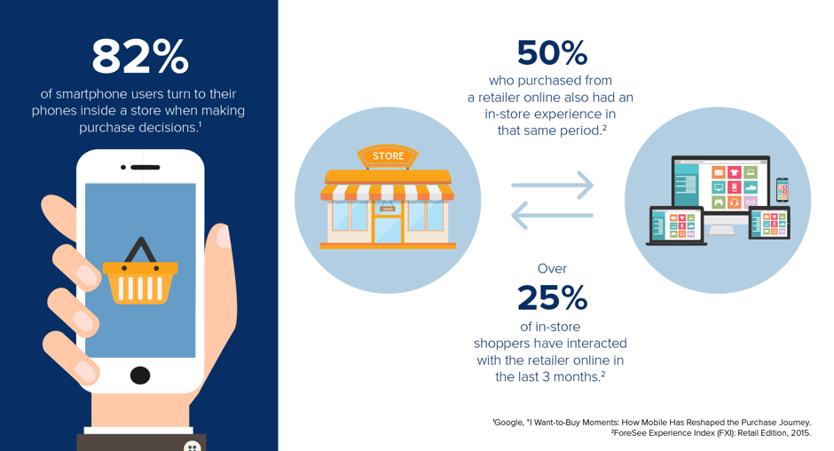
What’s better: shopping online or in-person? Short answer: yes. We’re in a new type of era where the spheres between online and off are blurry, interconnected, and strengthen one another. We’re all trying to meet the consumer where they are. If they can interact in both spaces indiscriminately, shouldn’t your brand?

“Phygital” is the concept of using technology to bridge the digital world with the physical world with the purpose of providing a unique interactive experience for the user. While the buzzword is relatively new (and awful), many of the technologies required to fuse a digital and physical experience have been around since the 90s.

Augmented Reality, now talked about as a “new” immersive experience, dates back to the Virtual Fixtures system developed at the U.S. Air Force’s Armstrong Laboratory in 1992. As early as 2015, a Microsoft Digital Trends report found that nearly 50% of consumers were more likely to engage with digital experiences that offered seamless integration with their physical world – signaling a shift in how consumers expect the physical and digital worlds to blend. The real trick has been combining this preexisting technology with an experience that people actually want to have.

According to the IAB Spain 2018 e-commerce study, at least seven out of every ten internet users buy online. Despite this near-ubiquity, 22% of users still miss the physical interaction, so they will end up browsing online and then make their purchase in a brick-and-mortar retailer.

This is why, despite reports of Amazon killing off independent bookstores, they have grown for a second straight year. This is also why many people go into a bookstore to see, touch, and read part of a book – then buy it online.

Phygital marries both the online and offline environments by trying to take the best aspects from each space to create a much more complete and satisfying customer experience. The user browses and buys, but they also feel. And that’s the real kicker.

As beautifully outlined by Jose Maria Machuca for we are marketing, phygital takes the best components from the digital retail experience like immediacy, immersion, and interaction to satisfy a consumer that is demanding, hyper-connected, and is looking to meet their needs through multiple platforms.

  • Immediacy: works to ensure things happen at an exact moment in time
  • Immersion: the user is part of the experience.
  • Interaction: generation of communication which is needed to activate the more physical and emotional part of the purchasing process.

“Consumers today are looking for a holistic and seamless experience that is curated specifically for them and not mass produced,” says Harshavardhan Chauhan, Head of Marketing at DLF Shopping Malls. “Hence, there is a need to build a 360-degree approach where the online medium plays an important role in initiating a captivating conversation that is further enhanced through differentiated and personalized offers and finally leads to a seamless offline experience.”

Humble Hardware Store Goes High-Tech

So, what does this look like in the real world? One example is Lowe’s OSHbots, an autonomous retail service robot designed to amplify the shopping experience for customers. Customers can tell the bot what they’re looking for or just hold up an item for it to scan, and then the 5-foot-tall robot navigates you there. The bot also helps store employees with tasks like inventory scanning and the ability to speak in English, Spanish, and five different Asian languages. The robots don’t replace the workers, they merely free them up from menial tasks to assist with things technology can’t replicate like empathy, storytelling, and forming a personal connection.

A Grocery Store with No Check Out, No Lines

Amazon Go is another example of a brick-and-mortar moving with the agility of an online shop. In these supermarkets, a customer scans a code with their smartphone, picks up the products they desire, and then leaves the store without passing through the traditional checkout line. Instead, they’ll get an electronic receipt detailing the amount Amazon will charge to their account. So, instead of wasting your labor force on scanning barcodes, they can be walking around, making recommendations, or demoing new products.

If Amazon already has a service where you can drone groceries straight to your house, why invest in brick-and-mortar? Because the future isn’t a straight line, speed isn’t everything, and the goal of technology should be finding more ways to bring us together, not isolate us in frictionless cells.

The Future of Fashion

Rebecca Minkoff is using technology in some of its retail stores to transform their customers’ experience. Shoppers can choose the items they want to try on by using touchscreens placed throughout the store. When they’re ready, they’ll get a message on their phone with the fitting room number, where they’ll find all the items they requested. But what happens if they need a bigger size? Every fitting room has a screen where they can request another size without having to look for it on the floor on their own or have to ask a Sales Associate to bring it. Customers leave happy – and also leave behind a trail of super valuable data: everything they like and what they are pairing it with.

Smart Businesses Can’t Run on Dumb Terminals

Even if you can’t afford to build a robot for your business, you can at least start to swap out the legacy technology keeping you in the dark ages. Smart terminal systems like Poynt, Clover, and Square are changing the game by turning the traditional point-of-sales into a digital platform for connecting with their customers, downloading apps, and growing their digital business. What was once a simple cash machine can drive customer loyalty or even keep your taxes in order.

What opportunities in your customer journey could be enhanced by the immediacy of a digital experience? What aspects of your online strategy could be bolstered by the interaction and emotional connection of a physical experience? How can we leverage technology to free people up to do what they do best: be people?

Phygital won’t replace brick-and-mortar. It’s about creating more efficient and ultimately more human interactions.

Emotive Brand is a brand strategy and design agency in Oakland, California.
The Myth of Likability and Other Lessons from Font

Last month, we were visited by the good folks at Dalton Maag, an independent font foundry with offices in London and São Paulo, Brazil. They make type for branding, retail, and corporate clients that perform beautifully across print and digital environments.

After running us through some of their work, including an amazing demonstration of variable fonts – responsive type that can store multiple variations of a type family into a single font file – we got into a discussion on the differences between three components of evaluating type: legibility, readability, and likability. And what we discovered illuminated a new way to approach creative decision-making in general.

Legibility

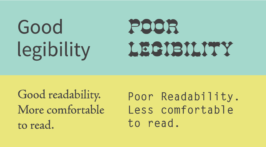
First off, the legibility of a typeface is a product of its design and relates to the ability to distinguish one glyph from another when reading. Factors contributing to a typeface’s legibility include the following:

  • X-height – The height of the lowercase in proportion to the caps. Traditionally, the taller the x-height, the more legible the typeface tends to be.
  • Character width – The easiest type designs to read are those that have an “average” overall width. Very condensed or extended designs are less legible, especially for smaller settings such as text, subheads, and credits.
  • Weight – Extremely light or heavy weights are more difficult to read, so if legibility is your goal, stick to something in the middle.
  • Design traits – The overall shapes and design traits of a typeface. If too quirky or fussy, it will reduce legibility.
  • Stroke contrast – The ration of thick to thin strokes.
  • Counters – Enclosed or semi-enclosed negative shapes.
  • Serifs, or lack thereof – While serifs are generally believed to enhance legibility, this is not always the case, as we’ll discuss later.

Readability

Readability, on the other hand, is related to how the type is arranged, or typeset, and therefore is controlled by the designer. The factors affecting type’s readability are more familiar to the average reader: type size, type case, line spacing, line length, color, and contrast.

For those outside the design world like myself, having a language and measuring system for evaluating type was an epiphany. Something that I assumed was completely subjective had an entire mathematical rubric behind it. If I could learn to see like a type designer, maybe I could change the way I make decisions.

Likability

So when we got to the topic of likability, based on the above information, I naturally assumed we would be crunching the numbers to land on the objectively best font.

In running a test for accessibility, Arial 14-point is actually not as accessible as some other fonts, explained Eleni Beveratou, Creative Director at Dalton Maag. Yet because Arial 14 point is what the test group was used to read in their daily life, they actually rated it as more likable and perceived it as more legible. In the end, the biggest contributing factor to likability is simply what you’re most familiar with.

“The likeability of a typeface has a major impact on whether someone will engage with a piece of content or not, despite research proving some typefaces more legible than others,” continued Eleni. “It is important to create inclusive and accessible reading experiences for all, regardless of reading ability or visual acuity. Inclusive isn’t synonymous with boring or monotonous; many typefaces can be inclusive while maintaining a distinct and fresh expression. This is the challenge that we need to embrace.”

In other words, what you read most, you read best. Despite all of the research, despite all of the proof points, despite our supposed obsession with trailblazers and disruptors, people tend to like what they’ve seen before.

Untrain Your Likability Reflex

Perhaps that seems obvious, but it’s a subtle sea change in how we should approach decision-making. Think back to your last team meeting, pitch, or even lunch order. How often when you say, “I like that” are you actually saying, “I’ve seen that before”? How often, when you reject an idea, are you rejecting its actual content vs. the implied fear of change?

For a minute, let’s briefly wander into the minefield of American politics. Think about how the word likability is used. Who gets to be likable? Who invented it? Whose intelligence gets to be described as inspiring and whose is off-putting, cold, inauthentic?

High-achieving women, sociologist Marianne Cooper wrote in a 2013 Harvard Business Review article, are judged differently than men because “their very success – and specifically, the behaviors that created that success – violates our expectations about how women are supposed to behave.” When women act competitively or assertively, rather than warm and nurturing, Cooper writes, they “elicit pushback from others for being insufficiently feminine and too masculine.” As a society, she says, “we are deeply uncomfortable with powerful women. In fact, we don’t often really like them.”

The Curse of Familiarity

In design, politics, and life in general, we are all vulnerable to our own biases. For those in charge of a brand, their job is often to maintain an image. Familiarity is a gift! It’s the easiest way to get approval with the least amount of friction and risk. But the curse of familiarity is stagnation. If you’re only ever making decisions based on what you like, you’ll never grow.

Remember the cycle of Facebook redesigns in the 2000s? Each new aspect – the Mini-Feed, poking, the Graffiti Wall, Open Graph, Newsfeed, Timeline – spurred dozens of petition groups with thousands of members demanding its removal. And then when they did? You guessed it: dozens of petition groups with thousands of members demanding its reinstatement. As satirized in the comedy series Jake and Amir, “Garbage becomes perfect over time as you get used to the garbage and forget what made it so bad. Like, you don’t get the internet.”

Change Is Hard

Reading the world, just like font, requires a set of criteria beyond likability. Familiarity is a detriment to making ground-breaking work. Next time you’re evaluating creative or presented with an opportunity for change, don’t be afraid to embrace the unknown. It might just become your new favorite type.

Emotive Brand is a brand strategy and design agency in Oakland, California.
Make It Sexy: The Big Impact of Branding “Boring” Things

Branding and advertising are infamous for making us covet things we don’t actually need. The super sleek sheen of a Tesla or an iPhone or a bra designed by NASA’s top scientists are alluring, but at the end of the day, they are merely luxuries. The question of getting people to need something they want is sales 101. But more and more, branding agencies are tackling the inverse.

How do you get people to want the things they need? Is there a space for surprise and delight in the most boring, pedestrian motions of daily life: applying a bandage, brushing our teeth, wiping our bums? Welcome to the world of utilitarian branding.

Utilitarian Branding

In our work with clients, we constantly espouse that nothing sells itself. No matter how brilliant your app is, if it isn’t differentiated in a meaningful way, it will get lost in an increasingly crowded market. Why don’t they get it?

Later at the supermarket, while staring at the endless wall of variously-plied toilet paper, I totally get it. Everyone draws their own line in the sand around the things they deem to be purely functional. I don’t want toilet paper, it’s just a basic thing I need to keep existing. As such, I’ve probably purchased a different brand every trip, based on price, stock, or some arbitrary impulse about the cartoon mascot. The big issue – and market opportunity – is that the basics are often invisible to customers. You’re not competing against another brand, you’re competing against indifference. All it takes is a little branding love to transform a random purchase into a deliberate, ongoing relationship.

Who Gives a Crap

Australian brand Who Gives a Crap might be the platonic ideal of millennial branding. Take a thing no one enjoys shopping for – toilet paper and tissues – give it gorgeous design, ship it directly to people, and donate 50% of the profits to build toilets in the developing world. If you had crowdfunding launch, subscription service, purpose-driven, or irreverent copy on your card, you just hit bingo. In my entire life, never once did I imagine someone complimenting me on my toilet paper. But through great branding, they’ve managed to bring some delight to the crappiest part of your day.

Welly and Tru-Color Bandages

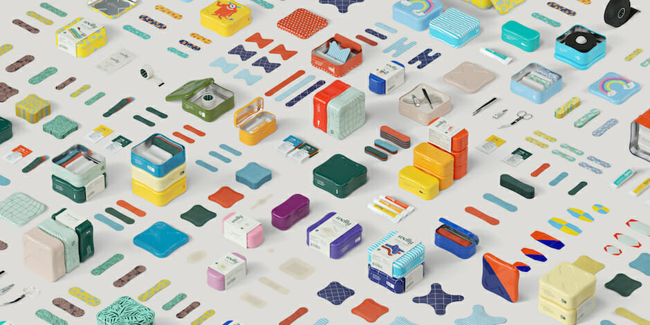
The best branding addresses a pain point, and the good folks at Welly understand this better than anybody. Co-founded by Eric Ryan, the same mind behind Method and Olly, comes vibrant, delightful, and stackable first aid kits. The tin kits include bravery bandages for those who love an adventure, single-use antibiotic ointments, and other first aid essentials like medical scissors and tweezers. Like Who Gives a Crap before them, they are taking something dull and infusing it with an abundance of life.

Beyond creating customer loyalty, utilitarian branding can have a profound effect on our identities and the way we move around the world. Earlier this year, 45-year-old Dominque Apollon had an emotional reaction to the most “boring” act possible: putting on a bandage.

“Ever wonder why bandages were only available in one skin-tone shade?” asks wellness brand Tru-Color. “We did, because there’s beauty in individuality, no matter the skin-tone.”

For years, various apps, products, and solutions have promised to transform our lives on a massive scale. The truth is, sometimes the most transformative moments in our day come from the smallest corners.

“I definitely didn’t expect the complex emotions that would swirl as I watched it just … blend in,” writes Apollon. “A seemingly trivial exercise I’ve repeated 1000x on my body with ‘regular’ ones since childhood. This felt like belonging. Like feeling valued. Sadness for my younger self and millions of kids of color.”

In the eyes of Apollon, this “purely functional” product has a purpose far beyond the utilitarian.

Put Utilitarian Branding to Good Use

There are countless of other examples. Virgin America turned the drudgery of the airplane safety video into a viral pop song. Shhhowercap manages to turn the least sexy object alive into a bona fide power statement. Quip adds an elegance and futurism to toothbrushes normally reserved for astronauts.

All of these are brilliant in their own way, but when I think about the most impactful opportunities for the future, it’s applying these lessons to underutilized resources. How many more people would interact with say, the DMV, a public health clinic, or a library if they looked and operated with the speed of the other brands in our lives?

The UK went to big lengths to redesign its postal service, as well as the products and experiences it offers. For some, that slightly improves a boring errand. For others, that could be the difference between getting a passport, opening up your first bank account, or getting a driver’s license. In other words, freedom and autonomy.

We will always be attracted to the biggest, shiniest inventions in tech. But if you really want to make an impact on people’s lives, start small.

Emotive Brand is a brand strategy and design agency in Oakland, California.

The Super Tough Brands of Fragile Masculinity

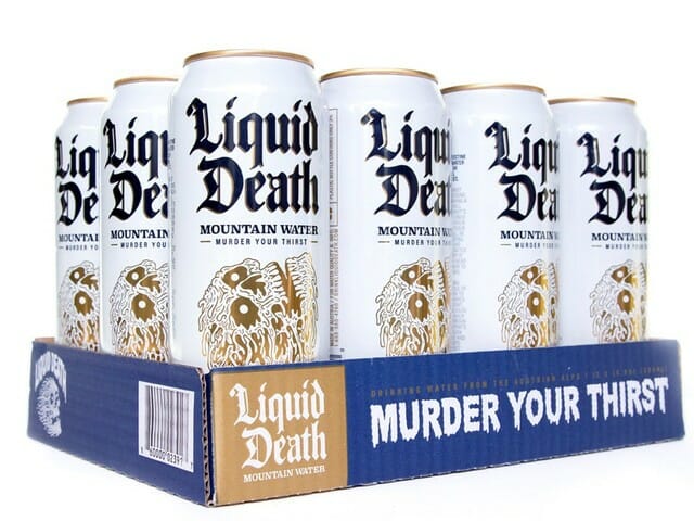
Last week, the world was given two small wonders: War Paint, a hyper-aggressive makeup brand exclusively for men, and Liquid Death, canned water designed to look like beer. Two “wellness” brands aimed at men, cloaked in the visual language of skulls, tattoos, and violence.

What can these two bizarre companies teach us about the role of gender in branding? And is breaking down male stigma in the wellness space simply a design problem?

Branding … For Him!

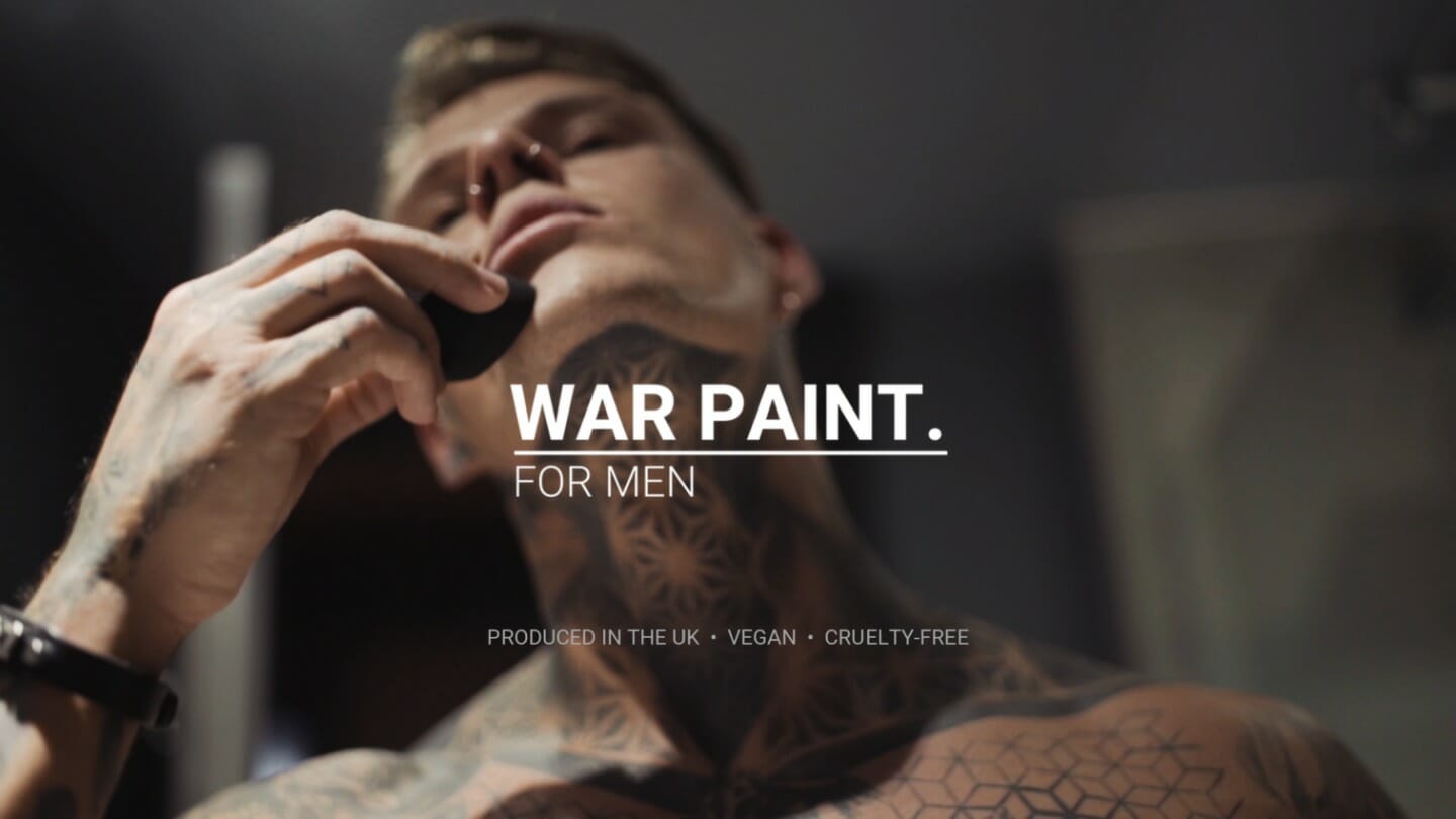
Let’s start with War Paint. Their 13-second ad features a heavily tattooed man using various products, flexing his pecs, and adorning himself with a skull ring. Notably missing from this peacocking is how the actual makeup looks on the guy’s face. But that’s not the point of this ad. The point is to disrupt your expectations of makeup and remind you, to a cartoonish degree, that this is for herculean men.

Everything about this brand – the militaristic association of its name, the tattoo parlor visual language, the chant of its tagline “makeup for men, designed by men, for men” – is attempting to shift perception. And in theory, that’s a good thing. For decades, many men have felt uncomfortable with the fact that they have human bodies that require basic care, like moisturizer or water. If War Paint is working toward a future in which men can boldly engage in self-care, that’s progress, right?

Unfortunately, everything about their execution is decidedly backward. Online, many people were off-put by their singular expression of what it means to be a man, and we’re hoping to see a larger spectrum of masculinity represented.

In a tweet attempting to clarify its positioning, War Paint wrote: “If females can have products just for women, why can’t men? Our aim is to allow makeup to be gender neutral and to do that we must have male-specific brands also.”

As Vox writer Cheryl Wischover responded in her piece, “Achieving the goal of increased gender neutrality by making stuff for the underserved ‘males’ demographic struck many as counterintuitive or even nonsensical. The truth is that it probably is still hard for some men to walk into a Sephora and buy makeup. But selling makeup with muscles and war is not going to take away that stigma any time soon.”

The Shape of Water

Let’s shift to Liquid Death, the punk rock canned water aiming to “murder your thirst.” In a way, this feels like a thought exercise for aspiring salespeople. Take the most basic thing possible – water – and make it irresistible. Former Netflix Creative Director Mike Cessario has done just that, raising a new seed round of $1.6 million for his new company. In total, he’s raised $2.25 million for, and I can’t stress this enough, water in a tallboy can. Backers include Biz Stone of Twitter and founders of Dollar Shave Club and Away.

According to Cessario, he’s not solely marketing to the heavily male punk and death metal crowd indicated by the skull logo; he’s targeting the “straight-edgers”– those who eschew drugs and alcohol in a scene often known for both – and doing so under the guise of eco-friendliness because a single, shiny nickel from every $1.83, 16.9oz. can sold will support cleaning up plastics from the ocean.

It would be a shame to deny Liquid Death’s sense of humor. They produced a truly bonkers video called, “Hey Kids, Murder Your Thirst,” which wouldn’t look out of place on Adult Swim. Similar to War Paint, they are aggressively (and joyfully) disrupting the status quo of their category. But here’s the thing: this whole brand narrative is still supported by outdated modes of masculinity. Healthy habits – drinking water, taking care of yourself – shouldn’t need to be draped in distortion and blood to appeal to men.

Why Is Self-Care Gendered?

Ideally, self-care has no gender. Over-indexing on masculinity to make something appeal to men doesn’t encourage actual perception shifts. Quite the opposite, it teaches men to only respond to the violent, the blunt, the obtuse.

As Erika Nicole Kendall noted in her essay, “Marketing has the ability to convey powerful messaging, drive consumer behavior, and legitimize messages we frequently see and hear about ourselves. It simultaneously guides our aspirations and affirms how we see ourselves. When the marketing used to sell wellness brands to the public validates questionable ideas about gender – and, for that matter, race – we should collectively cringe.”

War Paint and Liquid Death are hardly the first, and they won’t be the last. There’s Dude Wipes, which are baby wipes, but for dudes. There’s Man Salt Muscle Soak, which are bath salts, but for men. You’ll never guess who the target audience for the candle company Man Cans is. (Hint: it’s men.)

Perception Shifts

Those who work in branding have a real opportunity to shift perception – if they approach this challenge from a place of curiosity and empathy. What does it mean to be a man in 2019? Whatever we want it to mean. It can be intersectional, non-binary, and yes, masculine, if the aperture of that masculinity is open enough to allow for other identities to exist. Wearing makeup, drinking water, lighting a candle, or taking a bath shouldn’t rattle your identity. If it does, you’ve got bigger problems than branding.

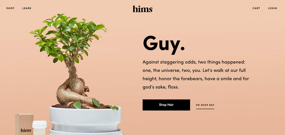
Hair loss company Keeps and wellness brand ForHims are steps in the right direction. Through diverse photography and minimalist design, they are expanding masculinity by focusing on what it means to be human, not just male. There’s still an edginess and personality to their copy, but it refrains from veering into the overtly macho.

“We hope to enable a conversation that’s currently closeted,” goes the ForHims’ about page. “Men aren’t supposed to care for themselves. We call bullshit. The people who depend on you and care about you want you to. To do the most good, you must be well.”

In the productivity-economy, caring about yourself can feel radical. The role of good branding makes those magic moments as accessible, inclusive, and frequent as possible.

Emotive Brand is a brand strategy and design agency in Oakland, California.
Image credit

#100DayProject: From Ancient Symbols to Brand Design

This year, the design team at Emotive Brand is participating in the #100DayProject. Today, we sit down with Senior Designer Jonathan Haggard to discuss symbols, simplicity, and how to be brave in your creative decision-making.

What is the #100DayProject?

The 100DayProject is a free art project started by Lindsay Thomson that takes place online. Every spring, thousands of people all around the world commit to 100 days of exploring their creativity. The idea is that you pick a theme or a project and rev on that 100 times. This year, our focus is on how ancient symbols inform contemporary brand design.

In the beginning, you tend to go for the most obvious choices, but by day 19, you find yourself really having to flex your creativity. It forces you to think from different perspectives and be thoughtful about your approach to rendering something in a unique way.

https://www.instagram.com/p/Bw294x1FRh-/

How did the team land on symbols?

We threw around a couple of ideas, but something about exploring symbols seemed to capture everyone’s imagination early on. Three or four years ago, I created a site called the State of Symbols, which is a designer-friendly repository for symbols. #100DayProject is a great way to build off that work and the fact that there are so many symbols with thousands of years of history fits the 100-day format nicely.

https://www.instagram.com/p/BwvO_m7FI66/

What excites you most about this project?

I think my favorite aspect is being able to research each symbol and the creative process of meditating on how to render it in a new way. With the State of Symbols, I was mainly recreating existing symbols. This project is much more about breathing new life into these ancient shapes and allowing yourself the time to reflect on the core idea in an illustrative way. That requires learning the history, what it means, and seeding it in your mind as a concrete thing.

Designer Keyoni Scott is helping create the animations, and he described the process “almost like doing crosswords or those daily mind games. It’s a good way to keep the creative mind sharp and fun to just create something daily. Nine times out of ten, I learn something that I didn’t know before and I think that’s amazing.”

https://www.instagram.com/p/BwaTqzVBdVj/

What reference materials are you using in your research?

We’ve been using “Shepherd’s Glossary of Graphic Signs and Symbols,” which is an amazing collection of everything from punctuation to railway iconography to maritime navigation symbols. Also, Carl G. Liungman’s “Dictionary of Symbols” and I. J. Gelb’s “A Study of Writing.”

To me, there’s something about these print collections that are a little more legitimate than wandering for images online. You can find interesting things online, but it can be hard to tell if the person is just making stuff up without the original source. As Design Director Robert Saywitz said, “Projects like these allow you to explore different mediums beyond just the computer and brings inspiration to the forefront rather than waiting for it to arrive.”

https://www.instagram.com/p/Bv-CgR-FBvI/

What have you learned from the process thus far?

For one, just how many Venus stars there are. From far east Chinese symbols all the way to the Celtic, thousands of people throughout history have been looking at this planet and rendering it in different ways. Whether it’s a five-pointed or eight-pointed star, there’s something kind of beautiful about everyone drawing inspiration from the same thing.

Another thing is how symbols change over time. We tend to think about meaning being fixed, but certain figures like the pentagram have changed meaning roughly every 1000 years – from the morning and evening star in Palestine to the contemporary Wiccan symbol for the elements and spirit.

Lastly, the pace of the project is a challenge of its own. It needs to go out every single day whether it’s perfect or not, which forces me to be brave about decision making. Sometimes, that means bringing something to life through simplicity. For instance, the North African Berber tribe symbol for “bird” is built out five simple squares, but through the use of animation, it suddenly looks like it’s in flight.

https://www.instagram.com/p/BwDa19Eh7ZC/

What lessons can you apply to your design practice and the work we do for brands?

People have been trying to communicate the same ideas for 40,000 years. At its heart, symbols display concepts – and that’s what we do as a brand studio. We get the core concept of a company, distill it down to a simple form – the simpler the better – and we bridge the gap between a visual symbol and a series of beliefs, values, or products. As Senior Designer Beth Abrahamson said, “Symbols and their histories are inherently tied to branding, as most logos are variations of symbols that have been around for centuries and have been reinterpreted many times. Symbols are part of our vocabulary as designers and it’s super important to know where the primary forms come from and what they mean.”

Oftentimes, a company’s symbol has grown so strong that it creates a life of its own and can be simplified down to a basic geometric shape. Look at Google: the open circle form makes this shape accepting, something that has an inward motion that is exaggerated with the horizontal rule created to the right. Regardless of color, scale, or representation, it communicates the friendly nature that Google has come to embody.

Whenever I’m starting a new identity or branding project, I always try to see if there’s anything that communicates the message through the symbol itself. Sometimes, I’ll bring a symbol into Illustrator and start taking it down to its components. It’s critical to do that kind of research, because you don’t want to pick a symbol that’s highly offensive in a certain culture, or references something that’s counter to a company’s mission. Designers have a responsibility to know their history, produce great work, and keep these symbols alive.

Emotive Brand is a brand strategy and design agency in Oakland, California.