

A B2C app developer launches a B2B master brand.
Services
- Brand Strategy
- Positioning
- Corporate Narrative
- Visual Identity
- Website Deisgn
- Collateral Design
- Copywriting
- Brand Guidelines
The developer of millennial meeting app MeetMe was launching a major acquisition strategy and needed a brand strategy to match. Its ambition was to grow from one app into the world’s largest portfolio of meeting apps under a new master brand, The Meet Group.
Emotive Brand was engaged to tell its story to investors, advertisers, employees, and recruits.
The new brand faced challenges. Investors couldn’t relate to its audience of 18-to-24-year-olds. They worried about the risks of helping young people connect. And they saw the Meet Group’s ad-based revenue model as less tested than subscription sites.
To overcome investor skepticism while appealing to advertisers and recruits, our strategy demonstrated the growth potential of The Meet Group. We did this by positioning The Meet Group as uniquely able to meet the universal need for human connection. With 7 billion people on the planet and a strong financial track record, The Meet Group’s potential was vast.
What We Learned Along the Way
Foundational truths unite audiences.
Creating a master brand across extremely diverse audiences can feel daunting. A lot of digging can be required to find the fundamental truth that unites the interests of all. But when that core idea is unearthed, it makes every part of the story more powerful.
Follow the passion.
A brand’s stakeholders each tell a valuable piece of the total story. But sometimes there is one person who truly embodies the brand. This person deserves special attention because they hold the key to the brand’s heart, voice, and passion that strategy must unlock and design must express.
Master brand equity is worth its weight in gold.
Creating a new master brand is a high-stakes undertaking. The equity it creates will affect not only the parent company, but every sub-brand it owns. Diving deeply into target research, brand strategy, design, and message development is an investment that will pay off for years.
Strategy Director, Emotive BrandBy focusing on The Meet Group’s highest aspirations, as well as its day-to-day needs, the new strategy spoke meaningfully to all of its audiences.”
Bringing Strategy to Life
Infusing Human Connection Into the Investor Site
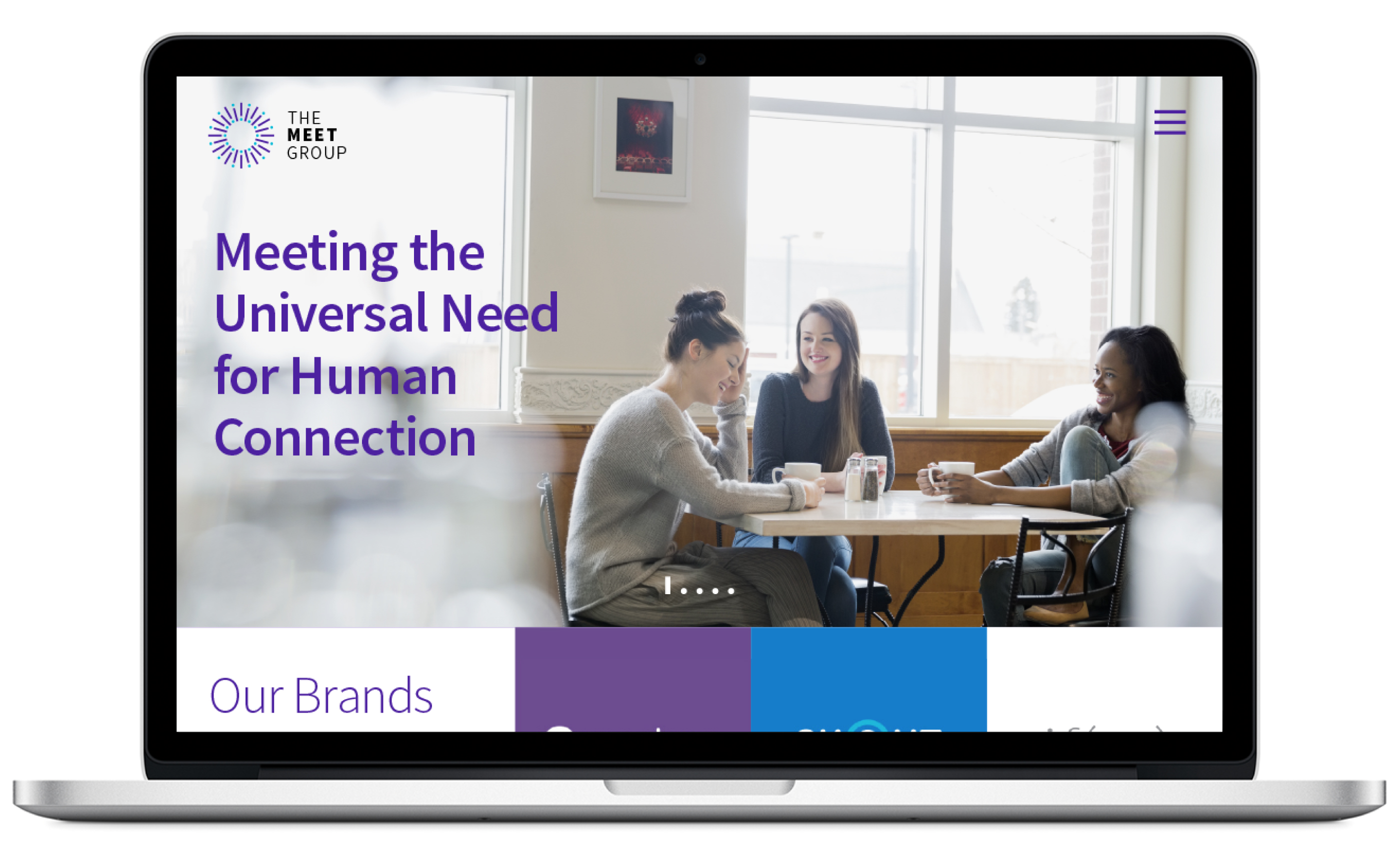
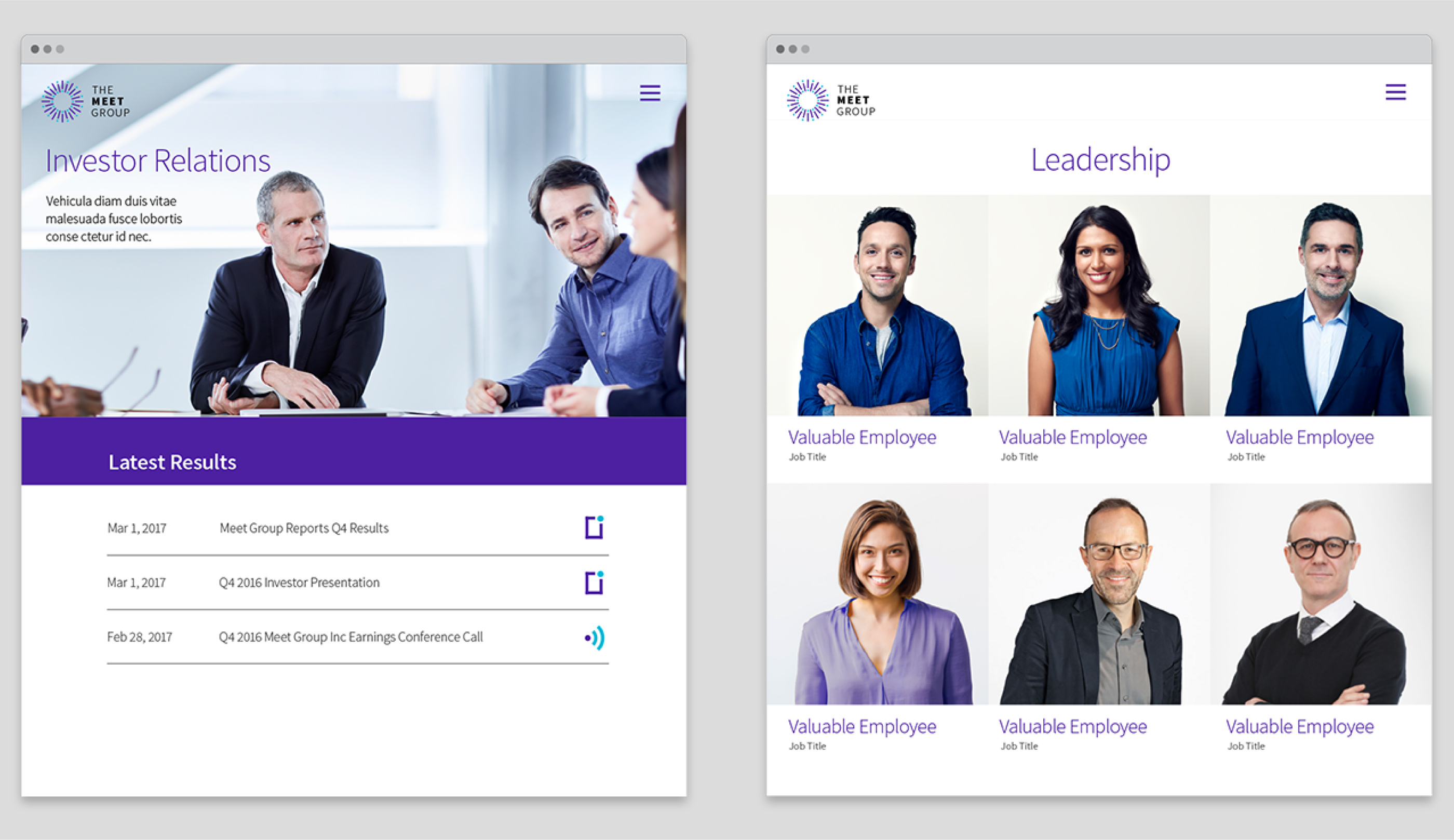
Formerly copy heavy and imageless, The Meet Group’s investor site was redesigned with the warmth of a brand that is meeting the universal need for human connection. Imagery depicts young people casually enjoying time together. The copy is professional but welcoming.
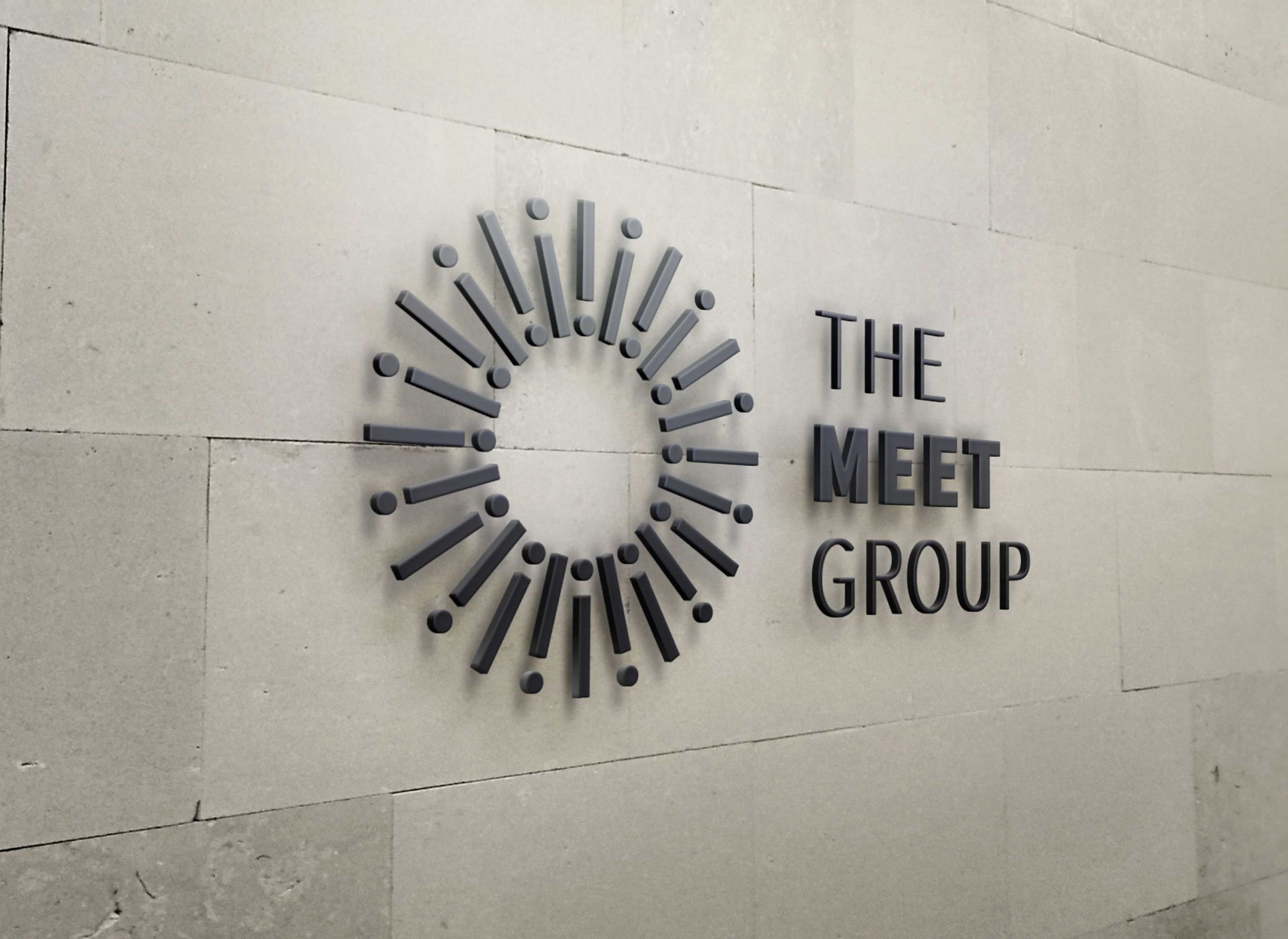
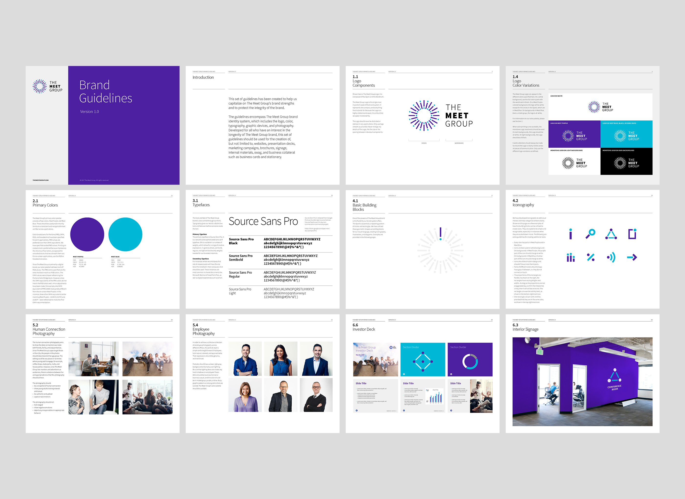
Spark Logo Symbolizes Human Connection
Symbolizing the spark of human connection, The Meet Group’s logo is a stylized burst consisting of pairs of lines and circles. Each pair represents a person. The pairs come together in a circular grouping, representing the bonds of friendship made possible by The Meet Group.
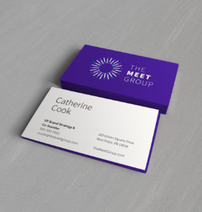

Visual Identity
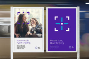
The Meet Group’s visual identity strikes a balance between youthful and fun on one hand and professional and reliable on the other. We livened up the dark purple palette of the original MeetMe app with a complementary turquoise. The font is friendly, clean, and honest.

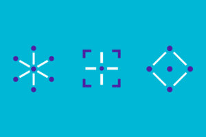
Creating a People-Centric Brand
The Meet Group’s new photographic style is friendly, open, and infused with brand colors. The line-and-dot pairs are a highly adaptable way to graphically represent people across media. The lines can also be used as a brand-friendly way to frame faces.
Experience that Works

Artifacts are the keys to culture.
DNA is as influential on companies as it is on people. An exercise in which company stakeholders shared artifacts from The Meet Group’s past helped shed light on the values and history that are still informing its culture today.

Put yourself in the audience’s shoes. Or phone.
To understand The Meet Group’s products, we joined the conversation happening on its apps. By listening respectfully to their audience, we were able to boil up the goodness into brand ideas that worked for everyone.

Go big or go home.
When crafting a positioning for a risk-averse audience, it might feel natural to play it safe. But focusing on the opportunity instead of the risk gave the brand an inspirational positioning that up-leveled the conversation.

Design that walks the line.
The Meet Group’s apps are dynamic and youthful. The master brand was positioned toward B2B audiences who value stability and reliability. To strike a balance, the new visual identity was both professional and infused with youthful dynamism.
Recent Work

Bringing a people-centered brand into a digital-first, product-led future.
View case study