

Startup launches life-saving brand.
A new treatment, a new brand.
Services
- Brand Strategy
- Brand Voice
- Visual Identity
- Corporate Narrative
- Logo
- Collateral Design
- Naming
- Brand Guidelines
Many families struggle with life-threatening allergies. In some cases, even a drop of milk on a child’s skin can lead to anaphylactic shock.
A treatment called oral immunotherapy (OIT) introduces small amounts of food allergens to patients so that they can build up their tolerance and, eventually, not react to foods that they previously avoided. Until recently, OIT has only been available through hospital-based clinical trials and a limited number of individual allergists’ offices. Latitude envisioned a network of clinics that would make OIT a routine, accessible, and convenient treatment.
The company approached Emotive Brand on the eve of their launch to develop a brand that would connote the safety of the process, persuade families that the often-difficult process would be worthwhile, and give families hope that they could gain control over their lives.
What We Learned Along the Way
It’s always personal.
No matter how tight a strategy is for a project, you must never lose sight of the human factors that need to be baked into a brand. Find a place for deeply personal memories and experiences, even if they are not front and center.
Process makes perfect.
Our job is to make design choices throughout any project, and we don’t share every design idea we generate. But it’s important to always remind clients of the process we go through to reach our destination and how we incorporate elements of the brand at every step.
Naming is marketing.
In an industry flush with descriptive names, an emotive name not only helps a brand connect to its audiences, it distinguishes them from the competition and provides greater potential for creative development.
Debbie Taback, Co-Founder of LatitudeWhat we needed was an agency to help us harness our passion for our mission into a cohesive and compelling brand. The Emotive Brand team expertly shepherded us through that process. Along the way, they were creative and tenacious when we hit obstacles. We walked away with the tools we needed to successfully propel our new specialty clinic into the world.”
Bringing Strategy to Life
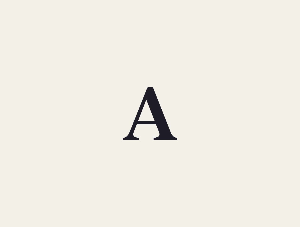
New Brand, New Logo
The Latitude name evokes freedom, flexibility, and the sense that a new door has opened for families. We wanted that sense of unlocking to be the core of the new logo. The two L’s create the image of an opening door or two adjacent pathways of support.

Potential for Storytelling
For Latitude, stories that conveyed the life-changing nature of their treatments were integral. So we created a visual identity that could transform into a rich graphic language for storytelling across platforms.


Credible and Human
The visual identify flexes across applications, conveying the credibility and trust associated with Latitude and evoking the human, empowering, and empathetic side of the brand.

Designed to Feel Supportive
We designed the new Latitude clinic space and other branded items to establish consistency and cultivate a sense of support for families as they go on the journey with the brand.

Cascading a New Narrative Through All Communications
Guidelines for Growth
Latitude didn’t plan on stopping at just one clinic. They wanted their unique care to reach families across the country. This meant they needed clear, intuitive, and applicable guidelines to leverage their brand for years to come.
Experience that Works

Understand the customer experience.
The founders of Latitude are all parents of children who have gone through oral immunotherapy. This gave us access to people who offered first-hand insight into the customer experience.

The power of emotion.
In talking to potential patients, we learned that every family doesn’t have the same definition of success. What they all wanted, though, was more freedom in their lives. This need to connote flexibility was a key driver for choosing the name “Latitude”.

Assume long-term use.
Latitude’s initial target patient group is children (and their families). However, they didn’t want to tie themselves too tightly to this demographic. We helped them choose a logo and color palette that would appeal to both children and adults and stand the test of time.

Some emotions are more powerful than others.
While the Latitude team identified several emotions that they wanted their brand to evoke, the most important was “safety and security”. Making the first step towards treatment is scary and can feel life threatening. If the brand couldn’t give families a sense of safety, nothing else mattered.
Recent Work

Bringing a people-centered brand into a digital-first, product-led future.
View case study