Celebrating the developer DIY mentality.
We helped Shipa to not only get ahead of the game, but to define it.
Services
- Brand Strategy
- Visual Identity
- Brand Positioning
- Messaging Platform
- Corporate Narrative
- Copywriting
- Website Design
- Brand Guidelines
Shipa simplifies how organizations and development teams deploy, secure, and manage applications across cloud native infrastructures by taking an application-centric approach.
Seeking a new round of funding and hoping to better articulate their value proposition, Shipa found itself trapped in a chaotic and confusing developing category where most competitors—including Shipa itself—focus solely on describing the nuts and bolts of their products, with minimal positioning and lackluster marketing. While Shipa’s old positioning had potential, many elements needed to be clarified and elevated.
We helped Shipa move beyond the rational logic of their technology offering by shifting the focus to an emotional appeal that conveyed a concise, easy-to-understand value proposition that resonated with consumers. Up-leveling the conversation to put an emphasis on Shipa’s purpose, their point-of-view, and how Shipa makes consumers feel propelled Shipa forward as a brand-driven, category-defining leader.
What We Learned Along the Way
Elevate your story.
In a category where most competitors focus on generic marketing tactics that fixate on the product and technology offering, there is opportunity for differentiation. Elevate your story to express your brand’s vision, purpose, point-of-view, reason-for-being, and what emotions you seek to evoke when customers interact with your brand.
Your competition isn’t the competition.
Sometimes a brand’s strongest competition isn’t a comparable product or direct competitor, but rather a mindset. Shifting the focus from what your competitors are doing to connecting with your target audience and deepening your understanding of their wants, needs, and desires is a sure-fire way to capture their hearts and minds.
From singular technology offering to comprehensive business solution.
It feels like software is taking over the world, so broadening your talking points beyond the IT department to include business leaders is crucial. Transitioning from a singular technology offering to a comprehensive business solution can help elevate a brand’s functional differentiation by shifting mindsets and strengthening relevance.
Bruno Andrade, CEO, ShipaEveryone on our team loves Emotive Brand’s work, which has improved our online platform. Their experience was what distinguished them from other providers.”
Build Forever
Inspired primarily by the form and function of an infinite loop, the Shipa logo conveys the brand promise of Build Forever. The geometric symbol—interlocking shapes that suggest the act of building—paired with an approachable logotype conveys the optimal balance of technical expertise and accessible storytelling.
Joined Forces
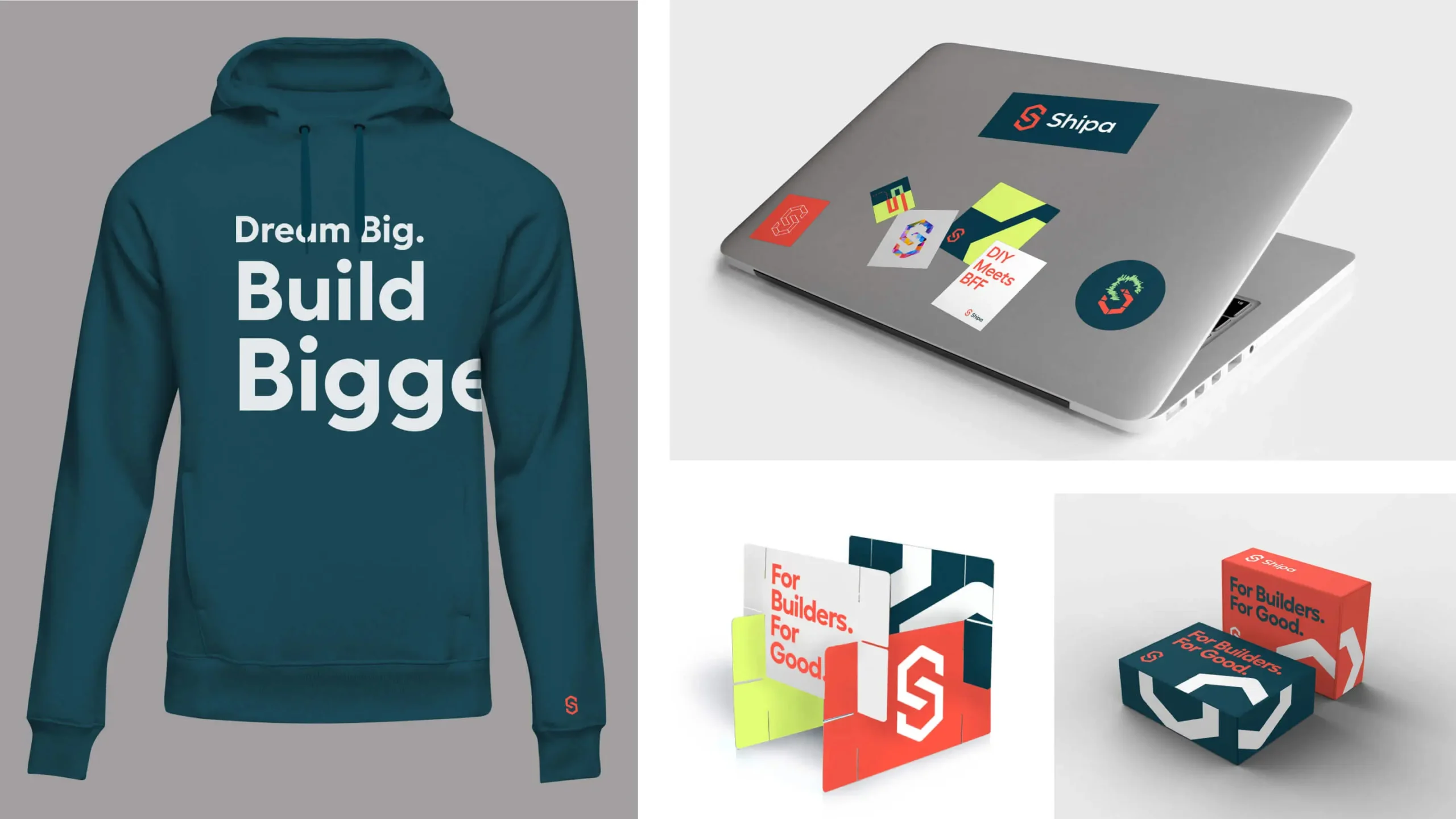
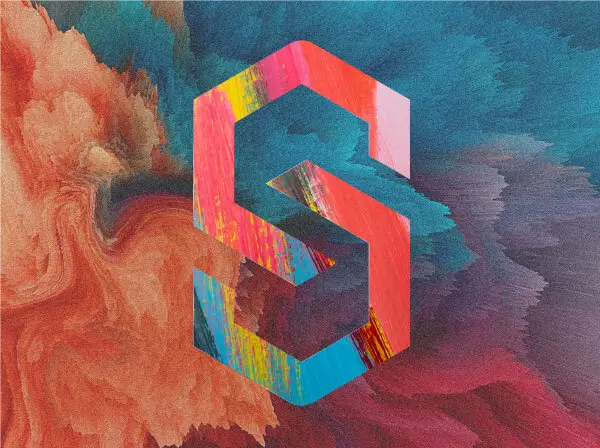
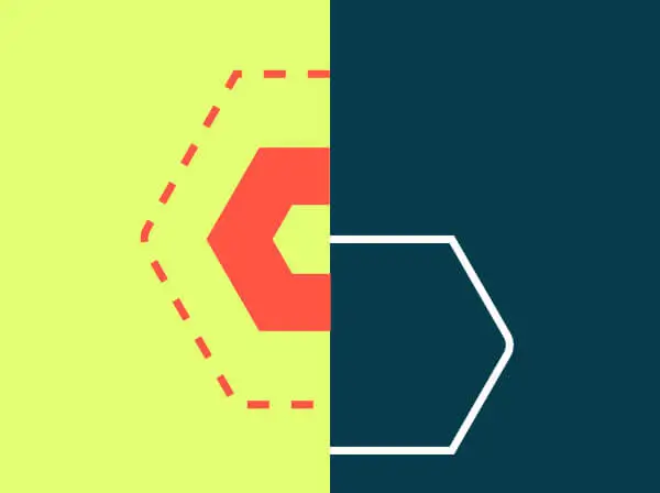
The Shipa logo is inspired by joinery and its geometry. Two hexagons perfectly interlock to form the symbol, which is visually “joined” to the logotype through the use of common angles. Without changing its core construction, the logo symbol is elevated to a dynamic super graphic element—shown in different rendered states, crops, and scale, or used as a portal for abstract imagery.
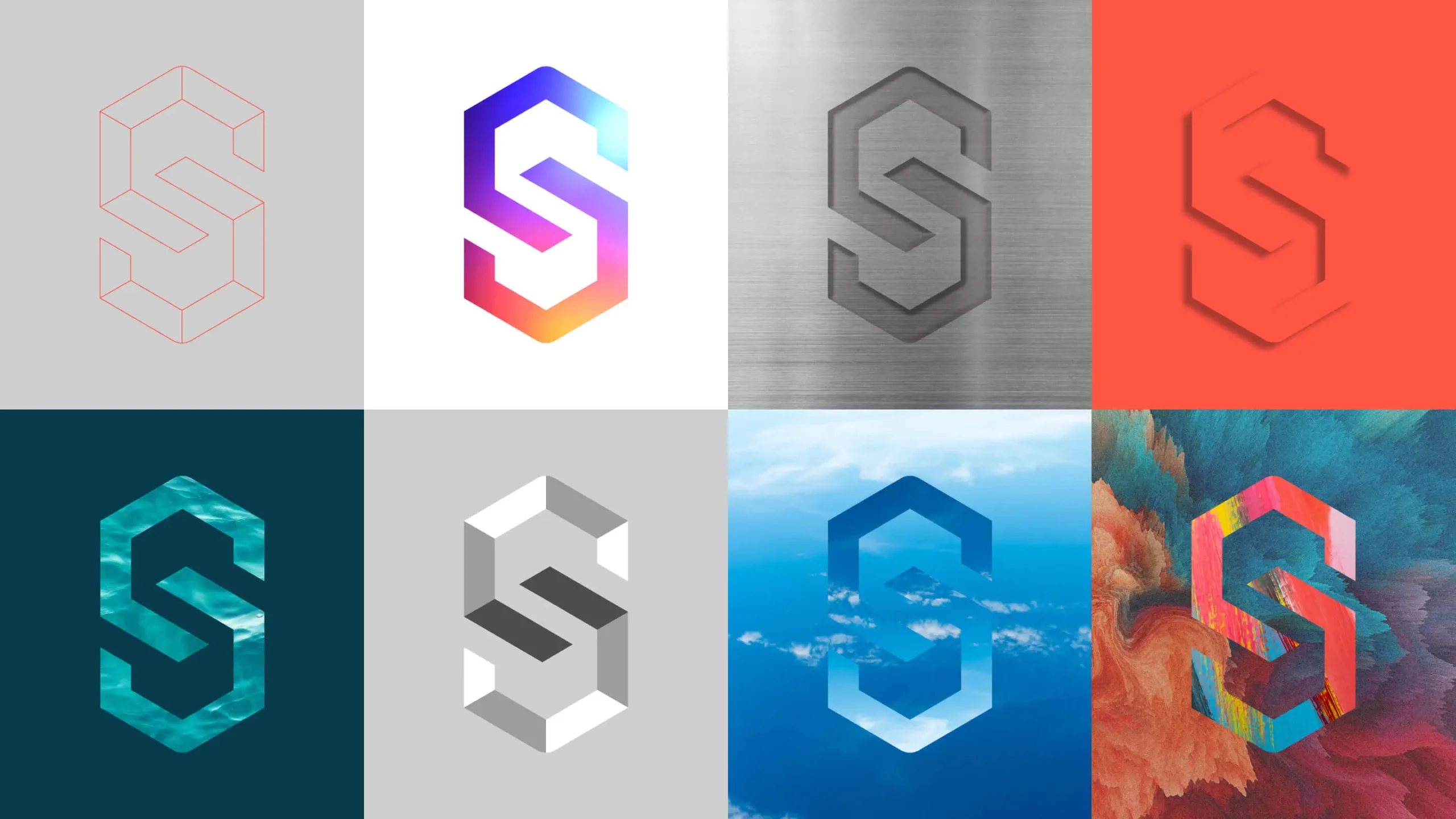

Form and Function
The iconography style was inspired by the form and construction of the Shipa logo symbol—often depicting two interlocking components. The connection to the symbol is further reinforced visually by constructing icons with at least one angled side and rounded line join.
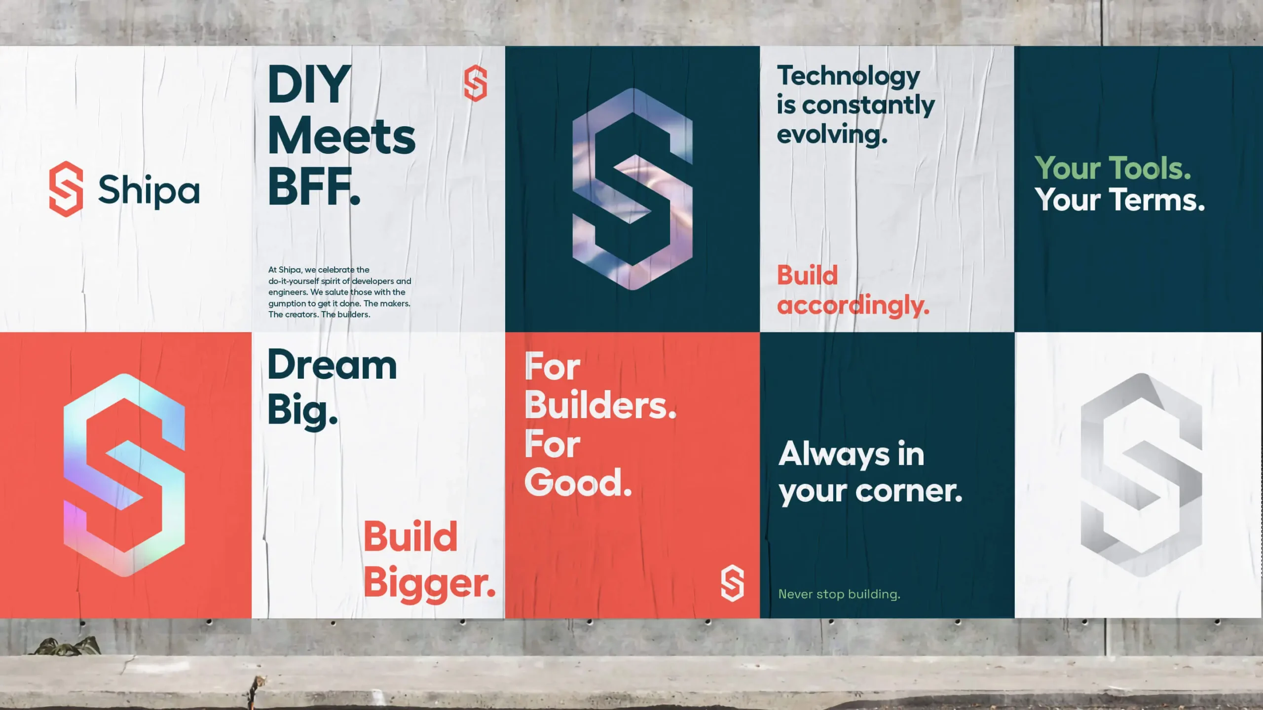
The DIY Spirit
The geometric structure of the identity and graphic elements is balanced by the approachable tone of voice to celebrate the do-it-yourself spirit of developers and engineers.
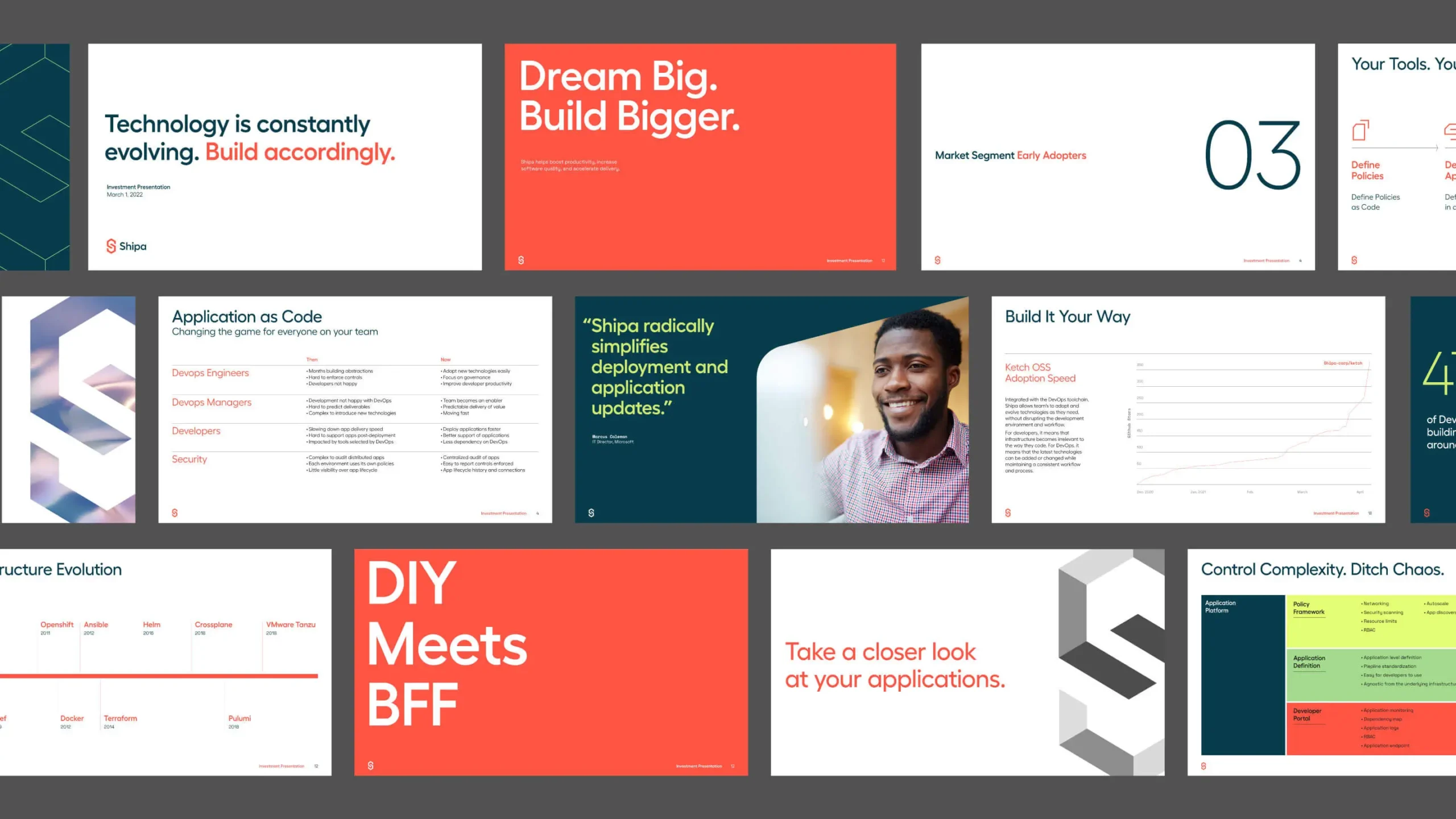
Experience that Works
Go deep.
The cloud computing space isn’t for the faint of heart. In a confusing and developing category, we immersed ourselves by conducting extensive research, auditing the competitive landscape, interviewing stakeholders, and facilitating workshops because a deeper understanding produces more meaningful insights.
Technical meets human.
Although product positioning offers limited dimensionality, we realized that omitting the product entirely from the positioning would be counterproductive, so we embarked upon a product positioning journey to help articulate the value proposition Shipa provides in human, non-technical language.

It’s all about the symbol.
Because a logo represents the core of a brand and it's positioning in the marketplace, we obsessed over crafting a symbol to reflect Shipa’s new brand, resulting in a dynamic symbol that became the foundation for the new visual identity.

Emotive bonds.
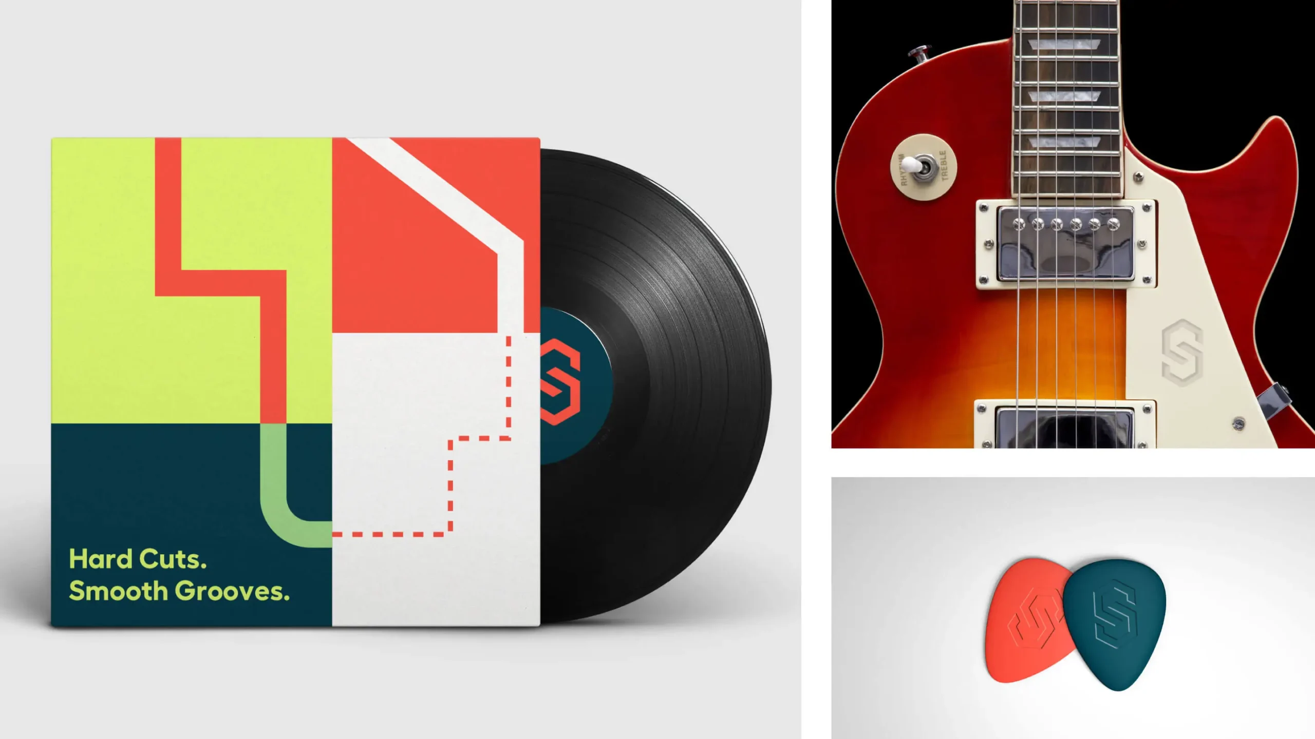
We pride ourselves on creating emotive, lasting connections with our clients, so when we discovered Shipa’s CEO, Bruno, collects guitars, we knew we had to mock up a guitar pick with the Shipa logo on it to add to his collection.
Recent Work
Bringing a people-centered brand into a digital-first, product-led future.
View case study


