


Using human voice to unlock worlds of opportunity.
A rebrand to express the full potential of voice identification.
Services
- Brand Strategy
- Positioning
- Visual Identity
- Corporate Narrative
- Copywriting
- Website Design
- Collateral Design
- Brand Guidelines
The rebrand launched in 2022 and with over 100 patents under its belt, Pindrop has long been a pioneer in voice identification technology. However, most of the company’s focus and therefore its reputation was in the Call Center and the technology it provided to customers to help them catch and reduce customer fraud.
As Pindrop evolved its offering to more future-forward applications such as Smart Home, IoT, and the automotive field, the brand needed a major overhaul to reflect both the future footprint of the company, and its increased relevance to a broader audience.
With this rebrand, we aimed to demonstrate the saliency and very human aspect of using people’s voices to solve for some of their most pressing needs. Finding a way to balance the feeling of intense and ground-breaking technology with an incredibly human sensibility was a challenge we could not resist.
What We Learned Along the Way
Entrepreneurial energy can translate to ‘scrappy’ and ‘tinkering.’
Even the most compelling aspect of an entrepreneurial company—the sense that it is always trying new things—can sometimes be its Achilles Heel. Pindrop’s customers needed the reassurance that the company was landed and focused, not constantly in tinkering mode.
Founding DNA is a critical ingredient to a successful brand.
We were impressed early on with the purposeful and mission-oriented nature of the CEO’s founding story. He had a vision for what could be accomplished with voice identification. We channeled this DNA into the new brand and it felt like it was meant to be.
Customers sometimes know where you’re headed before you do.
As we spoke to Pindrop’s customers, it became clear that they had an inkling of where the company was headed. Knowing that customers could see the future and were open to it gave Pindrop license to boldly embrace its future stance and serve it up clearly and proudly.
Mark Horne, Former CMO PindropThe company is excited as measured by an increase in employee engagement, and bookings growth has increased.”
Opening Worlds
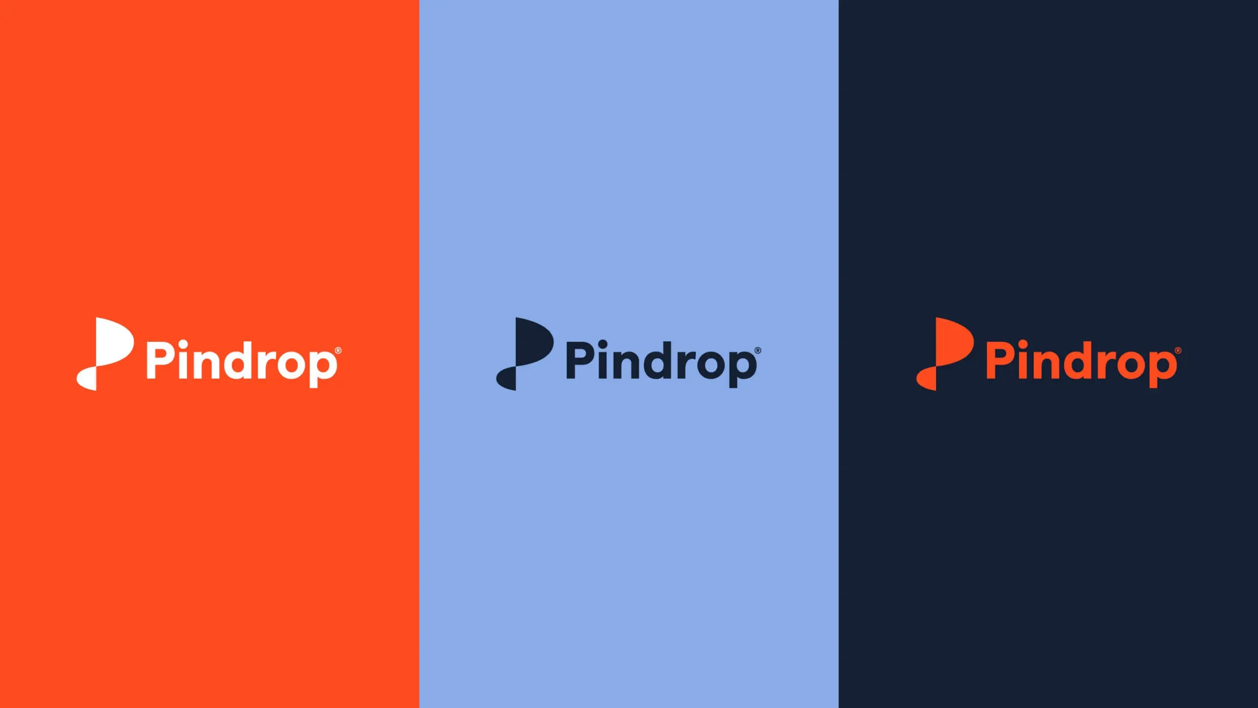
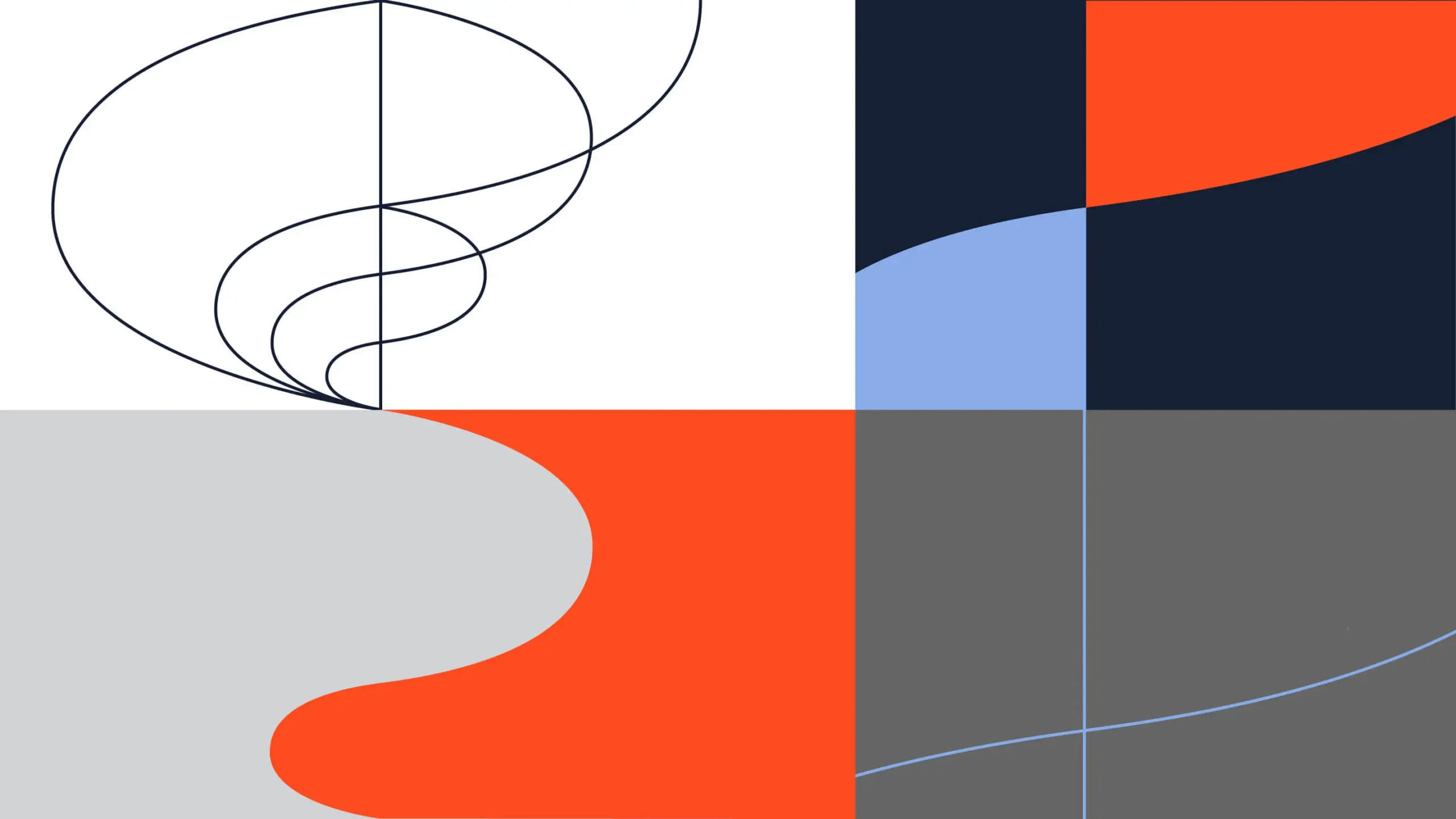
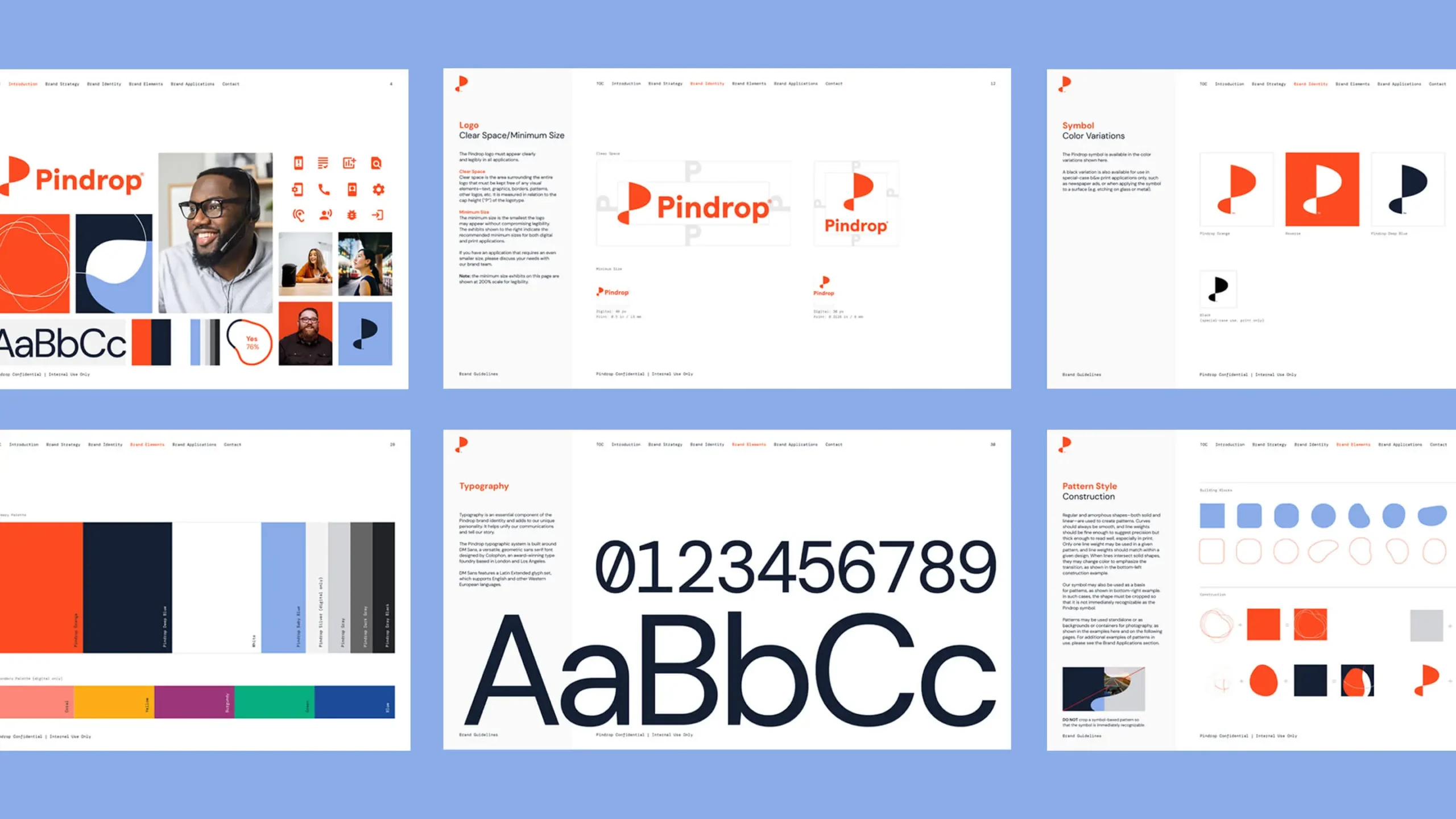
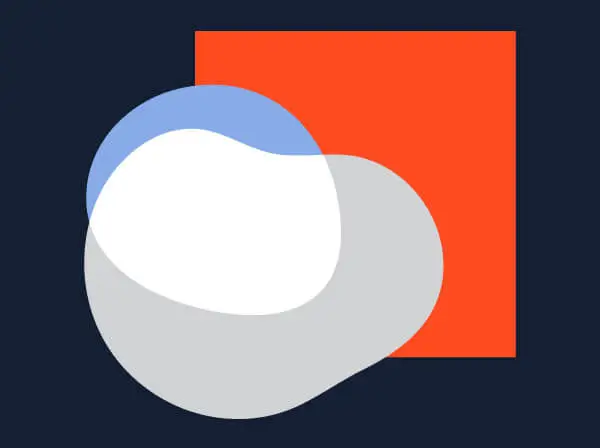
A dynamic identity was developed to embody movement and flow from one place to another, and represent how Pindrop grants people frictionless and fluid access to new worlds. Evocative of a sine wave, the Pindrop symbol represents both sound and growth—with the connecting point between the two shapes suggesting Pindrop’s role in both these dynamics.
The People Business
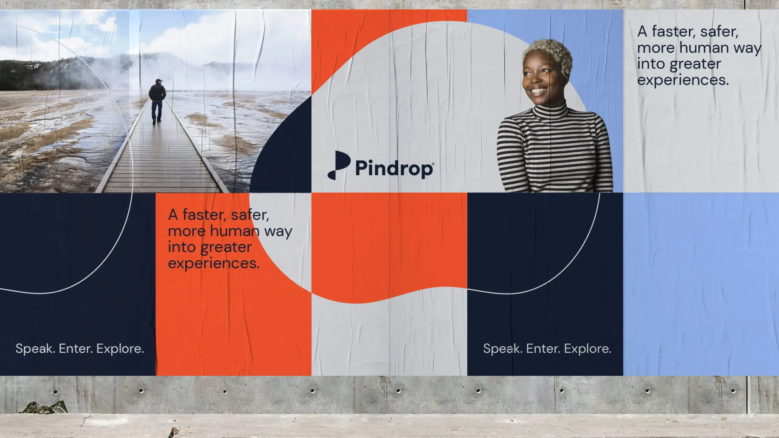
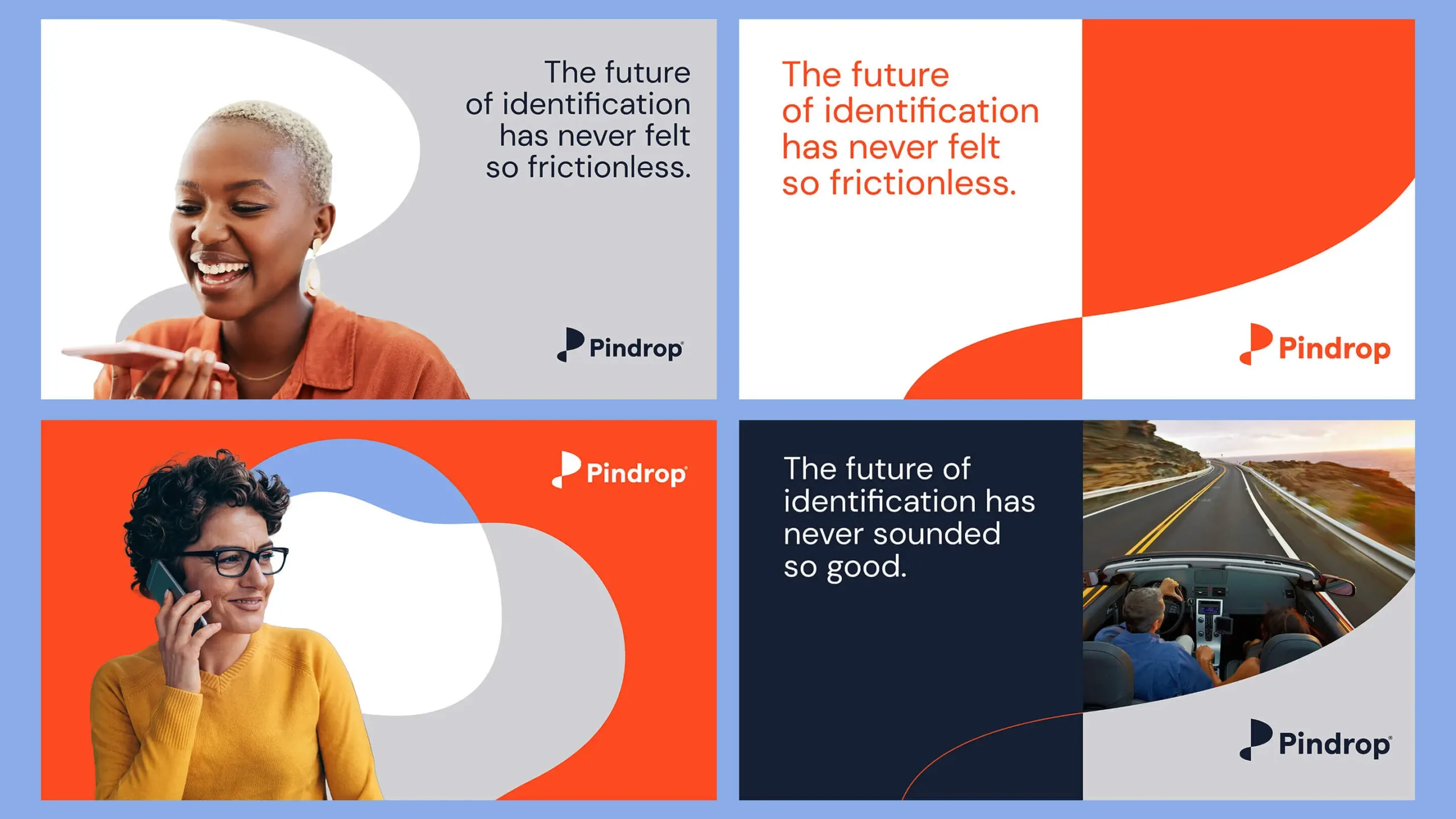
The visual language embodies a B2C sensibility paired with a B2B strategic point of view. A bespoke brand system is brought to life through the interplay of fluid, linear, and shape-based compositions, a fresh color palette and consumer-focused photographic style.
Sound + Vision
As a truly sonic brand, the Pindrop identity and design system needed to visually align with the core ideas supporting their sound technology—acceleration, access, speed, fluidity—as well as human connection and the safeguarding of privacy. Even in a static state, the visual language speaks to those dynamic aspects of a sonic brand experience. Partnering with a sound design agency allowed for a greater cohesion between the visual identity and the sonic brand.

Making it Real
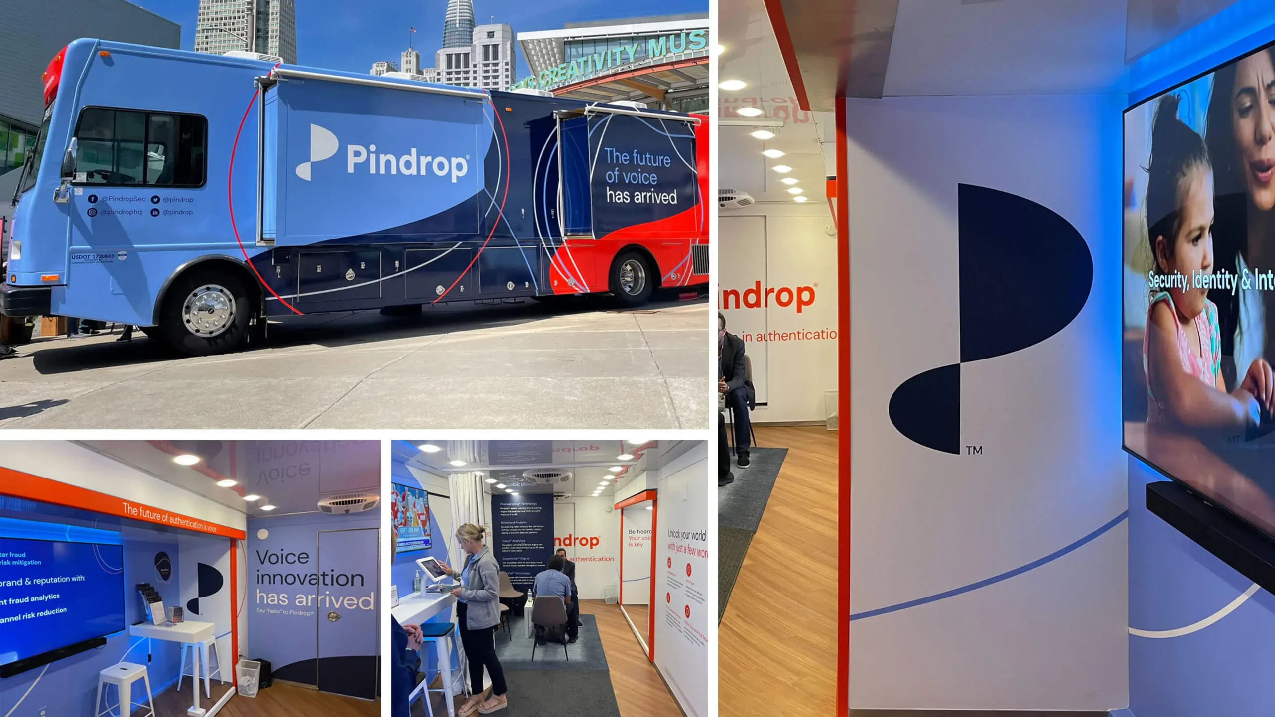
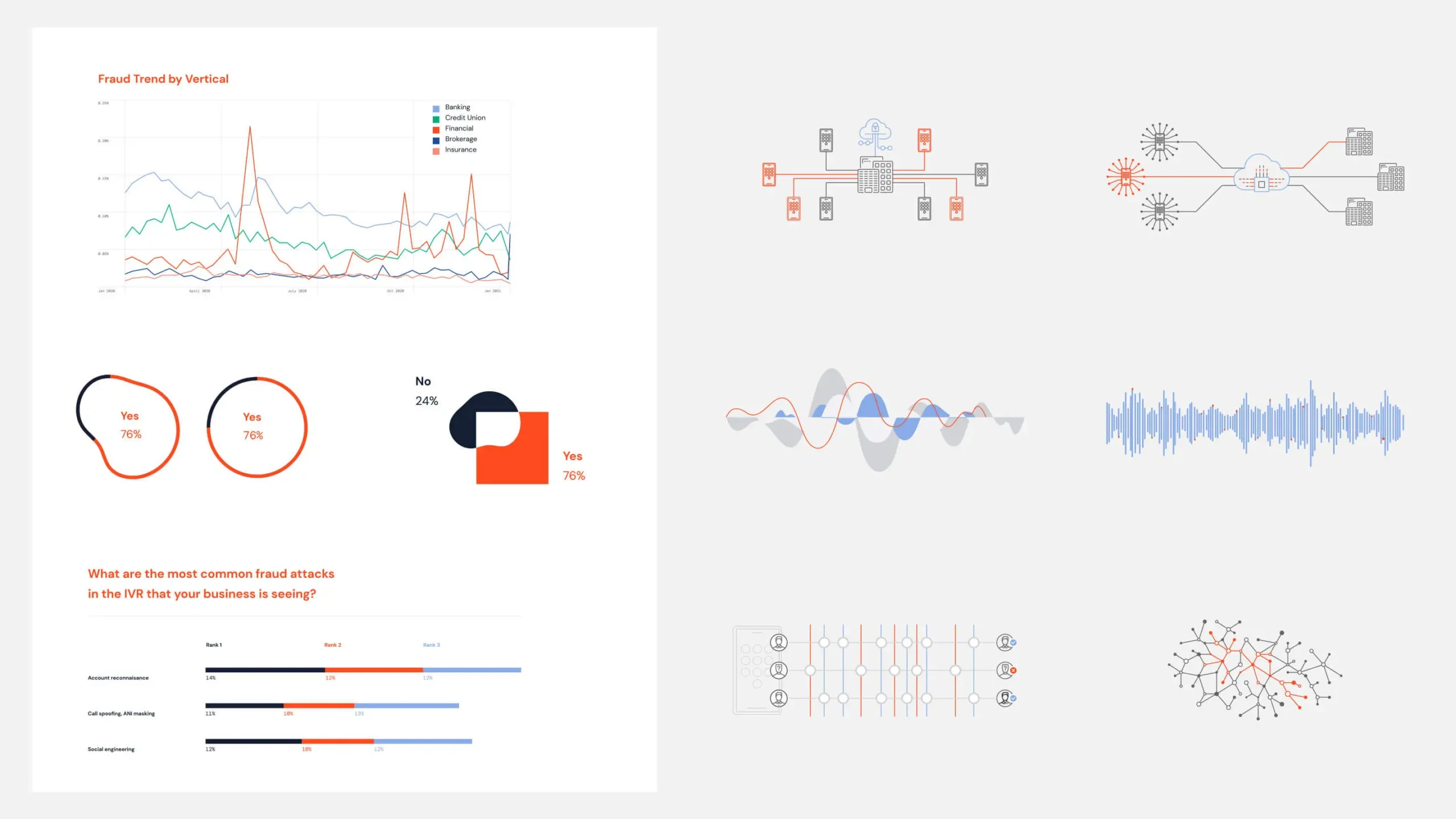
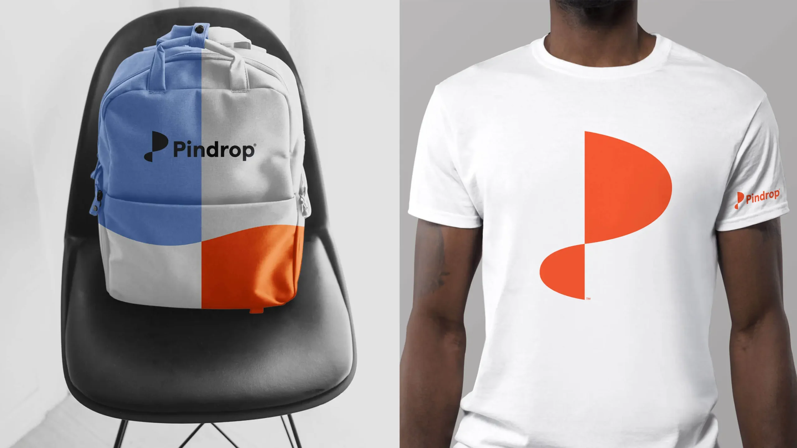
With a strong foundation of core brand elements, the system comes to life in the real world of environments, digital experiences and data visualization.

Surfacing the truths.
Our immersion and interviewing process is designed to help us learn about the company but also to surface key truths and create alignment. This immersion in particular gave us license to be bolder in our solution.

Strategic iteration is okay good!
Landing brand positioning in its final stages is like dancing on the head of a pin–it’s a tight space but it allows you to hone in on something that’s just right for your brand. Where we landed for Pindrop was tight…and just right.
Context is everything.
When we first presented the Brand Idea to Pindrop, there was pushback due to a very recent and noisy business news development. But a week later, the news frenzy had died down…and the Brand Idea was approved.

Plan, plan, plan.
When we started work, we were up against an aggressive timeline for launch. We organized bi-weekly planning and status sessions to keep both our and the client teams on point, and in a position to deliver on time.
Recent Work

Bringing a people-centered brand into a digital-first, product-led future.
View case study