


Amplifying optimism for nonprofits.
A beacon of a brand awareness campaign shows nonprofits that more is out there.
Services
- Advertising
- Campaign Strategy
- Campaign Design
- Copywriting
- Asset Production
- Video Production
- Collateral Design
In a world hungry for change, purpose matters more than ever. Yet the nonprofits dedicated to purpose are often unrecognized and underresourced. This vital industry is forced to adapt unwieldy B2B technology that doesn’t suit their unique needs, leading to fundraising struggles and a scarcity mindset.
Bloomerang came to us with the unshakeable conviction that even amid economic uncertainty, generosity abounds. Nonprofits can uncover it—they just need to know where to look. As a giving platform built specifically for nonprofits, they equip customers with the support and insights to raise more year over year, even as the industry reports declining donations.
To help more nonprofits maximize their transformative impact, Bloomerang’s brand needed to stand for something bigger than technology, with an emotional impact bolder than empathy alone.
We developed an awareness campaign that became something greater: a momentous shift, for the Bloomerang brand and nonprofit industry, from scarcity to abundance, frustration to momentum, limitation to ambition.
Insights that Inspired Us
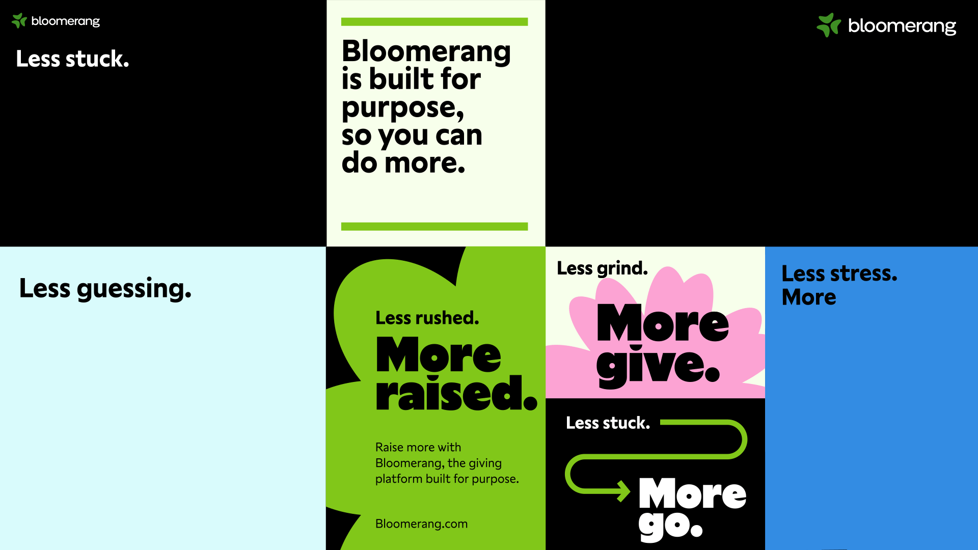
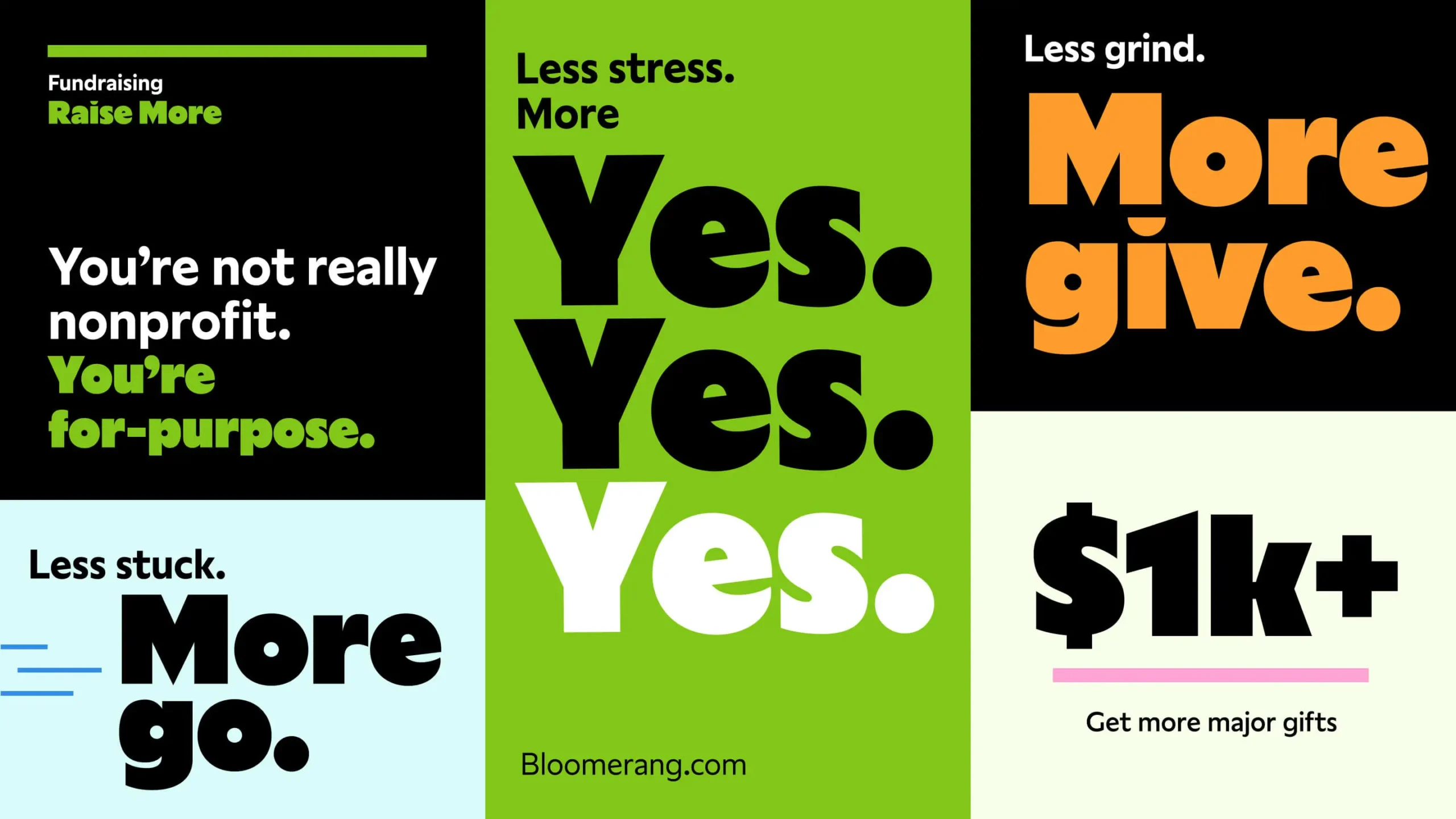
From “nonprofit” to “for-purpose.”
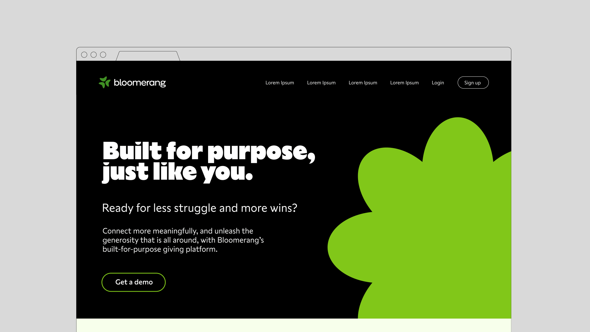
Conversations with Bloomerang and customers illuminated a truth hiding in plain sight: nonprofits are boxed in by their label. Why are world-changing organizations defined by what they don’t do? They’re not “nonprofits.” They’re “for purpose,” and Bloomerang exists to fuel their boldest ambitions. A new tagline offers a reframe: “the giving platform built for purpose.”
Abundance of impact.
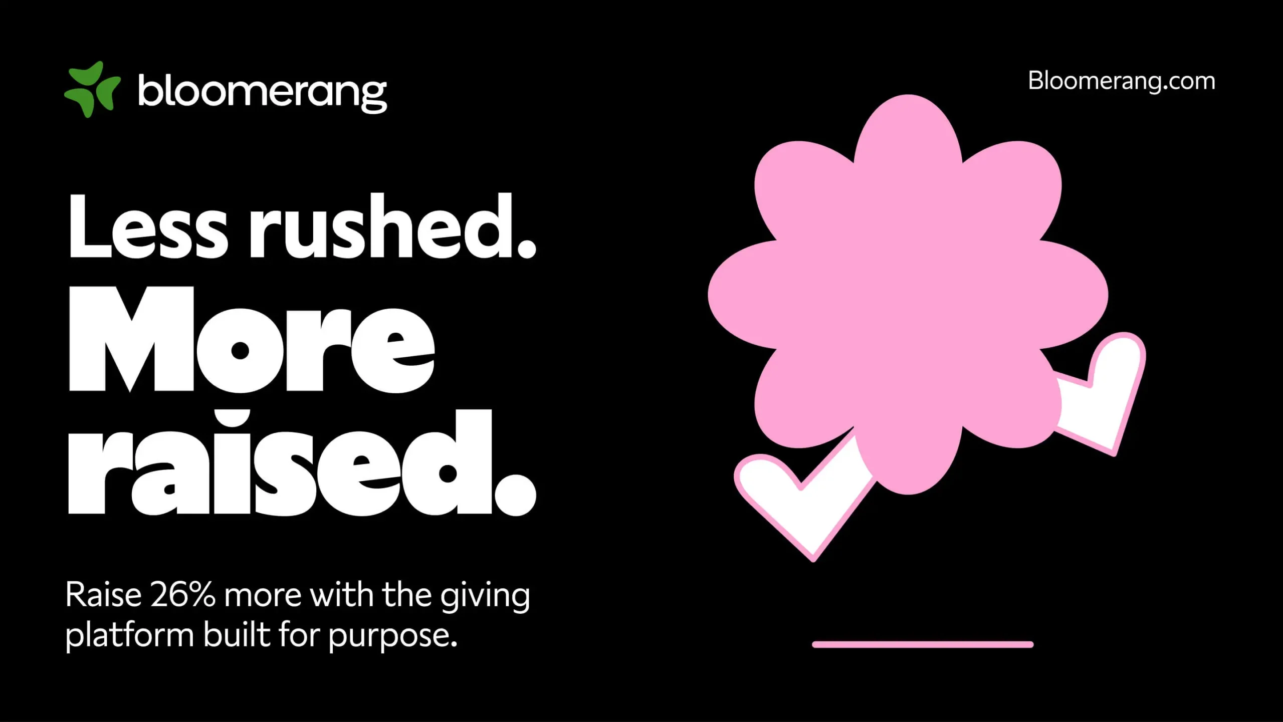
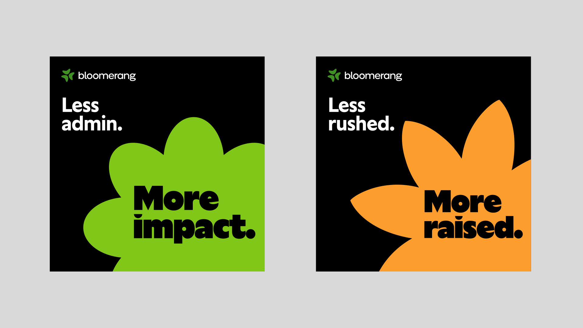
Bloomerang is born from deep empathy for nonprofits. But to fulfill their potential for impact, the brand had to challenge nonprofits’ scarcity mindset and inspire belief in abundance. Our campaign struck a balance, validating struggles while skewering the status quo. Nonprofits don’t have to do more with less. They can do more with more—and that changes everything.
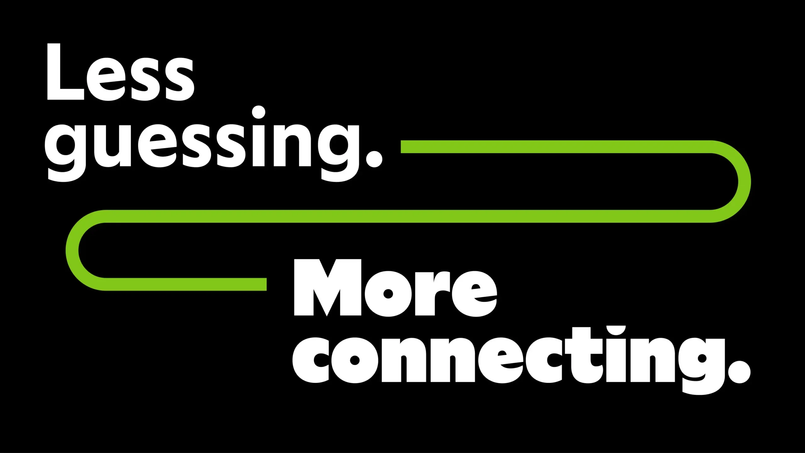
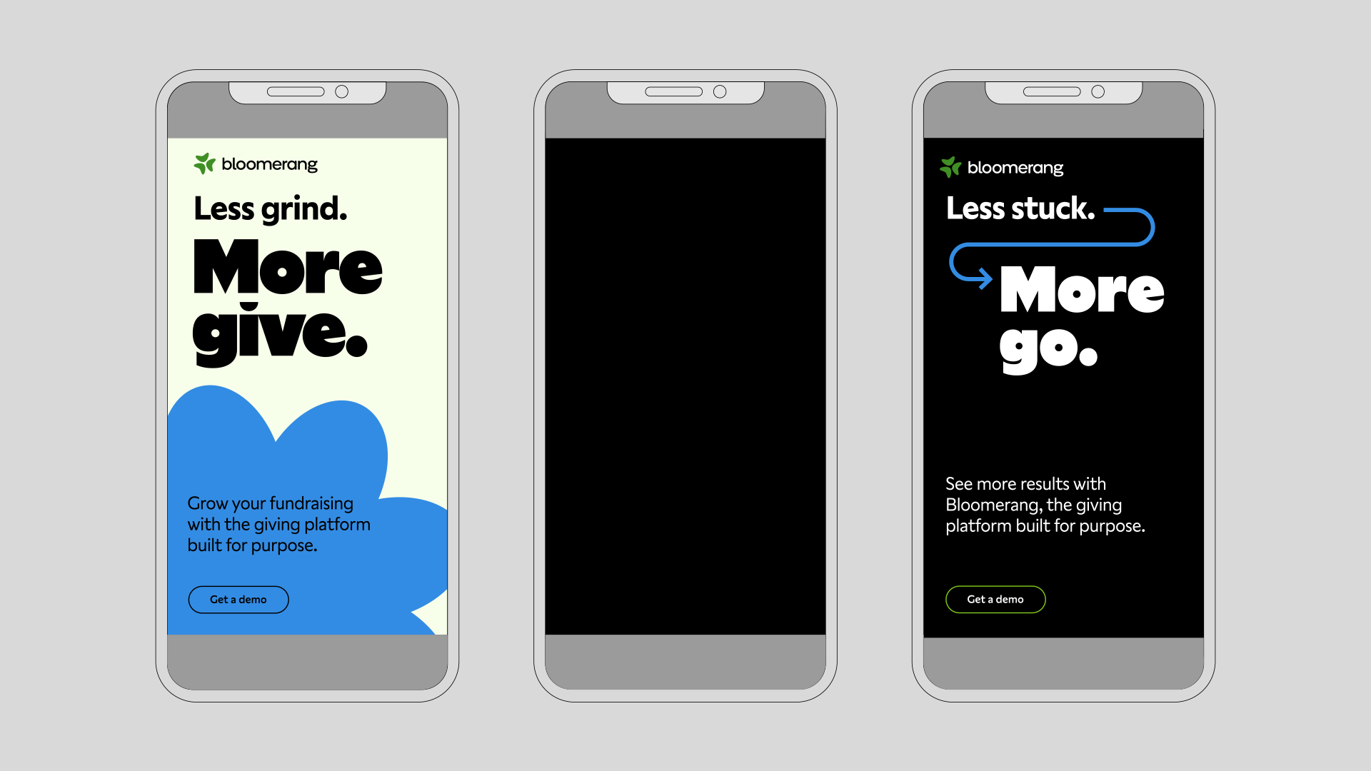
Less stuck, more go.
Growing fast and aiming ever higher, Bloomerang knew their branding lacked the substance and emotion to get them where they wanted to go. A new identity was on the horizon, but we helped them take giant steps forward. Invigorating campaign language was tangibly connected to their existing identity yet unbound by its limitations.
Ann Fellman Jones, CMO, BloomerangI’ve always believed that this is not B2B. This is B2H. We are selling to human beings. We are selling to people who have emotions.”
Built for Purpose
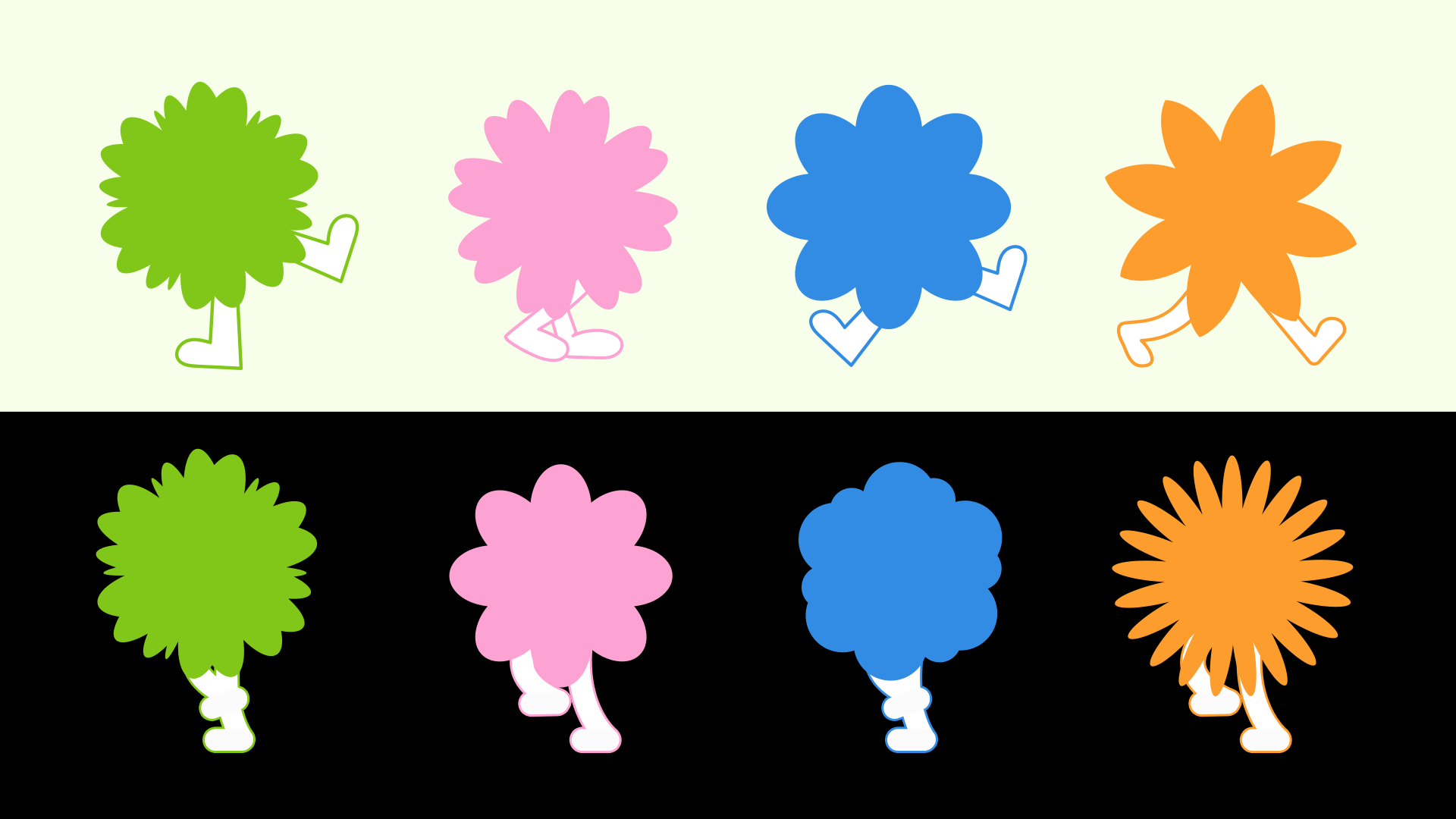
Dynamic shapes underscore impact. Directional graphics amplify messages. Characters remind us of the joy in giving. And motion weaves everything together for a new Bloomerang story. Using the existing visual identity as a foundation, we built a new verbal and visual toolkit to bring awareness to the Bloomerang brand and their giving platform built specifically for nonprofits.
More is More
Typography that feels like the voice of a trusted friend. Colors that make you smile. Words that wink at you with the excitement of what comes next. The energetic skip in the step of a running flower that’s eager to share Bloomerang’s new story. This system of visual elements enabled all the right feels to come to life across a compelling brand awareness campaign.
Recent Work


Bringing a people-centered brand into a digital-first, product-led future.
View case study