Alternatives for investing your IRA.
Full rebrand to elevate and reposition Alto as more than just a technical conduit to alternative investments.
Services
- Brand Positioning
- Brand Voice
- Visual Identity
- Messaging Framework
- Corporate Narrative
- Copywriting
- Collateral Design
- Brand Guidelines

The founder of Alto created the company to provide people with the ability to access alternative assets with their tax-advantaged dollars–an option that had only ever been available to institutions and the ultra-wealthy. Alto is a marketplace of the best providers of alternative assets from crypto to real estate, to private equity and startups, to artwork and farmland. While it was tempting to create a brand around the concept of access and democratization, these ideas felt less compelling than the notion that with access to heretofore ‘privileged’ assets, everybody could start to reimagine a different kind of life. A life that is planful and mindful of the realities of retirement and what it takes to be prepared, but importantly, a life that focuses more on the idea that retirement is the beginning of a new life, not the end of the current one.
What We Learned Along the Way
The classic chicken or egg conundrum.
Alto was very focused on building a marketplace for its partners—the providers of alternative assets. What resulted from this hyperfocus on partners was a go-to-market that felt quite B2B. While we recognized the importance of the creation of the marketplace so that customers would have assets to choose from, we helped Alto develop a go-to-market approach and voice that highlighted the consumer story even as they wooed partners.
Emphasizing Quality over Quantity.
Alto had amassed an impressive number of partners representing a wide variety of alternative asset classes. In our discussions with existing and prospective customers, we learned that they expected Alto to provide a more curated experience. Because these customers were adventurous but relatively inexperienced, they were less focused on breadth and more on quality so that they could invest with confidence.
Realistic targeting.
When we first talked about the target market, there was a temptation to target EVERYBODY—essentially, anyone with an IRA. It became clear in due course that the product was not as turnkey as it would need to be to offer novices an easy on-ramp to alternative investing. We honed our target audience to include experts–consumers experienced in self-directed investments, and not-yet-experts–those with an affinity and intellectual curiosity. But not newbies!
Robin Simkins, Former CMO, AltoEmotive provided consultative leadership throughout the process, ensuring our decisions were informed, strategic and not just based on personal preference.”
The Power of Perspective
At the heart of the Alto brand is a thoughtfully crafted wordmark—the juxtaposition of angles with curves, and the bespoke symmetry of the “A” form—which tells the story of shifting perspectives and how investing better today enables better living tomorrow. This brand storytelling is further elevated with the extracted “A” symbol creating a dynamic split screen effect.
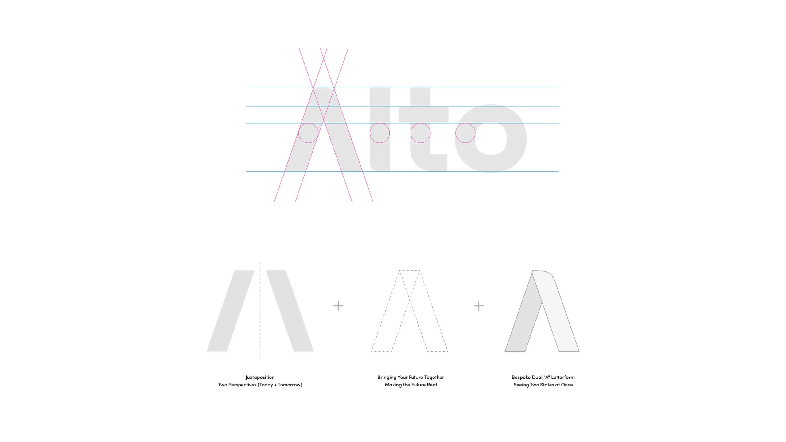


Deconstructing the Future
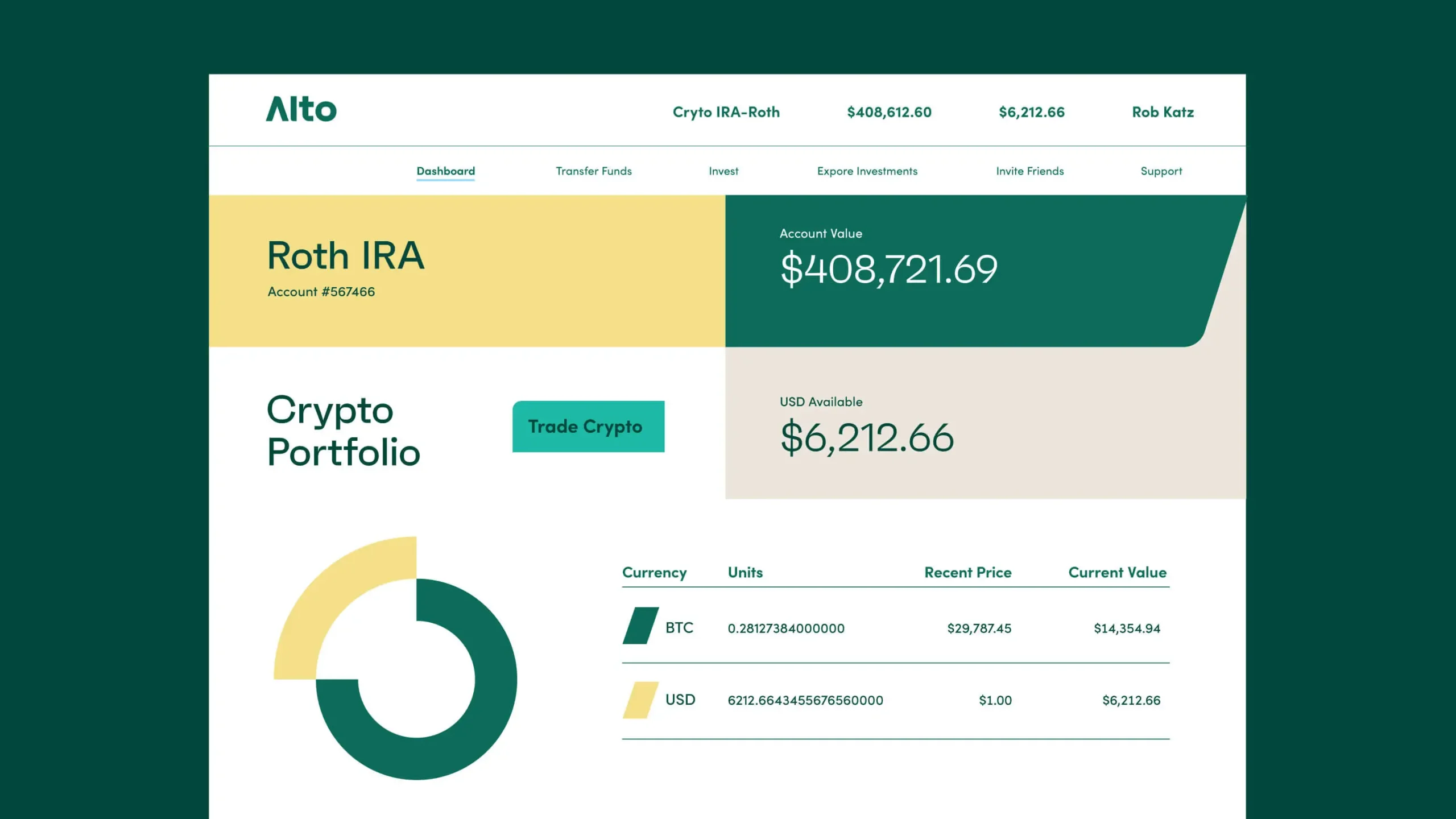
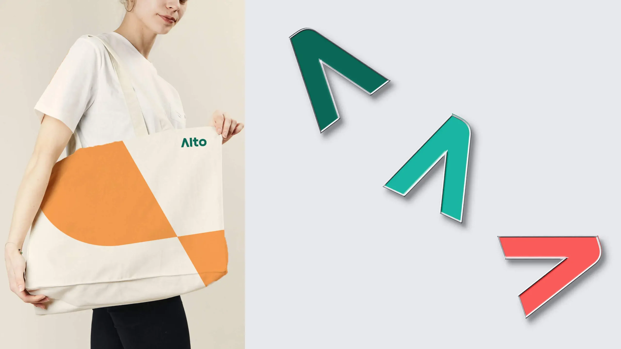
A bold and simple wordmark required an equally simple yet wholly flexible and rich, graphic system to support it. Based on the forms of the Alto Symbol, a shape-based vocabulary was developed that further tells the story of shifting perspectives and imagining the alternative way to invest in one’s future.


Data Can Move You
The world of data and dollars can be a dry place but a close relationship with our client and asking the right questions along the way, proved invaluable in knowing where to push the limits on design. The opportunity to visualize data in a compelling way beyond a static bar chart was an exciting way for us to flex some creative muscle.


Reduce to Enhance
The open dialogue with our client gave us great insight into where the brand should go—and not go—including the foresight to have a strong, simple wordmark that could provide a foundation for complex storytelling but also reduce down to a bold, iconic icon for use online.

Experience That Works

Come and see us again!
There’s no better testament to our work than when our clients come back for more. Our CMO client at Alto was an ‘old friend’ for whom we had completed a branding project at her previous company a couple of years earlier.

Surfacing elephants in the room.
During our immersion, we detected a series of topics that people were skirting around. We made a point of highlighting them with our clients to ensure alignment before making any pointed brand recommendations.

Stock isn’t (always) the devil.
Being in touch with your client’s needs means understanding their limitations, budgetary or otherwise. We developed a unique ‘non-stocky’ stock photography style that supported the brand without compromise.

Make it real.
No one can buy a brand solution they can’t imagine in the real world. We helped our clients to futurecast by sharing our design concepts in real-life applications. Call it genius, or call it prescient, it simply works.