


Doing more with less.
Drawing attention to the best sustainability story never told.
Services
- Sustainability Strategy
- Corporate Reporting
- Design
- Digital Assets
- Brand Guidelines
How a world-famous package delivery brand revealed itself to be a big data tech company.
UPS is big. How big? Operations in more than 220 countries and territories. Nearly 400,000 employees, 103,000 vehicles, 2,700 facilities and more than 16.9 million packages delivered each day. That’s how big. So when they started working with Emotive Brand on sustainability reporting, what did they do? They started small.
The project started with a small group of believers and grew in visibility and influence, eventually becoming a boardroom showpiece and C-suite gem that highlights UPS innovations in efficiency and responsibility. The compelling story now shared with the world is a complex epic that required a steady hand and ongoing diligence to match the legendary UPS attention to detail.
We started small, then built the story into a globally distributed testament to one brand’s commitment to a purpose beyond profit.
Promise delivered.
What We Learned Along the Way
Sometimes the best stories are the ones others tell about you.
We all know that the B2B world is really B2B2B, with relationships and dependencies up and down every supply chain. That’s why stories from multiple stakeholder perspectives are the best way to discover the real story of your brand.
Being first can be scary.
Strong brands are not made by the timid. You have to be bold to navigate new terrain on the fly. But taking risks is how a brand puts a stake in the ground. Standing for something is what gives your brand meaning.
If your brand stands for something, say it clear and say it loud.
Bold, positive action by a brand deserves to be highlighted in terms anyone can understand and communicated in a consistent way. That’s why we make the effort to be empathetic and fully understand every audience.
Scott Davis, UPS Chairman and Chief Executive Officer (From the 2013 report)How do we meet the needs of the many in the most efficient, responsible way possible? Such a challenge requires continual innovation, a global perspective and a clear focus on what matters the most.”

Celebrating the (supply) chain of life.
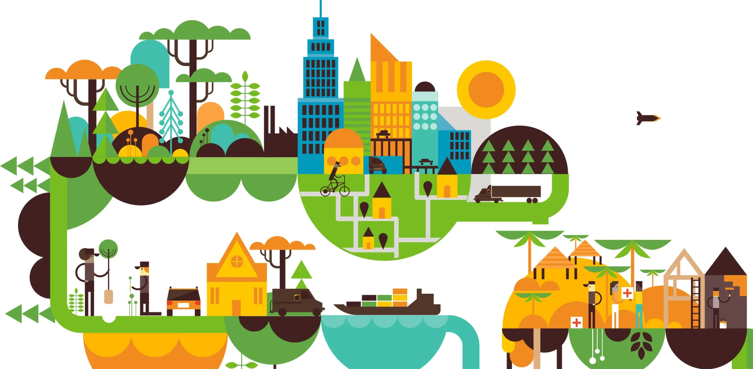
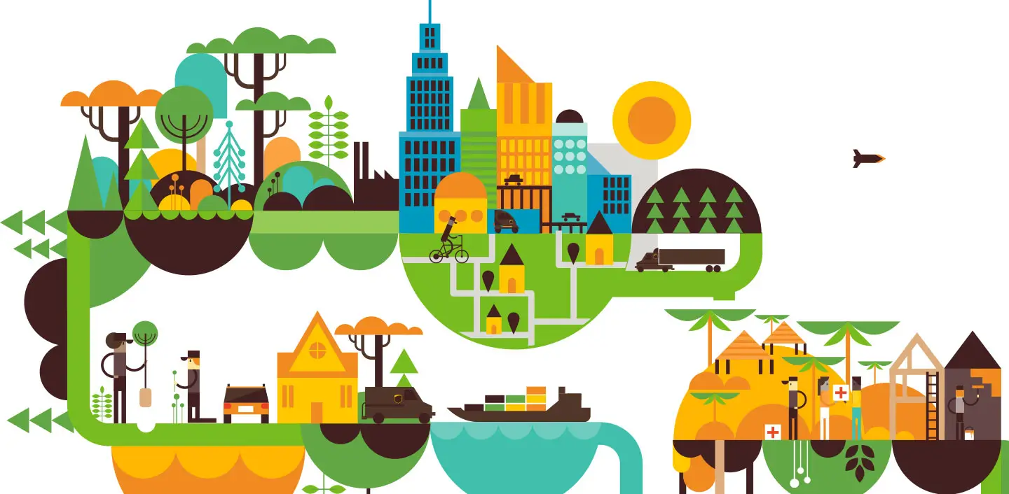
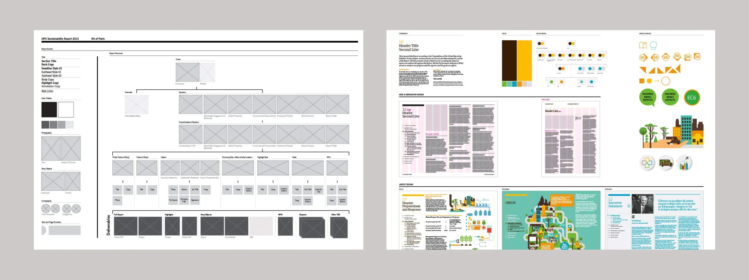
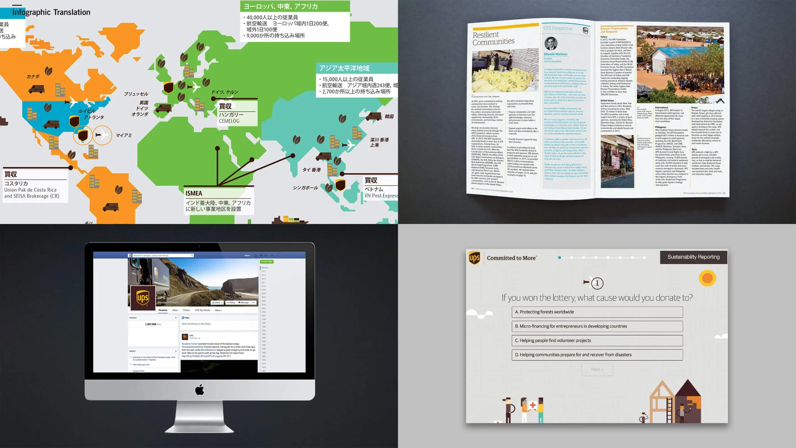
Fresh, human, friendly, accessible? Does that sound like a transportation behemoth? Didn’t think so. But it does sound like the UPS brand. The graphic look we developed for the sustainability brand has the same warm, inviting UPS feeling. UPS is a big data company, too, and our design of their sustainability report conveys a prodigious amount of information in bite-size bits.
The brand within the brand.
Efficiency is the DNA of a vast logistics company like UPS. The sustainability program lives inside the UPS brand in a completely compatible way.

Interactive content served to order.
We designed UPS sustainability information to be distributed to audiences all over the world as easy as drag and drop.
Experience that Works
Attention to detail. It’s a way of life.
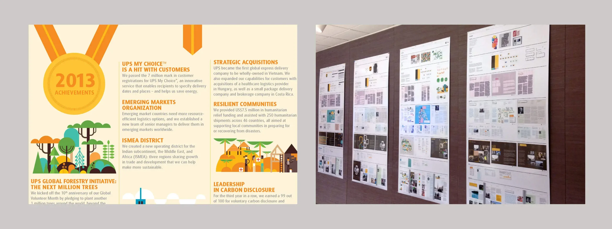
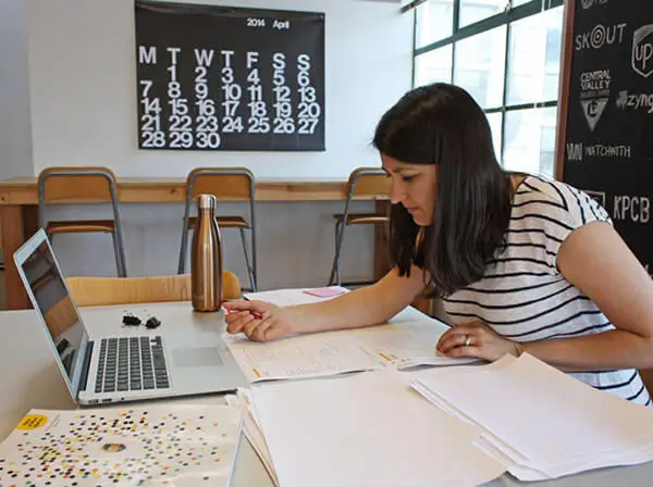
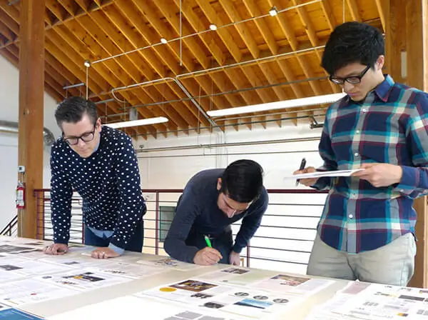
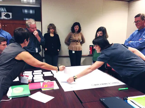
When a project takes ten months to build and you repeat the process every year, you need strong project management. We employed our battle-tested, Kevlar-reinforced, bullet-proof team to manage every detail of multiple UPS projects.
Design for accessibility. Information accessibility.
Data-intensive projects, like sustainability reports, need a unique design approach. For UPS, we packaged information in a modular way that was accessible for each audience. It was the best way to get the story straight, consistently.
Rome wasn’t built in a nanosecond.
Start-up brands move at internet speed. Large corporations move at their own speed. We know the difference, so we respected the UPS culture, and stepped in at the right moments to sustain momentum.

Push hard to get better each year.
When an ambitious brand project succeeds, it takes on a life of its own. As the UPS program grew into a corporate-wide global initiative, we pushed hard to improve year over year. We iterated and evolved the story to keep it transparent and fresh.
Recent Work

Bringing a people-centered brand into a digital-first, product-led future.
View case study