






Infusing a category with radical honesty.
We brought two entities together, creating a unified brand that operates on a whole new level.
Services
- Brand Strategy
- Brand Voice
- Messaging Framework
- Brand Narrative
- Visual Identity
- Collateral Design
- Brand Guidelines

When the company approached us, TopstepTrader was actually two separate products. The first, TopstepTrader, enabled online traders to prove their trading competence and earn the right to become a Funded Trader—trading Futures with the company’s capital. The second, TopstepFX, was the same product but enabled trading on the Foreign Exchange. Having two products in the market had created confusion and unnecessary bifurcation of spend and focus.
Although the original request was to unify the products under one brand, Topstep, the real opportunity was to give the unified brand a raison d’être. Although the platform had been ground-breaking when it first launched in 2012, eight years later, many competitors had sprung up, making for a crowded and confusing marketplace. Further, the category had been sullied by a lot of false promises that had tarnished the Topstep franchise as well. We saw a huge opportunity to shed light and put Topstep back in front.
What We Learned Along the Way
Disruption takes ongoing commitment.
Topstep truly disrupted the online trading category when it launched, but over the eight years since its founding, it had lost its edge. We worked with our client to re-disrupt the category, this time with a fresh voice and new relationship to its customers. Disruption cannot be one and done. It takes constant evaluation and commitment to find and keep your edge.
Discomfort can be a critical indicator.
During our internal interviews, we discovered that some stakeholders were slightly squeamish about certain aspects of the Topstep offering. We used this learning to help push the new brand to adopt a voice that reflected even more honesty and integrity.
It’s never too late to define your brand.
When Topstep launched in 2012, they had a logo, an icon, and a color palette, but no brand strategy. The business they had built and the integrity with which they had grown it formed a solid foundation upon which to create a trenchant and compelling brand strategy that we hope will provide a runway for the brand for the next eight years.
Robin Simkins, VP Marketing, TopstepWe hired Emotive to bring two brands together under a single umbrella and ended up completely redefining our category position. Emotive brought us a not terribly flattering series of findings and challenged us to think more deeply about our brand. Their unique combination of strategy and creative pushed us in a direction that was truly bold.”
Earning the Verb
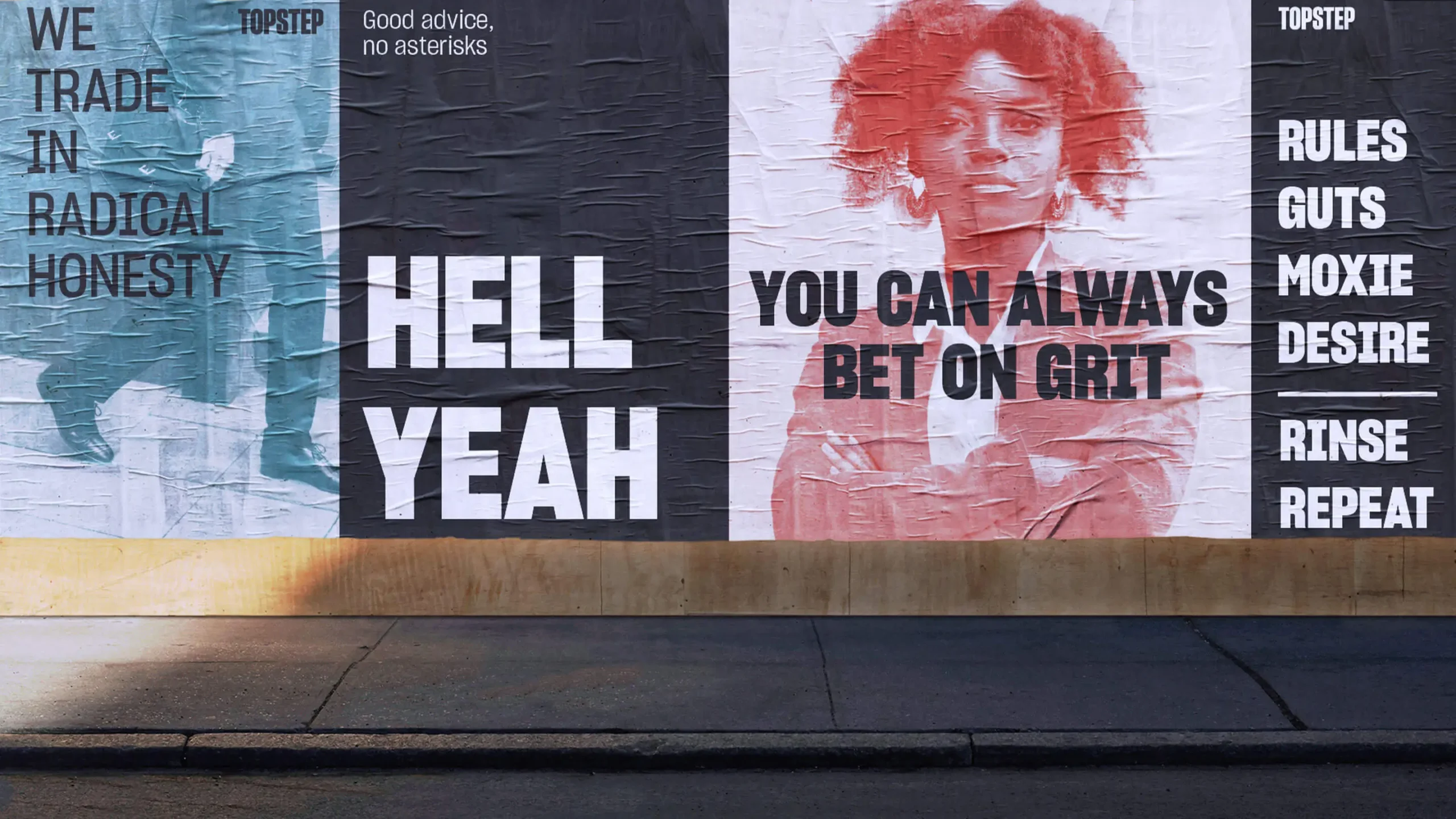
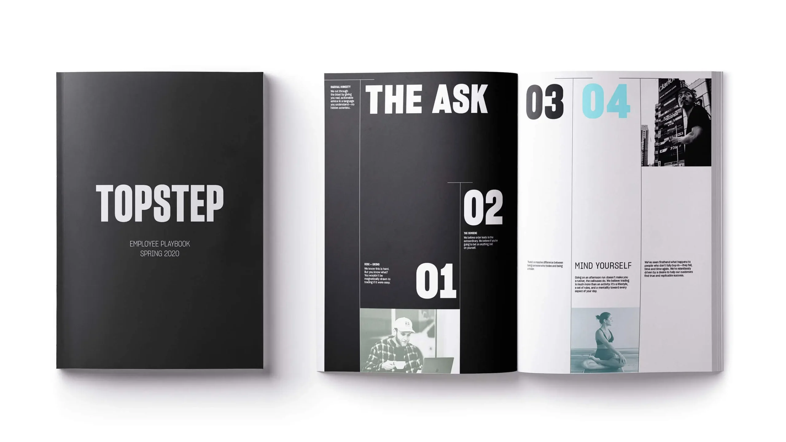
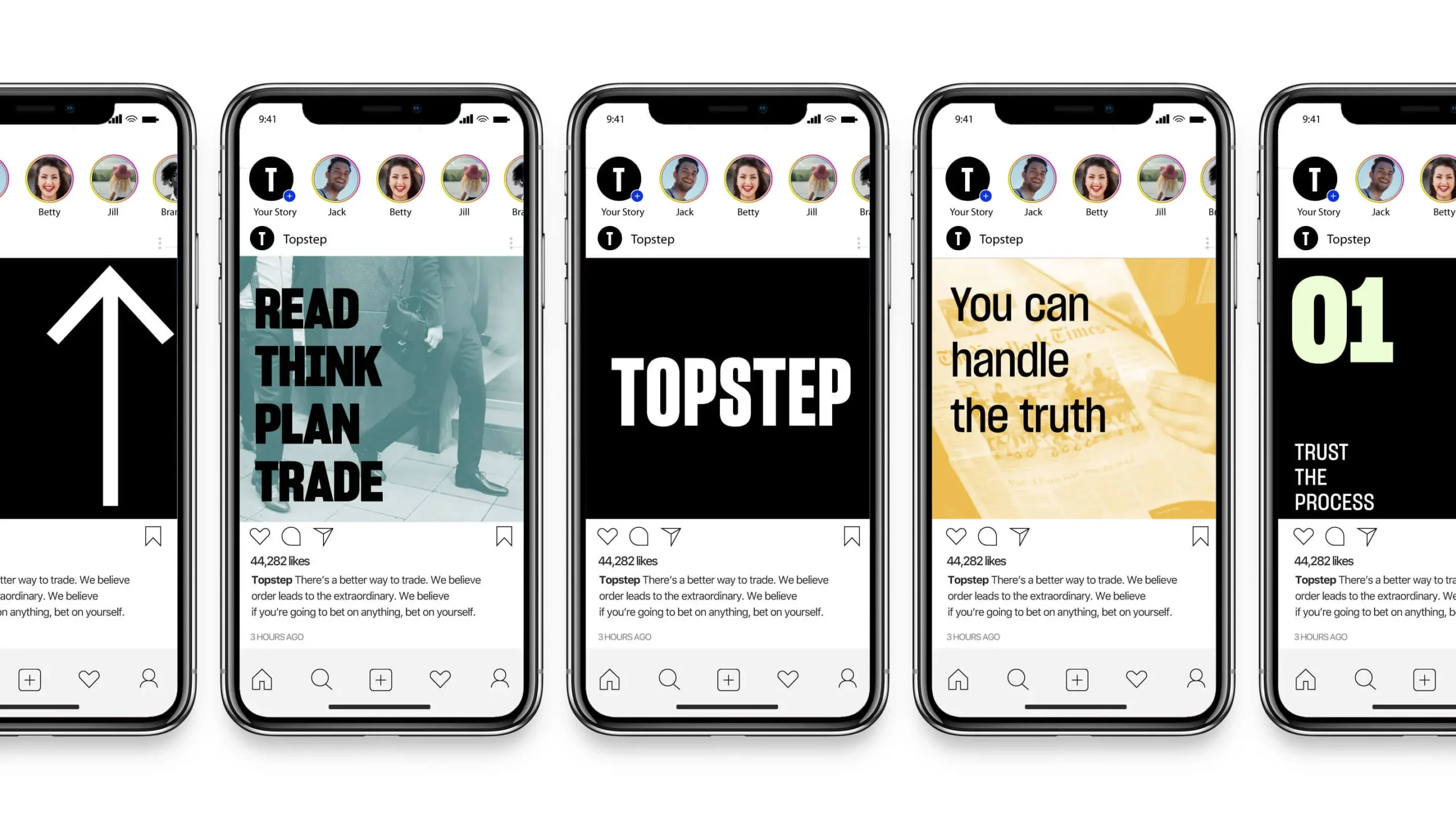
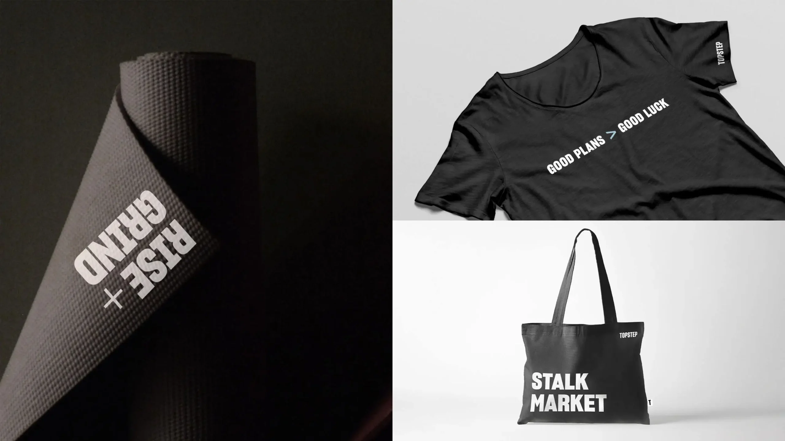
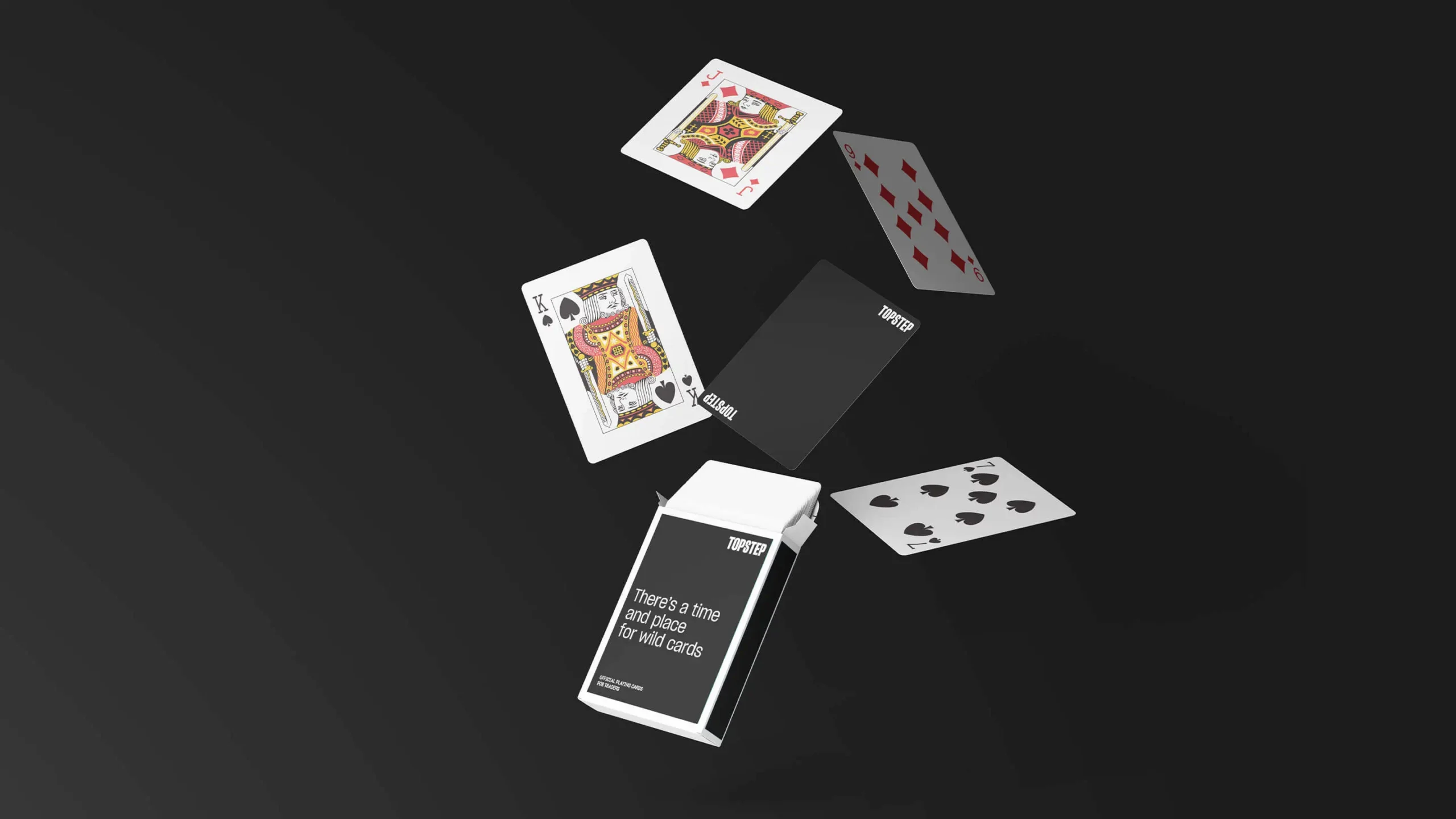
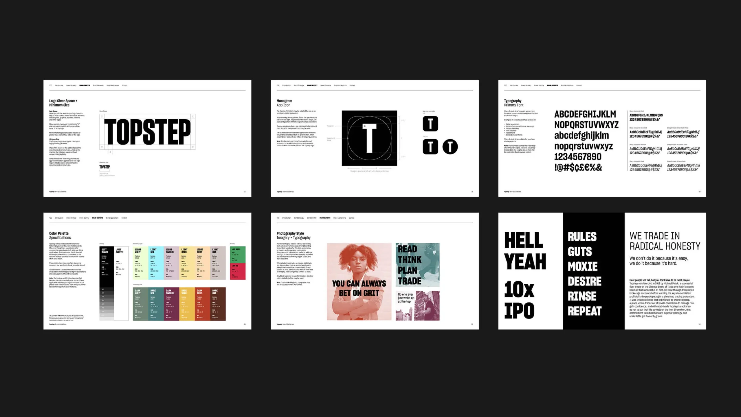
Trading is more than activity or passion—it’s an identity—and the Topstep approach employs the radical honesty that is required to turn people who trade into Traders. As typography and voice become the heroes, a restrained design language allows the brand to employ that same sense of radical honesty by speaking loud and clear.
Radical Simplicity
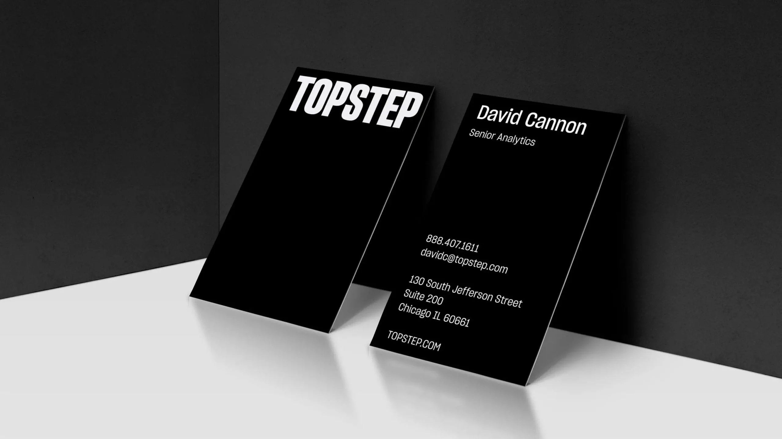
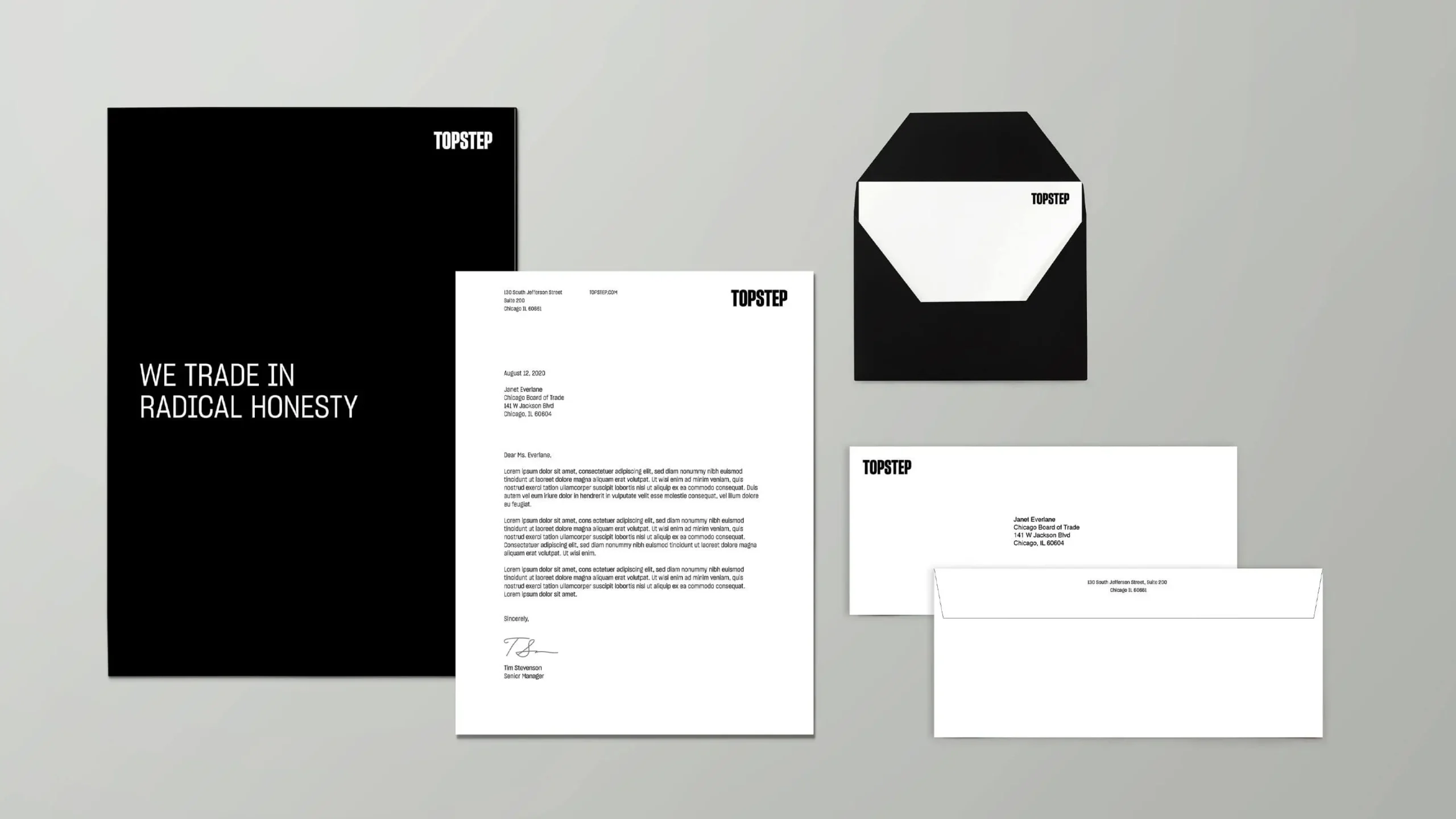
Inspired by the bold, hand-set type of newspaper headlines and the fearless voice of journalism, the Topstep logo sits at the heart of the system to reflect the brand spirit of radical honesty and a just-the-facts mentality. A pure and simple shorthand for the logo, the Topstep monogram ‘T’ reinforces the fact there is a difference between someone who trades and a “capital-T” Trader.

The Rules Shall Set You Free
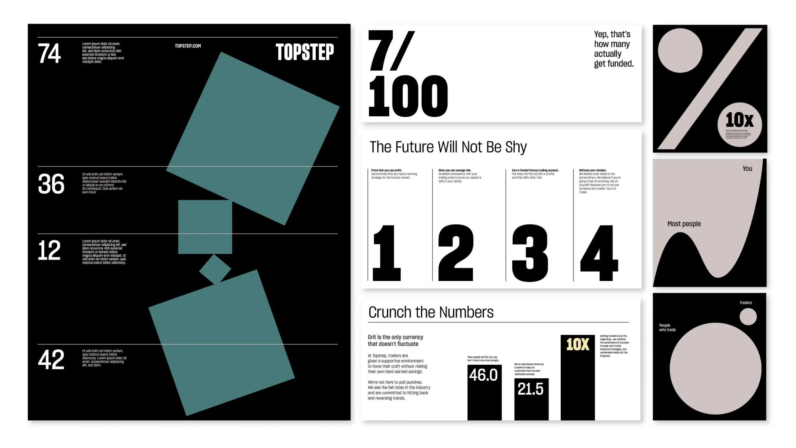
A flexible grid system was developed—the linear rules of the grid brought to the forefront—to craft narratives with the utmost clarity and impact. When used together, the horizontal and vertical rules can be configured to form a ‘T’ as a subtle nod to the ‘T’ in Topstep.
True Grit
Traders think in verticals—ups and downs, gains and losses. In navigating these peaks and valleys, traders must wade through murky clouds of overpromising, legalese, and fine print. The new Topstep brand cuts through the clutter and employs a bold clarity of thought through purposeful typography and sincere truth-telling.

Experience that Works
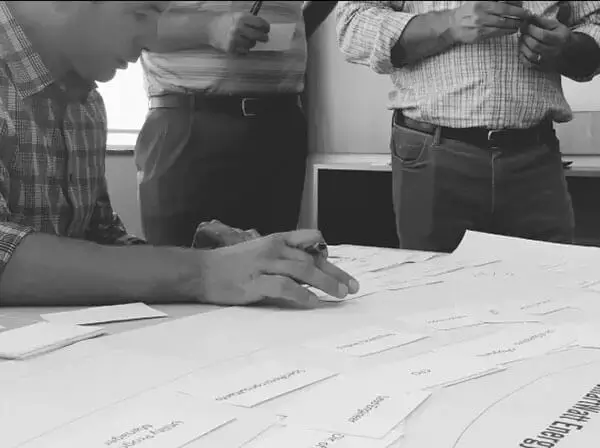
Never shy away from complete honesty.
For one of our earliest presentations, we were planning to share some fairly honest observations and worried that our client would not react well. Our honesty was rewarded with a round of applause.
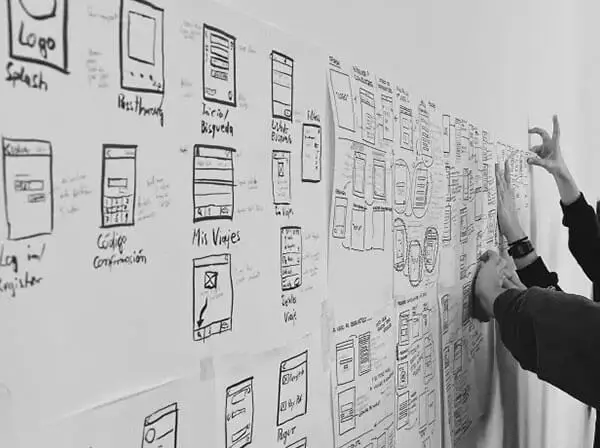
Parallels can come from anywhere.
As we mined for insights, we found ourselves investigating parallels for online trading in both the world of gambling and dieting. We found these parallel worlds useful and relatable as we applied them to our work.
The process is also the endgame.
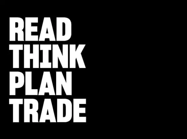
Good ideas need not be in the form of a final deliverable to have validity. One of the concepts we shared very early on during a workshop became the North Star for the tone of voice that ultimately infused the Topstep brand.

Relationships are everything.
We truly love our clients and work hard to get to know them, understand what makes them tick. When the client/agency barrier is broken down, (to an appropriate degree, of course!) the work just flows as does the good energy.
Recent Work


Bringing a people-centered brand into a digital-first, product-led future.
View case study