


Reaching for the next horizon in healing.
Infused an emotive ethos into the heart of Regenity’s new brand.
Services
- Brand Strategy
- Visual Identity
- Naming
- Positioning
- Corporate Narrative
- Copywriting
- Values Refresh
- Brand Activation
- Brand Guidelines
In the midst of announcing a large international acquisition, Regenity came to us during a pivotal moment in their organization’s history. Looking to unify and energize both internal and external audiences during this transitional period, Regenity sought our help to craft a new brand that would meet the moment. Not only did the new brand have to reflect what they had already accomplished in regenerative science, but also the new frontiers Regenity now had the knowledge and resources to explore thanks to their acquisition. Foundational to our work was imbuing a more human and approachable quality into Regenity’s brand to differentiate them in an overly technical and sterile competitive landscape. The result was a vibrant brand that clearly expressed Regenity’s hands-on, build-it-now attitude for bringing material advances in regenerative implant science to life.
What We Learned Along the Way
Tilting the Scales in Your Favor.
We quickly discovered how well-loved Regenity was by their customers; however, most of the appreciation was attributed towards specific people and teams, something that is challenging to scale. To make the brand as powerful and emotive as possible, we had to take the very human qualities of what made their team special, and infuse them into the brand positioning.
Reframing the Routine.
Innovation is the currency of the industry and what gets attention, but it has become the category’s hottest buzzword and its overuse has stripped it of its meaning. Finding new ways to frame up Regenity’s unbridled creativity gave them the lift they needed to differentiate from the masses.
The Heart of the Brand.
A common trope we uncovered in the category was that of Improving Patients’ Lives. But Regenity on the other hand has a stop-at-nothing compulsion to meet patients’ needs. We had to be sure that the new brand captured this spirit of urgency to deliver the best solutions possible to meet patients’ most pressing medical needs.
Jessica Swanson, VP of Marketing, RegenityEmotive Brand has an incredibly thoughtful, detailed process. They asked really great questions, which allowed them to uncover great insights about the opportunities ahead of us.”


The Art of Healing
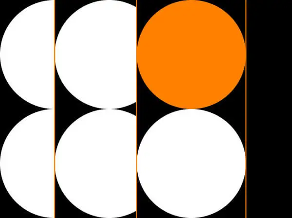
Working at the epicenter of regenerative implant science, a new identity was crafted to embody Regenity’s critical role in creating new transformations in healing. Elemental simplicity inspires a logo that captures creation in motion—building to reveal something new. Something whole. Something complete.


Material Impact
A relentless curiosity and can-do spirit, grounded in scientific expertise, is brought to life in Regenity’s brand system—from the dynamic data visualization and iconography style to the layered compositions and photographic approach.


Macro Micro
The Regenity brand brings to life the scientific detail and pragmatic expertise of their team—paired with their big thinking and going beyond what is possible.


The New Frontier
As co-creators with their partners and medical specialists, Regenity is a team of searchers and innovators that ask the difficult questions. A simple graphic system supported by sophisticated photography, allows for their story to shine as leading scientists and artisans on the frontiers of regenerative implant science.
Experience That Works

What’s In a New Name?
In addition to creating a new brand positioning and visual identity for Regenity, we were thrilled to work hand-in-hand with our trusted naming partner, Operative Words, to devise a new name and tagline for Regenity that signaled this pivotal moment in their history.
So… We’ve Crafted an Awesome New Brand, Now What?
We pride ourselves on delivering strategy that has real impact, so we conducted an activation planning meeting with Regenity to ensure they had all the tools and knowledge they needed to bring their new brand to life in the most effective way possible.

The More the Merrier.
Regenity’s acquisition was not finalized until a few weeks into the lifecycle of our engagement, but we still welcomed the new decision-makers from the acquired organization to the table for a fresh perspective and to ensure we had their buy-in.

Simplicity Cuts Through the Clutter.
Sometimes the best way to make a splash in a sea of sameness is to lean in to simplicity. The competitive landscape was uninspiring, galvanizing us to design an elegant logo for Regenity that clearly stands out from the crowd.
Recent Work

Bringing a people-centered brand into a digital-first, product-led future.
View case study