

Design that’s both accessible and beautiful.
Galt wanted to expand into the Fortune 500 while living its mission of accessibility.
Services
- Brand Strategy
- Brand Voice
- Visual Identity
- Positioning
- Messaging
- Website Design
- Collateral Design
- Brand Guidelines
- Brand Architecture

Galt had a successful business model placing skilled people with disabilities in temporary government jobs. But it served only three states: Oregon, Oklahoma, and Pennsylvania.
With little name recognition and a risk-averse organizational culture, Galt’s new leadership took on an ambitious challenge—to expand across the U.S. by targeting private-sector Fortune 500 companies. They hoped to offer additional services to people with disabilities and, ultimately, take their model global.
Galt needed help telling their story to both private- and public-sector clients, as well as to prospective employees in new markets. And they needed to prepare for future expansion. The linchpin was a new visual identity, logo, and website that were fully inclusive of people with disabilities.
What We Learned Along the Way
Accessibility without sacrifice.
Designing for disability removes many everyday tools from the design toolbox, from italicized type to conventional color combinations. But embracing the limits actually can be freeing. Designing for extreme clarity can allow a beautiful simplicity to shine through.
Stigma can cut two ways.
Developing messaging on both sides of disability–speaking to people with disability and those who work with them–requires understanding a stigmatized subject from both sides. By seeing beyond conventional views and understanding the unique opportunities of partnership, it’s possible to create persuasive messaging that brings them together.
Power and sensitivity aren’t mutually exclusive.
Sensitivity is required when working with a stigmatized subject, but that doesn’t mean the result can’t be powerful. The most sensitive brands can inspire bold and impactful strategy and design.
Nancy Geenen, CEO, GaltI’ve returned to Emotive Brand repeatedly because the agency does break-through work every time. It’s a group of great listeners and amazing doers who can drive success for any organization.”
A Logo That’s Simple, Powerful, and Symbolic
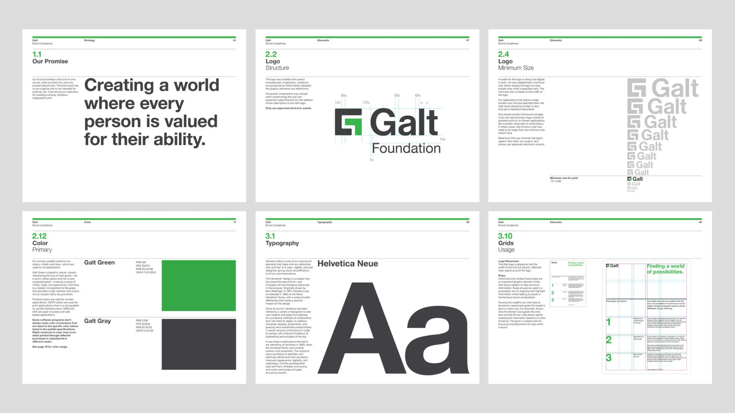
The interlocking components of Galt’s mark were inspired by the company’s unique ability to perfectly match employees to jobs. A minimal number of pieces make the logo powerful and clear. Every version has adequate color contrast for people with visual impairments. A subtle arrow symbolizes the progress Galt helps its employees and clients achieve.

What happens to color theory when people see color differently?
Color blindness, which minimizes contrast between colors, can make both words and images hard to see. Galt’s preferred brand color, green, is especially prone to contrast issues. We designed Galt’s palette using a digital tool to emulate the effects of color blindness, helping us create a beautiful, coherent palette that maintains high contrast ratios.


Taking Simplicity to Extremes
Designers love simplicity, but what do you do when extreme simplicity is mandatory? Our answer was to create beauty from simplicity in its most extreme form. The foundation is a grid layout with clear lines and generous sizing and spacing. Helvetica was chosen as a universal, ligature-free font.
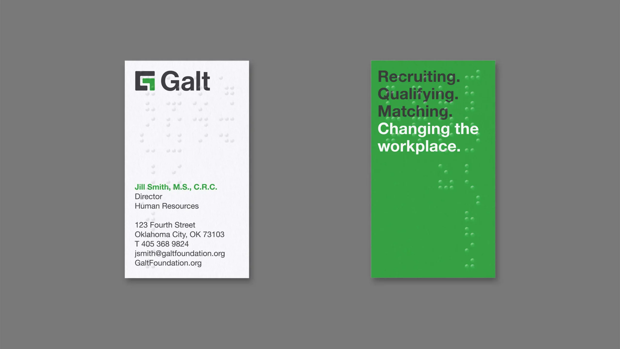
A Business Card in Two Languages
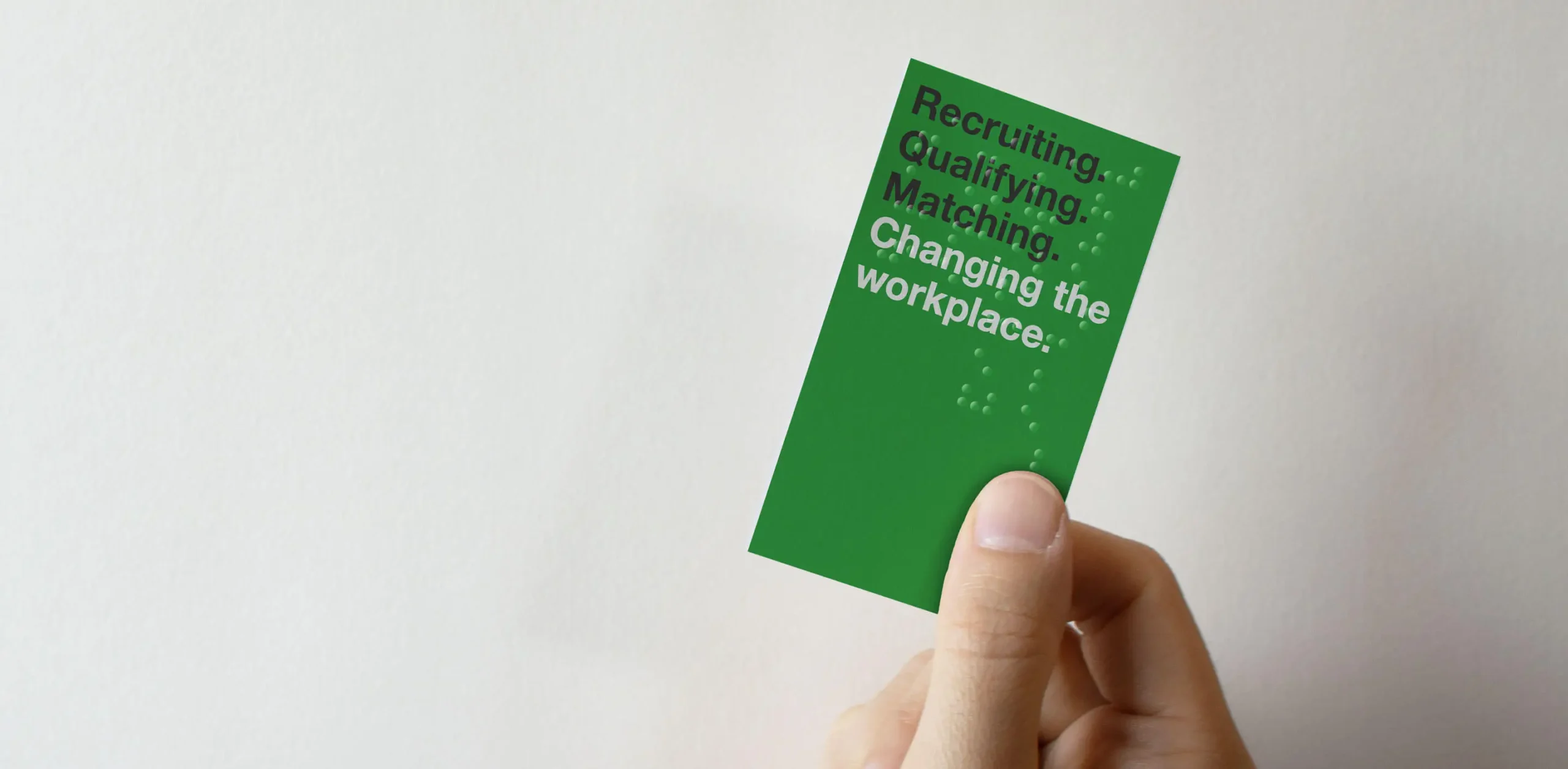
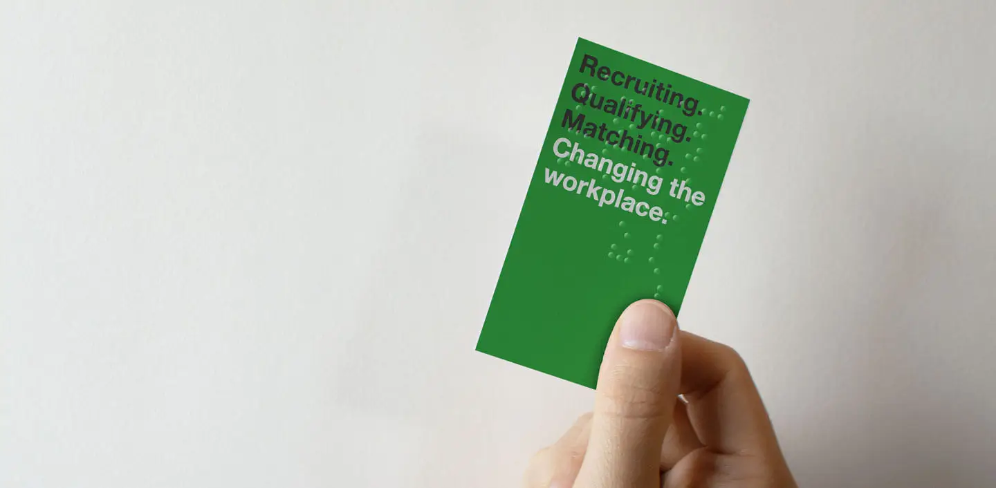
Designing a business card containing both printed type and embossed braille required two different overlaid designs. We chose a vertical layout for the type, which allowed the most impactful scale for the printed logo and messaging. For the best fit, we embossed the braille code horizontally.
A Brand Built for All
These examples highlight the core elements of the Galt brand—logo, color, typography—and show how they come to life in real-world applications. Designing for Galt invited us to experience branding through the lens of people who see, hear, and move differently than we might expect. The process pushed us to question our instincts, unmask assumptions, and deepen our empathy. In creating a system that is both functional and expressive, we grew not only as designers but as people—crafting a brand built to be understood and valued by everyone.

Experience that Works

When everything’s changing, the brand unites.
The new brand for Galt came when so much else was in flux. At a time of seismic shifts, the new brand helped unite the old and new into a cohesive whole.

Many voices create a harmonious new brand.
By tapping into Galt’s board members’ expertise, we were able to understand the unique needs of the private-sector target audience and integrate them cohesively into the brand.

Tonality translates from one medium to another.
Galt’s no-nonsense approach to its work inspired a clear and straight-forward brand voice that sounds like Galt and effectively connects with its audiences.

Creating a brand that can grow.
For an organization with ambitious plans for the future, we made the Galt brand stretch to fully meet today’s needs while being big and aspirational enough to accommodate a potentially very different future.