Heralding the “NextOps” strategy to maximize innovation.
Developed a brand to bring CodeOps and Crowdbotics’ pioneering spirit into the forefront.
Services
- Brand Strategy
- Visual Identity
- Collateral Design
- Brand Voice
- Messaging Framework
- Brand Guidelines
Crowdbotics is a platform that gives organizations the ability to plan and develop applications more strategically and efficiently through the systematic discipline of code reuse. Instead of recreating application specs and wrangling various sources of code (proprietary, open source and LLM-generated) organizations can streamline the entire process, resulting in a faster path to innovation.
Crowdbotics had begun to use the term “CodeOps” to describe this radical approach to spec and code reuse but had not fully defined it, explained its ultimate benefit to organizations, or taken ownership of it as its pioneers. We saw a tremendous opportunity to tether their brand to CodeOps in a way that we had witnessed other brands tether themselves to earlier frameworks like DevOps.
We took the Crowdbotics brand out of the traditional tropes of its low- and no-code peers by NOT talking about democratizing app development, or speed and efficiency. Instead we laddered up to higher order benefits like meeting economic and technological pressures that plague today’s Enterprise leaders.
What We Learned Along the Way
Functionality still dominates in B2B tech branding.
At this point it should come as no surprise…and yet. Every one of the competitors in Crowdbotics’ space was leveraging functional benefits…which not only feels small and unimpressive but also predetermines an audience that is not in a leadership role or mindframe. Getting out of functionality serves to command the attention of a more influential buyer.
The answer is often in plain sight.
During our stakeholder interviews, we were exposed to CodeOps and the infectious enthusiasm our clients and their customers already had for it. It became obvious very quickly that finding a way to build it into the brand was a surefire way to connect to a powerful and differentiating positioning for Crowdbotics.
Much of AI branding is cacophonous but hollow.
Crowdbotics has a meaningful play within AI because its platform solves for LLM-generated code and utilizes AI as part of its code identification mechanism. We cautioned Crowdbotics to be cognizant of the insincerity of much of the activity within current AI branding so as not to squander its very real and formidable AI credentials.
Lesley Rubin, VP MarketingEmotive’s work was key in our transition to an Enterprise SaaS solution for the market. Their strategic approach revamped our brand, aligning it seamlessly with our vision for CodeOps. Through collaborative efforts, they crafted our narrative and positioned us effectively in the market. Working with the Emotive Brand team was awesome, they made the process informative and enjoyable. We are now poised for success in our go-to-market strategy.”
A Call for CodeOps
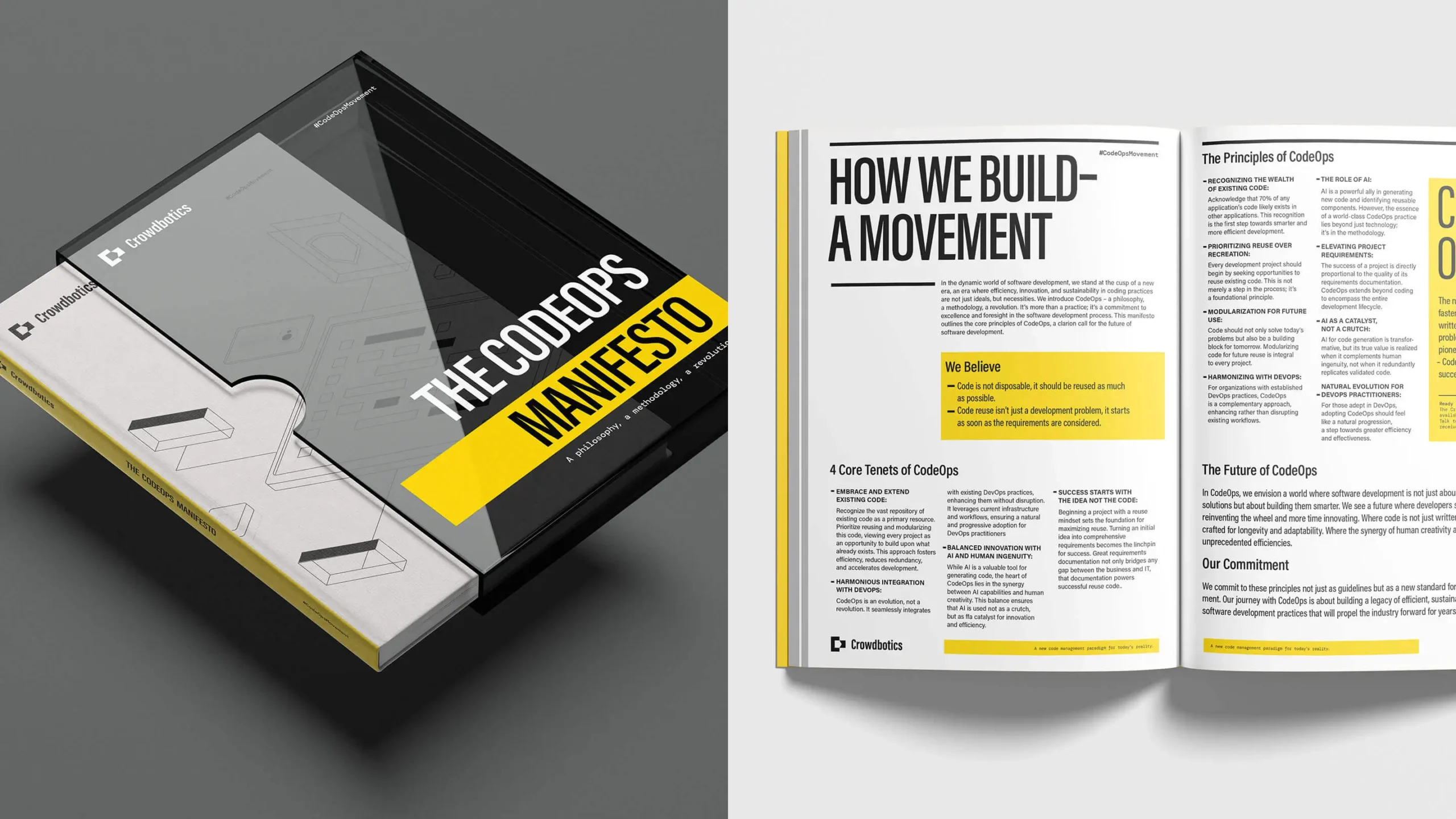
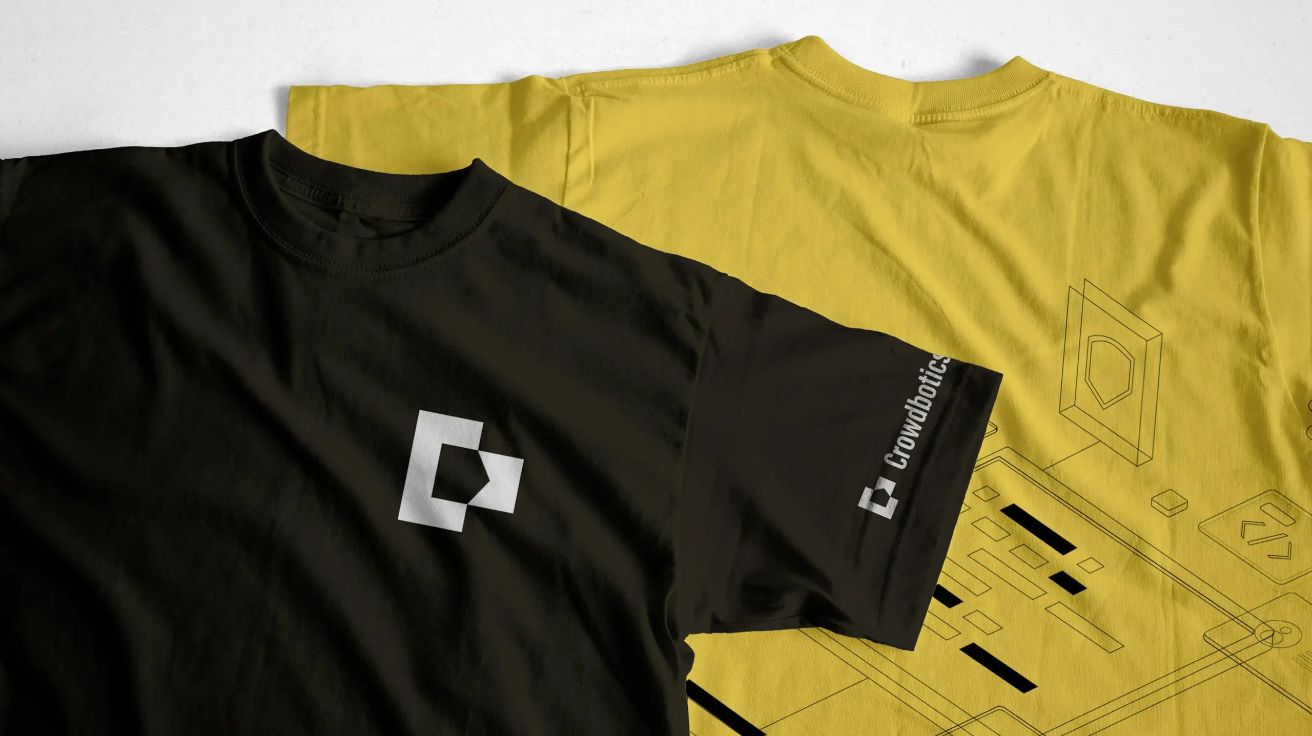
The Crowdbotics identity epitomizes boldness, confidence, legibility, and approachability—making it a fitting emblem for the CodeOps movement. At the core of the logo lies the essence of a movement—where “C” signifies Crowdbotics, CodeOps, and a Call-to-Action. The abstract “C” pays homage to the coding brackets commonly used in programming.

From Drag to Drive
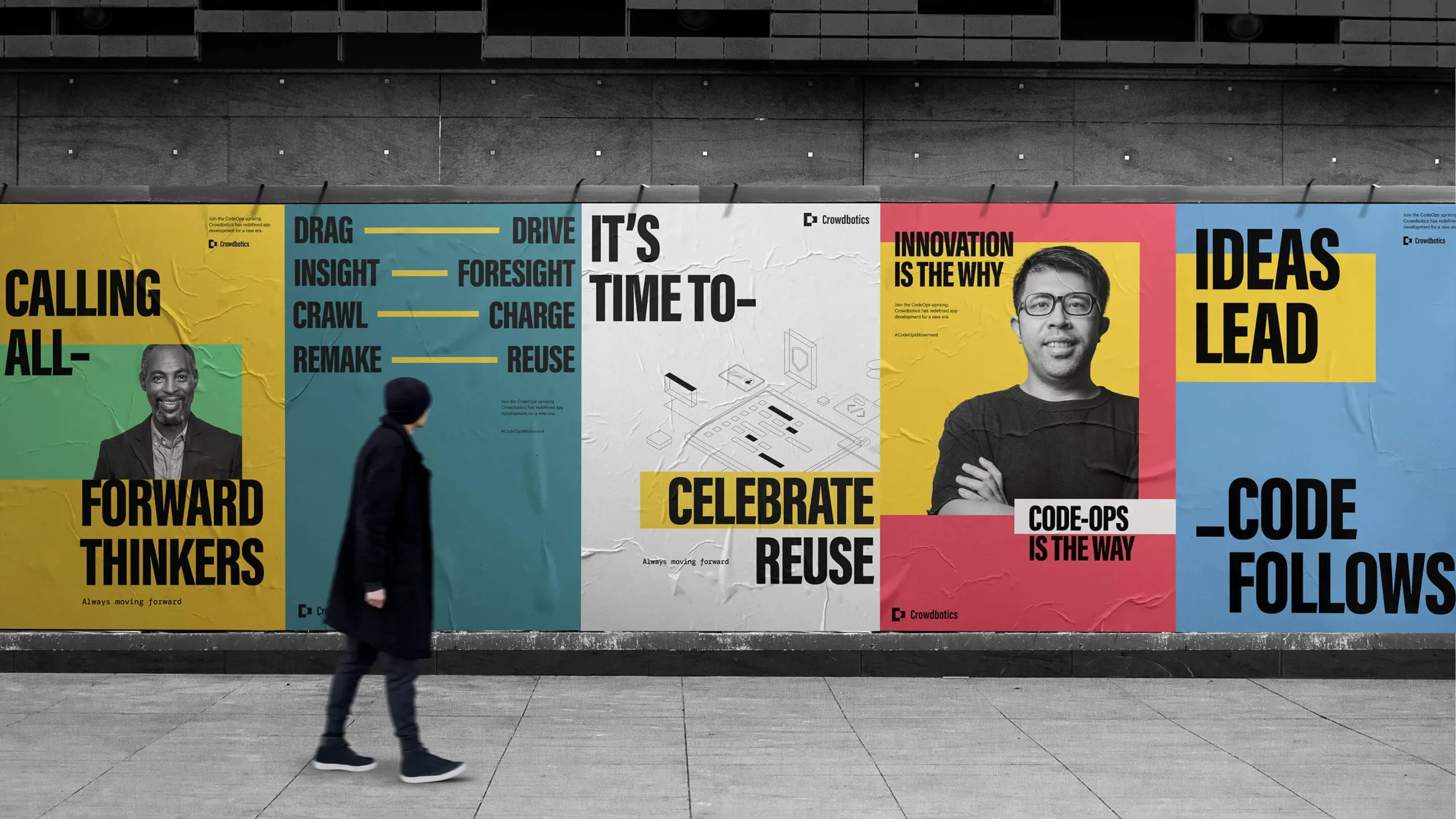
A bespoke graphic treatment—bold, condensed typography and authentic portraiture—feels worthy of a movement. Channeling the idea of going from “Drag to Drive”—the dash (dynamic bar) becomes a flexible graphic device to convey movement, disrupt layout convention, and connect ideas, thoughts, and actions.
More is More
How we visually tell the story of innovative processes and systems—precise, technical, and detailed—anchors Crowdbotics as the industry expert at the forefront of the CodeOps movement.


A New Paradigm
Language as hero and an identity that symbolizes a movement—the Crowdbotics brand becomes a tangible representation of moving forward into a better future.


Experience that Works

Take risks in your thinking.
We had a hunch about the role of CodeOps in the brand and we decided not to hedge our bets when we shared our hunch with the client. Conviction and going ‘all in’ rather than sharing multiple options can be very powerful.

Build lateral relationships.
Although our main client was in Marketing, we also developed an especially good rapport with the Heads of Engineering and Revenue. These relationships afforded us an inside track and critical advocacy for our work.

Use brand parallels to illuminate.
When we began to discuss the idea of tethering Crowdbotics to CodeOps, we shared examples of brands who have done the same with other ‘-Ops’. These relatable parallels helped sell the idea we were promoting.

Brand ‘modeling’ for the win.
Once we landed the brand strategy, we showed our clients how the brand could come to life visually and experientially before we even began the design process. This allowed them to hone our approach and make efficient choices.
Recent Work
Bringing a people-centered brand into a digital-first, product-led future.
View case study


