



Fueling a purpose-first platform with unstoppable belief.
We helped Bloomerang transform conviction into a joyful, momentum-building brand nonprofits can rally around.
Services
- Brand Strategy
- Visual Identity
- Brand Voice
- Website Design
- Positioning
- Collateral Design
- Campaign Development
- Brand Guidelines
- Employee Engagement

Bloomerang didn’t just want to align its team around a new vision for their giving platform—they aspired to lead a new era for nonprofits. At the heart of that ambition was a bold idea from their leadership: that it’s time for nonprofits to let go of scarcity thinking and embrace the abundance that surrounds them. That belief became the spark for transformation.
Through deep stakeholder listening and emotional insight work, we validated what Bloomerang already sensed—that this message resonated profoundly with nonprofit leaders and their own team alike. What they needed was a unifying idea powerful enough to carry it forward. Together, we shaped a strategic foundation and brand idea—Pushing Purpose Higher—that gave voice to this conviction.
From core messaging to visual identity to team activation, every element was designed to uplift and energize. The result is more than a refreshed brand—it’s a rallying cry for the sector, and a confident new chapter for a company built to lead it.
What We Learned Along the Way
Empathy is powerful. Energy moves people.
Early in the process, we saw that Bloomerang’s team carried a profound empathy for nonprofits—a deep understanding of their challenges and constraints. But we realized that to truly lead this sector forward, they needed to do more than validate struggle. They needed to ignite possibility. That insight became a guiding force: helping us channel empathy into energy, and shaping an identity designed to move people from compassion to momentum.
Belief sticks when teams live it.
One of the most powerful unlocks in this work was how fully the Bloomerang team embraced its new ambitions—not just as a message, but as a mindset. Their collaboration helped shape key expressions across touchpoints, from a photoshoot spotlighting real nonprofit customers to a trade show wall inviting attendees to share their purpose. These weren’t just activations—they were acts of alignment. By living the brand out loud, Bloomerang made their belief contagious.
Momentum builds when everything aligns.
Launching a brand isn’t a single moment—it’s a series of intentional choices that turn strategy into experience. With Bloomerang, we partnered beyond the brand foundation to help bring it fully to life—from a website refresh and brand voice workshops to launch campaigns and creative activations. That end-to-end approach ensured every expression of the brand carried the same emotional clarity and conviction. Because belief, once sparked, needs momentum to spread.
Dennis Fois, CEO, BloomerangOur success as a company is connected with unlocking that sense of abundance and opportunity. That’s how you blast through all of the excuses not to grow. Now you're confronted with your own reality–what is driving you? It's that passion for the purpose.”
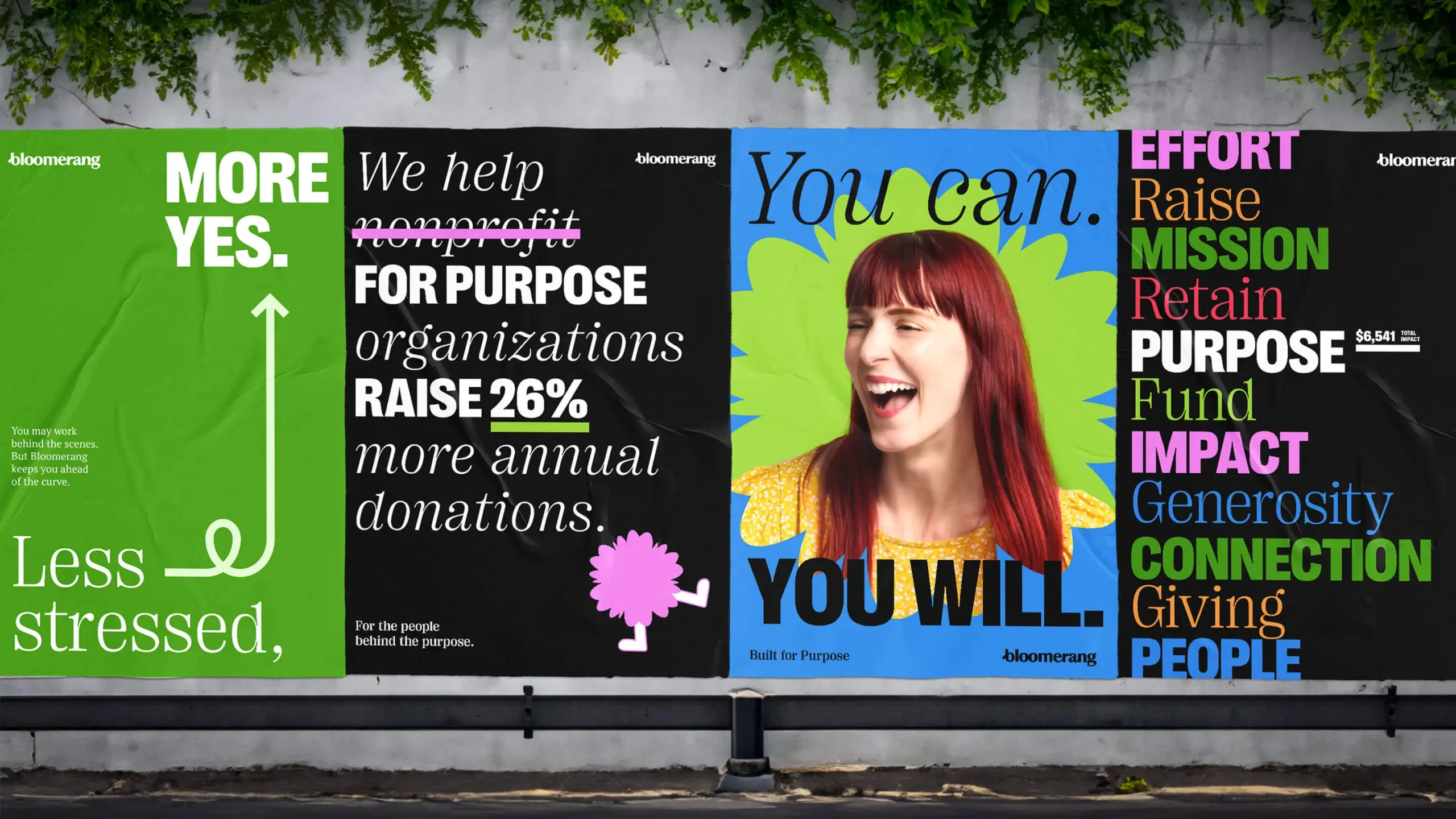
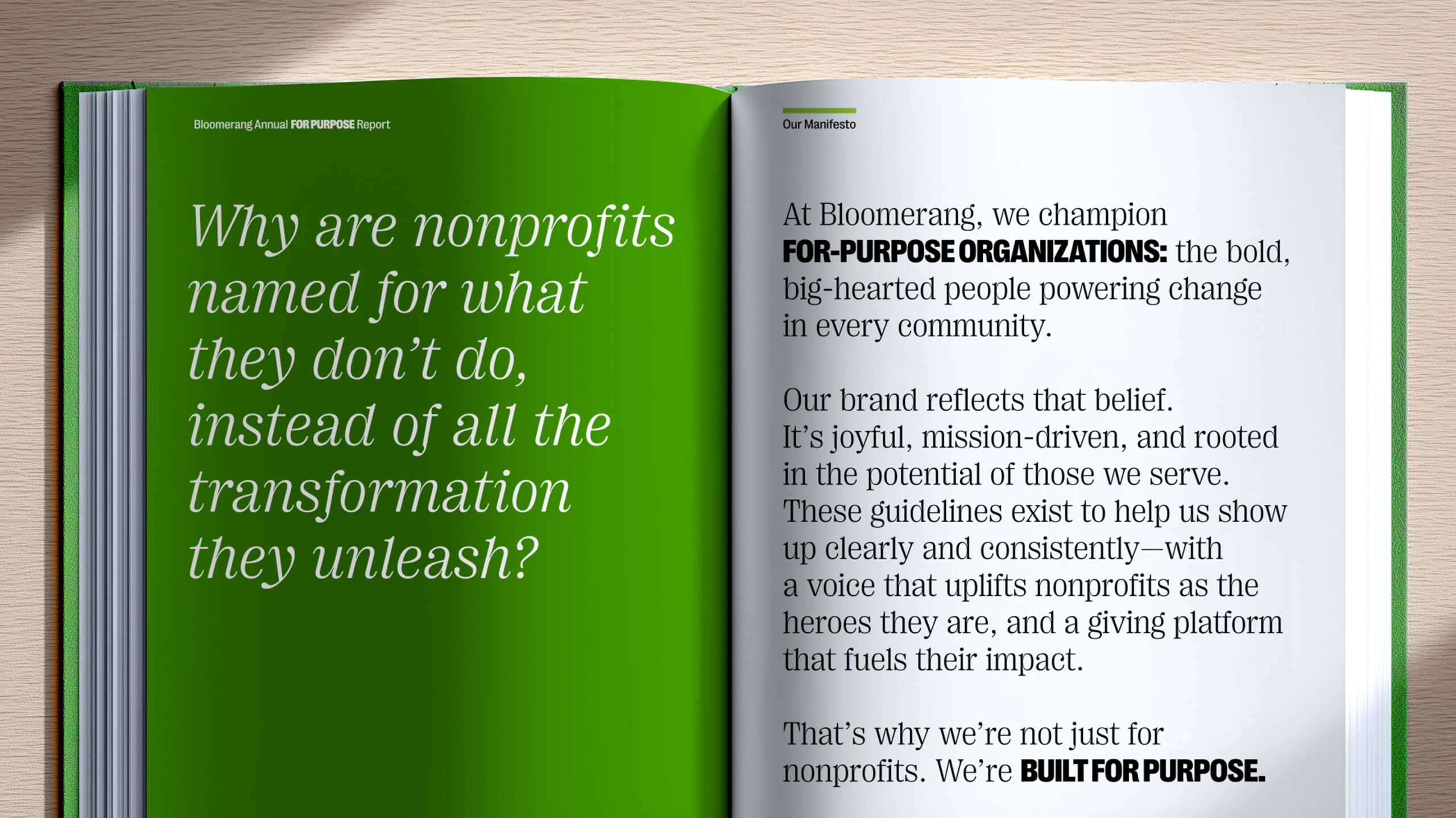
Bold & Big-Hearted
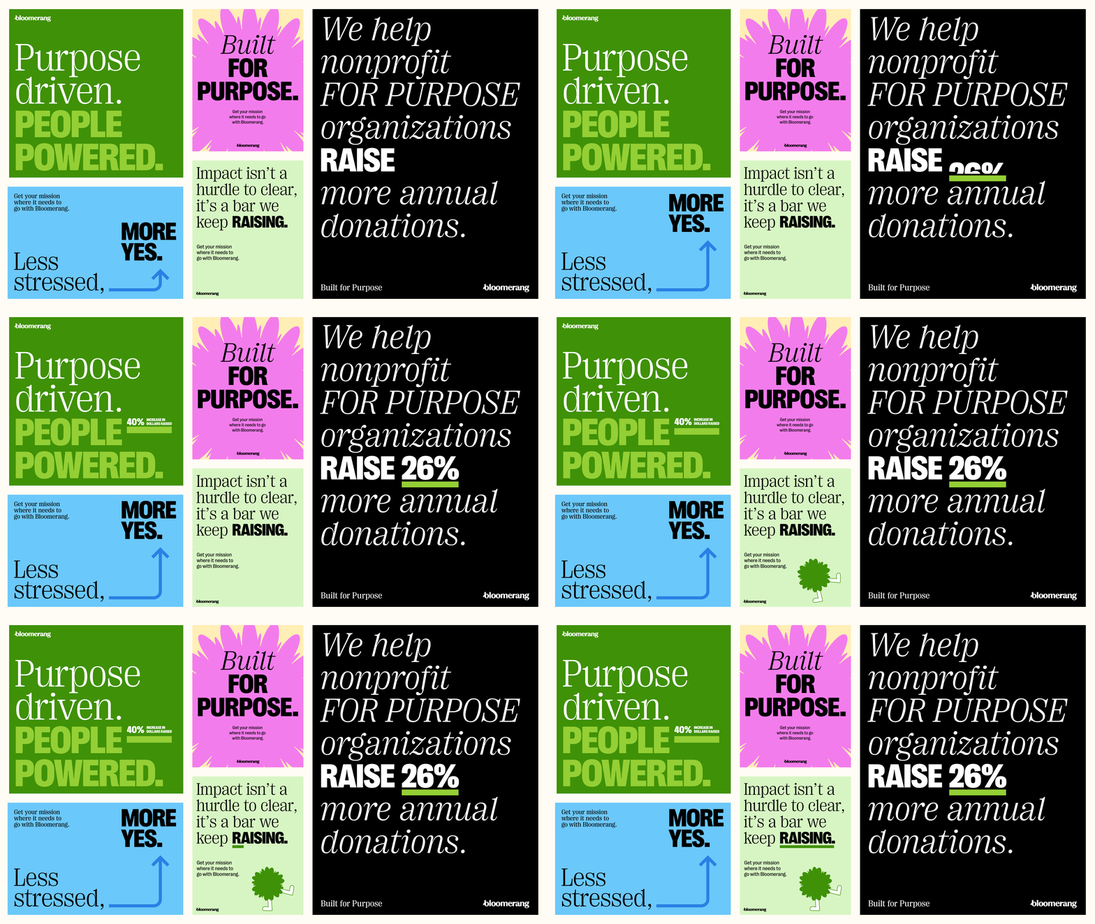
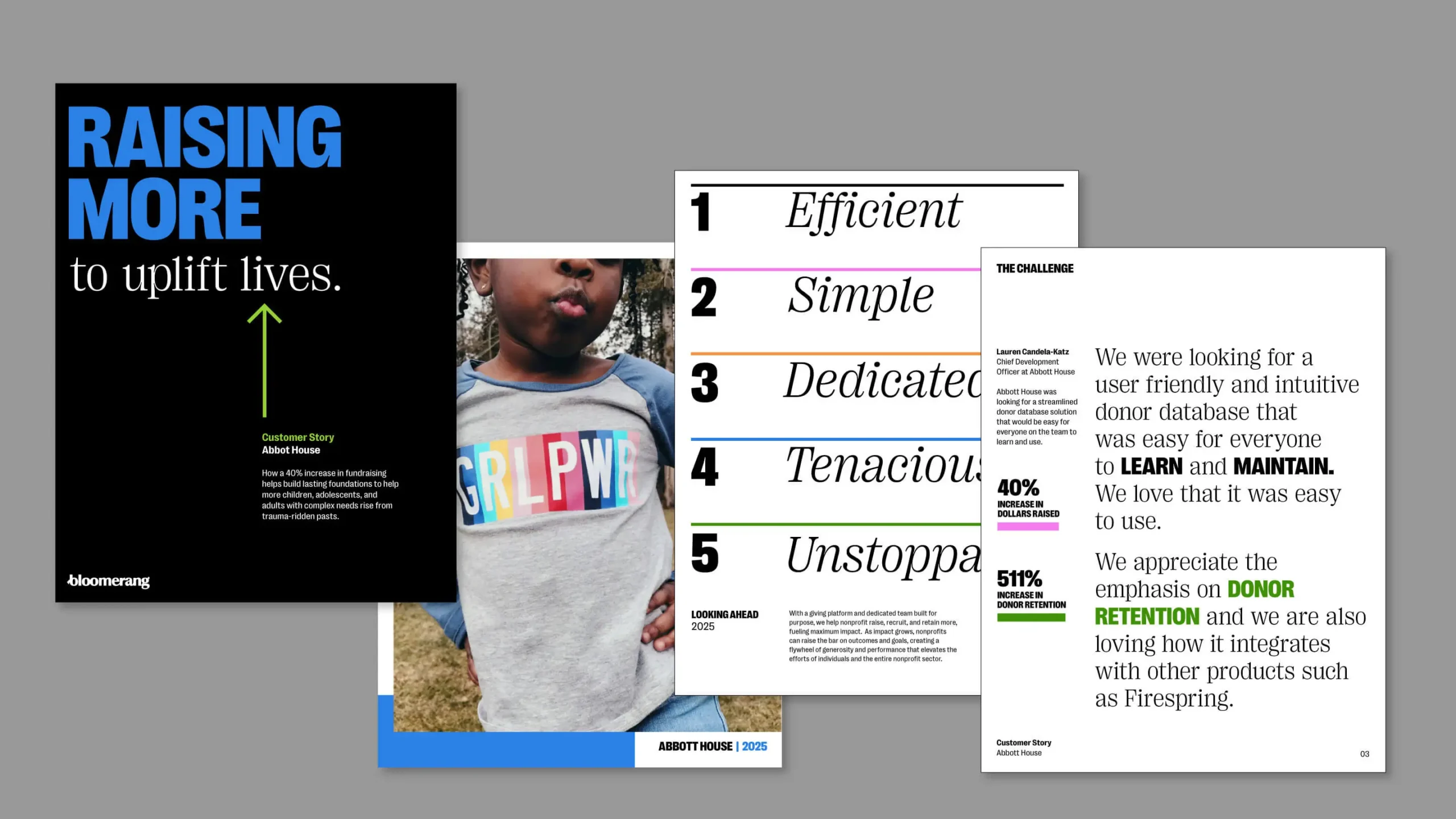
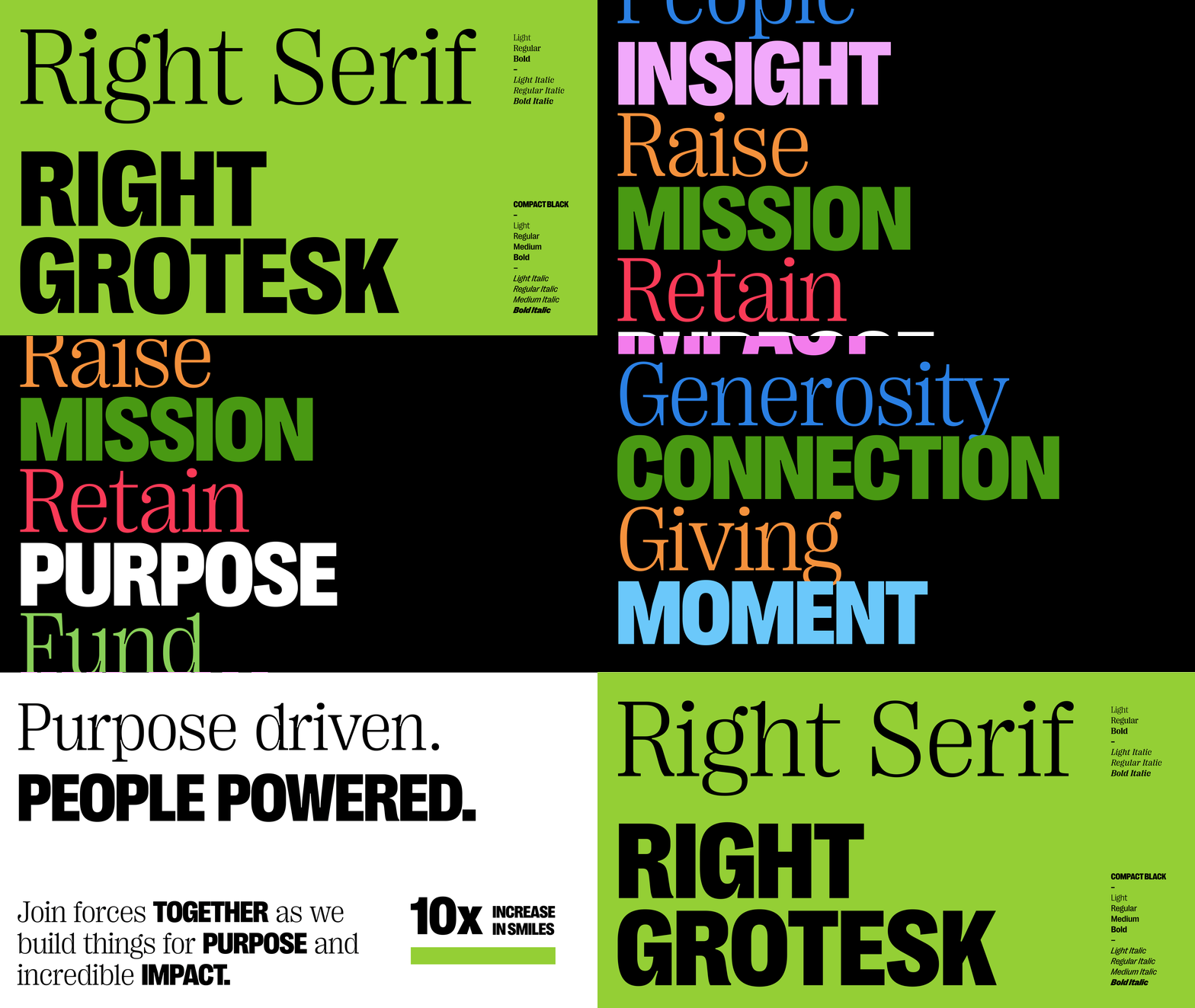
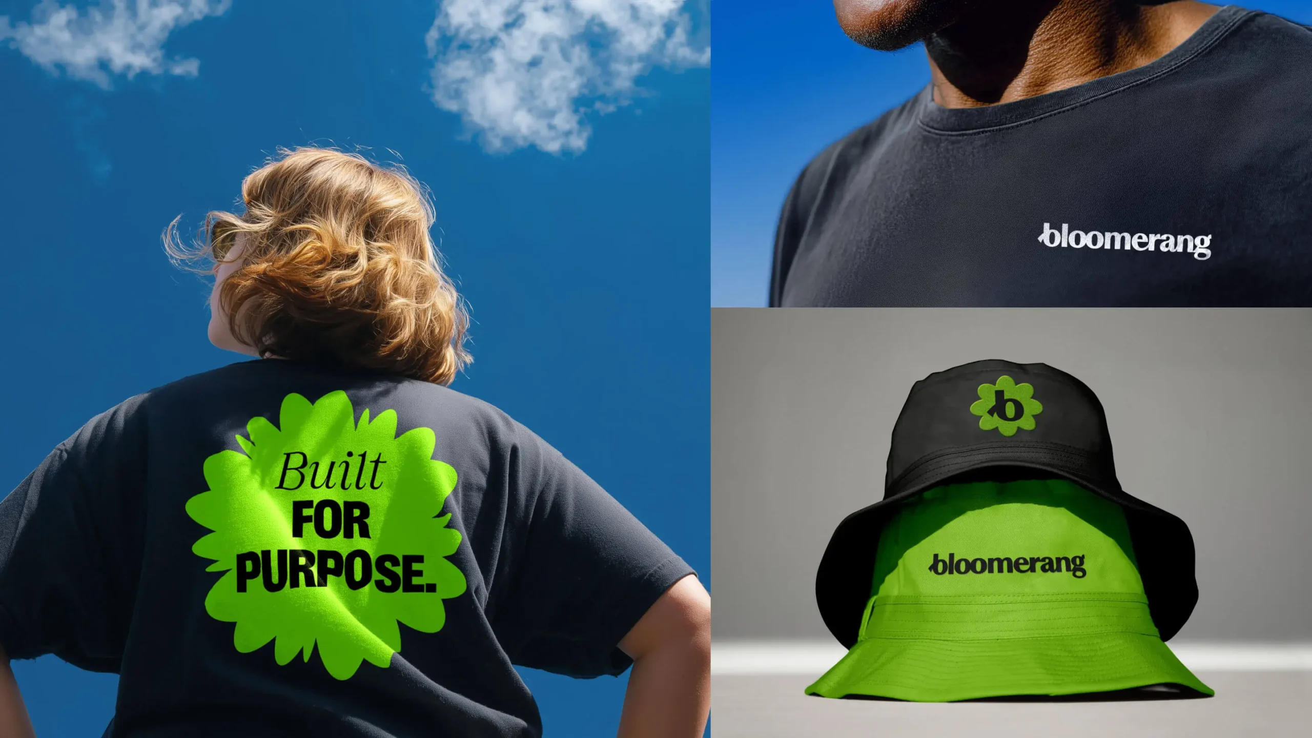
Typographic expression leads the way in the new Bloomerang brand, reflecting the voice and people powering big change across communities. The new Bloomerang identity—a custom logotype woven together with bespoke ligatures—embodies the momentum and collaborative nature of the Bloomerang community. The brand system extends that thinking with a graphic toolkit built for joy, connection, impact and purpose.
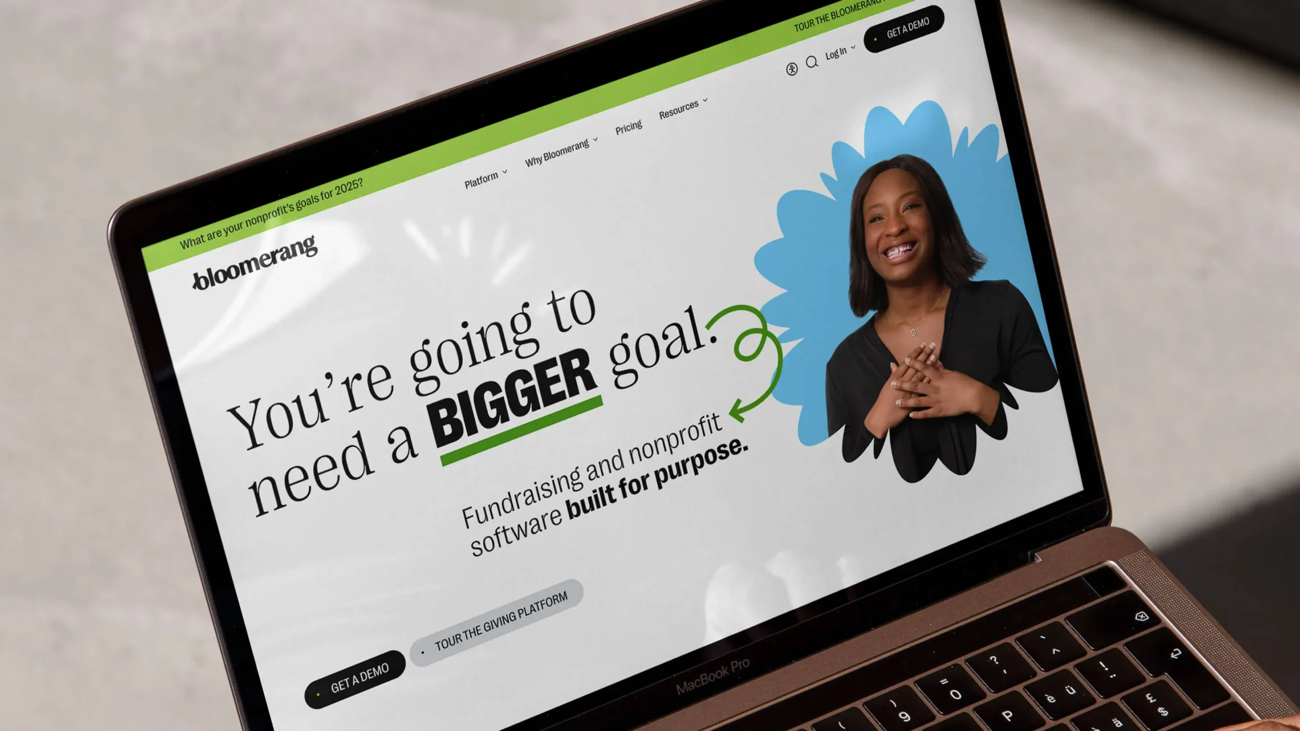
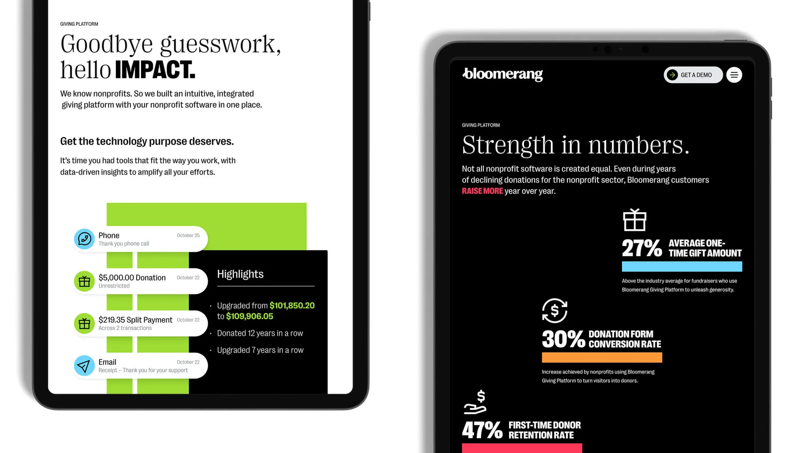
Raising the Bar
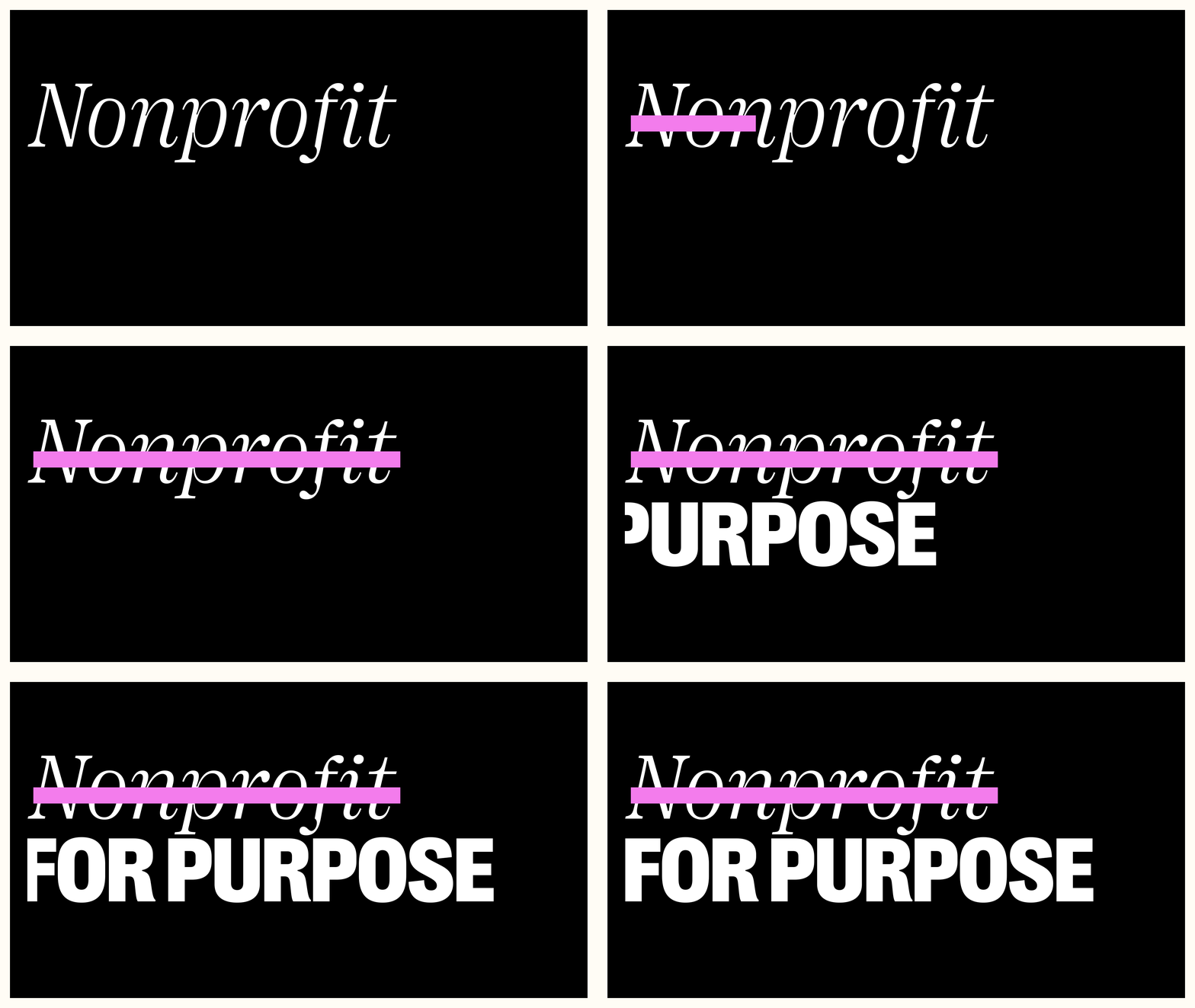
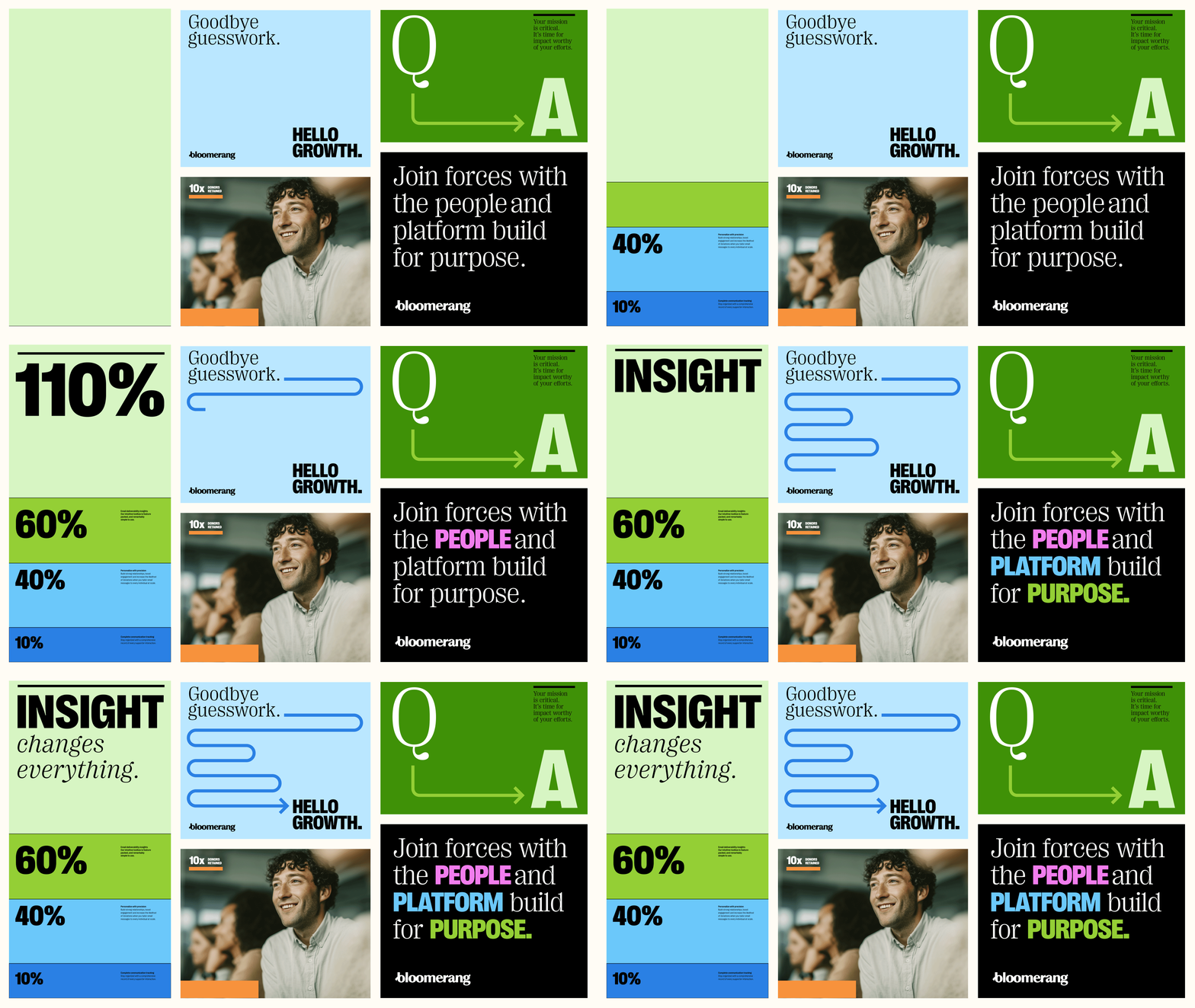
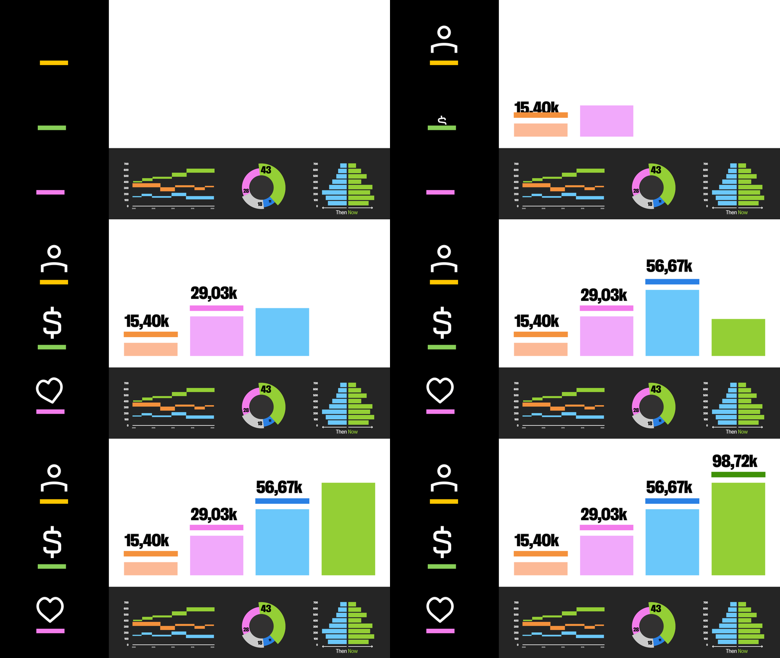
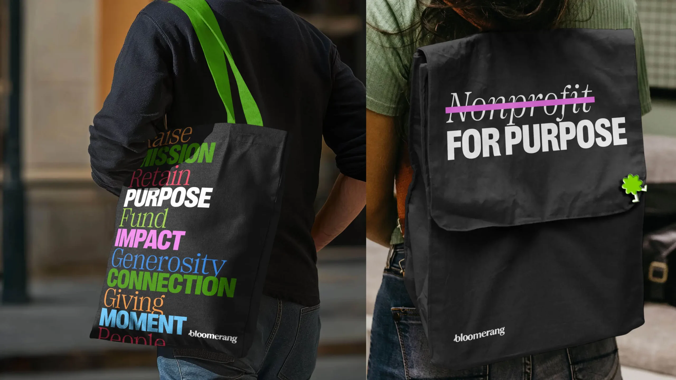
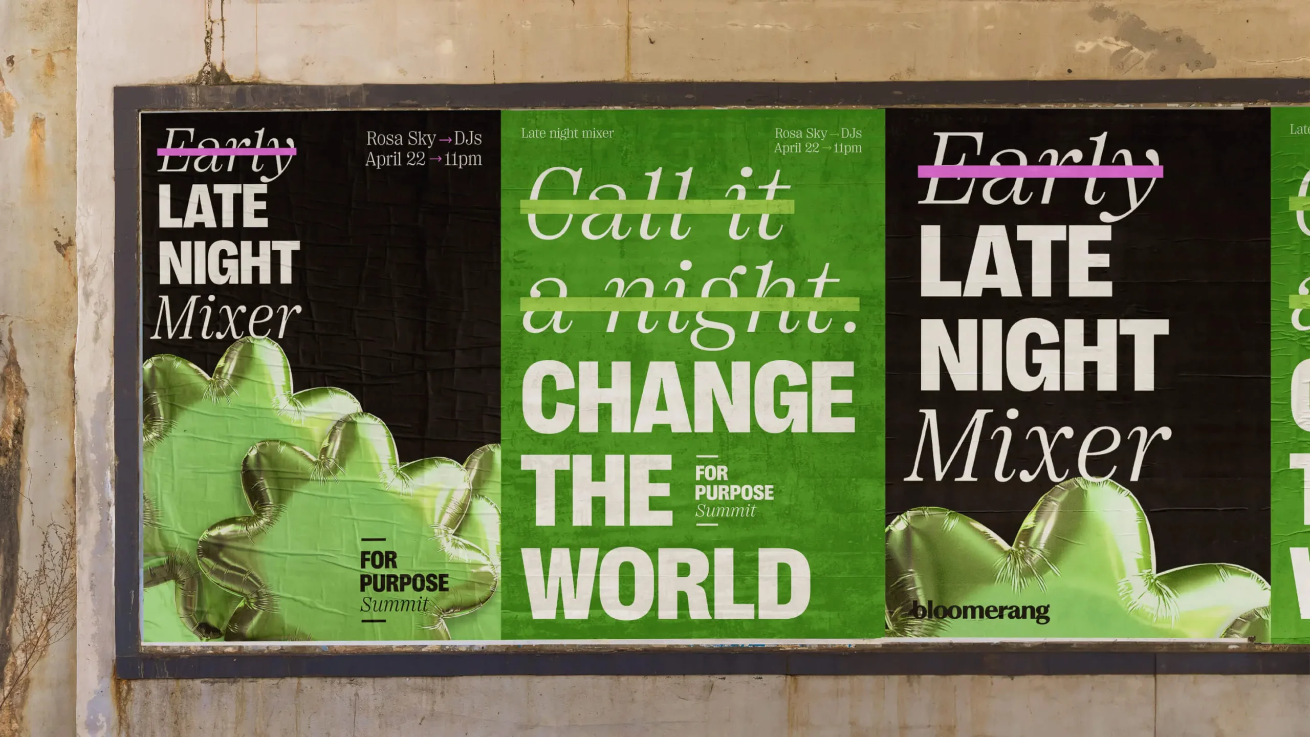
The dynamic line graphic—The Bloomerang Bar—activates the brand by connecting ideas, leveling up impactful stats, supporting key ideas with an underline, and even striking through language to highlight what IS rather than what IS NOT. The new Bloomerang brand literally raises the bar on what is possible.

People Powered
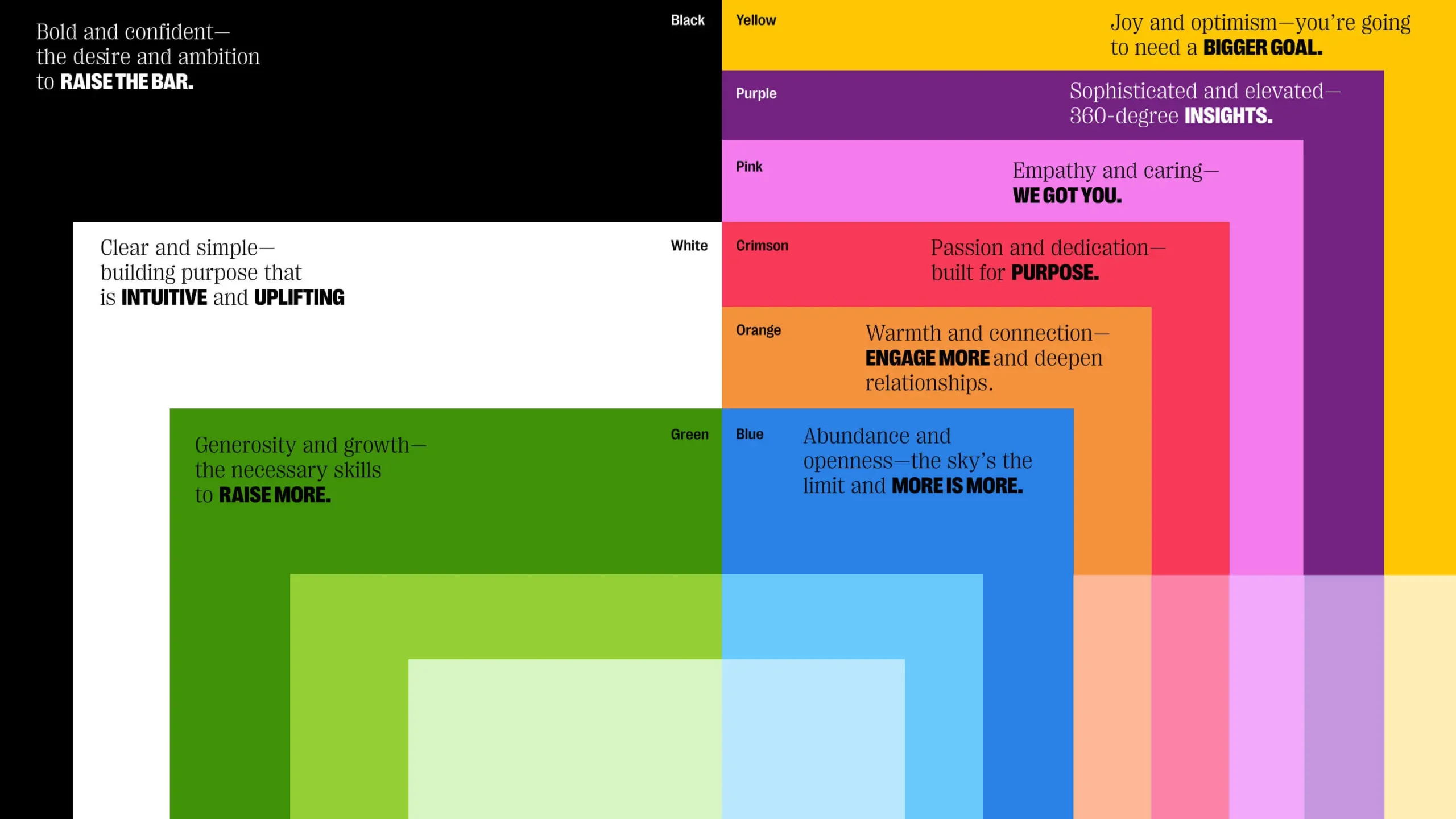
Maintaining the original brand idea that green plays a primary role, a new palette was crafted with a renewed sense of energy, vibrancy and joy with feet still firmly on the ground with the consistent use of black and white. Custom photography of Bloomerang customers and employees allowed us to heroize those behind the scenes bringing purpose to the forefront of the Bloomerang story.
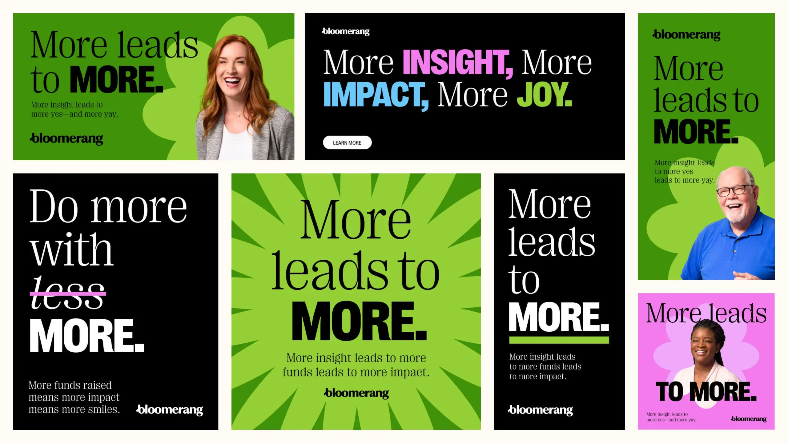
More is More
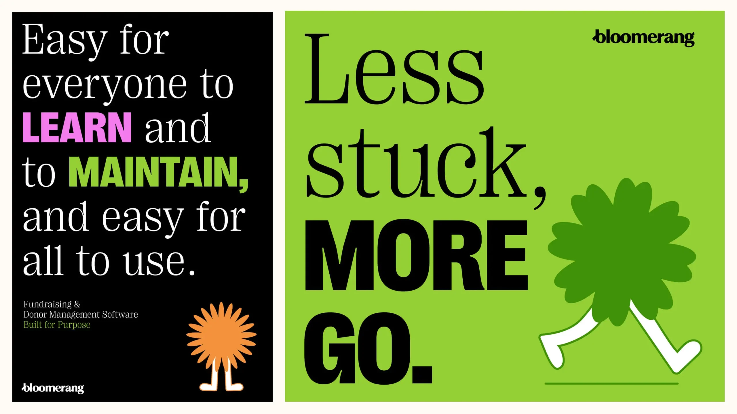
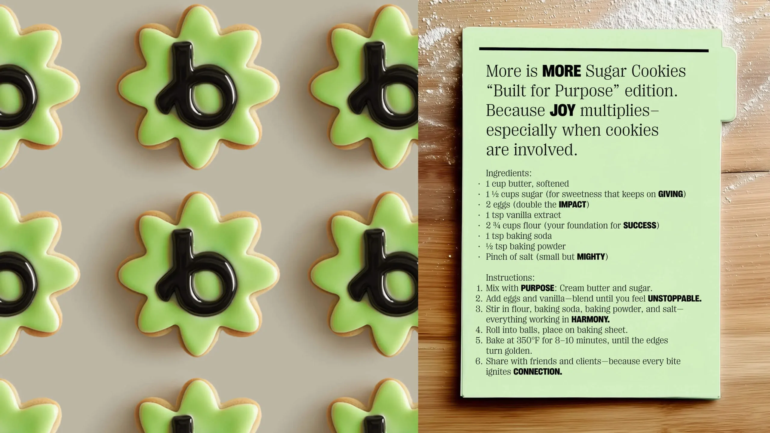
The new design toolkit was leveraged for a new advertising campaign to accompany the brand launch. The “More is MORE” campaign joyfully asks the critical question: Why should nonprofits settle for doing more with less, when Bloomerang lets them do more with MORE.
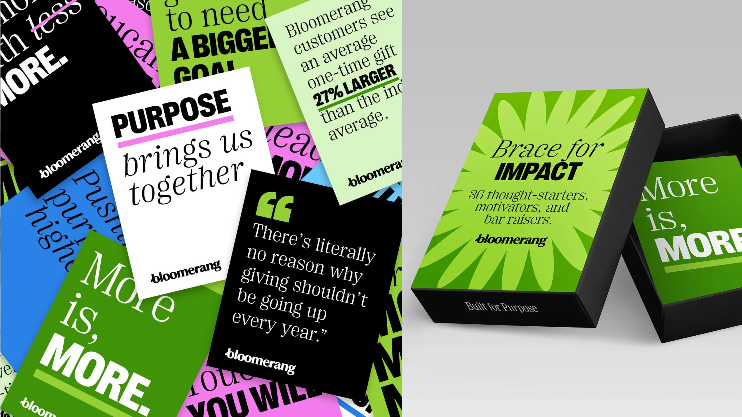

Stronger Together
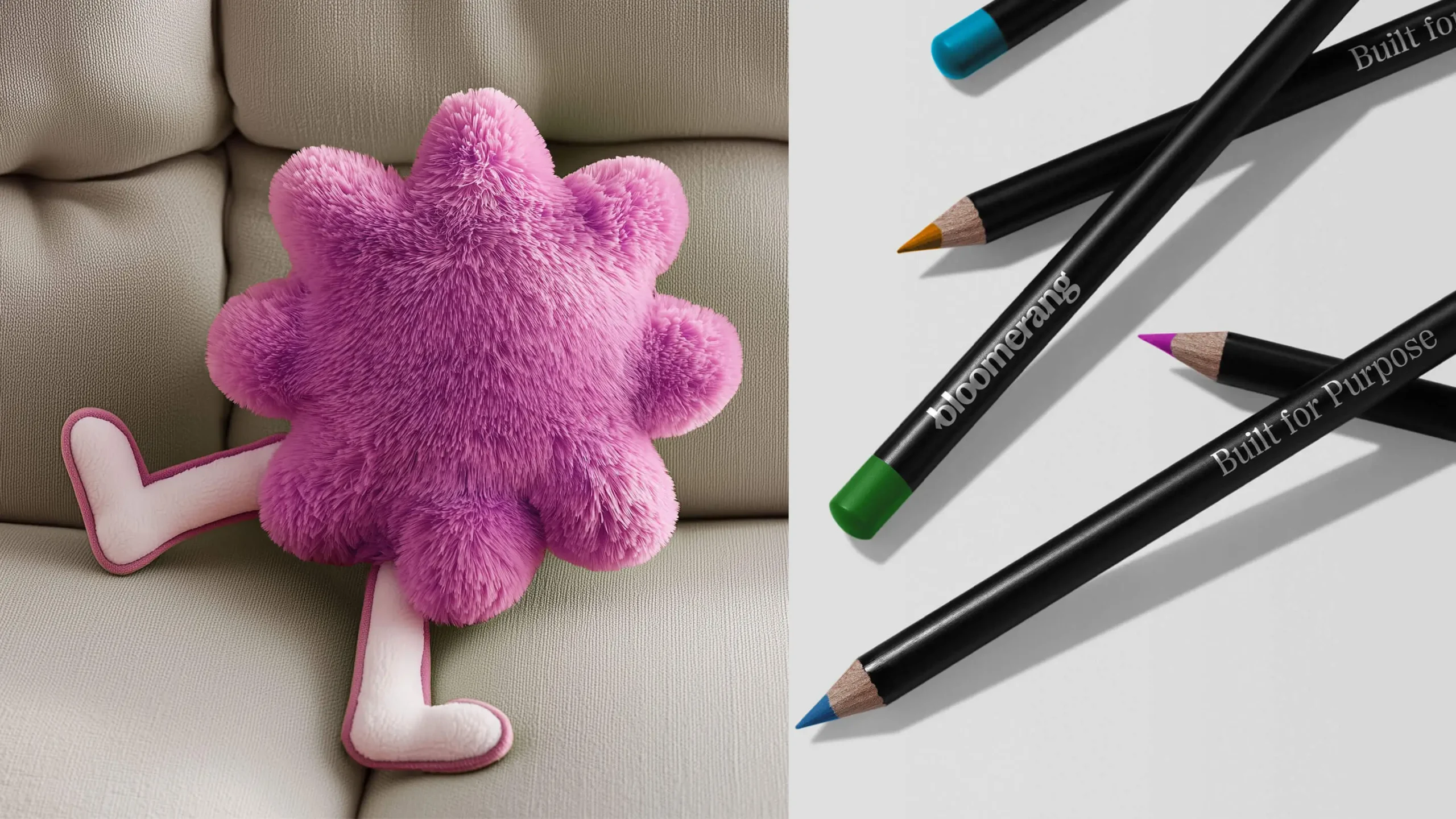
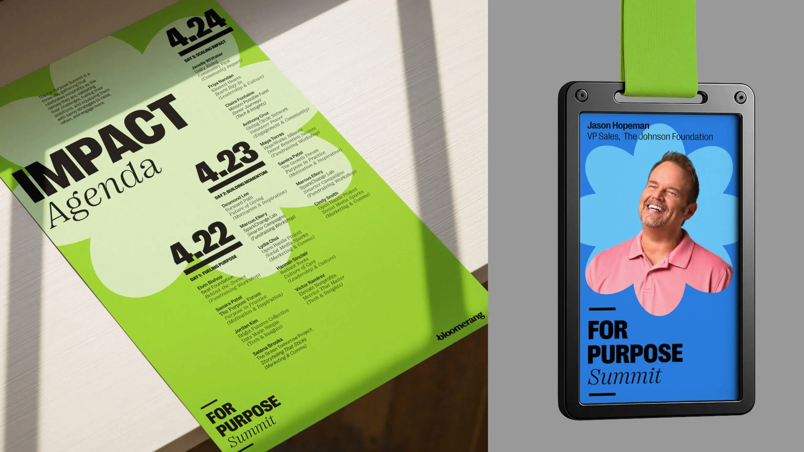
Graphic impact shapes pop up throughout the system to frame key messages, highlight individuals, amp up the energy, as well as a nod to Bloomerang’s visual heritage. On occasion, you might even see a shape anthropomorphically come to life and bring an unexpected moment of delight to an application. Our new design system lets the joy shine through at every turn—from marketing communications to the everyday objects and experiences that make us all smile.
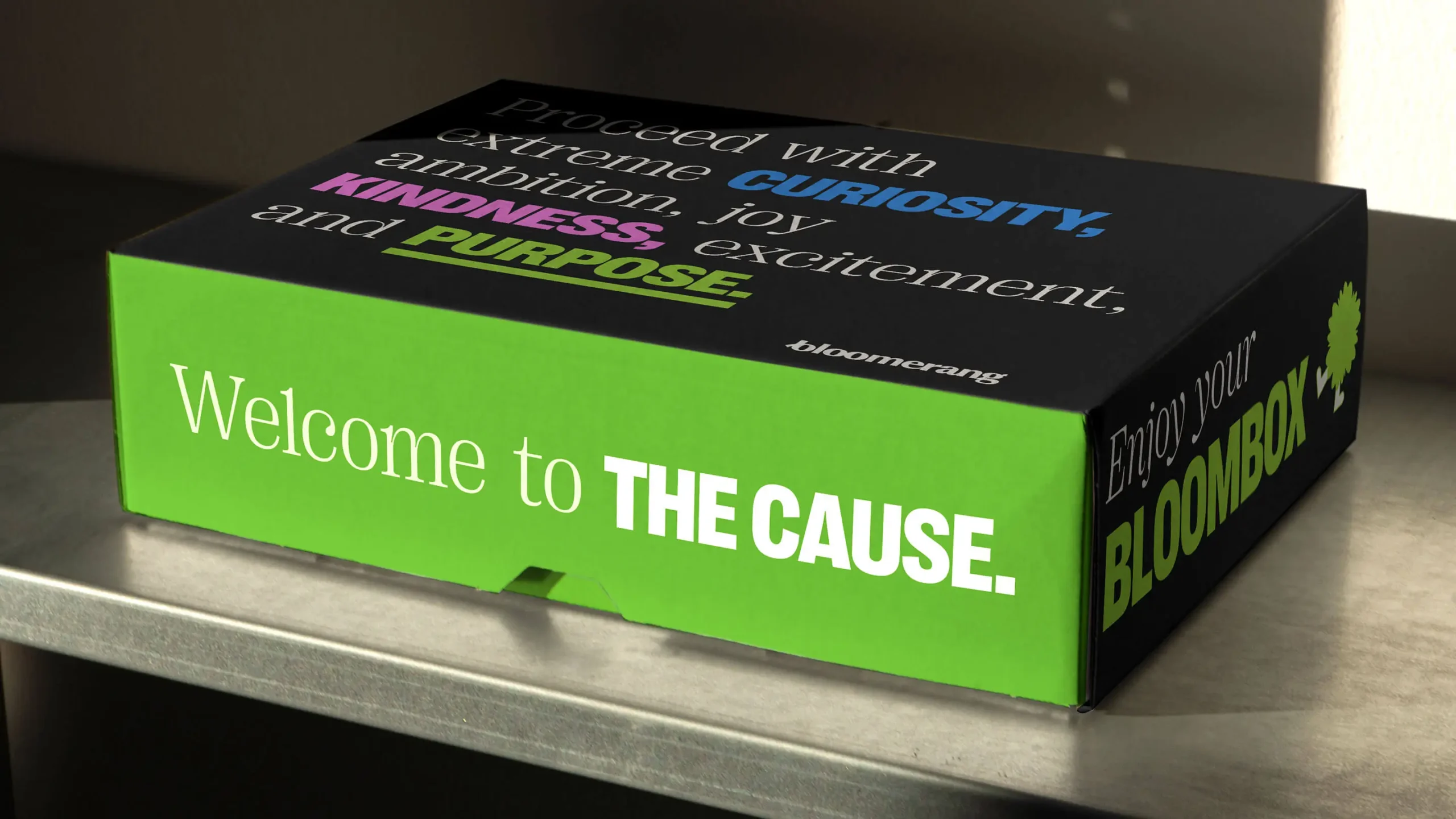
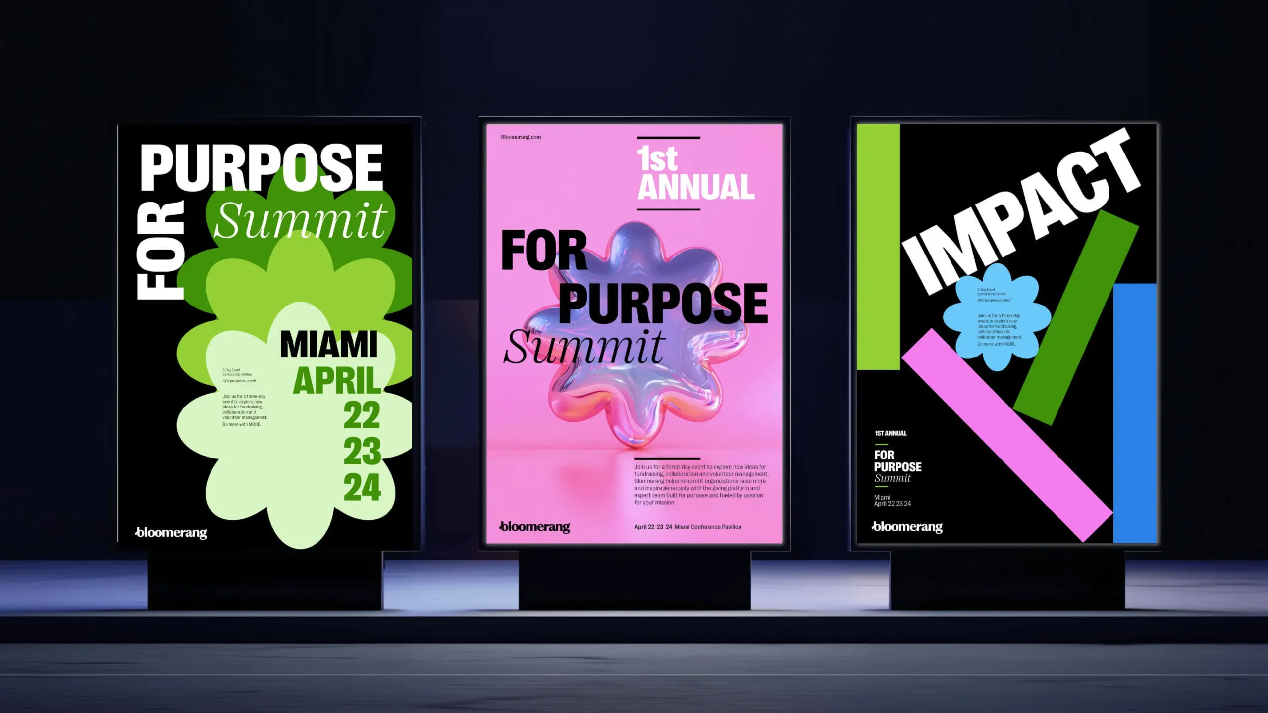
For Purpose
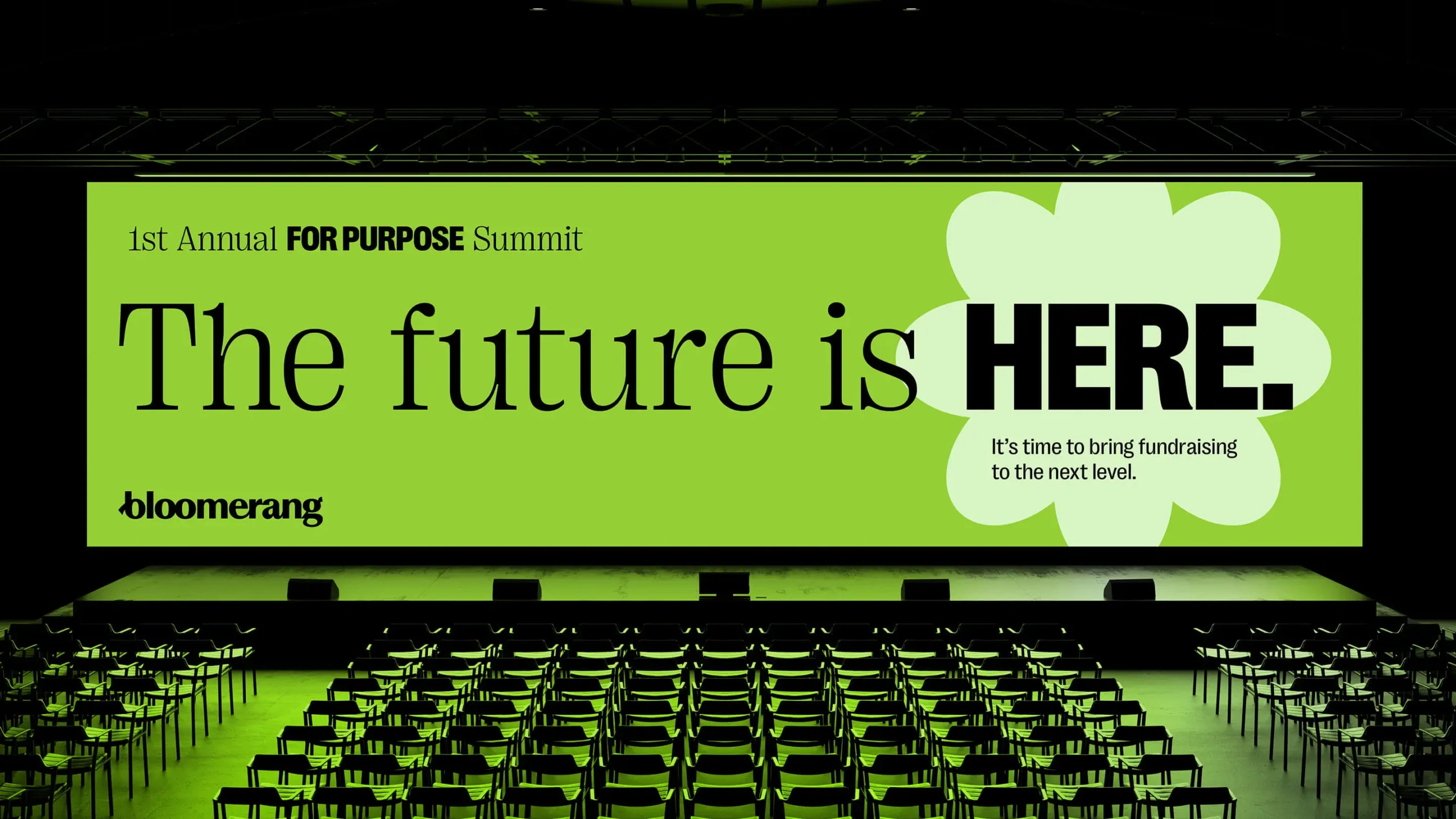
The FOR PURPOSE Summit is more than a conference—it’s a space designed for nonprofit leaders to feel seen, supported, and unstoppable. Every detail—wayfinding, signage, even the smallest touch—points to one truth: purpose belongs here, and it’s growing stronger together.

Emotion isn’t fluff. It’s fuel.
At Bloomerang’s heart was an emotional truth: nonprofits want to feel empowered, not just supported. By grounding that feeling in strategic rigor, we helped define a brand idea—Pushing Purpose Higher—that drives action, not just inspiration. It’s emotion, engineered for impact.

If your team doesn’t feel it, no one will.
We realized early on that the Bloomerang brand had to resonate as deeply with employees as it did with nonprofits. That conviction shaped everything from the messaging framework to the brand activation ideas we co-created for launch. By grounding the brand in internal conviction, we didn’t just build alignment—we built momentum from the inside out.
Big ideas need brave partners.
Throughout the process, we had deep, candid conversations with Bloomerang’s leadership about their ambition to reframe what’s possible for nonprofits. Those exchanges—grounded in bold thinking and emotional honesty—became essential to shaping our work. The resulting brand and activations truly carry their conviction forward, turning vision into voice, and purpose into impact.
AI + human heart = emotional scaling.
To bring Bloomerang’s bold voice to life across every touchpoint, we paired smart tech with human insight. We trained an AI model to write in Bloomerang’s unique tone—and empowered their team to use it as a creative co-pilot. This wasn’t just about efficiency. It was about scaling emotion with consistency, clarity, and heart.