Overlay
Let's talk

Hello!

Shedding Ego in The Branding Process

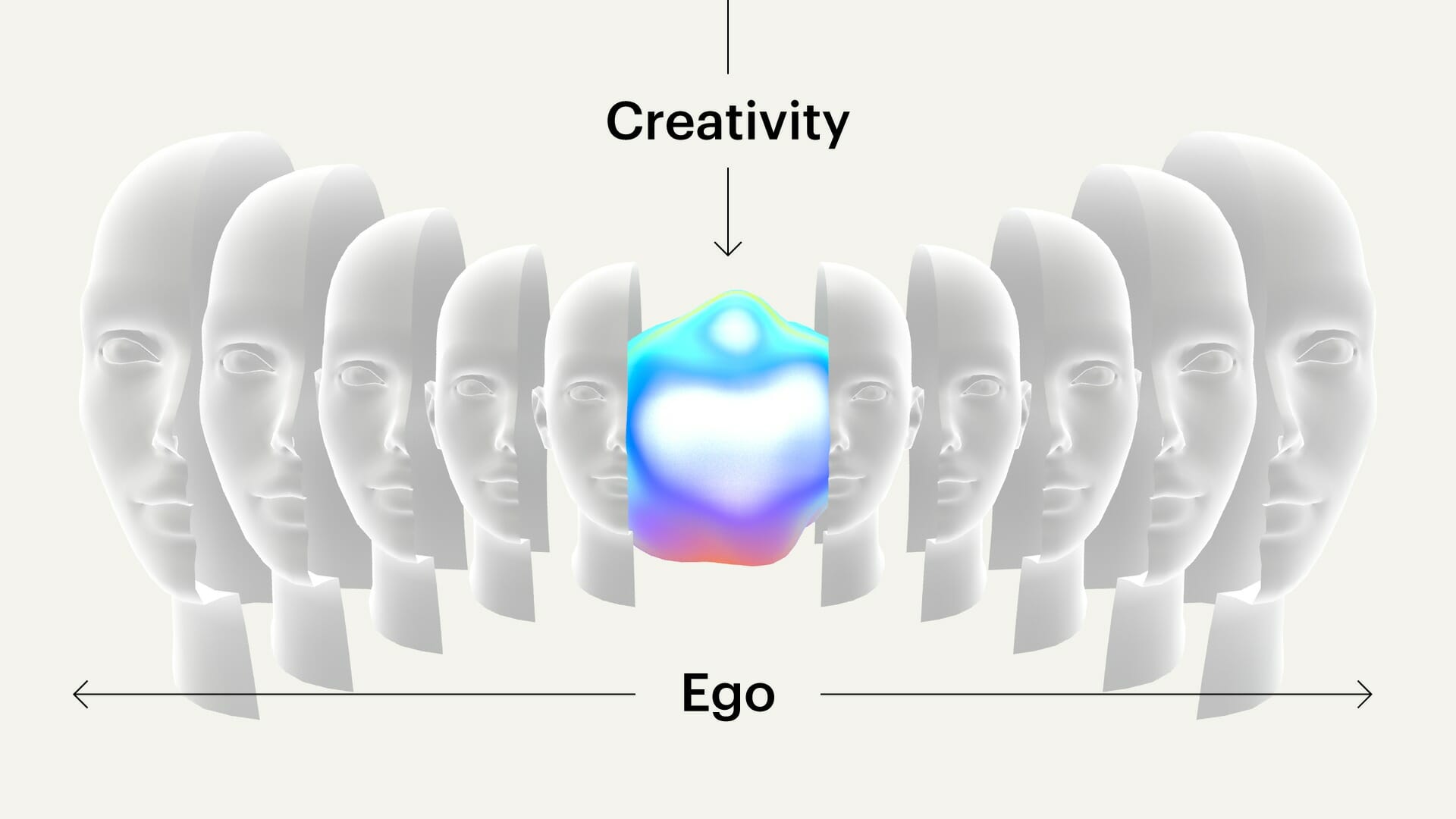
As creatives, we believe deeply in our craft and put ourselves fully into what we make. Our humor, our creativity, our problem-solving gets baked into the product. So, when work is rejected, it can feel like you’re being rejected. Add tight deadlines and multiple projects to the mix, and emotions are even higher. The key to keeping a level head is all about leaving your ego at the door and keeping a healthy authorial distance between maker and product. This is a guide for designers of all skill levels, clients, strategists—anyone taking part in the design process.

Creativity

Assume Good

If someone suggests changing the design, assume that they are coming from a good place. They want to improve the work and giving them the benefit of the doubt will not only start the collaboration off on the right foot, but it’ll also build trust over time.

Creativity

Try it on for Size

If you disagree with a piece of feedback, implement it anyway and see if it works. Your initial assumptions could either be totally wrong, or it could spur some additional inspiration that you wouldn’t have come to otherwise. The important part of this is to actually try and be an advocate for the thing that you may have initially disagreed with. If you can design from their viewpoint, you might uncover the root cause of the piece of feedback and be able to address it better.

Creativity

Yes and…

If you’re collaborating with someone and they mention an idea, try to build on their idea even just a little bit. They have given you a nugget and you can help them shine it into something amazing. It takes a lot of courage to share ideas. If you have made a safe environment to share thoughts, you’ll uncover gems that otherwise would be kept secret.

Creativity

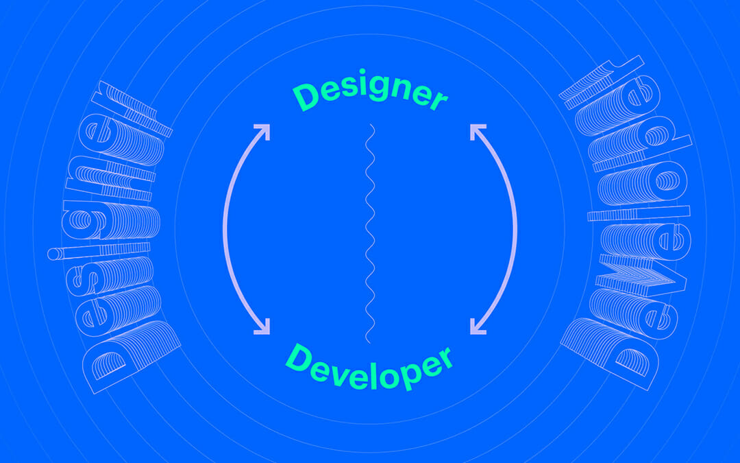
It’s Not YOUR Design, It’s THE Design

Remember that no matter what, everyone’s job is to work together on the design. It is not your solo creation to be hung in a museum long after you’re dead. It’s a communal work that is being refined by multiple people. This helps distance yourself from any feedback that might sting. Oftentimes, when people are criticizing a piece of work, they are trying to improve the work—not make you look bad.

Creativity

Liven Up the Mood

Even if you feel very attached to a design you’ve been working on and someone points out a flaw, use that as an opportunity for humor. Oftentimes, if you can shift your perspective to the person who criticized the design, you can find a joke to make about it. Humor doesn’t just lighten the mood and facilitate good collaboration, humor has a sneaky way of lowering our own defenses and opening our minds to new ideas. Many brilliant ideas start out as “joke ideas,” something we throw out impulsively, wildly, provocatively. People don’t judge them with the same mind frame because “it’s just a joke.” And this type of playful ideation makes “joke ideas” become real ideas, with real impact.

How it Happens in Practice

Imagine you have an internal design review in 2 days—this time around everyone is expecting the work to be fully designed. Strategy will be there, client services, project management, and the managing director might stroll by. But your designs are stuck, you can’t seem to push through. Instead of trying to break through that wall on your own, take initiative and reach out to someone. Ask them how they’d make it cooler (instead of asking for their feedback). This starts the conversation off as immediately collaborative and frames it so that what they suggest is already going to be an improvement. When they think of something, get stoked about it. Really, let yourself feel that emotion. Then execute their suggestion. It may feel like you’re going down the wrong path, but it’s an open door that will let you get through that wall that was blocking you before.

5 Quick Tips:

  1. Get fast. If it only takes you 20 minutes to make changes, it won’t be that big of a deal. But if it takes 2 hours, then feedback hurts because you know you’re staying late.
  2. Meditate. 10 minutes a day, focus on your breath. This trains the brain to stay calm in situations that are overwhelming.
  3. Write it down. If you don’t, you’ll forget it and you won’t do it.
  4. Be proactive. Ask for feedback. You’ll become accustomed to receiving it gracefully.
  5. Practice. The goal here isn’t to be perfect. In fact, it’s the opposite. Shedding your ego is an ongoing practice that takes regular maintenance. Shedding your ego doesn’t need to be an earth-shattering event. It can be a series of small moments that are strung together.

Emotive Brand is a brand strategy and design agency in Oakland, California.

The Fusion of Strategy and Design

The Best Branding Is More Than the Sum of Its Parts

Since its founding in the 1950s, branding has largely been divided into two distinct disciplines: strategy and design. Strategy’s traditional role is to research, understand the competitive landscape, distill the meaning, and establish the market opportunity into a well-formed creative brief. At this point, designers typically take the brief and visually communicate against the strategic objectives.

The handoff from strategy to design is not without its pitfalls. Oftentimes, key information gets lost. Strategists can work in intellectual isolation, sometimes forgetting how ideas can manifest and communicate non-verbally. Designers, on the other hand, have the challenge of breathing life into work they did not have a hand in creating. That’s a lot of potential to leave on the table.

Good Ideas Come from Anywhere

Strategy needs to be able to uncover ideas that clearly communicate the value of a brand in a way that can connect with audiences. Too much academic isolation can leave strategies flat, empty, and impractical (looking at you, Peloton). On the flip side, brand design void of strategy risks being received as an artistic expression without any clear purpose (remember the Tropicana redesign?).

In today’s complicated and fragmented world, audiences are more informed and aware than ever. Only brands with compelling creative and strategically-sound value propositions are able to cut through the clutter and connect with customers. In other words, only the best ideas can win.

In Steven Johnson’s “Where Good Ideas Come From,” the author argues that “the trick to having good ideas is not to sit around in glorious isolation and try to think big thoughts. The trick is to get more parts on the table.” When it comes to branding, this means that design and strategy need to be working in tandem throughout the entire project.

The Approach in Practice

When design and strategy work hand-in-hand, strategists get to experiment immediately with new and different ways of communication earlier than they usually would. Oftentimes, discussion leads to powerful metaphors and concepts that can inspire design. Designers get first-hand experience with the raw data that is used to shape strategy.

More interestingly, there is space for those who sit somewhere between worlds. At Emotive Brand, we call these players Creative Strategists. During our recent work for Gantry, creative strategy played an important role in guiding the process.

“Very early on, in a collaborative meeting with strategists and designers, we came up with the concept that the emotional foundation of real estate should be just as strong as the physical one,” said Creative Strategist, Chris Ames. “This wasn’t really copy, it wasn’t exactly a brand idea, but it was a common language we all agreed on: emotional support as scaffolding. And while there were a million other vital strategic pieces and meetings, this common thread helped us stay in-sync in a language we all understood. It’s about the ability to structure thinking logically for non-writers and visualize big ideas for non-designers. That’s the magic.”

What’s the result of this integrated approach? Designs are deeply rooted in strategy. Strategy has vetted ideas for clarity and actionability along the way. Before the creative brief is even written, powerful ideas are being generated and the work moves forward seamlessly. This makes for better work that can be done in less time.

The Challenge of an Integrated Approach

Agencies and consultancies large and small have talked at length about the importance of fusing these disciplines, but few are able to deliver a truly collaborative approach. Self-constructed silos and the egos of leaders often become stumbling blocks. The heart of the matter is that working in this truly collaborative way can be uncomfortable, but the results are worth the effort.

Truthfully, getting strategy and design to work well together is hard for human reasons. It takes a lot of humility to check your proficiency and talent at the door to contribute to projects where you aren’t always the expert. When teams can exhaustively explore ideas and don’t allow themselves to be precious with ownership, then the best ideas will flourish.

Emotive Brand is a brand strategy and design agency in Oakland, California.

When Designers and Developers Collaborate, Everyone Wins

A great developer recognizes and enhances design decisions. A great designer understands the technology they are designing for. Both developers and designers need to have an intimate understanding of each other’s fields in order to produce better experiences for brands.

In order to deliver a bespoke experience for a brand, a collaborative environment needs to be fostered.

How to Actually Collaborate

A key element to facilitating design and developer collaboration is reshaping the reviewing process. The traditional way is to do a bunch of design work upfront, get client approval, polish the entire project, and hand it off to a developer completely “designed.” This often results in quite a few design decisions being compromised because of poor documentation, developer interpretation, or non-feasibility.

The new way of doing things is beyond agile—its actual collaboration.

Collaborate

Setting a frequent and casual cadence of check-ins between designer and developer not only speeds up each other’s workflows, but it also allows each party to influence each other’s practice. True collaboration is a developer showing a designer an interaction that is 50% of the way done, so that the designer can fiddle with the code in order to make it perfect. True collaboration is also a designer showing the developer what they are thinking for design early on, so that the developer can raise any flags or offer suggestions to improve the design.

Using contemporary tools is the best way to achieve this type of working relationship. Gone are the days of sharing Sketch files over email and setting calendar events where eight people on the agency side show up to have a formal conversation with a developer.

Today, we use Figma so that the developer can see and modify the designs as they are being worked on. We use Slack to keep in communication on a regular basis and have video/screen share calls when reviewing things that keep updates frequent and easy.

Building Collaboration via Overlapping Skill Sets

To actually collaborate with someone, having overlapping skill sets is key. If each party has an understanding of the other’s expertise, they can make decisions together confidently. This also establishes trust between one another. For example, if a certain interaction is going to be too time-consuming to develop, the developer can offer a suggestion that is rooted in the agency’s design expertise. This is great when needing to come to a consensus on changing a piece of the design to fit the timeline since we can trust that the developer’s suggestion is going to be feasible. It also gives designers a new model of interaction to design against, so we can refine the design accordingly.

Building Collaboration via Remixing

When you have two parties with overlapping skill sets, the other party will often take the idea you have designed and enhance it.

Internally, we used our knowledge of front-end development to deliver custom interactions to our developer Cory, and he would surprise us by making them even better in his implementation. This type of relationship is critical in creating a site that expresses the brand to its fullest potential.

To be technical, our original design intended to use CSS to pin one part of the design while the rest scrolled. The developer went even further and added an overlap to the pinned area once a certain scroll threshold is reached.

This design was enhanced in implementation because the developer split up a Lottie animation and CSS animations that aligned perfectly with the timing. This needed to be implemented this way because the text needed to be editable in the CMS.

Start Today

The best way to build a culture of true collaboration is to start actually collaborating with people today.

Are you working on a document that you are trying to perfect before sending off? Get on a screen share and get input from a developer.

Do you work with a team that has a skill set you don’t have? Start learning their skills, gain empathy for what their jobs are, and bring them into the conversation. Show that you care about their craft and that you’re willing to learn outside of your role in order to make something better than you could have done alone.

Did someone send you a project to execute? Think creatively about it and enhance it beyond what they were expecting. Those little one to two-hour experiments add up over time and really improve the quality of what you’re working on.

Emotive Brand is a brand strategy and design agency in Oakland, California.

The New Web: How Development Tools and Collaboration Enable New Design

From 2007 until very recently, the web was infiltrated by the same design patterns. Everyone is familiar with this: a generic headline with a call to action, three icons below describing features, and a few full-width, black-tinted images with text on top.

When Sketch burst onto the scene in 2010, the web design discipline sped up, but the developer hand-off process was still tedious. Dimensions were specified using redlines, and the web was built with block and inline elements. Flash was dying, and there were no tools for designers to easily bring their more expressive designs to life. Mobile browsers were, for the first time, making a huge dent in the web’s traffic and the current desktop designs were failing.

Between 2007 and 2010, dominant patterns emerged and were swiftly distributed across the web, otherwise known as Web 2.0. Sites were designed as “mobile-first,” and the same design needed to grow to desktop. The result? A simplification of UI, a flattening of design expression, and designs that were nearly indistinguishable from each other.

Web Two Dot Oh No

In the same way that designers weren’t yet educated in development practices, developers were often blind to design decisions. Due to the time spent learning Web 2.0 development practices, developers would take redlines and build them to spec with little improvement on the design. In the early 2010s when web design patterns were so new, designers weren’t comfortable pushing the boundaries. It was impossible to find rules to break while still creating a successful design on multiple platforms.

Developers started building tools to educate designers on how they could use their new playground. Prototyping and animation toolsets started appearing, like Principle, Framer, and Invision, which gave designers tools to bring their work to life through animation and interaction. On the dev side, new technologies like flexbox, CSS transitions, Lottie, and most recently canvas libraries like three.js and p5.js gave developers tools to seamlessly bring those animated designs to fruition—instead of hacking designs together with jQuery. Additionally, tools like Zeplin sped up the transition between design and development, allowing both departments more time for creative expression.

As the crossover between design and development increased, the line between the two disciplines blurred and a design resurgence occurred. A new generation of designers emerged that were comfortable designing for the web with these new tools from day one. Graphic design became a key component to what was previously specified as interaction design, as designers could be more experimental with elements like layout, typography, and color. Web tutorials and resources like codepen.io, CSS-tricks, and DevTips let designers in on the new tech that was being developed for the web and how they could employ it in their designs.

Welcome to the New Web

This merging of graphic design, interaction design, and new development practices has created a New Web. This New Web is rooted in the principles of design and comes to life through the collaboration of contemporary development practices. In fact, a savvy designer can create a New Website using a tool like Webflow which incorporates design and development into one seamless tool.

The key to creating a New Website is to get developers in on the conversation as early as possible. Showing them the thinking behind a design, and being open to modifying as needed can be the difference between a static site or a great brand expression. The more frequent these conversations happen, the more opportunities there are for collaboration. On the other side of the coin, developers who are open to non-traditional designs and to learning new technologies can be the turning point in making a great site.

New Web can be as avante-garde as you can imagine. No forms are off-limits, as long as you spend the time designing a mobile experience that achieves the same goal as your desktop design. This allows for more specific and greater brand expression. A New Website creates a custom experience for a brand that stands out from the pack as memorable and clever. This also allows for cohesion between web, print, event, and motion in a brand system.


There is no excuse for an average-looking site today. For many companies, your website is your lifeblood. It’s the first point of contact, a funnel for sales, a magnet for attracting top talent, and a vehicle for radical creative expression. There have never been better resources for building than right now—and that’s because the people who spend their days making websites are the ones actually making the tools. Both designers and developers must continue pushing the boundaries to take the New Web into uncharted territories.

Emotive Brand is a brand strategy and design agency in Oakland, California.

Accessible Design Must Be the Rule, Not the Exception

In the nascent days of computing, the highly sought after feature we now call “dark mode” was the standard. Cathode ray tube (CRT) monitors got their green-on-black look from the phosphor inside of the screens. While this technology was long-ago abandoned, dark themes have re-entered the zeitgeist as the latest “new innovation.”

“It’s thoughtfully designed to make every element on the screen easier on your eyes,” Apple claimed in its announcement of the feature for iOS 13. But here’s the thing: there’s no real evidence that’s true. For people with astigmatisms (approximately 50% of the population), dark mode is worse on the eyes.

As Gizmodo reported in 2014, citing research by the Sensory Perception and Interaction Research Group, at University of British Columbia, white backgrounds act as a “crutch” for astigmatic eyes:

People with astigmatism find it harder to read white text on black than black text on white. Part of this has to do with light levels: with a bright display (white background) the iris closes a bit more, decreasing the effect of the “deformed” lens; with a dark display (black background) the iris opens to receive more light and the deformation of the lens creates a much fuzzier focus at the eye.

Follow the Leader Is a Losing Game

While there isn’t concrete evidence of the benefits of dark mode, at the end of the day, Apple is a tastemaker and hundreds of companies will now see this as a design imperative. The question then becomes: instead of playing follow the leader, how can brands leverage design to make themselves accessible to the most people possible?

“When we think about accessibility design, dark mode is a recent example of behavior change only coming as a result of following others, as opposed to being the one to take those risks,” says Senior Designer Jonathan Haggard. “Software and accessibility can influence brand in a great way, instead of being an afterthought.”

It starts with an acknowledgment that if you want to create something truly groundbreaking, there is no such thing as “a given.” It requires pausing to question those knee-jerk decisions you make without really thinking, like, “Oh, I’m building a website. First step: white page.” After all, when Tesla designed their car, they didn’t start with a gas engine.

It Ain’t Easy Being Pink

Take the Financial Times, for example. Instead of volleying back and forth between white or black modes as others have done for the last 35 years, they are unabashedly pink. As a design choice, it’s a risk. But it’s one that immediately differentiates them, increases the contrast, and may provide better readability over longer sessions, especially at night. They could have just stuck with white like everyone else, or followed-suit with Apple, but they have stuck to their guns.

Walk the Walk with Your Design

For another take on accessibility, consider Low-tech Magazine, a solar-powered, self-hosted website that has been designed to radically reduce the energy use associated with accessing content online.


They opted for a back-to-basics web design, using a static site instead of a database-driven content management system. They apply default typefaces, dithered images, off-line reading options, and other tricks to lower energy use far below that of the average website. Because it uses so little energy, this website can be run on a mini-computer with the processing power of a mobile phone. In addition, the low resource requirements and open design help to keep the blog accessible for visitors with older computers and/or less reliable internet connections.

Countless brands tout the importance of accessibility and sustainability, but how many are actually walking the walk with their design choices?

Accesible Design Has Unexpected Positive Upsides

As we learned in our work with Alluma, a tech nonprofit whose solutions help people enroll in public benefits programs, designing for accessibility lends itself to unique executions. People tend to think about the word “disability” as a separate, static category, but it’s much more fluid than that. In taking the steps to make your website accessible, you will be helping everyone on the spectrum—from those with slight preferences to those with severe barriers.

“When you design for the ‘worst-case scenario,’ oftentimes people who are suffering in similar but less intense ways can benefit, too,” says Jonathan Haggard.

Accessible design will always save you time in the long run. It’s worth remembering that you and your customers are not fixed in space. Their preferences, abilities, and circumstances will change over time. Why not plan for those contingencies now?

Emotive Brand is a brand strategy and design agency in Oakland, California.

Don’t Let Your Product Ruin Your Brand

It’s a tale as old as time. You can’t sell product without a brand; you can’t sell brand without a product. Product designers and brand designers are sometimes viewed as adversarial disciplines, but in truth, both sides are working toward the same goal with different tools. But what’s the right balance? And how can you get the best of both worlds? To begin, a bit of level-setting.

Product Designers

Product design is commonly defined as the approach to building a new product from start to finish. This encompasses market research, identifying problems, product development, designing informed solutions—and everything in between. It is a practice that values analytics, speed, efficiency, and multiple iterations, so it should come as no surprise that the role of product designers has exploded in the age of startups. Most of the time, product designers are working with an established toolkit and experimenting with how best to implement it.

Consider this clip from The Founder wherein they mockup a version of a McDonald’s kitchen on a tennis court. The way they are thinking about design is decidedly not about how it will make customers or employees feel when entering the restaurant, it is about what levers can be tweaked to create a burger in thirty seconds.

“While every project is different, there is a paint-by-numbers approach to the visuals that can happen in product design,” says Senior Designer Jonathan Haggard. “It tends to be very mathematical and results-driven to get to the design. Deciding a color works because it signifies a specific goal which can be tested. Technically, you can be a fantastic product designer and still have an unappealing aesthetic.”

As outlined by the UX Collective, the main tasks of a product designer are to:

– Define different scenarios and build interaction patterns
– Use tools that help them study user behavior (UX)
– Create interface prototypes (UI) and create the logic of the product with wireframes
– Pose and analyze different tests (A/B) to verify that this is the best product that can be offered
– Transfer the status and needs of the product to the Product Manager

Brand Designers

Creating a brand, on the other hand, is a completely different story. In the words of Seth Godin, a brand is “the set of expectations, memories, stories, and relationships that, taken together, account for a consumer’s decision to choose one product or service over another.” Whereas brand may once have been confined to a logo, it now extends on-and-offline to encompass visual identity, photography, video, copywriting, events, experiences, and behaviors. The tall order of brand designing is constituting a system that can hold all of these different elements and form an identity that not only feels right for today, but is flexible enough to grow for tomorrow. By definition, brand designers will not have analytics for every decision and there is an element of risk in decision making.

Action vs. Reaction

To be clear, companies need stellar product and brand design. But in the age of analytics and big data, when it has never been easier to make every single decision a numbers game, we argue that companies have over-indexed on product design thinking. If you’re always reacting to analytics, it’s incredibly difficult to surprise, provoke, or differentiate yourself because you’re letting what’s there dictate what could be.

There is a video from 2006 that still gets passed around between designers. It asks the simple question: What if Microsoft designed the iPod?

“The fact is that great design is a mix of art and science, and in a world run by product, where is the art?” asks Creative Director Thomas Hutchings. “Results and testing are incredibly important, but they will lead you to familiarity. If you want to pave the way for new thinking, you need an element of risk—you have to resist the urge to test everything and be comfortable with the fact that ground-breaking stuff may be poorly received at first.”

“The tricky thing about product design is that it is all about patterns, without necessarily an investigation of whether those patterns are good or bad,” continues Jonathan Haggard. “If you make a change to the pattern, some product designers will ask, ‘Does Google or Apple do that?’ It’s a fair question, but that’s not how you break the mold. That is the mold.”

Stay Weird

In a perfect world, you adopt best practices without losing your appetite for risk. Because while business is, of course, a business, there will always be an unquantifiable element of art, of storytelling, of magic that brings it all together and elevates your rational strategies to a higher emotional plane. You can’t get there by brain alone. You need heart.

In his great article, “When Product Design and Brand Join Forces,” Rob Goldin says, “Often as product designers, we develop such a deep empathy for customer needs, fears, and desires, that it can become a natural extension of our thinking from product requirements to emotional brand attributes.”

And that’s the ticket right there. A willingness to blend the rational and the emotional, the analytical and the unknown to create something larger than the sum of its parts.

Emotive Brand is a brand strategy and design agency in Oakland, California.

Introducing the Art of Symbols: How Ancient Symbols Inform Brand Design

After successfully completing the #100DayProject, Emotive Brand is thrilled to launch the Art of Symbols, a website exploring how ancient symbols inform contemporary brand design. Check it out!

The Art of Symbols

As previously discussed, the 100DayProject is a free art project started by Lindsay Thomson that takes place online. Every spring, thousands of people all around the world commit to 100 days of exploring their creativity.

“It’s a lot to commit to, 100 variations on a theme,” said Jonathan Haggard, Senior Designer. “Just like creating anything, the first 90 are the expected and routine, and it’s not until you feel like you’ve scraped the bottom of the barrel that the truly creative stuff comes out.”

The Power of Side Projects

At Emotive Brand, we’ve long believed that side-projects are not only important to keep us inspired and flex new creative muscles, but that it makes our client work much stronger.

“Side projects are critical for me,” continued Jonathan. “I like to keep my momentum going, so when I have a few hours in between client work, I can fill that with some creative exercise. This also pushes me outside of my comfort zone and allows me to learn about subject matter that I may be curious about, but haven’t had a reason to pursue.”

In terms of our next project, we will be exploring Emotive Branding—our methodology of digging deep into a brand’s products and services and finding emotional connections to the needs, beliefs, interests, and aspirations of its target audiences. It’s about aiming for a meaningful outcome from your commercial endeavors, and recognizing that when you touch people in meaningful ways, they pay you back.

Emotive Branding

When it comes to brand strategy, you may not always have all the answers—but chances are, you know exactly how you want your brand to make people feel. If you can hone in on that emotional impact: your employees work with greater purpose and get more satisfaction from their work, your customers become more loyal, and your supply and distribution chains become more responsive to your needs.

This isn’t about creating “emotional” advertising that gets people all misty-eyed about your widgets. Rather, it is about conveying meaning and evoking emotions that draw people closer to you—and sets you apart from your competition. When brands deliver in these ways, it is one of the most powerful ways to differentiate, grow revenue, hire top talent, and more easily deliver customer success stories.

“We are in the process of bringing new life to the 300+ emotions we use with all of our clients,” said Beth Abrahamson, Senior Designer. “Emotions are super intangible and super personal—one feeling can mean twenty different things to twenty different people. We hope that by honing in our interpretation of them, we can provide clients with an Emotive Branding language that is relatable, impactful, and artful.”

Whether you’re an artist, an agency, or just an avid fan of symbols and their histories, we hope you enjoy exploring the Art of Symbols. And as always, keep an eye on our Instagram to stay up to date with our creative projects.

Emotive Brand is a brand strategy and design agency in Oakland, California.

Turn Your Instagram Into a Playground for Experimentation

Instagram is incredible. All in one app, you can feel jealous of other people’s lives, hungry for other people’s food, and intimidated by other people’s makeup routines. When it comes to brand strategy agencies and design studios, Instagram tends to be used for either sharing polished client work or photos of employee’s dogs (equally important).

But more and more, we’re seeing studios break out from the norm and utilize the platform as a playground for design experimentation. Turning the web into their own personal focus group, agencies are sharing weird sketches, creative side projects, and honing new skills.

The Art of Symbols

Recently, we completed the #100DayProject on our Instagram – an experiment in reimagining 100 symbols through illustration and motion design. Part creative marathon, part research assignment, it was a fantastic way to test-drive some new ideas. Outside the typical constraints of a client project, we could ideate and follow our curiosity wherever it led us.

https://www.instagram.com/p/Byq0UOFh8k7/

As Senior Designer Jonathan Haggard says, “I think there’s something about quick validation via Instagram. I’ll throw ideas up on Instagram that I’m not sure if I should keep pushing. If it gets a positive response, I’ll keep going. And if it doesn’t, I know that it might not be worth pursuing. I don’t have to work at something for months to finally unveil it in some grand gesture.”

Testing, Testing

DIA studio specializes in kinetic typography, and they utilize their Instagram as a veritable gymnasium for moving type. Alongside client work, they showcase tests, attempts, and chaotic exercises. Maybe there’s an assumption one should only post perfect works from your portfolio to appear “professional,” but bringing the client in on your thinking shows your brilliance in another way. From a strategic and artistic point of view, people love gaining insight into the process.

https://www.instagram.com/p/BhuwyAcFpbQ/

As Design Director Robert Saywitz says, “Social media has completely changed how we think about design. Instagram is a positive tool for design firms to share their own work – and work that inspires them – with the world. The impact of that instant access, compared to say, ten or twenty years ago when you’d have to hunt through websites or printed design annuals to connect with work, is massive. It’s also a beacon for finding agencies you’d like to work for.”

Unexpected Collaborations

Pentagram, the world’s largest independent design consultancy, created a yearlong data drawing collaboration between partner Giorgia Lupi and information designer Stefanie Posavec. Each week, for a year, the designers sent each other a transatlantic postcard with analog, hand-drawn data describing what had happened during the week. Over the course of the self-initiated project, the pair became good friends, using data as their primary source of communication.

https://www.instagram.com/p/Bzizc1DBDve/

As Creative Strategist Chris Ames says, “I love the idea of treating Instagram as an imperfect, collaborative tool between creatives. There’s a sleekness and polish to the digital age that we should push back against. I want to see process shots, behind the scenes sketches, the joke ideas that never made it to the client.”

The World Is Your Mood Board

Spin Studio, a graphic design agency in London, treats their Instagram as a constant source of inspiration. From experiments in typography to their travelogue photography, they capture whatever intrigues them. Everything is potential fuel for better client work. So often, projects become hermetically sealed within the confines of a studio. If we’re making work that ultimately goes out into the world, shouldn’t we turn a critical eye to the world around us?

https://www.instagram.com/p/BysUIhAB6ZF/

As Designer Keyoni Scott says, “Mobility is really powerful. Being able to always be in touch with a studio’s work and the new inspiring things they are doing is amazing. So, I think it’s really important to do quick experiments and just put your work out for people to see. I think everyone sees things differently and can be inspired in different ways, so you can’t be afraid to just put your work out there.”

Keep It Weird

Chances are, your website already has a section for case studies. Instagram doesn’t have to be your portfolio. Instead, it can be a repository for your 3 a.m. ideas, your moonshot designs, and wonderful distractions. After all, finding new ways to flex our creative muscles will only make the client work stronger in the end.

Emotive Brand is a brand strategy and design agency in Oakland, California.

The Myth of Likability and Other Lessons from Font

Last month, we were visited by the good folks at Dalton Maag, an independent font foundry with offices in London and São Paulo, Brazil. They make type for branding, retail, and corporate clients that perform beautifully across print and digital environments.

After running us through some of their work, including an amazing demonstration of variable fonts – responsive type that can store multiple variations of a type family into a single font file – we got into a discussion on the differences between three components of evaluating type: legibility, readability, and likability. And what we discovered illuminated a new way to approach creative decision-making in general.

Legibility

First off, the legibility of a typeface is a product of its design and relates to the ability to distinguish one glyph from another when reading. Factors contributing to a typeface’s legibility include the following:

  • X-height – The height of the lowercase in proportion to the caps. Traditionally, the taller the x-height, the more legible the typeface tends to be.
  • Character width – The easiest type designs to read are those that have an “average” overall width. Very condensed or extended designs are less legible, especially for smaller settings such as text, subheads, and credits.
  • Weight – Extremely light or heavy weights are more difficult to read, so if legibility is your goal, stick to something in the middle.
  • Design traits – The overall shapes and design traits of a typeface. If too quirky or fussy, it will reduce legibility.
  • Stroke contrast – The ration of thick to thin strokes.
  • Counters – Enclosed or semi-enclosed negative shapes.
  • Serifs, or lack thereof – While serifs are generally believed to enhance legibility, this is not always the case, as we’ll discuss later.

Readability

Readability, on the other hand, is related to how the type is arranged, or typeset, and therefore is controlled by the designer. The factors affecting type’s readability are more familiar to the average reader: type size, type case, line spacing, line length, color, and contrast.

For those outside the design world like myself, having a language and measuring system for evaluating type was an epiphany. Something that I assumed was completely subjective had an entire mathematical rubric behind it. If I could learn to see like a type designer, maybe I could change the way I make decisions.

Likability

So when we got to the topic of likability, based on the above information, I naturally assumed we would be crunching the numbers to land on the objectively best font.

In running a test for accessibility, Arial 14-point is actually not as accessible as some other fonts, explained Eleni Beveratou, Creative Director at Dalton Maag. Yet because Arial 14 point is what the test group was used to read in their daily life, they actually rated it as more likable and perceived it as more legible. In the end, the biggest contributing factor to likability is simply what you’re most familiar with.

“The likeability of a typeface has a major impact on whether someone will engage with a piece of content or not, despite research proving some typefaces more legible than others,” continued Eleni. “It is important to create inclusive and accessible reading experiences for all, regardless of reading ability or visual acuity. Inclusive isn’t synonymous with boring or monotonous; many typefaces can be inclusive while maintaining a distinct and fresh expression. This is the challenge that we need to embrace.”

In other words, what you read most, you read best. Despite all of the research, despite all of the proof points, despite our supposed obsession with trailblazers and disruptors, people tend to like what they’ve seen before.

Untrain Your Likability Reflex

Perhaps that seems obvious, but it’s a subtle sea change in how we should approach decision-making. Think back to your last team meeting, pitch, or even lunch order. How often when you say, “I like that” are you actually saying, “I’ve seen that before”? How often, when you reject an idea, are you rejecting its actual content vs. the implied fear of change?

For a minute, let’s briefly wander into the minefield of American politics. Think about how the word likability is used. Who gets to be likable? Who invented it? Whose intelligence gets to be described as inspiring and whose is off-putting, cold, inauthentic?

High-achieving women, sociologist Marianne Cooper wrote in a 2013 Harvard Business Review article, are judged differently than men because “their very success – and specifically, the behaviors that created that success – violates our expectations about how women are supposed to behave.” When women act competitively or assertively, rather than warm and nurturing, Cooper writes, they “elicit pushback from others for being insufficiently feminine and too masculine.” As a society, she says, “we are deeply uncomfortable with powerful women. In fact, we don’t often really like them.”

The Curse of Familiarity

In design, politics, and life in general, we are all vulnerable to our own biases. For those in charge of a brand, their job is often to maintain an image. Familiarity is a gift! It’s the easiest way to get approval with the least amount of friction and risk. But the curse of familiarity is stagnation. If you’re only ever making decisions based on what you like, you’ll never grow.

Remember the cycle of Facebook redesigns in the 2000s? Each new aspect – the Mini-Feed, poking, the Graffiti Wall, Open Graph, Newsfeed, Timeline – spurred dozens of petition groups with thousands of members demanding its removal. And then when they did? You guessed it: dozens of petition groups with thousands of members demanding its reinstatement. As satirized in the comedy series Jake and Amir, “Garbage becomes perfect over time as you get used to the garbage and forget what made it so bad. Like, you don’t get the internet.”

Change Is Hard

Reading the world, just like font, requires a set of criteria beyond likability. Familiarity is a detriment to making ground-breaking work. Next time you’re evaluating creative or presented with an opportunity for change, don’t be afraid to embrace the unknown. It might just become your new favorite type.

Emotive Brand is a brand strategy and design agency in Oakland, California.

The Super Tough Brands of Fragile Masculinity

Last week, the world was given two small wonders: War Paint, a hyper-aggressive makeup brand exclusively for men, and Liquid Death, canned water designed to look like beer. Two “wellness” brands aimed at men, cloaked in the visual language of skulls, tattoos, and violence.

What can these two bizarre companies teach us about the role of gender in branding? And is breaking down male stigma in the wellness space simply a design problem?

Branding … For Him!

Let’s start with War Paint. Their 13-second ad features a heavily tattooed man using various products, flexing his pecs, and adorning himself with a skull ring. Notably missing from this peacocking is how the actual makeup looks on the guy’s face. But that’s not the point of this ad. The point is to disrupt your expectations of makeup and remind you, to a cartoonish degree, that this is for herculean men.

Everything about this brand – the militaristic association of its name, the tattoo parlor visual language, the chant of its tagline “makeup for men, designed by men, for men” – is attempting to shift perception. And in theory, that’s a good thing. For decades, many men have felt uncomfortable with the fact that they have human bodies that require basic care, like moisturizer or water. If War Paint is working toward a future in which men can boldly engage in self-care, that’s progress, right?

Unfortunately, everything about their execution is decidedly backward. Online, many people were off-put by their singular expression of what it means to be a man, and we’re hoping to see a larger spectrum of masculinity represented.

In a tweet attempting to clarify its positioning, War Paint wrote: “If females can have products just for women, why can’t men? Our aim is to allow makeup to be gender neutral and to do that we must have male-specific brands also.”

As Vox writer Cheryl Wischover responded in her piece, “Achieving the goal of increased gender neutrality by making stuff for the underserved ‘males’ demographic struck many as counterintuitive or even nonsensical. The truth is that it probably is still hard for some men to walk into a Sephora and buy makeup. But selling makeup with muscles and war is not going to take away that stigma any time soon.”

The Shape of Water

Let’s shift to Liquid Death, the punk rock canned water aiming to “murder your thirst.” In a way, this feels like a thought exercise for aspiring salespeople. Take the most basic thing possible – water – and make it irresistible. Former Netflix Creative Director Mike Cessario has done just that, raising a new seed round of $1.6 million for his new company. In total, he’s raised $2.25 million for, and I can’t stress this enough, water in a tallboy can. Backers include Biz Stone of Twitter and founders of Dollar Shave Club and Away.

According to Cessario, he’s not solely marketing to the heavily male punk and death metal crowd indicated by the skull logo; he’s targeting the “straight-edgers”– those who eschew drugs and alcohol in a scene often known for both – and doing so under the guise of eco-friendliness because a single, shiny nickel from every $1.83, 16.9oz. can sold will support cleaning up plastics from the ocean.

It would be a shame to deny Liquid Death’s sense of humor. They produced a truly bonkers video called, “Hey Kids, Murder Your Thirst,” which wouldn’t look out of place on Adult Swim. Similar to War Paint, they are aggressively (and joyfully) disrupting the status quo of their category. But here’s the thing: this whole brand narrative is still supported by outdated modes of masculinity. Healthy habits – drinking water, taking care of yourself – shouldn’t need to be draped in distortion and blood to appeal to men.

Why Is Self-Care Gendered?

Ideally, self-care has no gender. Over-indexing on masculinity to make something appeal to men doesn’t encourage actual perception shifts. Quite the opposite, it teaches men to only respond to the violent, the blunt, the obtuse.

As Erika Nicole Kendall noted in her essay, “Marketing has the ability to convey powerful messaging, drive consumer behavior, and legitimize messages we frequently see and hear about ourselves. It simultaneously guides our aspirations and affirms how we see ourselves. When the marketing used to sell wellness brands to the public validates questionable ideas about gender – and, for that matter, race – we should collectively cringe.”

War Paint and Liquid Death are hardly the first, and they won’t be the last. There’s Dude Wipes, which are baby wipes, but for dudes. There’s Man Salt Muscle Soak, which are bath salts, but for men. You’ll never guess who the target audience for the candle company Man Cans is. (Hint: it’s men.)

Perception Shifts

Those who work in branding have a real opportunity to shift perception – if they approach this challenge from a place of curiosity and empathy. What does it mean to be a man in 2019? Whatever we want it to mean. It can be intersectional, non-binary, and yes, masculine, if the aperture of that masculinity is open enough to allow for other identities to exist. Wearing makeup, drinking water, lighting a candle, or taking a bath shouldn’t rattle your identity. If it does, you’ve got bigger problems than branding.

Hair loss company Keeps and wellness brand ForHims are steps in the right direction. Through diverse photography and minimalist design, they are expanding masculinity by focusing on what it means to be human, not just male. There’s still an edginess and personality to their copy, but it refrains from veering into the overtly macho.

“We hope to enable a conversation that’s currently closeted,” goes the ForHims’ about page. “Men aren’t supposed to care for themselves. We call bullshit. The people who depend on you and care about you want you to. To do the most good, you must be well.”

In the productivity-economy, caring about yourself can feel radical. The role of good branding makes those magic moments as accessible, inclusive, and frequent as possible.

Emotive Brand is a brand strategy and design agency in Oakland, California.

Image credit