Overlay
Let's talk

Hello!

Shedding Ego in The Branding Process

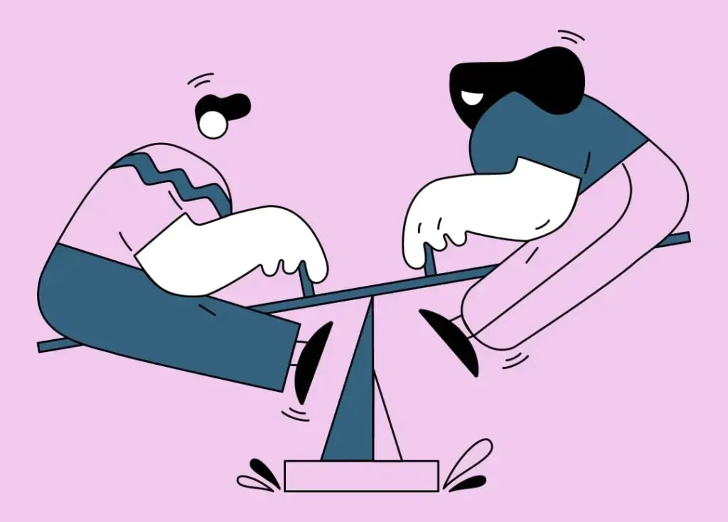
As creatives, we believe deeply in our craft and put ourselves fully into what we make. Our humor, our creativity, our problem-solving gets baked into the product. So, when work is rejected, it can feel like you’re being rejected. Add tight deadlines and multiple projects to the mix, and emotions are even higher. The key to keeping a level head is all about leaving your ego at the door and keeping a healthy authorial distance between maker and product. This is a guide for designers of all skill levels, clients, strategists—anyone taking part in the design process.

Creativity

Assume Good

If someone suggests changing the design, assume that they are coming from a good place. They want to improve the work and giving them the benefit of the doubt will not only start the collaboration off on the right foot, but it’ll also build trust over time.

Creativity

Try it on for Size

If you disagree with a piece of feedback, implement it anyway and see if it works. Your initial assumptions could either be totally wrong, or it could spur some additional inspiration that you wouldn’t have come to otherwise. The important part of this is to actually try and be an advocate for the thing that you may have initially disagreed with. If you can design from their viewpoint, you might uncover the root cause of the piece of feedback and be able to address it better.

Creativity

Yes and…

If you’re collaborating with someone and they mention an idea, try to build on their idea even just a little bit. They have given you a nugget and you can help them shine it into something amazing. It takes a lot of courage to share ideas. If you have made a safe environment to share thoughts, you’ll uncover gems that otherwise would be kept secret.

Creativity

It’s Not YOUR Design, It’s THE Design

Remember that no matter what, everyone’s job is to work together on the design. It is not your solo creation to be hung in a museum long after you’re dead. It’s a communal work that is being refined by multiple people. This helps distance yourself from any feedback that might sting. Oftentimes, when people are criticizing a piece of work, they are trying to improve the work—not make you look bad.

Creativity

Liven Up the Mood

Even if you feel very attached to a design you’ve been working on and someone points out a flaw, use that as an opportunity for humor. Oftentimes, if you can shift your perspective to the person who criticized the design, you can find a joke to make about it. Humor doesn’t just lighten the mood and facilitate good collaboration, humor has a sneaky way of lowering our own defenses and opening our minds to new ideas. Many brilliant ideas start out as “joke ideas,” something we throw out impulsively, wildly, provocatively. People don’t judge them with the same mind frame because “it’s just a joke.” And this type of playful ideation makes “joke ideas” become real ideas, with real impact.

How it Happens in Practice

Imagine you have an internal design review in 2 days—this time around everyone is expecting the work to be fully designed. Strategy will be there, client services, project management, and the managing director might stroll by. But your designs are stuck, you can’t seem to push through. Instead of trying to break through that wall on your own, take initiative and reach out to someone. Ask them how they’d make it cooler (instead of asking for their feedback). This starts the conversation off as immediately collaborative and frames it so that what they suggest is already going to be an improvement. When they think of something, get stoked about it. Really, let yourself feel that emotion. Then execute their suggestion. It may feel like you’re going down the wrong path, but it’s an open door that will let you get through that wall that was blocking you before.

5 Quick Tips:

  1. Get fast. If it only takes you 20 minutes to make changes, it won’t be that big of a deal. But if it takes 2 hours, then feedback hurts because you know you’re staying late.
  2. Meditate. 10 minutes a day, focus on your breath. This trains the brain to stay calm in situations that are overwhelming.
  3. Write it down. If you don’t, you’ll forget it and you won’t do it.
  4. Be proactive. Ask for feedback. You’ll become accustomed to receiving it gracefully.
  5. Practice. The goal here isn’t to be perfect. In fact, it’s the opposite. Shedding your ego is an ongoing practice that takes regular maintenance. Shedding your ego doesn’t need to be an earth-shattering event. It can be a series of small moments that are strung together.

Emotive Brand is a brand strategy and design agency in Oakland, California.

Turn Your Instagram Into a Playground for Experimentation

Instagram is incredible. All in one app, you can feel jealous of other people’s lives, hungry for other people’s food, and intimidated by other people’s makeup routines. When it comes to brand strategy agencies and design studios, Instagram tends to be used for either sharing polished client work or photos of employee’s dogs (equally important).

But more and more, we’re seeing studios break out from the norm and utilize the platform as a playground for design experimentation. Turning the web into their own personal focus group, agencies are sharing weird sketches, creative side projects, and honing new skills.

The Art of Symbols

Recently, we completed the #100DayProject on our Instagram – an experiment in reimagining 100 symbols through illustration and motion design. Part creative marathon, part research assignment, it was a fantastic way to test-drive some new ideas. Outside the typical constraints of a client project, we could ideate and follow our curiosity wherever it led us.

https://www.instagram.com/p/Byq0UOFh8k7/

As Senior Designer Jonathan Haggard says, “I think there’s something about quick validation via Instagram. I’ll throw ideas up on Instagram that I’m not sure if I should keep pushing. If it gets a positive response, I’ll keep going. And if it doesn’t, I know that it might not be worth pursuing. I don’t have to work at something for months to finally unveil it in some grand gesture.”

Testing, Testing

DIA studio specializes in kinetic typography, and they utilize their Instagram as a veritable gymnasium for moving type. Alongside client work, they showcase tests, attempts, and chaotic exercises. Maybe there’s an assumption one should only post perfect works from your portfolio to appear “professional,” but bringing the client in on your thinking shows your brilliance in another way. From a strategic and artistic point of view, people love gaining insight into the process.

https://www.instagram.com/p/BhuwyAcFpbQ/

As Design Director Robert Saywitz says, “Social media has completely changed how we think about design. Instagram is a positive tool for design firms to share their own work – and work that inspires them – with the world. The impact of that instant access, compared to say, ten or twenty years ago when you’d have to hunt through websites or printed design annuals to connect with work, is massive. It’s also a beacon for finding agencies you’d like to work for.”

Unexpected Collaborations

Pentagram, the world’s largest independent design consultancy, created a yearlong data drawing collaboration between partner Giorgia Lupi and information designer Stefanie Posavec. Each week, for a year, the designers sent each other a transatlantic postcard with analog, hand-drawn data describing what had happened during the week. Over the course of the self-initiated project, the pair became good friends, using data as their primary source of communication.

https://www.instagram.com/p/Bzizc1DBDve/

As Creative Strategist Chris Ames says, “I love the idea of treating Instagram as an imperfect, collaborative tool between creatives. There’s a sleekness and polish to the digital age that we should push back against. I want to see process shots, behind the scenes sketches, the joke ideas that never made it to the client.”

The World Is Your Mood Board

Spin Studio, a graphic design agency in London, treats their Instagram as a constant source of inspiration. From experiments in typography to their travelogue photography, they capture whatever intrigues them. Everything is potential fuel for better client work. So often, projects become hermetically sealed within the confines of a studio. If we’re making work that ultimately goes out into the world, shouldn’t we turn a critical eye to the world around us?

https://www.instagram.com/p/BysUIhAB6ZF/

As Designer Keyoni Scott says, “Mobility is really powerful. Being able to always be in touch with a studio’s work and the new inspiring things they are doing is amazing. So, I think it’s really important to do quick experiments and just put your work out for people to see. I think everyone sees things differently and can be inspired in different ways, so you can’t be afraid to just put your work out there.”

Keep It Weird

Chances are, your website already has a section for case studies. Instagram doesn’t have to be your portfolio. Instead, it can be a repository for your 3 a.m. ideas, your moonshot designs, and wonderful distractions. After all, finding new ways to flex our creative muscles will only make the client work stronger in the end.

Emotive Brand is a brand strategy and design agency in Oakland, California.

The Design Process: Interview with Emotive Brand Senior Designer

The Design Process Matters

At Emotive Brand, we work each day to bring brands to life through strategically informed design. And doing this requires a multi-step process. Wayne Tang, a senior designer in the studio, adds a rare balance of analytics and creativity to the design part of the process. With his background as a mechanical engineer, Wayne brings a logical focus to all projects, a honed systematic approach, and an ability to see the big and small picture to us help deliver the best design solutions for our clients. In this interview, he explains and discusses his design process at Emotive Brand, why it works, and the challenges and rewards embedded in it.

What is the design process? Can you define it in simple terms?

The design process is the set of steps we take, as designers, to reach the final solution. Every studio and designer takes a different approach. It’s another way of explaining our workflow, the ways in which we collaborate, and how we reach the best strategically informed design solution possible.

Why is process so important to design?

There are some designers who just start creating things on the computer right away, and don’t take the time to build or follow a design process. But usually when you do it that way, the solution is not as well thought out and falls short when it comes to execution. A good solution stems from doing your homework. You need to know the client and the industry inside and out. Often times, it takes time for unique ideas to come to you, especially if the industry is complicated. It’s critical that as designers we move through each step of the process carefully and thoughtfully. By doing so we are able to create unique solutions that help differentiate your client and avoid repetition or design that is not distinctive. Process helps promote collaboration between designers maximizing ideas and ultimately creating the most powerful solutions.

Can you outline your design process for us?  

1. Research:

First, it’s always important to have an in-depth understanding of the client and their industry before diving in. We analyze the competition as well as best practices outside of the category.

2. Absorb the brief:

The brief is critical for designers, providing the big picture view of what a client needs, and connecting to the strategy our team has created. Understanding the emotional impact of the brand strategy helps me find imagery that evokes those same emotions. I always use the brand promise to help guide the design.

3. Free association:

Not every designer does this, but I find it helpful to draw a word map at this point in the process. It’s almost like a string of word associations that come from the brand. I look for images that match those associations to get a better sense of what direction to take.

4. Mood board:

This is the most important stage of the process for us at EB. It’s a stage of inspiration and creativity as well as focus and distillation. At the studio, we create mood boards for the brand by scouring the net for images. These could be anything from branding projects to graphic design, photography, posters, album covers, packaging, etc. We print, cut, and categorize images and try to create solid concepts from groups of images that reveal something to us about the brand. These boards are always different. Some are very conceptual. Others are more style-driven. From there, we can narrow it down to the most compelling, and powerful concepts. This part of the process is inspiring and exciting. It gives us the momentum we need to move forward.

5. Design explorations:

From the mood boards, we begin to focus in on the concepts. However, we make sure not to limit the possibilities. Often times, new concepts emerge in this stage. Sometimes initial concepts get grouped together. Or one concept gets broken apart. This part of the process is all about creating quick designs. For instance, we would create a quick sketch of a logo, explore how the system could look with a few layouts, and then move onto the next concept. It’s not about details. It’s about coming up with as many rough directions as possible.

6. Refine, expand, refine, refine, refine:

Out of the many concepts we’ve created, we collaborate to select three or four that we agree hold the most potential. These are the concepts we refine again and again until the solution is where we want them both aesthetically and strategically. We would then expand on these concepts to see how the system could flex in different media, and then refine again and again and again.

What are the challenges you have come across in this process?

Sometimes, I hit a block. And this is hard, but creative blocks are inevitable to any creative process. However, what usually helps me is simply talking to my fellow designers. I just ask what other designers think, and we always find a way around a particular problem. Getting other perspectives really helps move through blocks in the process. Sometimes I take a walk. Or I do menial tasks and turn my brain off design for a while. I really have had a few new ideas pop up in a shower – it’s not a myth!

Another challenge, as always, is allocating time correctly. This is why understanding the client and their industry is so important, as well as designing from a strategically informed mindset. This understanding makes it easier to identify what parts of the process are going to require more time and attention and be of more value to the client and the end solution.

Can you talk more about how working with the EB team plays into the process?

Having a team to talk through differences, gather inspiration from, and flesh out ideas with is key to moving the process forward. As you get to know the people you work with, you learn their strengths and weaknesses. Everyone has them. In our team, some designers are more logical, while others are more intuitive. You need both to create truly unique, well thought-out solutions. Every designer brings something different to the table, and another set of eyes can make all the difference.

What are some of the most important attributes to the design process today?

I would say adaptability and flexibility. Some projects are less conceptual. Others are more client-orientated. The ability to be able to tailor the process to the project is very important. And processes that allow adaptability and flexibility often lead to more creative, innovative, and powerful ideas and design solutions.

Emotive Brand is a San Francisco brand strategy and design agency.