How to Spot a Great Logo and the Impact of Superliminal Design
How to Spot a Great Logo and the Impact of Superliminal Design
Logo Spotting
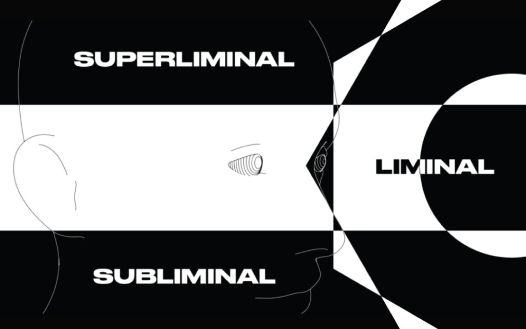
A great logo hits hard. It has a solid impact with the impression of an untouchable work of art that stays with you whether you like it or not. The best logos tickle your brain a little bit and that brain tickle is what we in the design biz call superliminal design.
What Is Superliminal Design?
Superliminal design is something that brand designers specifically strive for in their work. It’s the distillation of an idea down to its most obvious form which might sound a little heady so let’s break down the philosophy behind superliminal design and explore it in the following visual examples.
From Subliminal to Superliminal
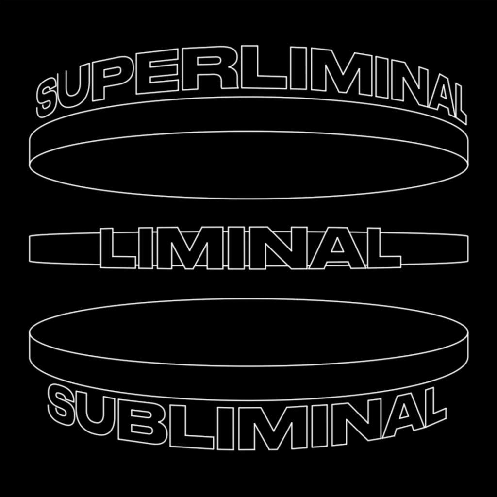
When interacting with a brand there are 3 different levels of awareness: subliminal, liminal, and superliminal. Each of them plays a very specific role in brand design and our waking consciousness.
Subliminal design comes into play with things like color choice.
Take a moment to view the swatches collection below.
How do you feel when you let your eyes relax on them? What connotations come up for you? Are there certain memories that are triggered? What about smells? Associations with people? Subliminal triggers lie beneath the surface of your awareness but still elicit a response within your mind.

Let’s bring this example into the liminal space—the space in the mind where it can sync the message and the awareness of the mind.
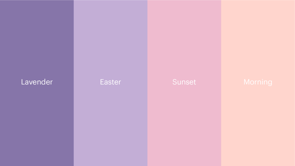
As we begin to name and codify entities, we bring awareness to them and our consciousness recognizes them as discrete and concrete associations. The introduction of text into a system can bring the subliminal message to the forefront of our waking consciousness, making it exist in the liminal space.
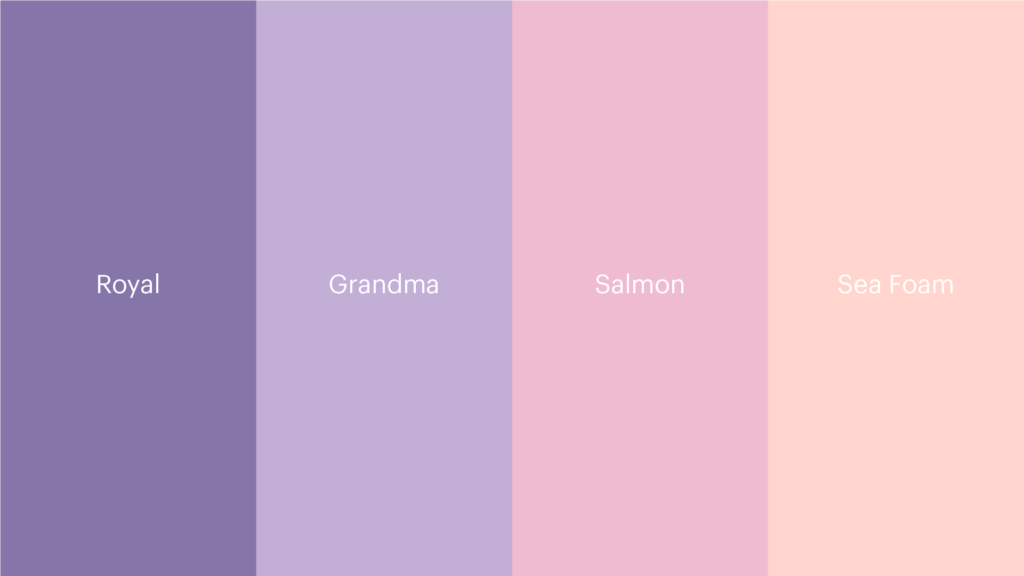
The thing about liminal space is that it’s very easy to manipulate, and it’s very obvious when the manipulation happens. Here is the same set of subliminal colors, but a different set of liminal classifications can alter the associations.
Ascending to the Superliminal
Human beings have a keen skill of employing abstraction when it comes to distilling complex ideas that take too long to explain in liminal space, and are too unwieldy to communicate subliminally. We have to work in the superliminal in order to get huge ideas across quickly and succinctly.
In contrast to the subliminal which exists below awareness, superliminal exists above awareness. It’s one of those things that are right in front of you, but you haven’t seen it yet. It’s like looking for your lost keys for an hour then realizing they’ve been in your hand the whole time. It’s the puzzle and the solution presented at the same time, but you still get that shot of dopamine when you solve it.
Humans have been doing this for over 40,000 years by creating abstract symbols that capture everything from spiritual philosophy, education systems, and scientific endeavors. However, it takes a highly skilled person to create something in the superliminal space that is cogent enough to be understood on all 3 levels of awareness.
Superliminal Logo: Moveworks
The Moveworks logo is constructed out of 1 geometric shape. This 1 shape is repeated and rotated until a form emerges that is specific in its message and becomes something in its own right. It’s the simplest and most concise distillation of the brand concept.

The logo contains 3 main messages from the superliminal:
- The combined triangle forms communicate the sense of fast-forward movement, a direct connection to the Moveworks name, and its goal as a brand: instantaneous resolution.
- It brings two sides of the conversation together—the top and bottom representing IT and users respectively.
- It contains the monogram of the company name—MW in a connected and cohesive shape.
Arriving at a logo that is this concise is rare and incredibly difficult to achieve. It’s the needle in the haystack to have multiple messages being delivered as well as containing the monogram letters in the form without being disruptive to the message.
Superliminal Logo: Material
In Material’s case, there is a dissection of a square to produce a right angle that is used to construct the 3D illusion via repetition.

The only properties that are modified to construct the logo are the lengths of the lines that create the angle. The lines are repeated to create a 3-dimensional infinite tunnel which references 3 main parts of Material’s solution:
- Radical resilience—the infinite tunnel shows the never-ending resilience and the angle that creates the 3D illusion represents the radical—it’s an entirely different solution than the rest of the market.
- Material secures from the inside-out. We are able to see the inside of the tunnel as well as the outside.
- Defense of depth is Material’s main tenant of security. Once one layer is breached there is another layer right after it ad infinitum.
Superliminal Logo: Genki
Genki is a symbol of passion. This mark for FUJIFILM Diosynth Biotechnologies pulls together individual sparks of passion from everyone involved in their organization to form something even stronger than what they are able to contribute individually.

The individual spark is a simple rounded rectangle. Each spark is then distributed continuously around a perfect circle. Every other spark is rotated 45 degrees. This symbolizes 3 main things:
- The individuality of each contributor and that each contribution is adding to the whole.
- Each contribution is equally valuable. There is no hierarchy of ideas.
- The form is then modified to create the letter G to further drive the association with Genki home.
Does Your Brand Need a Superliminal Logo?
No. Superliminal design is like enlightenment. If you force it, it’ll never arrive. Superliminal design comes as a result of emergent design and is something that naturally happens as a part of employing that methodology.
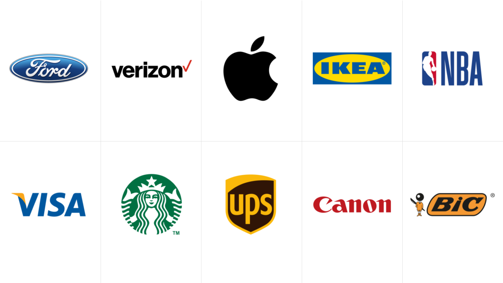
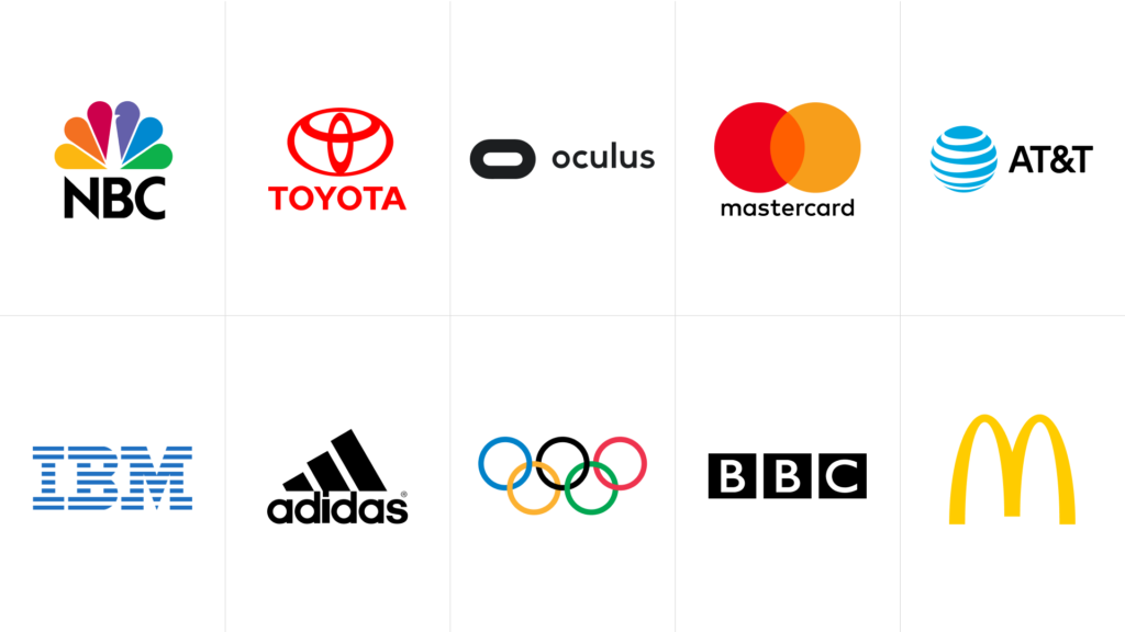
Below are some of the most famous brands in the world that do not employ superliminal design in their logos.
And here are some of the most famous brands that do in fact employ superliminal design in their logos.
Superliminal logos aren’t for every brand. They’re like puzzles that give your audience an additional little gift if they are open to it. The advantages of a superliminal logo are that it’s long-lasting, able to evolve over time and still retain the underlying concepts, easy to recognize and draw by hand, and lends itself to a systemic approach to the rest of the brand—ensuring a consistent thread through all components of a brand.
Not every brand needs a superliminal logo, but if it does happen take a moment to realize you’ve just seen a unicorn.
Emotive Brand is a brand strategy and design agency in Oakland, California.


