The Value of Outside Creativity on In-House Work
The Value of Outside Creativity on In-House Work
As an agency, we have the benefit of outside perspective on client work. Our distance allows us to see situations with a more objective lens. But what happens when we get too close to our own work or get caught in a creative slump? As Design Director Robert Saywitz tells us, sometimes the best solution to in-house problems is outside inspiration. We sat down to discuss how his background in illustration, graphic novels, and mixed-media informs his design thinking.
Tell us a bit about your artistic practices.
I do a little bit of everything: painting, drawing, ink, mixed-media works on paper, graphic novels, personal and commercial illustration. I work with many non-traditional and found materials, such as antique books, wooden crates, or music-related items like vinyl and cassettes. Part of my process is to breathe new life into discarded or antiquated things that often find themselves on the street or in second-hand shops. I not only try to find materials that will work as a blank canvas for a drawing or painting but I also look for specific materials that relate to the subject matter, and to my own sense of storytelling.
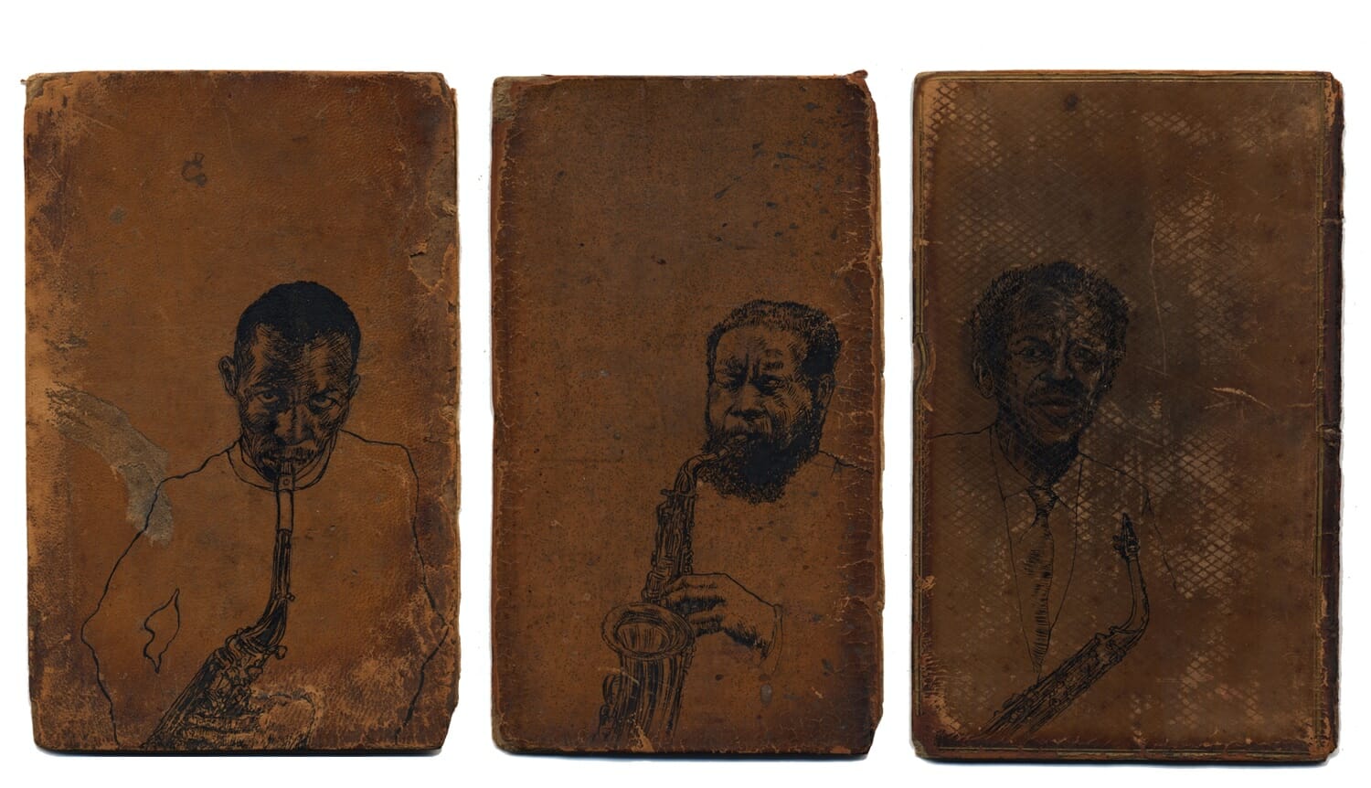
For example, as part of my series, Music Was My First Love, I used antique, leather book covers as canvases for ink drawings of jazz musician and composer, Ornette Coleman. The triptych shows him at three stages in his life – a rising star, at the height of his powers, and as an aging legend. The deterioration of the materials adds much more to the story than any ink wash or layered background I could have tried to create by hand. This was also a nod to the process and how we convey and gather information – reading about art and music – as well as my own love of the physical book. At my heart, though, I’m a drawer. It all goes back to pencil and paper.
How does that sensibility feed into your practice for client work?
I never start on the computer. You have pens, paper, scissors, drafting boards, and oh, a computer as well. It’s just one piece in a massive toolkit to tell a story. I’ve always viewed myself as a visual storyteller. Whether it’s a singular poster or a super complex brand system. For me, I’m always searching for that layered story. Too much focus on any one instrument, like the computer, tends to dilute the experience. The computer is an amazing tool, but it’s not an idea generator. You can have happy accidents, but you can’t let the tools dictate the idea. I didn’t get into design until later in life. I came to it from an art background – and I think my sideways path in has made a big difference in how I approach work.
You mentioned the idea of posters. You often start projects by designing a poster, even if it won’t necessarily live in this format. What does this process illuminate for you?
The poster, for me, is a perfect object. It’s that blank slate, open canvas, anything-can-happen object. Whether it’s a logo or complete brand identity, I tend to think in terms of the poster. If you can figure out what the big idea is in a single frame, then you have the spark that allows you to expand the idea into an entire campaign. Solving the poster is like this secret puzzle that will inevitably answer questions that come up later in the process.
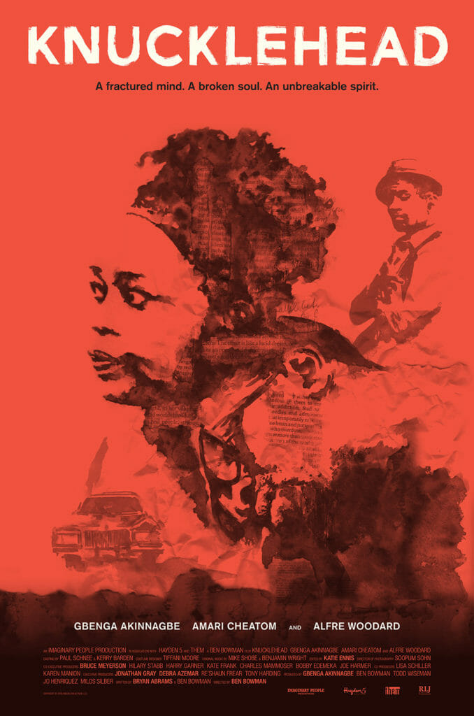
Initially, it was album covers and film posters that sparked my love for design and it was people like Saul Bass, who you felt could capture the entire mood of a two-hour movie in a 2-D plane. There’s something magical about starting from a simple rectangle and trying to tell a story in multiple parts. Again, for me it goes back to the pencil and paper – the sheet of paper is essentially that blank poster frame where the problem needs to be solved in a clear and compelling way. That’s how I approached the poster for Knucklehead, which is another example of letting the idea (not the computer) drive the design. My watercolor and ink illustrations with collaged magazine clippings captured the emotional quality and narrative of the film more than traditional photography could have hoped to achieve.
How much of your client work is inspired by these other worlds?
I think you can see it in almost everything I do. If there is ever an opportunity to bring in something that feels hand-drawn, organic, or illustrated, I think it adds warmth and empathy. My gut instinct is the pencil, not the mouse – and that line of thinking will always filter in. The art of making something is nuanced and gestural. I love when you can feel the hand of the creator a little bit. Especially in the digital age, when things can feel a little too slick, too polished, too clean. Obviously, every project has its own parameters, but at the end of the day, everything is human and you need that component. Even if it’s just a starting point that gets digitally refined later, the emotional core will bubble up.
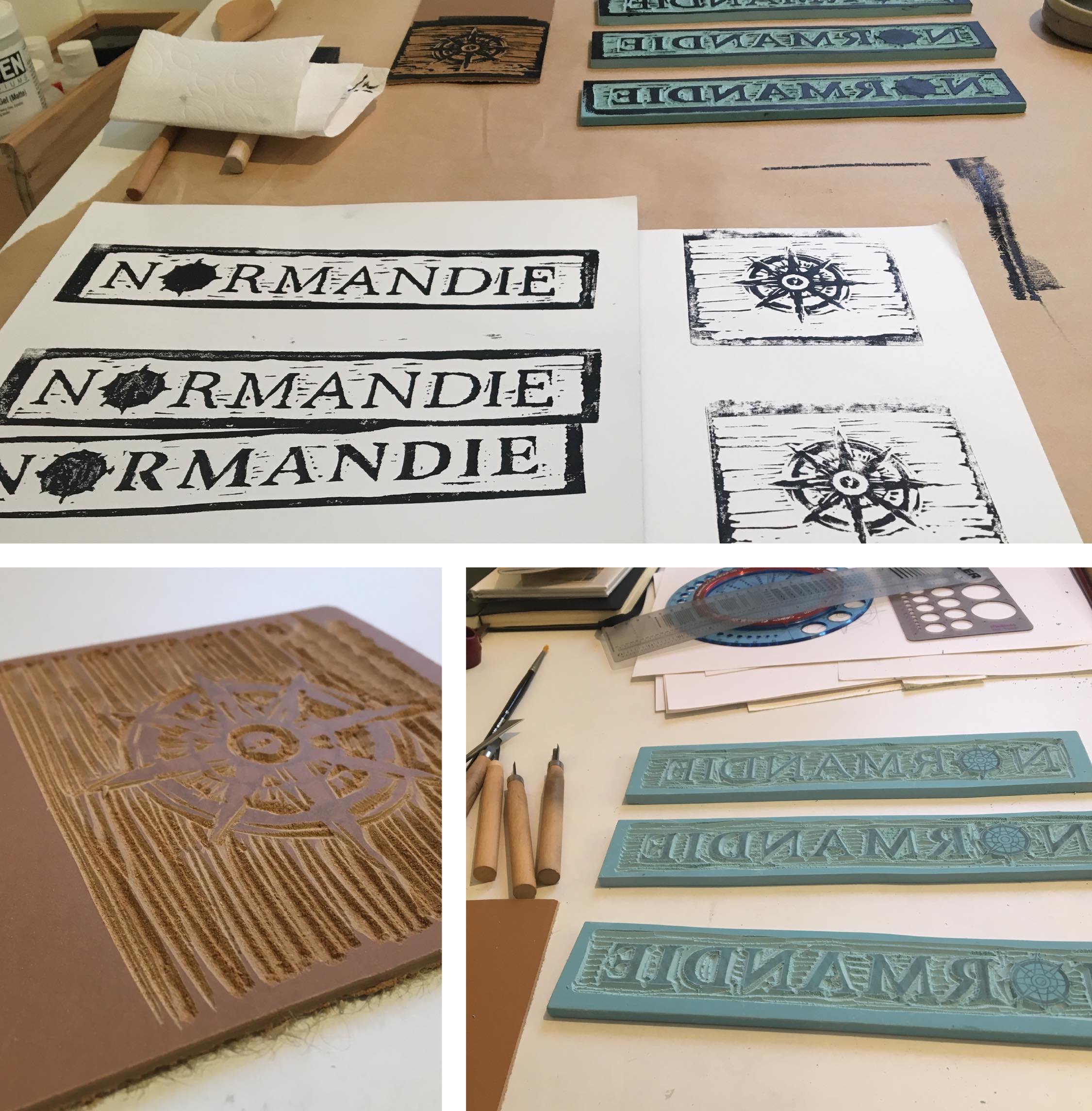
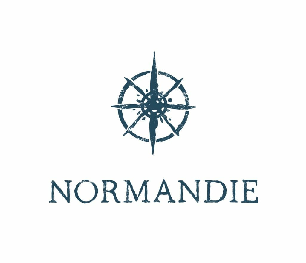
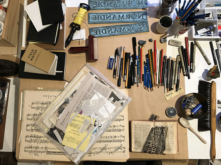
For example, the identity I created for Normandie – a new restaurant in Portland, Oregon – began as an actual linoleum block print before getting tediously refined on the computer. The only way to create a bespoke, block-printed logo was to make it by hand.
 How can say, a B2B tech company, get out of their comfort zone and let outside creativity bolster their offering?
It sounds cliché, but inspiration is everywhere – you just have to be willing to see it. A lot of that is just getting outside and looking for answers in unexpected places: the museum, the used bookstore, public gardens, architecture, travel guides, novels, even the design of old appliances. You’d be surprised how many times the work of someone in a completely different field can inspire or solve the problem you’re working on. It can be as simple as watching a really good documentary series, like Abstract, which showcases the work of designers in different fields at the top of their game.
A very tangible lesson is to set up Google Alerts under research categories you’re interested in. I have one set up for “book arts.” Every day, I get four or five unique articles sent to me from places I would never think to look, like a local paper in Des Moines, Iowa. You need to be open to everything serving as a potential source of inspiration, whether it’s going on a trip to the post office or wandering into an estate sale. The beauty of the iPhone is you always have a way to capture that random spark.
Beyond the digital, I think it’s incredibly important to start a physical inspiration folder. Put one in your design department and start to collect objects that intrigue or inspire. It doesn’t have to make sense right away. The internet tends to feed on itself, and there’s something liberating in having your designers get bold new ideas from the world around them. My personal studio is full of seemingly random artifacts: old instruction manuals, maps, magazine clippings, keys, matchbooks, old manual typewriters, compasses, ticket stubs. Design is all around us and you never know what object will unlock or inspire. I recently submitted to The Sketchbook Project, which is a crowd-funded sketchbook museum and community space. My submission was all about tiny maps, and its creation was a direct result of the process of maintaining this archive of physical inspiration.
How do you manage your creative and professional lives? Do you view them as at-odds or supporting one another?
A big internal obstacle for most working creatives is separating your two lives – the creative and the professional – because they don’t fit in. You feel like your day job is taking away from your art, or vice versa. I’ve struggled with that.
To be honest, coming to Emotive Brand is the first place where I truly feel those two lives are intermeshed. There’s no shame to keep one hidden. In fact, we’re encouraged to share and inspire others. In all the jobs I’ve worked, it’s never been that way, and it does a huge disservice to the employee, the agency, and even the client. When you build a culture of expression, the ideas just get better and feed off one another. It’s liberating and opens up all these other doors. I’ve always bifurcated my creative lives, but I don’t have to do that here. At a previous job, I would have my work included in a group show at a gallery and not tell anyone. Here, I feel totally enabled to let my outside creativity influence and improve everything else I do.
Check out all of Robert’s work on his website here.
Emotive Brand is a brand strategy and design agency in Oakland, California.
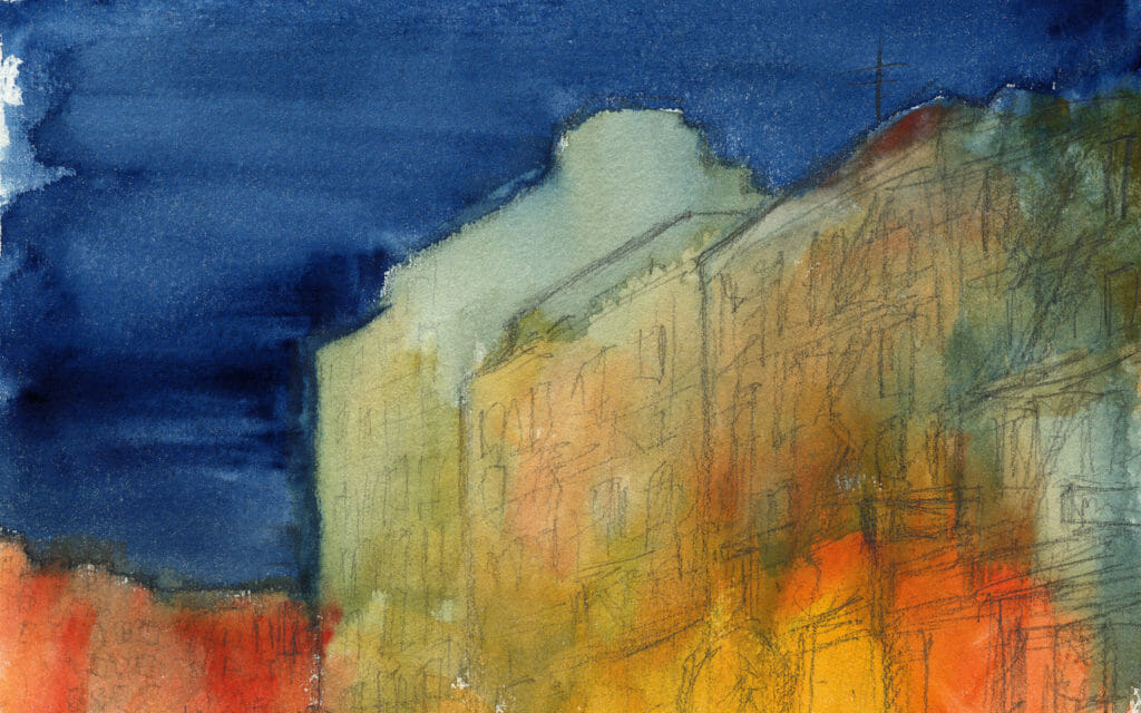
Cover Image by Robert Saywitz: Chinatown (detail), watercolor and graphite on paper, 5 x 7 inches


