Last week, the world was given two small wonders: War Paint, a hyper-aggressive makeup brand exclusively for men, and Liquid Death, canned water designed to look like beer. Two “wellness” brands aimed at men, cloaked in the visual language of skulls, tattoos, and violence.
What can these two bizarre companies teach us about the role of gender in branding? And is breaking down male stigma in the wellness space simply a design problem?
Branding … For Him!
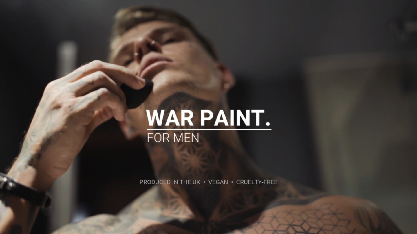
Let’s start with War Paint. Their 13-second ad features a heavily tattooed man using various products, flexing his pecs, and adorning himself with a skull ring. Notably missing from this peacocking is how the actual makeup looks on the guy’s face. But that’s not the point of this ad. The point is to disrupt your expectations of makeup and remind you, to a cartoonish degree, that this is for herculean men.
Everything about this brand – the militaristic association of its name, the tattoo parlor visual language, the chant of its tagline “makeup for men, designed by men, for men” – is attempting to shift perception. And in theory, that’s a good thing. For decades, many men have felt uncomfortable with the fact that they have human bodies that require basic care, like moisturizer or water. If War Paint is working toward a future in which men can boldly engage in self-care, that’s progress, right?
Unfortunately, everything about their execution is decidedly backward. Online, many people were off-put by their singular expression of what it means to be a man, and we’re hoping to see a larger spectrum of masculinity represented.
In a tweet attempting to clarify its positioning, War Paint wrote: “If females can have products just for women, why can’t men? Our aim is to allow makeup to be gender neutral and to do that we must have male-specific brands also.”
As Vox writer Cheryl Wischover responded in her piece, “Achieving the goal of increased gender neutrality by making stuff for the underserved ‘males’ demographic struck many as counterintuitive or even nonsensical. The truth is that it probably is still hard for some men to walk into a Sephora and buy makeup. But selling makeup with muscles and war is not going to take away that stigma any time soon.”
The Shape of Water
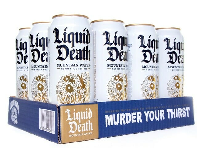
Let’s shift to Liquid Death, the punk rock canned water aiming to “murder your thirst.” In a way, this feels like a thought exercise for aspiring salespeople. Take the most basic thing possible – water – and make it irresistible. Former Netflix Creative Director Mike Cessario has done just that, raising a new seed round of $1.6 million for his new company. In total, he’s raised $2.25 million for, and I can’t stress this enough, water in a tallboy can. Backers include Biz Stone of Twitter and founders of Dollar Shave Club and Away.
According to Cessario, he’s not solely marketing to the heavily male punk and death metal crowd indicated by the skull logo; he’s targeting the “straight-edgers”– those who eschew drugs and alcohol in a scene often known for both – and doing so under the guise of eco-friendliness because a single, shiny nickel from every $1.83, 16.9oz. can sold will support cleaning up plastics from the ocean.
It would be a shame to deny Liquid Death’s sense of humor. They produced a truly bonkers video called, “Hey Kids, Murder Your Thirst,” which wouldn’t look out of place on Adult Swim. Similar to War Paint, they are aggressively (and joyfully) disrupting the status quo of their category. But here’s the thing: this whole brand narrative is still supported by outdated modes of masculinity. Healthy habits – drinking water, taking care of yourself – shouldn’t need to be draped in distortion and blood to appeal to men.
Why Is Self-Care Gendered?
Ideally, self-care has no gender. Over-indexing on masculinity to make something appeal to men doesn’t encourage actual perception shifts. Quite the opposite, it teaches men to only respond to the violent, the blunt, the obtuse.
As Erika Nicole Kendall noted in her essay, “Marketing has the ability to convey powerful messaging, drive consumer behavior, and legitimize messages we frequently see and hear about ourselves. It simultaneously guides our aspirations and affirms how we see ourselves. When the marketing used to sell wellness brands to the public validates questionable ideas about gender – and, for that matter, race – we should collectively cringe.”
War Paint and Liquid Death are hardly the first, and they won’t be the last. There’s Dude Wipes, which are baby wipes, but for dudes. There’s Man Salt Muscle Soak, which are bath salts, but for men. You’ll never guess who the target audience for the candle company Man Cans is. (Hint: it’s men.)
Perception Shifts
Those who work in branding have a real opportunity to shift perception – if they approach this challenge from a place of curiosity and empathy. What does it mean to be a man in 2019? Whatever we want it to mean. It can be intersectional, non-binary, and yes, masculine, if the aperture of that masculinity is open enough to allow for other identities to exist. Wearing makeup, drinking water, lighting a candle, or taking a bath shouldn’t rattle your identity. If it does, you’ve got bigger problems than branding.
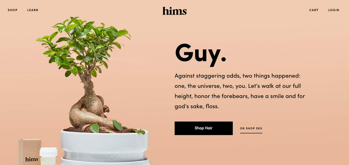
Hair loss company Keeps and wellness brand ForHims are steps in the right direction. Through diverse photography and minimalist design, they are expanding masculinity by focusing on what it means to be human, not just male. There’s still an edginess and personality to their copy, but it refrains from veering into the overtly macho.
“We hope to enable a conversation that’s currently closeted,” goes the ForHims’ about page. “Men aren’t supposed to care for themselves. We call bullshit. The people who depend on you and care about you want you to. To do the most good, you must be well.”
In the productivity-economy, caring about yourself can feel radical. The role of good branding makes those magic moments as accessible, inclusive, and frequent as possible.
Emotive Brand is a brand strategy and design agency in Oakland, California.


