Design Trends for 2019
Design Trends for 2019
Friction Builds Character
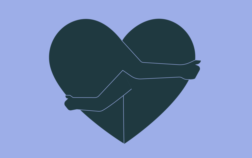
Friction is one of those words you see in Silicon Valley all the time. Specifically, in technology’s promise to remove it. A frictionless experience is instantly digestible, seamless, clean. The only problem is that in desperately trying to remove the friction from every experience, you can remove the experience altogether. A little friction, intrigue, or mystery is not always a bad thing – especially when it comes to design. As we look forward to 2019, we have talked about trends for employer branding and overcoming strategic challenges. Today, we turn our sights to the world of design. Combining the best elements from nostalgia and futurism, the design trends of 2019 are reinventing the aesthetic movements of the past to create a bold and fired-up vision for the digital future.
Just My Type
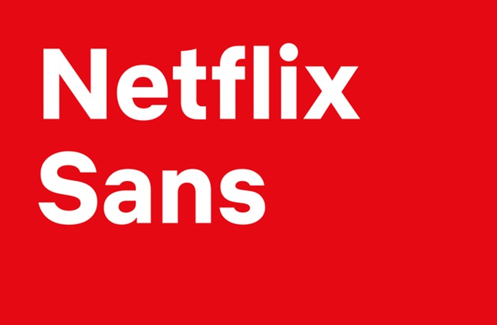
They say never use Futura. Well, apparently, everyone listened. This year, all the big brands decided to invest in creating their own typefaces. Airbnb, Netflix, Uber, and Squarespace each took the plunge. And while designing your own typeface can have a huge upfront cost, it will actually save them millions every year on font licensing. Plus, type is an essential building block for creating meaningful connections for your brand. You get what you pay for.
Think Way Outside the Box
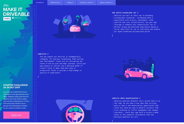
After years of being forced to encase every element in a strict order of circle avatars and content boxes, designers are finally being given the freedom to experiment with open compositions. Akin to the iceberg method of writing, these are designs where you are only given a slice of the picture and are enticed to explore an entire world off-page. As Meg Reid of 99designs says, “Often open-styled, seemingly chaotic, broken, and cut-up, these compositions take a very strong design hand since the placement of each element is anything but random.” Check out the beautiful motion of VIITA Smartwatch, or the typographic playground of Lionel Durimel.
Worlds of Opportunity
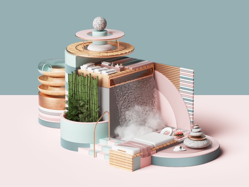
As technology advances, it seems like we’re wielding entire universes in the palm of our hands. Perhaps it’s only natural that design has followed suit, exploring the use of isometric illustration. In short, it’s about creating visual storytelling through elaborate miniature landscapes or scenarios. The style is especially adept at explaining services that have many parts or stages, which is probably why technology companies like Cryptogoal and Docker have embraced the trend.
Brutalize the Web
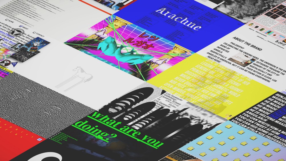
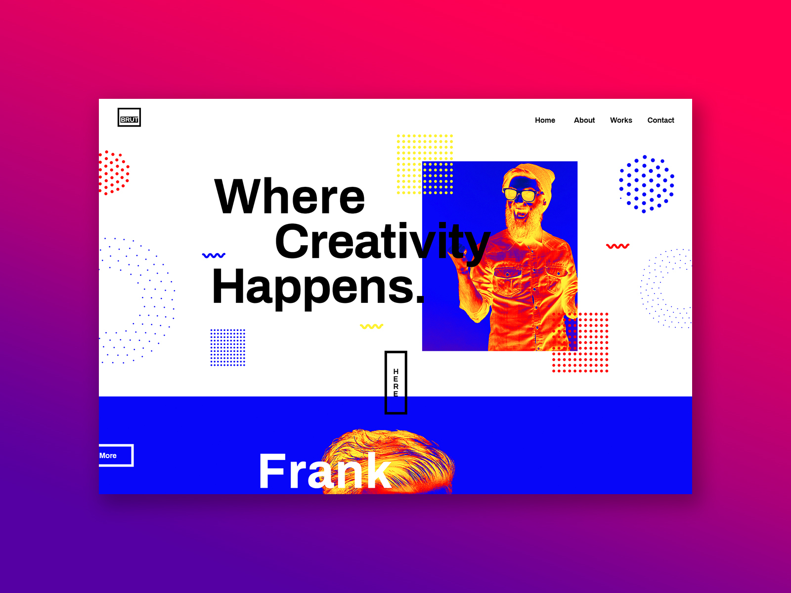
Though it was written in 2016, Xtian Miller’s essay “How To Brutalize The Web” continues to be way ahead of its time. In architecture, Brutalism was a movement that exhibited a lack of concern to look comfortable or easy. Web Brutalism continues this trend, exhibiting an intentional effort to be whatever a consumer website isn’t. As Miller says, “A unique journey and experience for the user is more memorable and engaging than the one they’ve seen countless times before. A Brutalist approach can provide the opportunity to create something that is unexpected – even chaotic.” Sites like Bloomberg Businessweek and Drudge Report were early adopters to this movement, which has only led to more experimental and artistic sites like Yale University of Art, The Outline, Indiecon, and Props Paper Magazine.
You Too Could Have a Body Like Mine
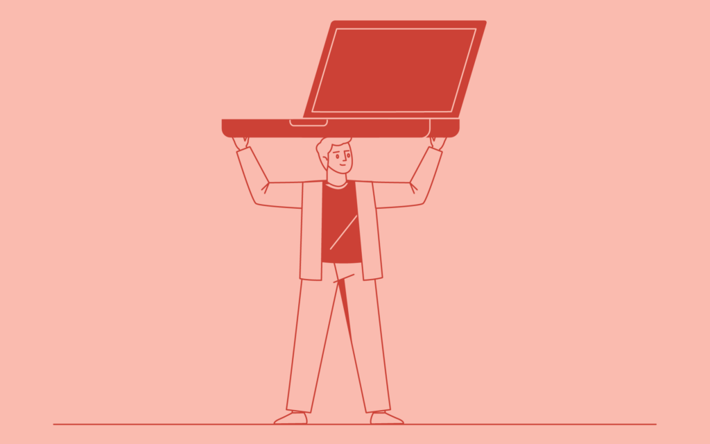
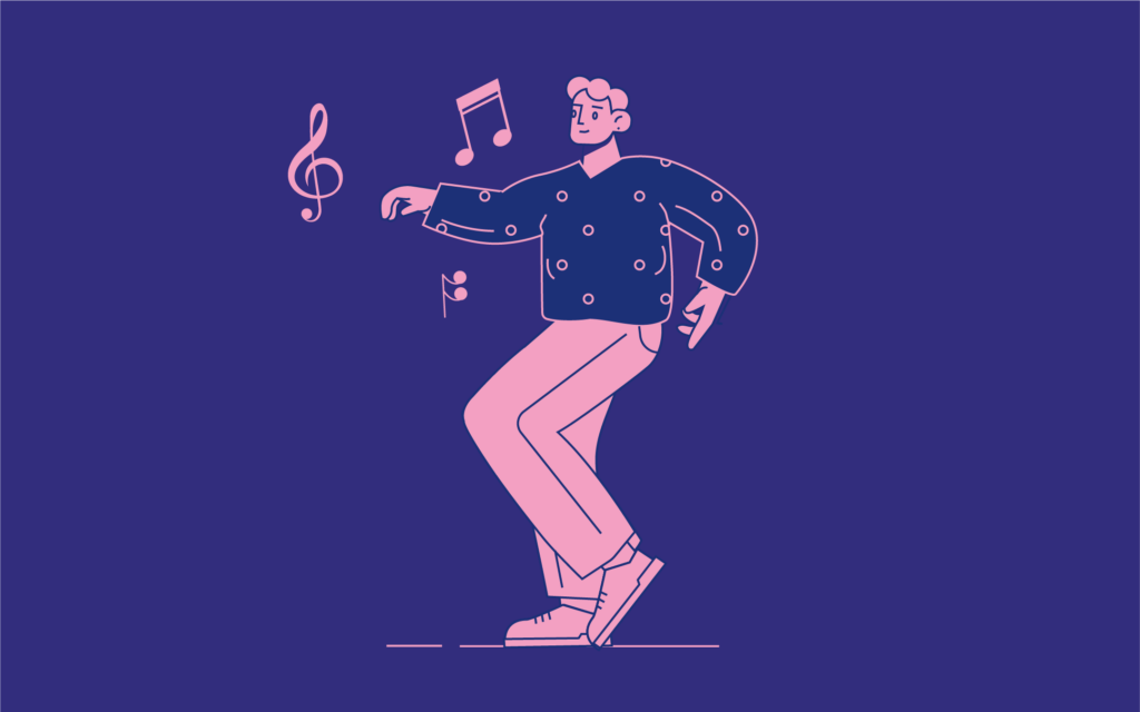
In HR, we talk a lot about the importance of representation, perspective, and making sure everybody has a seat at the table. Maybe that’s the force behind the recent explosion of retro human illustration among software companies. In all skin tones, proportions, and sizes, brands are becoming body positive for every kind of body. Zendesk, Slack, Headspace, and Airbnb all took part in the mid-century aesthetic of bodies that can move, work, and thrive with jazz-like agility.
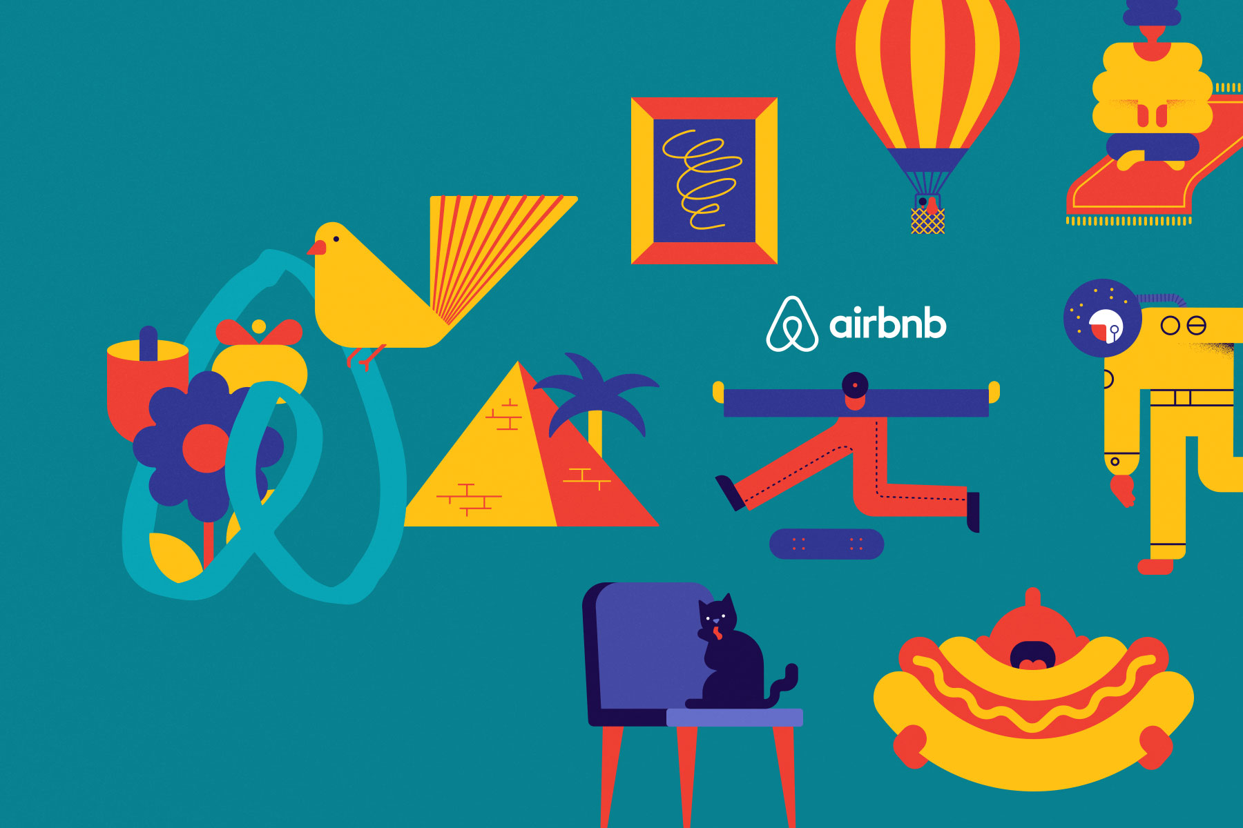
Bold Colors, Bolder Gradients
Vivid color combinations have been on trend for a while now – but expect these transitions to only get dreamy, bolder, and more futuristic. Ever since Dropbox blew the lid off its blue and white identity, it seems tech companies are getting more and more comfortable with embracing something vibrant.
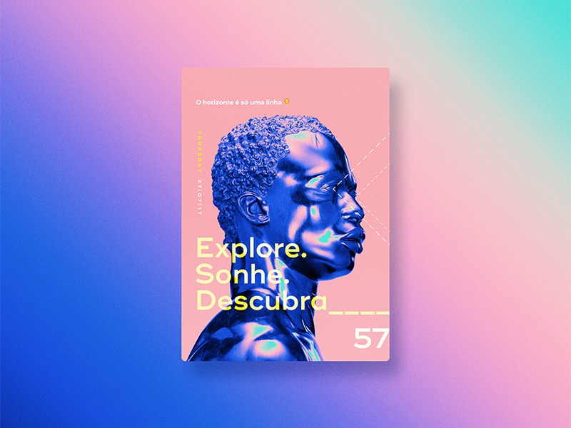
Limitless Opportunities
It would be impossible to list all the ways that designers will push the envelope in 2019, but if there’s one key lesson here, it’s this. Don’t be afraid to visually disrupt your audience. Your technology may be frictionless, but that doesn’t mean your design has to be. As Charles Thaxton says, “If the internet is trending toward commercial consolidation and monopoly, it shouldn’t really surprise us that this would also mean a monopolization of its effect, its look and feel, too.” Don’t feed into the design monopoly. Nothing is harder to grab than your customer’s attention. Design is your first line of defense in disrupting the expected and instilling a sense of true delight.
To discover how your brand can disrupt and differentiate itself through design, contact Founding Partner Tracy Lloyd at [email protected]. Emotive Brand is a brand strategy and design firm in San Francisco.


