Find Your Mark
As a brand strategy and design agency, we develop logos for myriad of businesses. Creating the right mark for our clients requires hard work – deep explorations of design territories, continual returns to the creative brief, and iterations upon iterations on typography, color, graphic language, etc. A huge volume of work to get to that one logo our clients love.
Finding the right logo is also hard work for our clients. A logo is an important and meaningful touchpoint for the people you need to connect, engage, and build loyalty with for years to come. The process forces you as a team to align around the expectations for the brand overall and decide what the logo must accomplish for the business.
What’s Your Type? Logo Types
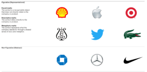
Not all logos are the same. Think a Nike Swoosh or an Apple Apple or a Twitter Bird. Do you want a symbol that can detach from your name and operate as an independent symbol of your brand? Or do you want a logo that leans completely into your name like a Facebook or an IBM.
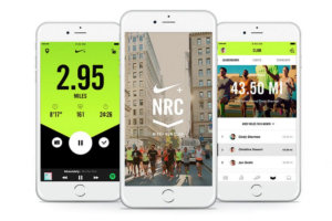
It’s all about what’s right for you as a brand. A symbol can complicate and subtract from a great and meaningful brand name. Other times, it can add greater meaning, history, and storytelling to your brand.
Let’s talk symbols. Representational symbols depict what you actually do or what you offer as a business. Say you sell pianos like Steinway & Sons; your logo might take the shape of a Lyre, like theirs does (two S’s with an ampersand in between). Metaphorical symbols, on the other hand, don’t directly depict what your company does or your products. For example, Apple doesn’t sell apples. The mark of the apple originated from the story of Newton and his apple tree. Now, it signifies new thinking, innovation, and going against the status quo. Apple owns the symbol more than any apple producer in the world.
No matter what kind of logo you pursue, here are some important things to consider.
1. Building Meaning into Your Logo
You have a meaningful brand; have a meaningful logo. It’s natural to lean towards literal logos that seem obvious to everyone – but it’s not always the right direction. You can integrate meaning into a logo in many ways.
Take Mitsubishi. The name “Mitsubishi” refers to the three-diamond emblem. “Mitsubishi” is a combination of the world mitsu and hishi – mitsu meaning three, and hishi meaning water chestnut. The logo originates from the combination of the Iwsaki Family Crest (the family of the company’s founder) and the Yamuchi Family Crest (the family of the founder’s first employer.
Although the average consumer may have no idea of this story and the origin of the logo, it is steeped in meaning, history, and familial roots.
2. More Than a Static Logo
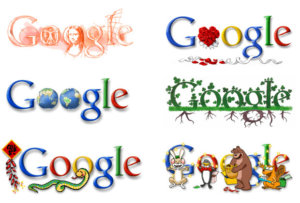
Logos need legs. They need to work for static applications like signage and also live in more animated formats – digital–in particular. Great logos work best when they connect to a brand system. Consider the static Google logo. Then think of all the forms it takes on in the digital application. Like Google, many logos act as blank canvases for storytelling or support rich and vibrant graphic languages.
When you evaluate the right logo for you, ask yourself about how the logo would live across various environments and brand architectures. Is it flexible enough to flex to your needs?
Evaluate your logo not just for what it looks like on a business card, but what it could be and what it could become for your core audiences across platforms and applications.
3. Your Brand is More Than Just Your Logo
Your logo represents one aspect of a greater ecosystem at play. At Emotive Brand, we believe powerful, successful brands are built from the inside out. Every touchpoint counts and can build or hurt your brand. From how your employees treat one another, to the tone of voice your customer service representative strikes, to the messaging on your website—all of these things must link back to your brand strategy, promise and emotional impact. In fact, a logo gains meaning when you reinforce it with other brand experiences.
Three Requirements of Successful Logos Today
Is your logo memorable? Is it differentiating? Is it emotive? Those are the three criteria you should be asking before asking anything else.
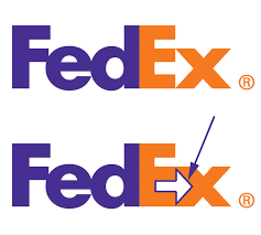
People are always going to make their own meaning of your logo. Think of the FedEx logo – only 50% of people notice the ‘magic’ arrow that appears in the negative space. Does that make the logo a failure? No, it makes it even more special.
At the end of the day, you want a logo that looks different from all the others in your space and links to something meaningful: a story, a history, or maybe a metaphor. You want a logo that makes the people who matter to your business feel something. Emotive logos always win.
If you need help developing an identity or redesigning your logo, please reach out to us as a design agency.
Emotive Brand is a San Francisco brand strategy and design agency.


