Up-leveled a brand for a newly centralized company, sorely in need of sophistication and gravitas.
- Services Provided
- – Brand Strategy
– Brand Voice
– Visual Identity
– Positioning
– Messaging Platform
– Corporate Narrative
– Copywriting
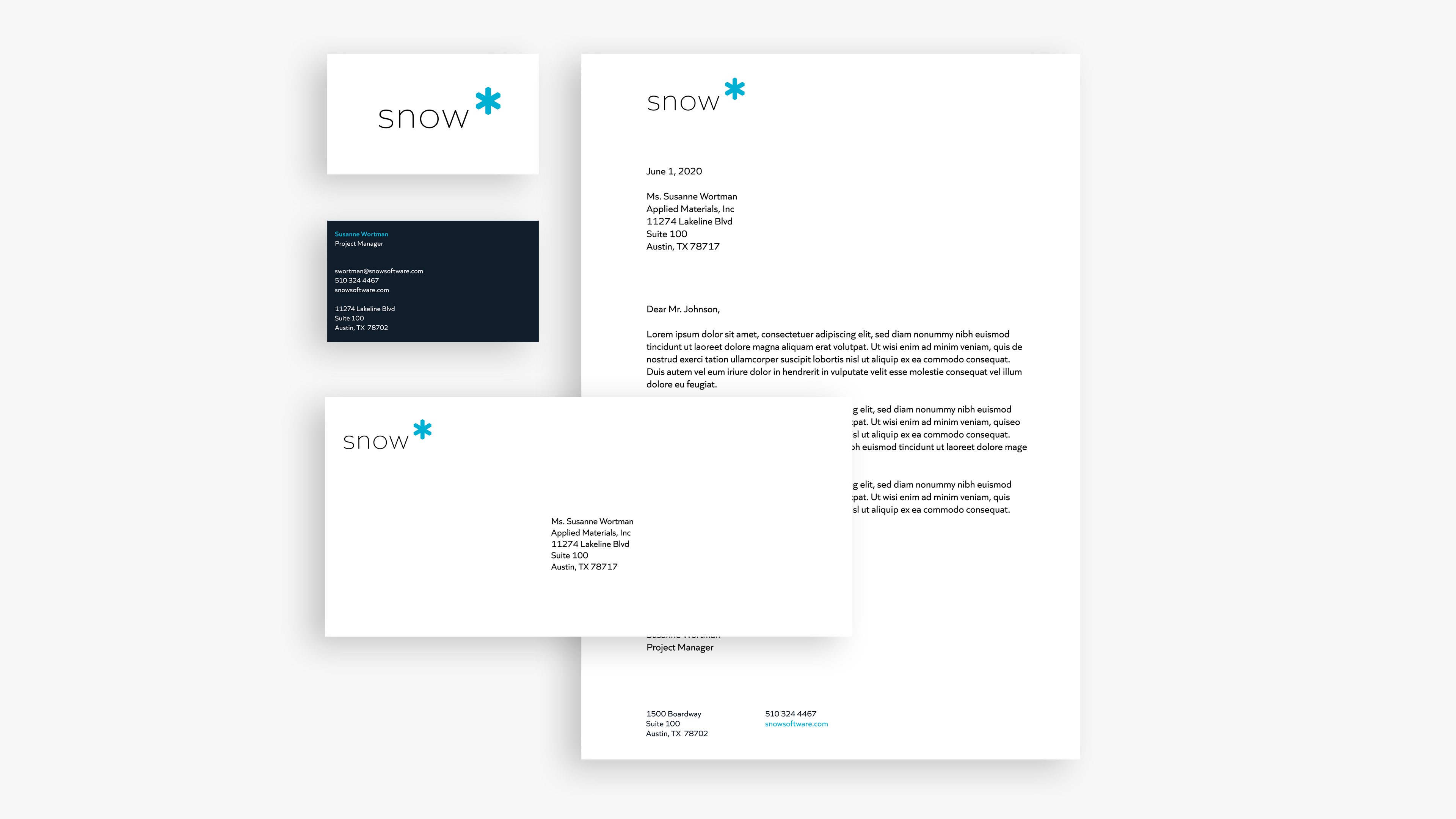
– Collateral Design
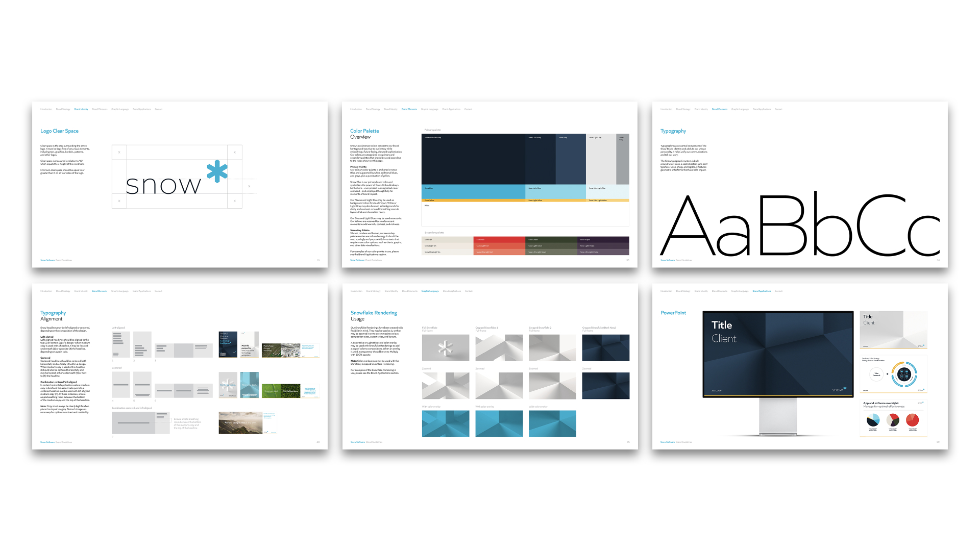
– Brand Guidelines
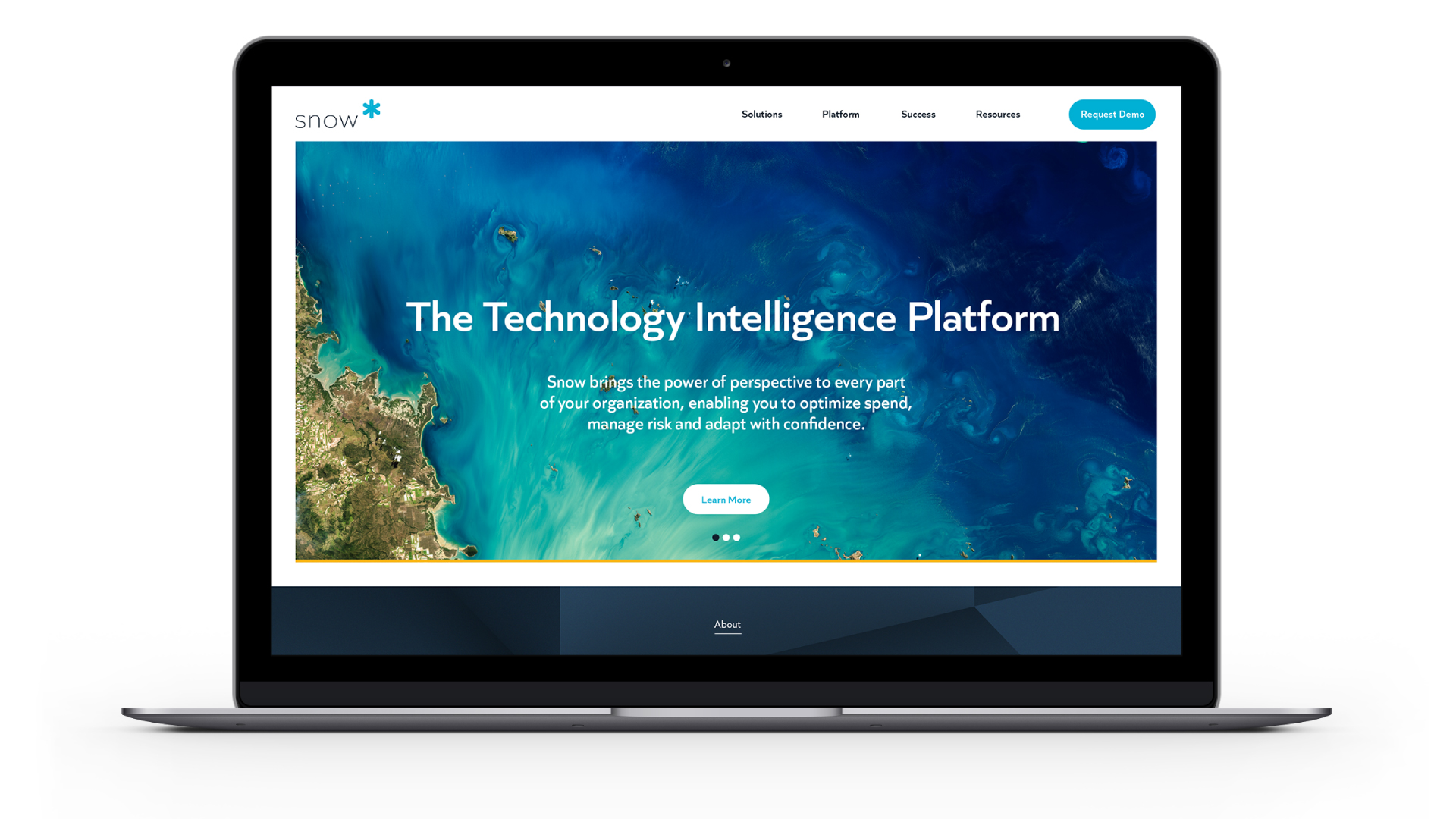
Snow Software is a SaaS-based Technology Intelligence platform that gives IT and Software Asset Managers the tools they need to gain a full and up-to-date perspective on their entire technology ecosystem.
While the company had been in existence for about a decade and had achieved a good deal of success, including a spot in Gartner’s Magic Quadrant, the brand was not performing as well. Further, the existing brand was not reflective of the new CEO’s vision or the company’s migration to a platform that could enable both on-prem and cloud management.
From both a strategic and design perspective, the brand felt diffuse, unclear and most importantly, not ready for a C-Suite audience. This brand disarray was evident within the company as well. Newly centralized under a global leadership, the company was desperately in need of clear direction that only a revitalized brand could provide.
What We Learned Along the Way
Sometimes, it’s not who your audience is, it’s how they think.
We knew the brand needed to stretch to include a C-Suite audience but we could not abandon the current technical buyer who was key to Snow’s success, and truly understood the utility of the platform. We bridged the gap by identifying a common psychographic insight about people who would be attracted to Snow’s proposition.
Anchoring in the familiar and adding a unique twist—for the win.
Many of Snow’s competitors had identified “visibility” as the key benefit of this kind of technology. We anchored our positioning in the notion of visibility but took it further by laddering up to the notion of Perspective. With visibility, you can see what you have in your ecosystem, but with Perspective, you can understand how your ecosystem can enable business acceleration.
Not every brand identity needs to be a revolution.
There was a lot of love internally for Snow’s existing logo—a simple representation of a snowflake. We knew we had to evolve the logo but, in such a way that internal stakeholders would still be able to see the origins of their beloved company and identity. We added dimension, complexity and sophistication, broadening out the overall system, while retaining much of its original intent.
“What the brand work has really done is unify all of our work over the last two years. It’s put a wrapper around our work and puts us in a position to more eloquently speak to the evolution of our vision.”
Vishal Rao, President and CEO of Snow Software
Anchored in the Past but Future Proofed
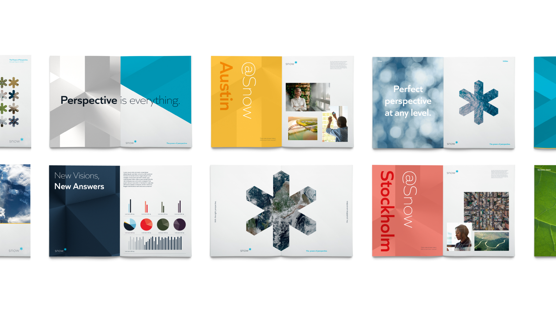
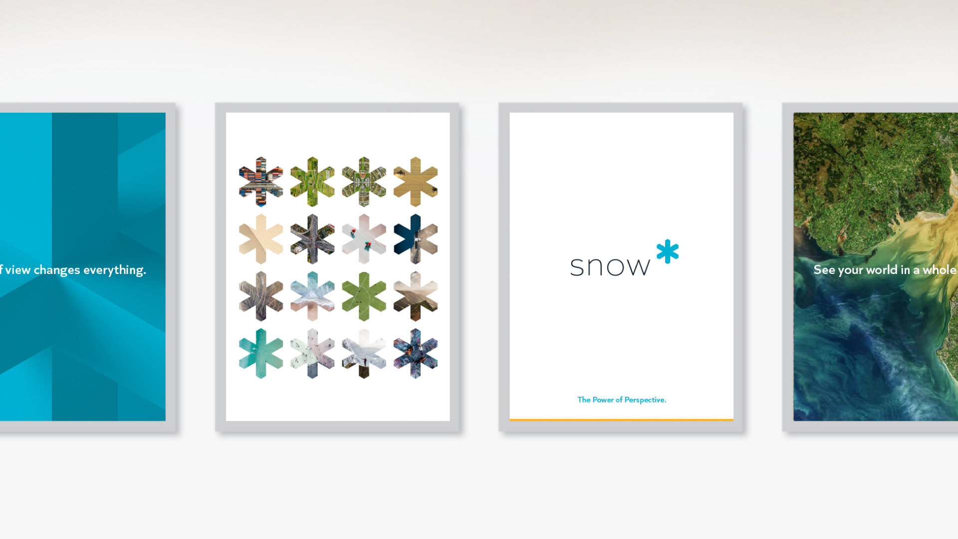
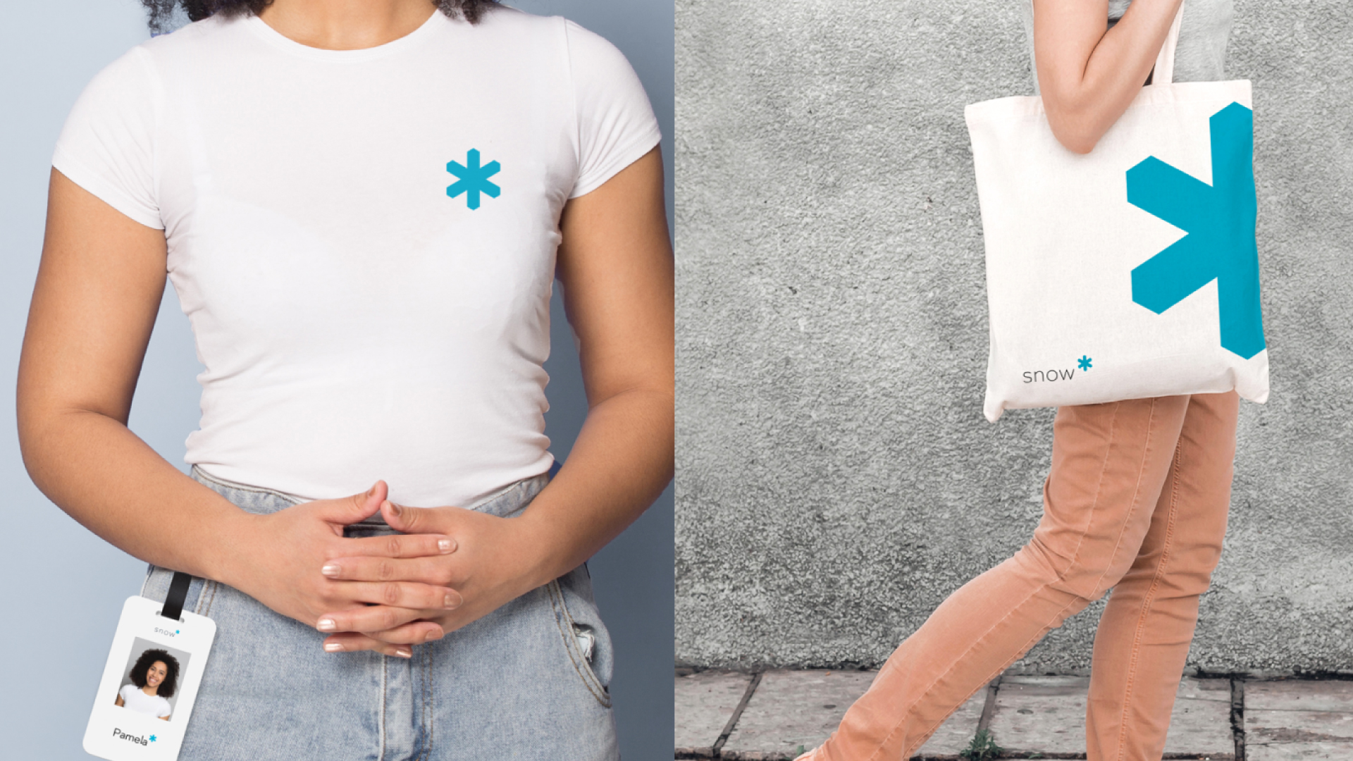
The Snow Symbol, inspired by the hexagonal forms of Snow’s old logo, the snowflake, is the primary attribute of the new identity and positioned as a superscript with the contemporary wordmark to communicate exponential power.


Endless Potential
To further tell the story of perspective, multi-dimensional renderings of the Snow Symbol were created to evoke a sense of depth and gravitas. The solid 2D form of the Snow Symbol is also used for moments of brand impact as a supergraphic image portal, or an asterisk within messaging, to communicate the exponential
power of perspective.



Perspective Truly is Power
Software and IT Asset Managers are so close to the business at hand, that they often cannot see the forest for the trees. We created Micro/Macro photo pairings to underscore the idea that by influencing nuances at the micro level, Snow drives possibilities at the macro level. Snow’s customers can zoom out from the minutiae and get perspective on how what they do informs and even catapults the bigger picture.


Clarity of Information
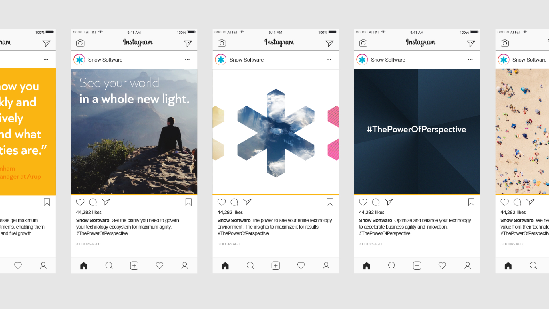
An iconography style was developed for two distinct categories based on their usage—Functional (external and internal brand communications to convey descriptive and actionable information) and Snow Spirit (aspirational for internal and external employer branding).
Experience that Works
Multiple time zones? No problem.
Snow’s leadership team and employees are distributed across multiple time zones. We were flexible in our approach, conducting calls around the clock to ensure complete alignment through the process.
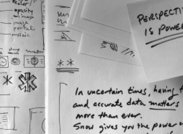
Be prepared for anything…even a pandemic.
Snow had planned its brand launch months in advance, unaware that Covid-19 would upset its plans. To ensure a tone-appropriate launch, we created an additional set of messages that felt more empathetic to businesses dealing with the pandemic and its impact.
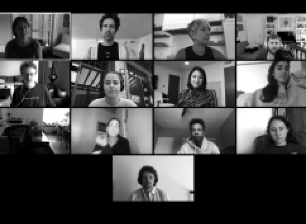
Collaboration, early and often.
There were no “big reveals” during our design exploratory. We brought our client partners into the process very early and often, to ensure that they knew where we were going and they could weigh in at the right time.
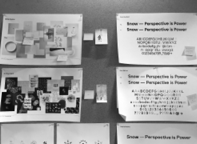
A stitch in time…eases the Brand Guidelines process.
Our clients had many questions about the minutiae of the visual identity while were were creating it. So many in fact, that we ended up building out the Brand Guidelines ahead of schedule, because we had already reconciled many of its rules.


